The Background
Solitaire is the face of modern Bulgarian wines. When it was first released, I really had no idea how unique this wine was. Today after many years I really know how important the Solitaire is both for me as a designer and for our Bulgarian wine industry too. Working on such strong brand was and still is such a privilege and challenge.
Started in 2002 the old design remained almost unchanged for nearly 15 years since its first appearance in 2003. In 2019 together with Domaine Boyar we decided to rethink current design and lift it to a higher level by making a lot of changes, enhancing different elements but preserving its overall appearance.
The Project
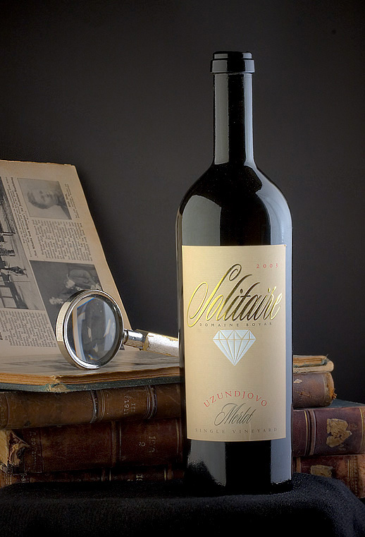
When I created the original Solitaire design back in 2003, I really thought the brand name was the most important thing for this new wine, so I put it on top using elegant script letters.
The central part of the label was for the diamond stamped with strong embossing while the bottom was preserved for variety and region.
In this new version I was truly convinced I should change the priorities in the label elements.
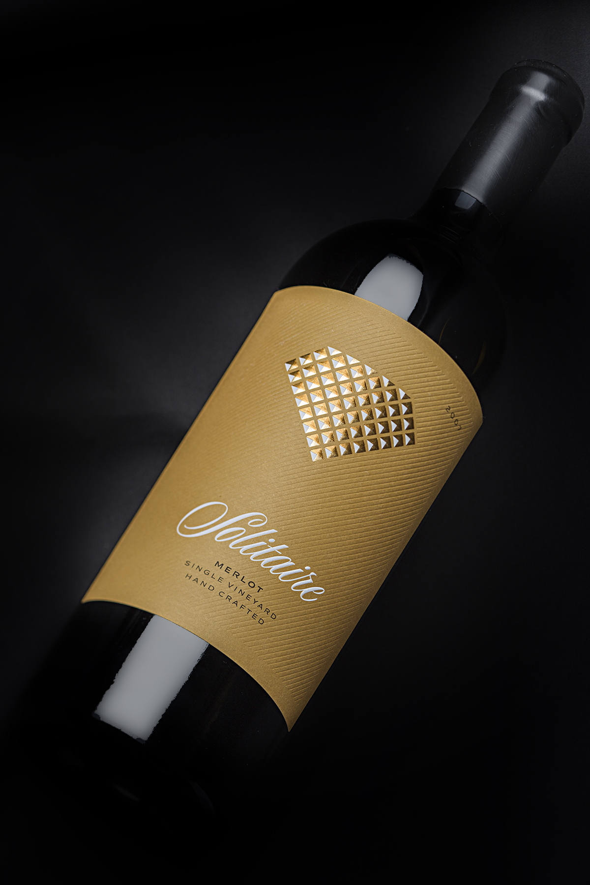
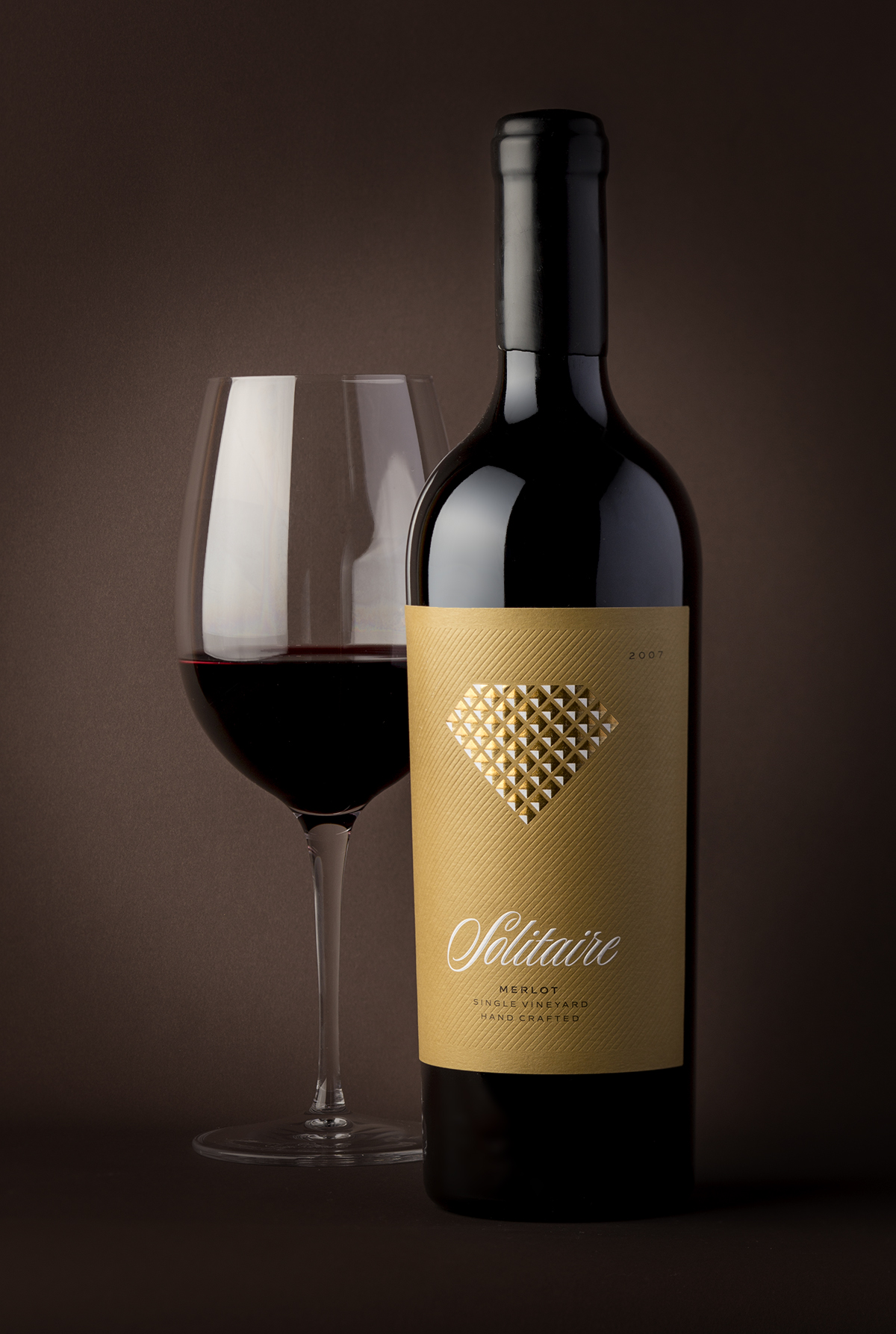
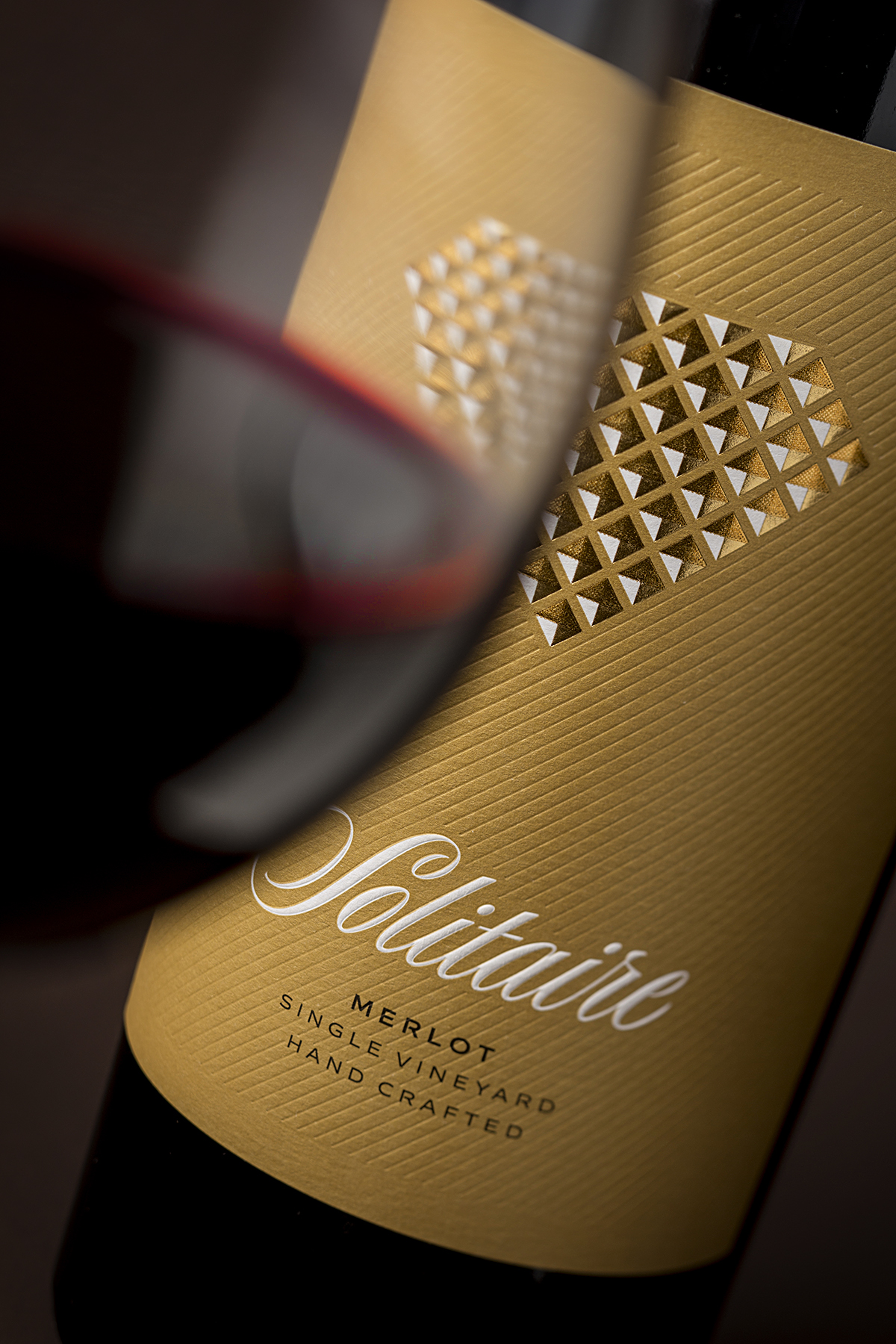
This time I paid really lots of attention to the Solitaire itself. The brand is without any doubt more than well-known so I decided to focus on the diamond and turn it into an icon of the brand. Just like the grapes we use for the wine I made one large diamond made of any small ones. Each piece consists of 4 triangles in different colors to simulate the visual effect of a small pyramid seen from top. To enhance this feeling and make it even more authentic, I used strong raised roof embossing. When you see the label in real the 3D effect is stunning!
The diamond as well as the Solitaire lettering uses white color that is very special for the color scheme of the whole design. In Solitaire – what is really important is in white.
Solitaire lettering is custom made, based on existing script letterforms. It is stamped with solid round embossing to make it stand out even more from the background.
We also made another change – we needed very strong and heavy paper to make deep embossing. Our choice No. 1 was the Cotton Touch paper by Fasson for its elegant even texture and excellent performance when embossed.
Compared to the original the new label is larger and with different background color. The old one had more pale yellowish feeling while the new is more solid and serious giving better contrast with white elements as they are special in the project.
Another major change are the debossed lines in the background. They provide a lot of elegant details on the label especially when you see it in different and changing light conditions while applied around the bottle.
Another step ahead from the original is the bottle we used. For this new version we picked the Paradis bottle by Saverglass. It is solid and strong without being too heavy. It also looks excellent with black wax put on the top.
Bottle, paper, wax – all elements are carefully selected to fit the demands of this special and unique project.
For these 15 years I have changed a lot in my life as an artist and I did my best to reflect and implement all these changes in my work for Solitaire.
There is a small personal story behind this incredible wine I had never shared before. My very first professional wine photography was made for Solitaire. It was long time ago – Solitaire was the only wine I had at home and I had just purchased my new digital camera. When the night came, and the lights were low I used two simple lamps to create custom continuous light setup and started making photos of the Solitaire. This is how I started my career of wine photographer.
Credits:
Client: Domaine Boyar
Designer: The Labelmaker
Print: Daga Printing House
Paper: Fasson
Bottle: Saverglass
Typography: The Fontmaker
Photo: Jordan Jelev


CREDIT
- Agency/Creative: the Labelmaker
- Article Title: Solitaire – The Face of Modern Bulgarian Wines Redesigned
- Organisation/Entity: Agency, Published Commercial Design
- Project Type: Packaging
- Agency/Creative Country: United States
- Market Region: Global
- Project Deliverables: Brand Redesign, Brand Strategy, Branding, Graphic Design, Packaging Design, Photography
- Format: Bottle
- Substrate: Glass Bottle


