


Dorian – Solertia
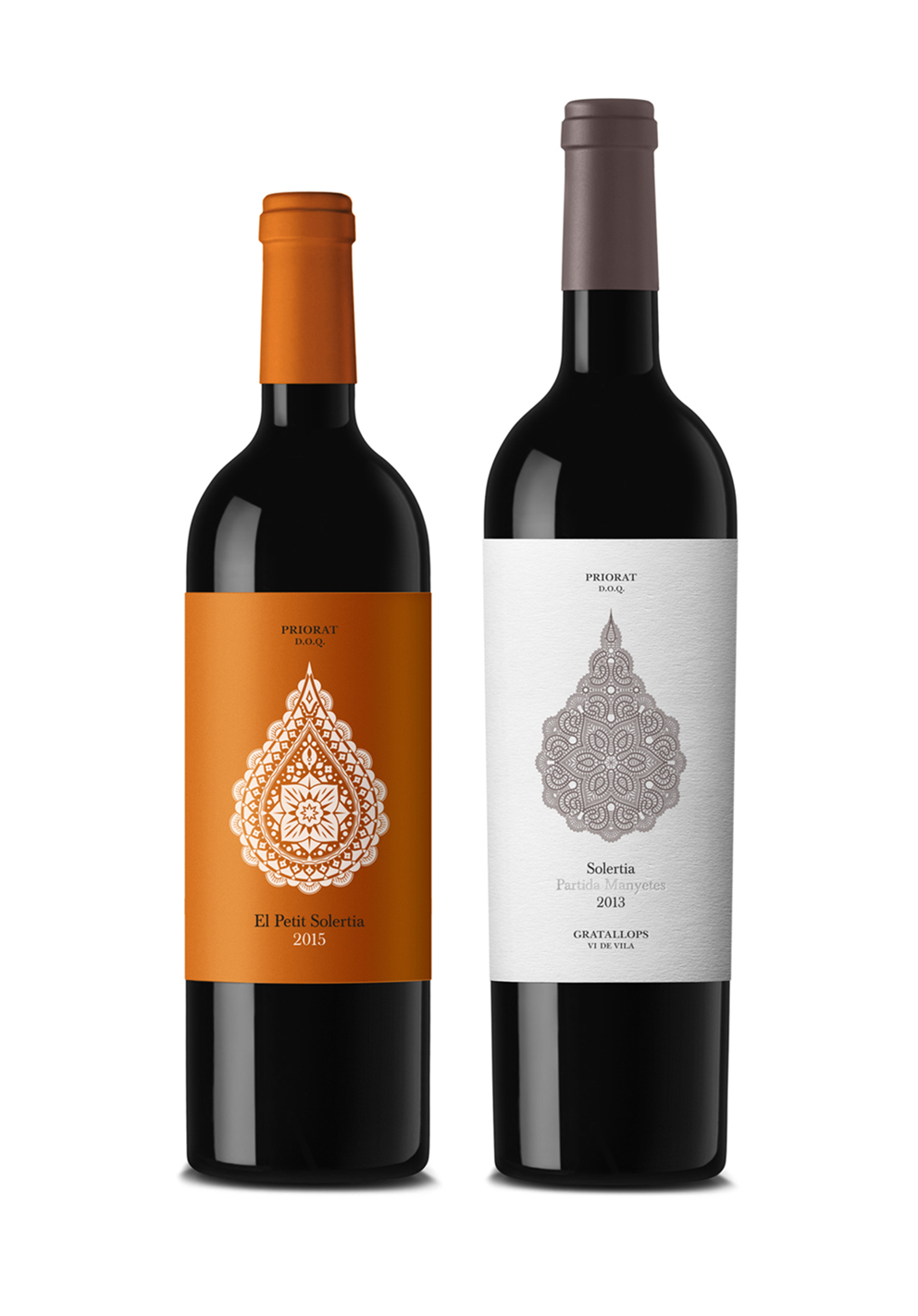
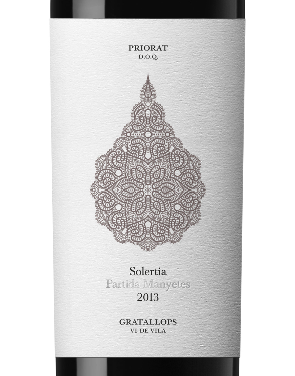
Solertia was born in one of the most privileged Spanish lands, el Priorat, source of many of the most prestigious wines in the world. The respect for the terroir and the meticulousness in the production is the secret of the great quality of this wine.
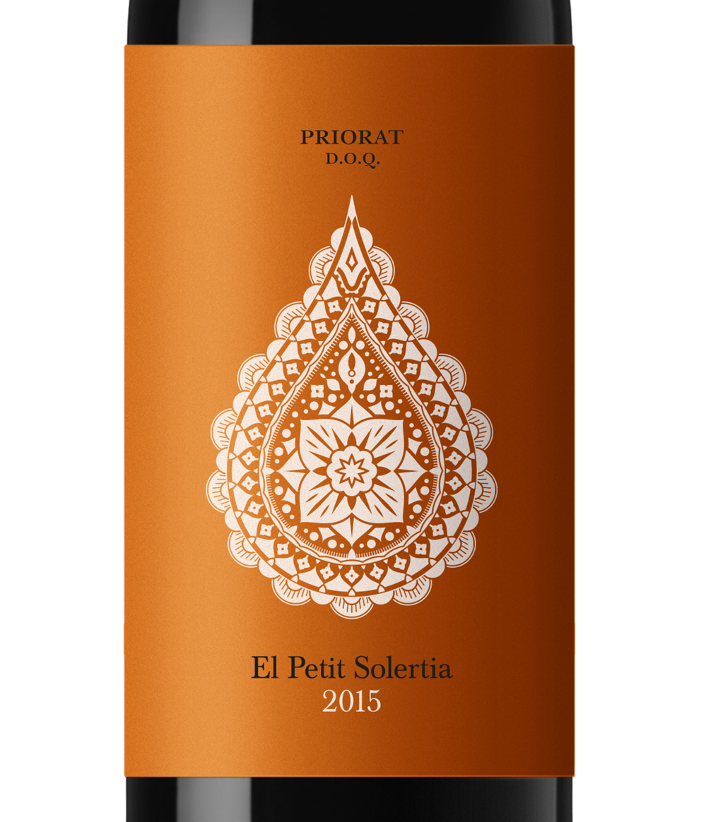
The image aims to recreate the exclusivity of the product with a delicate lace in the shape of a wine drop. A minimalistic yet elaborated design that communicates the quality of its essence.
A few years later Petit Solertia completed the range. This product is the little brother of Solertia, and to design this younger and fresher version we opted for a less detailed illustration and a bright orange background.
CREDIT
FEEDBACK
Relevance: Solution/idea in relation to brand, product or service
Implementation: Attention, detailing and finishing of final solution
Presentation: Text, visualisation and quality of the presentation


