


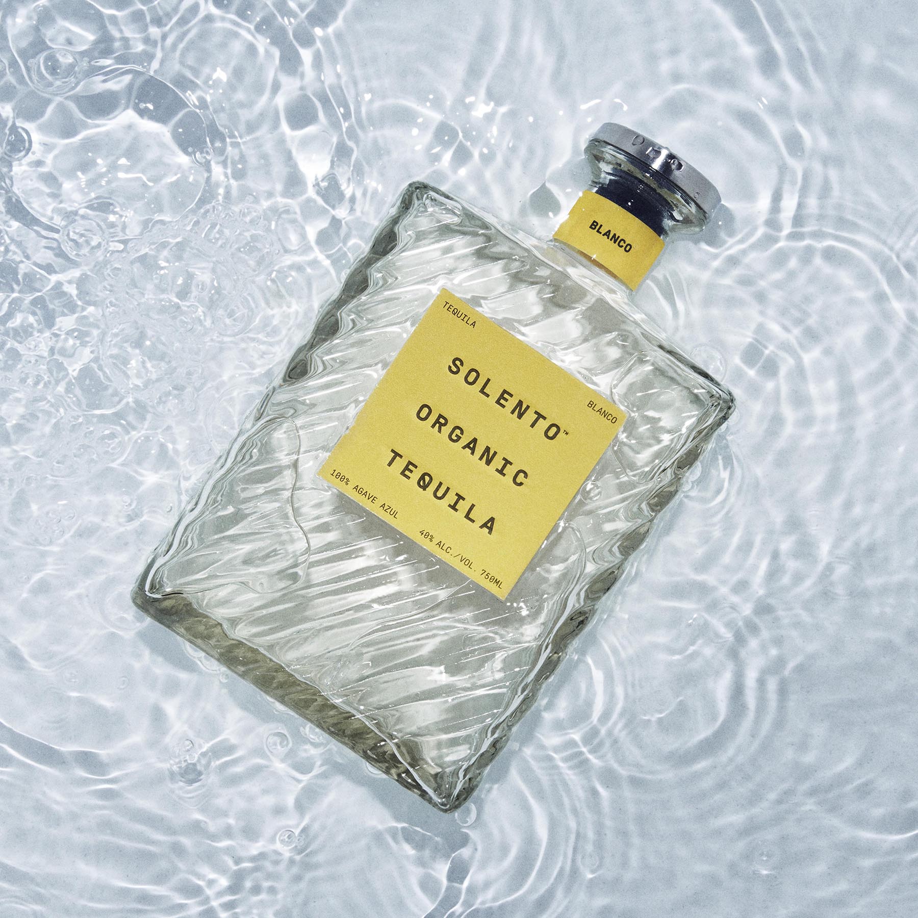
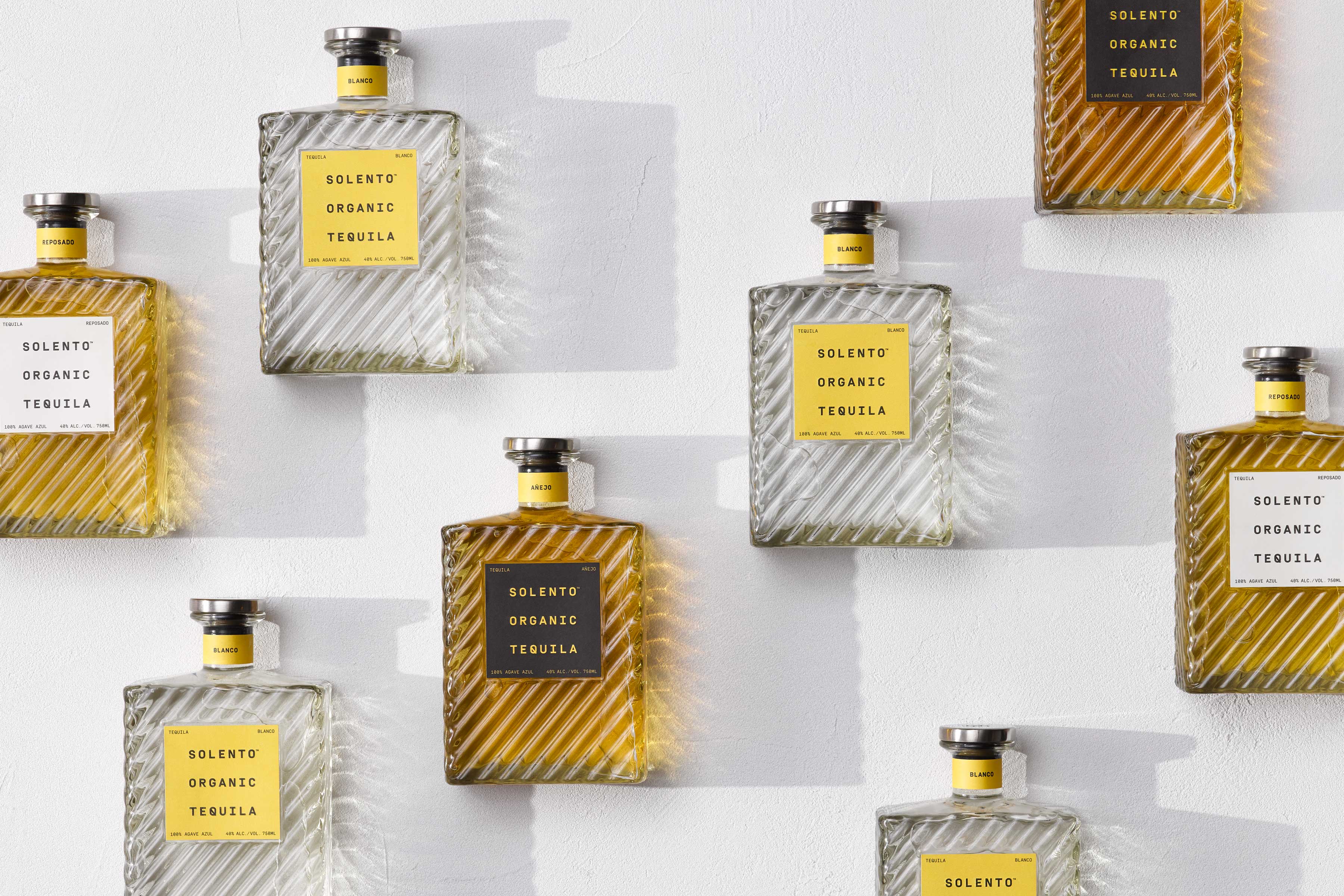
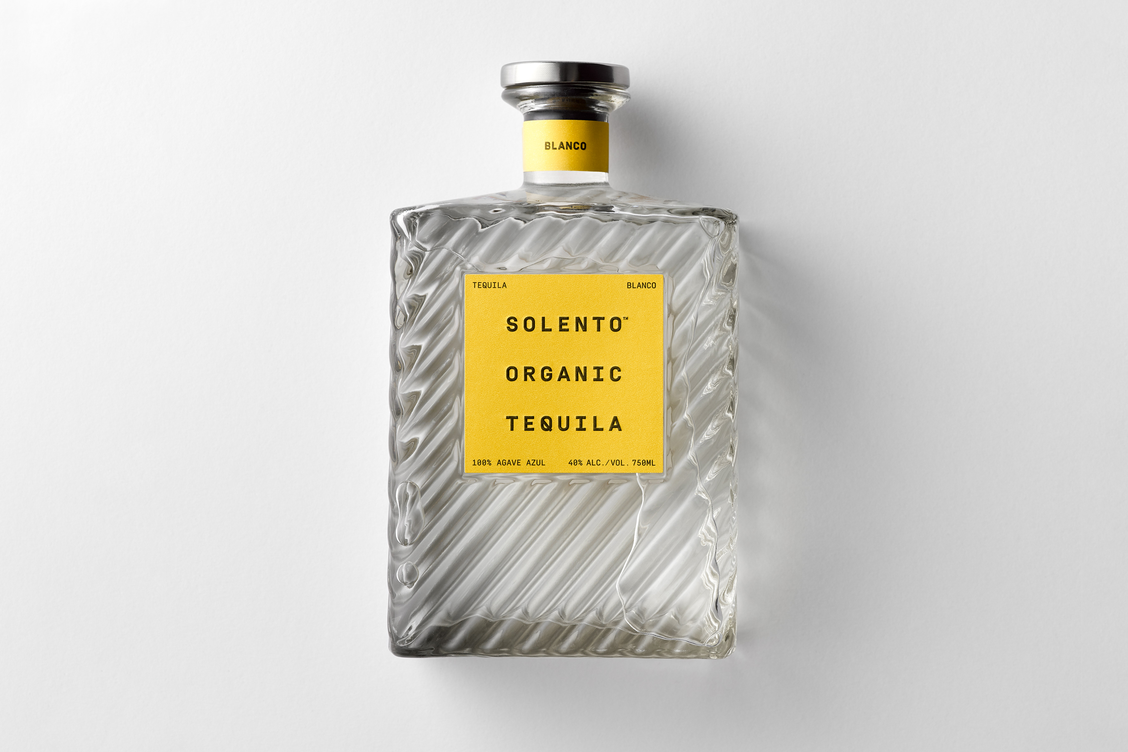
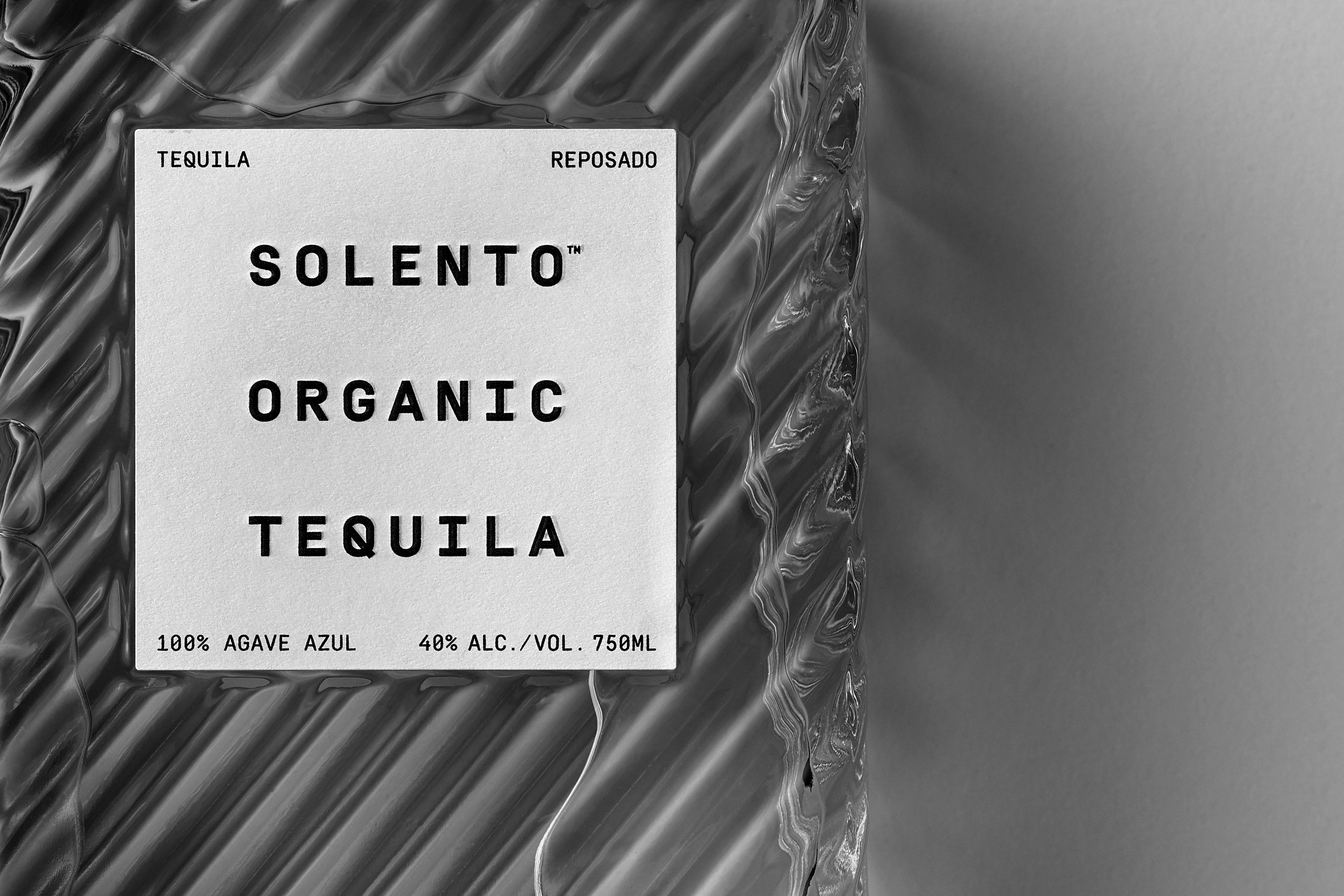
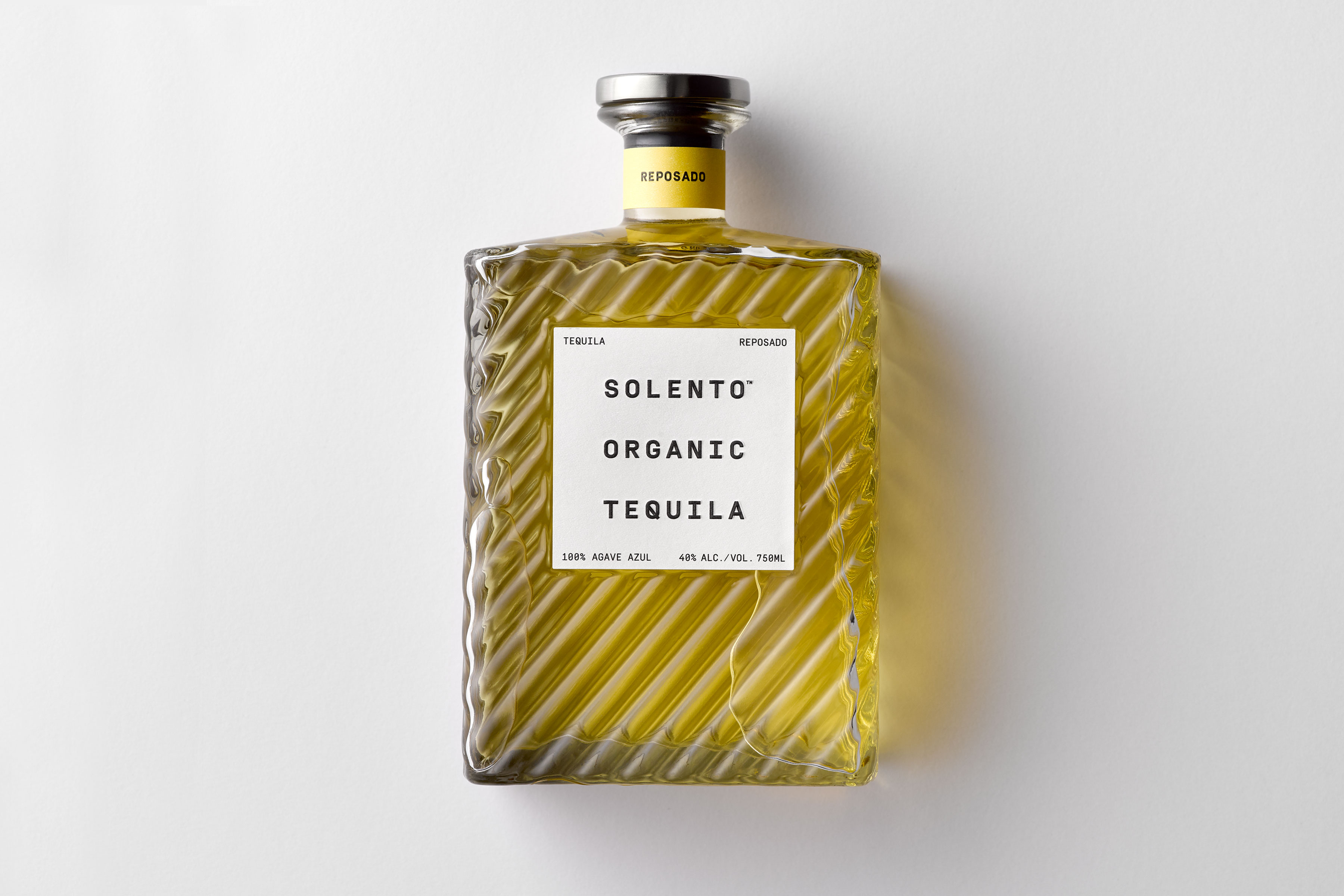
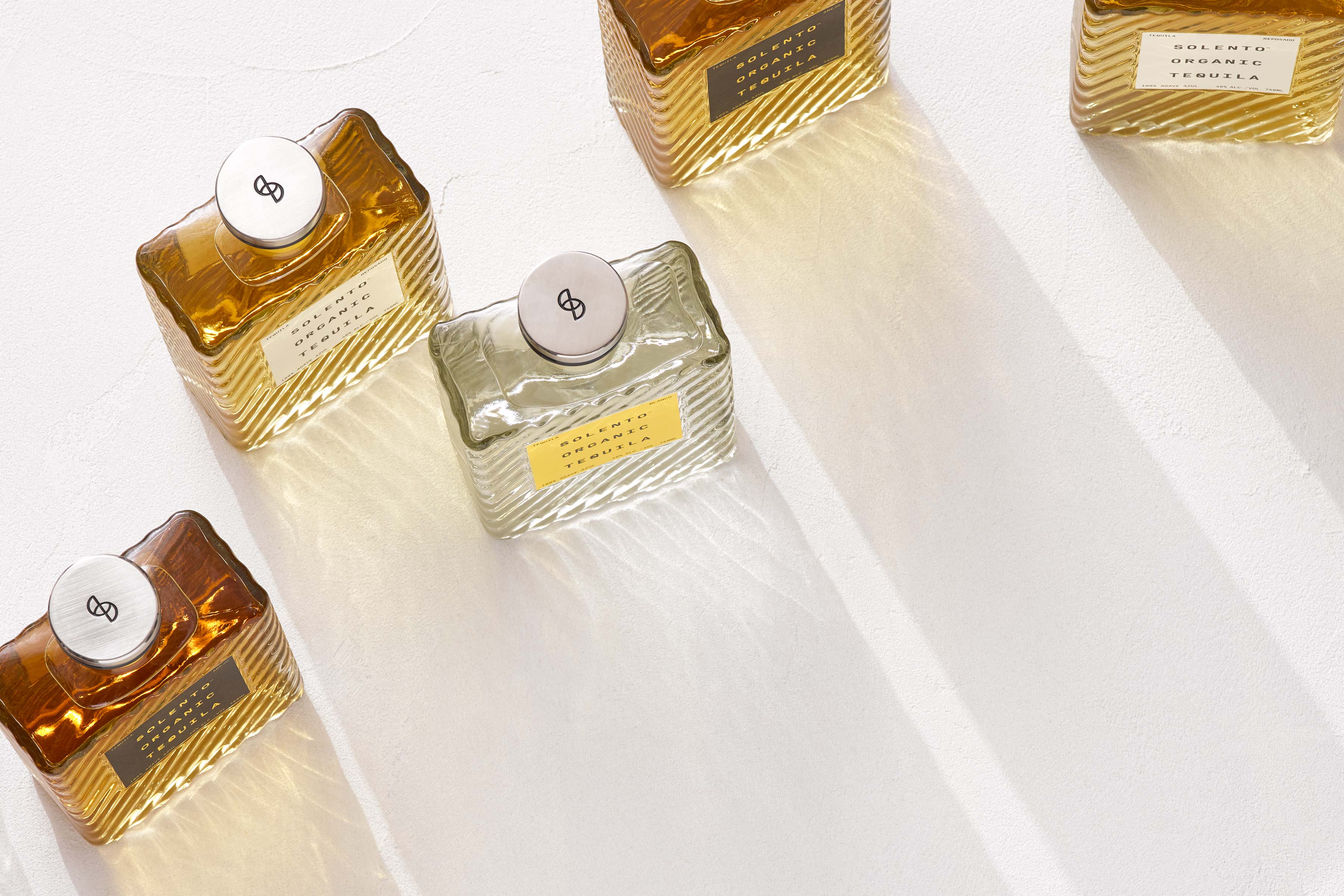
Solento Organic Tequila — A Slower Sipping Tequila Javas Lehn Studio worked closely with the Solento team to concept, define, and articulate the brand identity system, bottle design and campaign imagery for a new type of premium organic sipping tequila. The name Solento derived from combining the Spanish words for sun (sol) and slow (lento). The name set the tone for much of the brand expression and bottle design. These concepts run through every aspect of the brand identity: from the color palette (punctuated with golden yellows) to the bottle design, which is accented with diagonal ribs that evoke rays of sun, to the brand’s sundial logo. The Solento identity is infused with a warm, slow-sipping ethos, reminding us to slow down and enjoy the moment.


CREDIT
- Agency/Creative: Javas Lehn Studio
- Article Title: Solento Organic Tequila – A Slower Sipping Tequila
- Organisation/Entity: Agency, Published Commercial Design
- Project Type: Packaging
- Agency/Creative Country: United States
- Market Region: Global
- Project Deliverables: Brand Architecture, Brand Creation, Brand Design, Brand Guidelines, Brand Identity, Brand Strategy, Brand World, Branding, Graphic Design, Identity System, Packaging Design, Photography, Structural Design, Tone of Voice
- Format: Bottle, Box, Case
- Substrate: Glass, Glass Bottle


