


ENGLISH
Buzuluksky milk – dairy products from Soldis
Company: Buzuluksky milk / Brand: Buzuluksky milk / Agency: Soldis Communications
Soldis conducted a comprehensive rebranding for “Buzuluksky milk”
“The main objective of the project – to build a strategy for brand building, build a strong brand a competitive, due to the integrated approach to creating and building brands, where all communication media and channels affect the perception of the company and the products of the target audience. A unique design of packaging and unification of the entire line of products will attract new customers, improve navigation on the shelf, and thus stimulate the growth of sales.
A fundamental step in brand building “Buzuluksky Milk” was the analysis of the competitive environment and the development of the brand portfolio. It was necessary to do the job, as a result of which each brand will take its price niche in the market, becoming a self-formed and successfully sold the unit. At the same time, all the brands in the portfolio have to work in the complex without interfering with each other. That is, they must be separated by the ideological and price positioning.
As a result, it developed a harmonious brand portfolio, where each brand is designed for major price segments. It is possible to ensure stability on the market for the company due to the fact that the products will always be in demand by consumers, regardless of their personal financial situation.
In the course of the project, it was decided that modernization with the corporate identity of the company will begin with “Buzuluksky milk.”
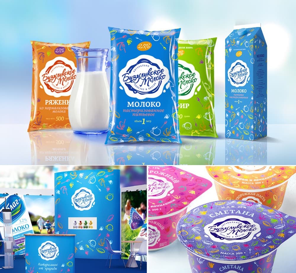
In developing the design concept of the logo, the agency used a cursive style that echoes in the subconscious of consumers with home production and involvement in the creation of human milk products from TM “Buzuluksky Milk.”
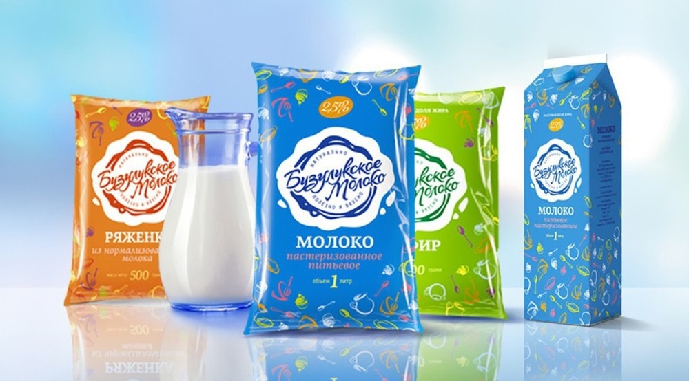
Brand block logo resembles in outline print of milk, which is a certain sign of the quality of products TM “Buzuluksky Milk” and, as a consequence, creates trust among consumers.
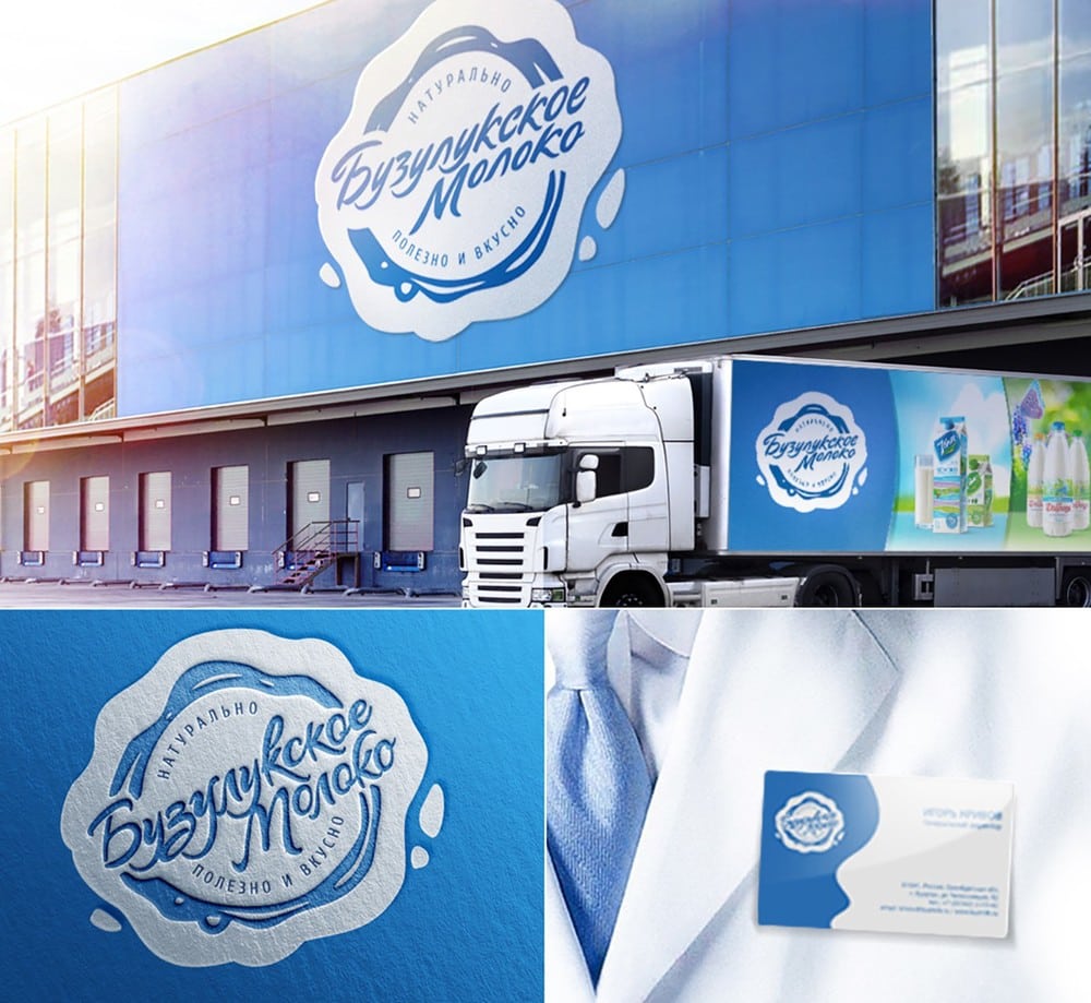
For a more complete perception of the company in Central Asia, it has developed several communication channels, aimed at both the B2B audience and to B2C. Packaging is designed for B2C audience booth – on B2B website aimed at both the B2B and B2C audiences at the same time.
Packaging design is in bright, unusual colors for Central Asia. Thus, each color corresponds to their product that improves navigation on the shelf, increasing the level of memorability products in the line. The exhibition stand is made in the company’s corporate colors and logo positioned in such a way that the viewer immediately knows which brand the company is dominant.
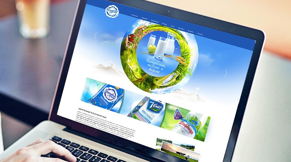
The design of the corporate website have a simple light style. Website adapted for different monitor resolution, which allows the same view it comfortably on the big screens today, and on portable gadgets.
The unique design of the banner on the home page of the website gives the company “Buzuluksky Milk” image of a modern and dynamic company with a broad product range.
“One of the strategic objectives of the project was to help Russian producers in the global modernization of its brand that could compete on a par with Western producers,” – says the owner of the brand and creative director Soldis Communications Group, Arseny Soldau.
As a result, by using an integrated approach in building brands, we have a competitive strong brand that will ensure the stability of the market, and used communication channels give a positive perception as B2B, and B2C audiences.”
РОССИЯ
Бузулукское молоко – молочные продукты от Soldis
Компания: Бузулукское молоко / Торговая марка: Бузулукское молоко / Агентство: Soldis Communications
“Soldis провел комплексный ребрендинг для компании «Бузулукское молоко»
Основная цель проекта – выстроить стратегию создания бренда, построив сильный конкурентноспособный бренд, за счет комплексного подхода в создании и построении брендов, где все коммуникационные носители и каналы влияют на восприятие компании и продукции целевой аудитории. А уникальный дизайн упаковки и унифицирование всей линейки продукции позволит привлечь новых потребителей, улучшить навигацию на полке и, тем самым, стимулировать рост продаж.
Основополагающим этапом построения бренда «Бузулукское Молоко» стал анализ конкурентной среды и разработка портфеля брендов. Необходимо было проделать работу, в результате которой каждый бренд займет свою ценовую нишу на рынке, став самостоятельной, сформированной и успешно продаваемой единицей. При этом, все бренды в портфеле должны работать в комплексе, не мешая друг другу. То есть они должны быть разведены по идеологическому и ценовому позиционированию.
В итоге был разработан гармоничный портфель брендов, где каждый бренд рассчитан на основные ценовые сегменты. Это позволило обеспечить устойчивость на рынке для компании за счет того, что продукция всегда будет востребована потребителями вне зависимости от их личной финансовой ситуации.
В ходе работы над проектом, было принято решение, что модернизация с фирменного стиля начнется с самой компании «Бузулукское молоко».
При разработке дизайн-концепции логотипа, агентством использовало стилистику рукописного шрифта, который перекликается в подсознании потребителей с домашним производством и причастности человека к созданию молочных продуктов от ТМ «Бузулукское Молоко».
Бренд-блок логотипа напоминает по своим очертаниям печать из молока, что является неким знаком качества продукции ТМ «Бузулукское Молоко» и, как следствие, вызывает доверие у потребителей.
Для более целостного восприятия компании у ЦА, было разработано несколько коммуникационных каналов, направленных как на В2В аудиторию, так и на В2С. Упаковка рассчитана на В2С аудиторию, выставочный стенд — на В2В, веб-сайт направлен как на В2В и на В2С аудиторию одновременно.
Дизайн упаковки выполнен в ярких, необычных для ЦА цветах. При этом, каждый цвет соответствует своему продукту, что улучшает навигацию на полке, повышая уровень запоминаемости продуктов в линейке. Выставочный стенд выполнен в корпоративных цветах компании, а логотип расположен таким образом, что зритель сразу понимает, какой бренд в компании является главенствующим.
Дизайн корпоративного сайта компании выполнен в лаконичном легком стиле. Сайт адаптируется под разные разрешения мониторов, что позволяет одинаково комфортабельно просматривать его как на больших современных мониторах, так и на портативных гаджетах.
Уникальный дизайн баннера, расположенного на главной странице сайта, придает компании «Бузулукское Молоко» имидж современной и динамично развивающейся компанией с широкой ассортиментной линейкой.
«Одной из стратегических задач проекта было помочь российскому производителю в глобальной модернизации своего бренда, который смог бы наравне конкурировать с западными производителями», — комментирует владелец торговой марки и креативный директор Soldis Communications Group, Арсений Сольдау.
В результате, за счет использования комплексного подхода в построении брендов, мы получили сильный конкурентноспособный бренд, который обеспечит компании стабильность на рынке, а использованные коммуникационные каналы дадут положительное восприятие как B2B, так и B2C аудиторией.”
CREDIT
- Agency/Creative: Soldis Communications
- Article Title: Soldis Communications – Buzuluksky Dairy Products
- Project Type: Packaging
- Substrate: Plastic, Pulp Carton


