


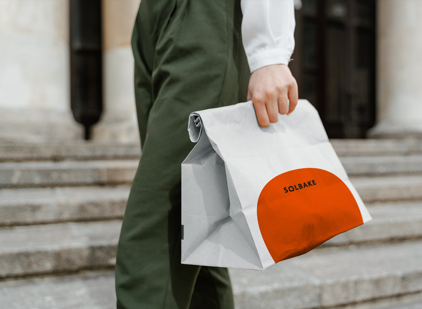
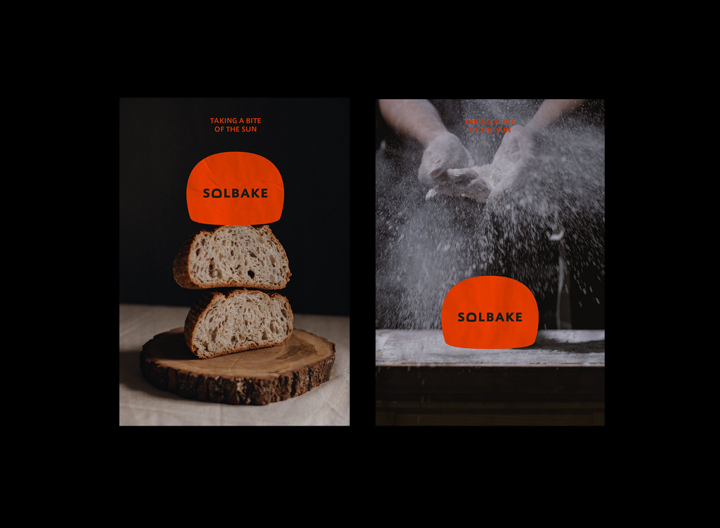
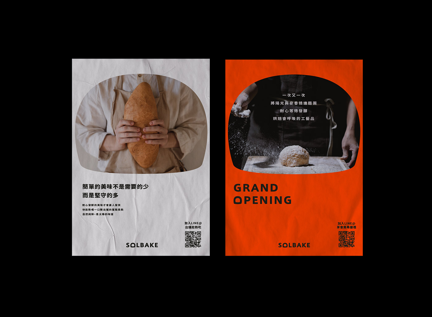
Solbake hopes to build a warm, food-safe, and freshly baked bakery. The entire brand vision strategy is also based on this core concept. The concept of the brand logo is derived from the fermentation dough, the freshly baked bread, and the slow rise. The Logo design hopes to be as intuitive and concise as possible for the image of the sun, which can help consumers more easily remember the appearance of the logo and open imagination for various graphic associations, and can also assist in the extension of various designs in the brand’s visual design. The use of can be the layout design in the poster, the pattern in the packaging design, or the exterior design of the signboard.
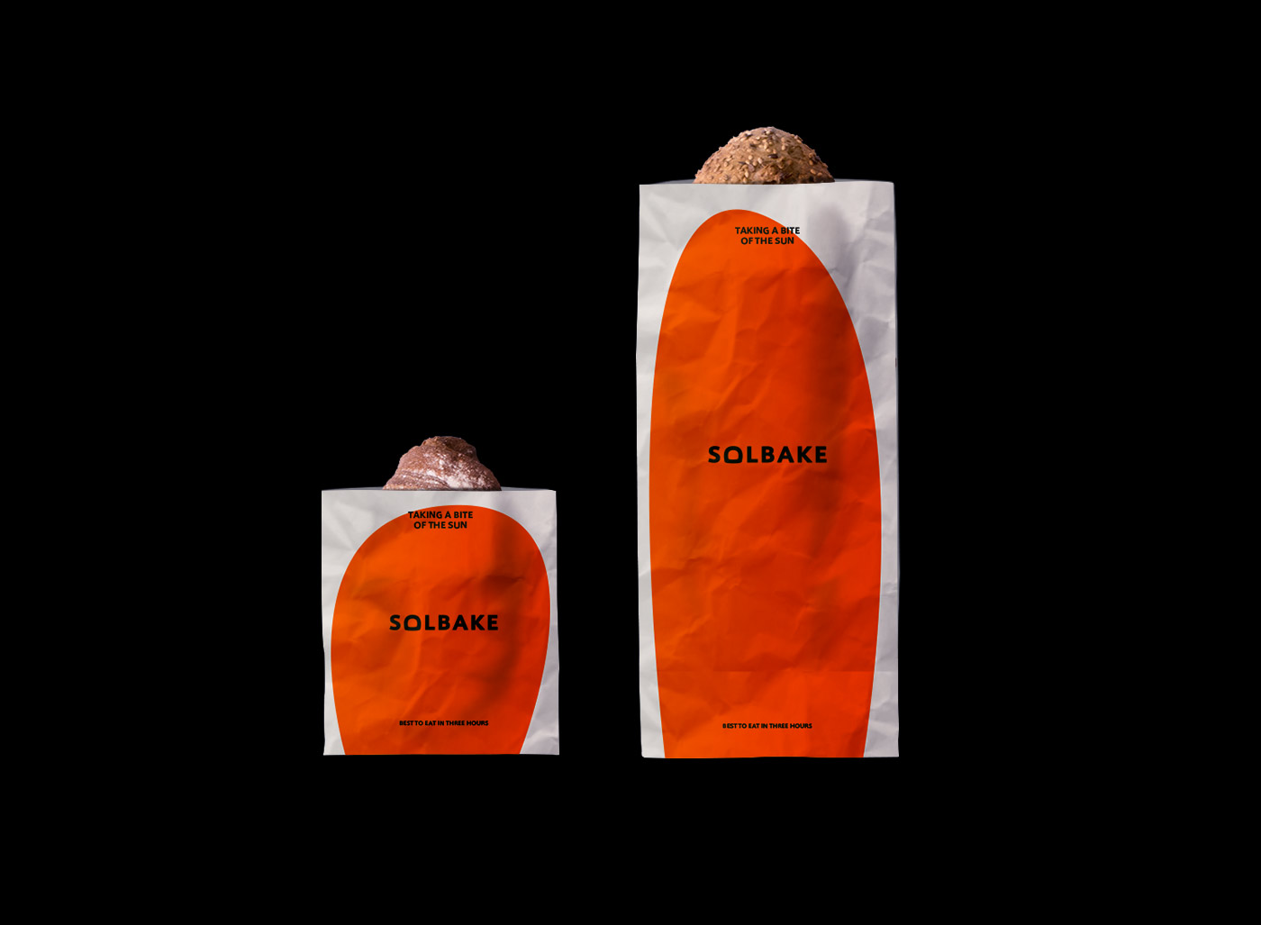
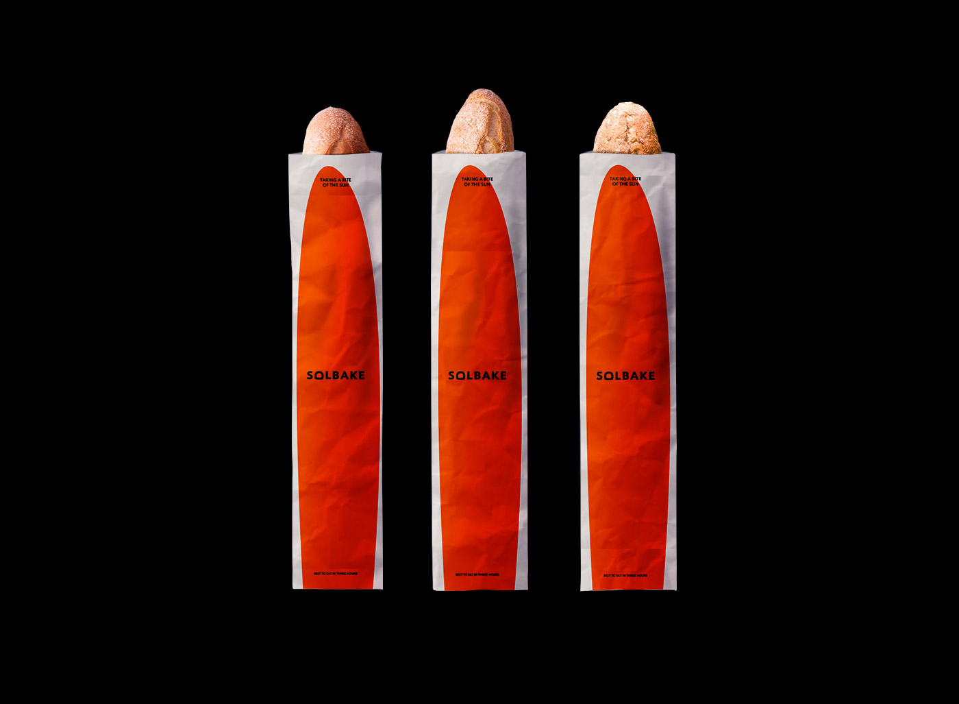
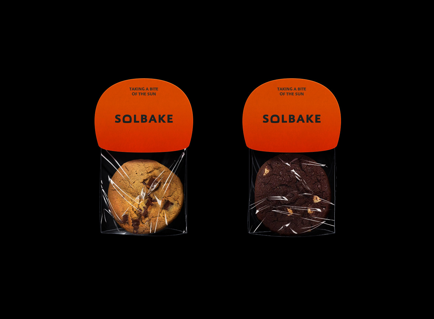
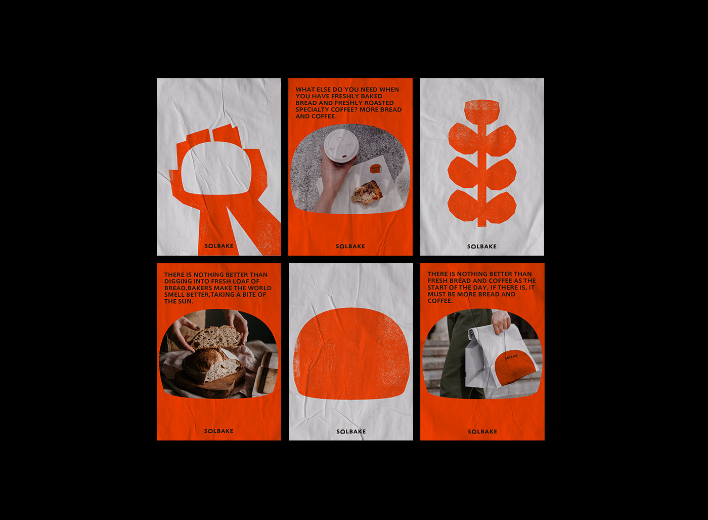
Solbake’s brand logo also refers to the concept of fermented dough expansion. With different bread shapes, the logo also changes. Like the vitality of baker’s yeast, the fluffy and softness is combined in various bread packaging designs. When the breads are arranged one by one It is like the sun just coming out of the oven, warming the whole bakery.
The illustration design hopes to maintain the warm and natural personality of the brand, choose to present it in the style of engraving, and draw the picture with geometric figures that are not deliberately modified, hoping to make consumers feel the brand impression of interest and natural ingredients in the illustrations.
The colour plan of the brand identity uses orange as a representative, symbolizing the warmth of the sun and the vitality of baker’s yeast. It is hoped that consumers will feel that every loaf of bread is like the sun just baked, fresh, warm and full Energy and light up your life. Good food always makes people happy. I hope that we can uphold this concept and share good food with every consumer who likes Solbake.
CREDIT
- Agency/Creative: Lung-Hao Chiang
- Article Title: Solbake Bakery Visual Identity Design Created by Lung-Hao Chiang
- Organisation/Entity: Agency
- Project Type: Packaging
- Project Status: Non Published
- Agency/Creative Country: Taiwan
- Agency/Creative City: Taipei
- Market Region: Asia
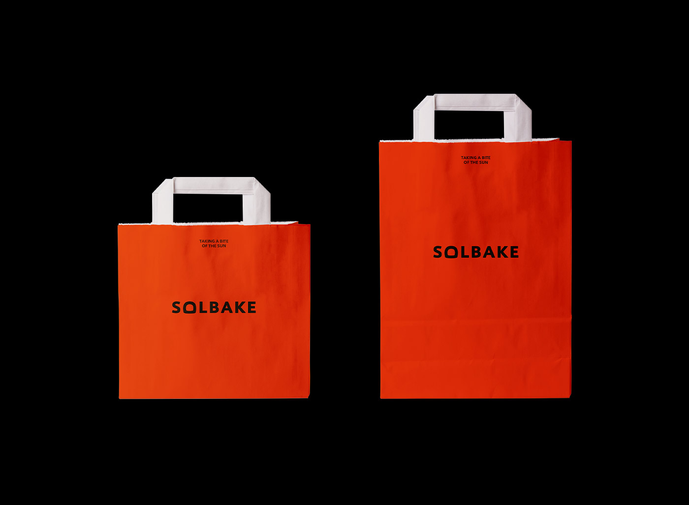
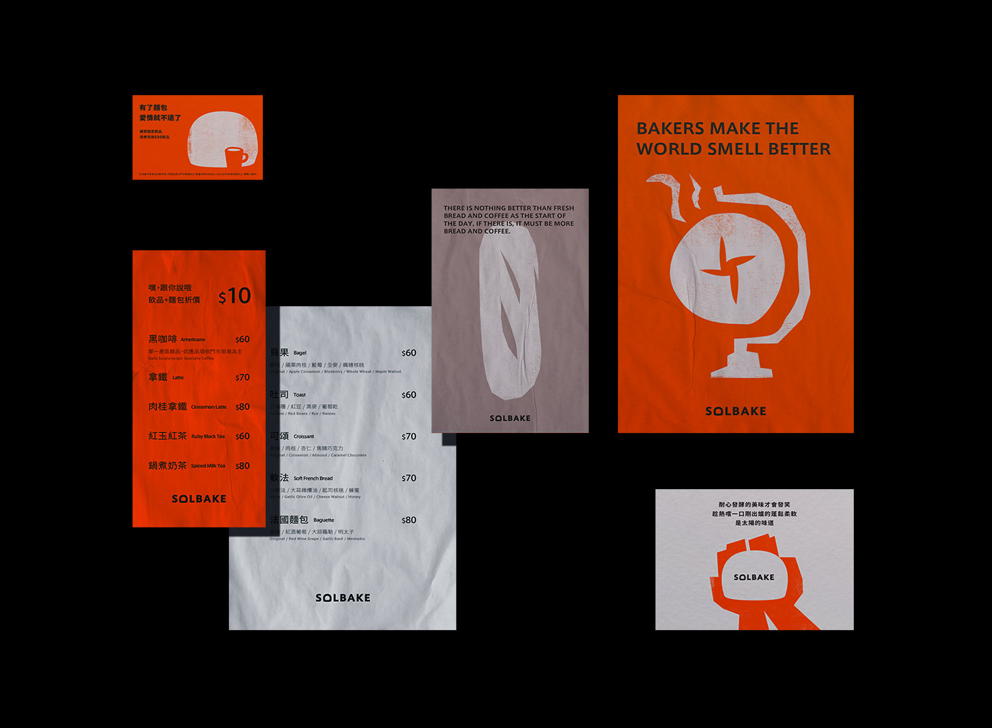
- Project Deliverables: Brand Design, Brand Identity, Brand Mark, Brand Naming, Brand Tone of Voice, Copywriting, Design, Illustration, Packaging Design, Poster Design
- Format: Bag, Cup
- Substrate: Plastic, Pulp Paper
- Industry: Food/Beverage
- Keywords: Beverages, Brand, Branding, Coffee, Identity, Illustration, Packaging, Bread, Logo, Bakery
-
Credits:
Art Director / Graphic Designer: Lung-Hao Chiang


