Partners in Change _Bespoke Design for Category-Altering Clothes Alteration Service, Sojo
Fashion doesn’t fit our bodies, our values or the planet. The clothes you buy might be perfect for today, but trends come and go, hemlines rise and fall, people grow. And that’s why clothes-alteration service Sojo is the partner in change, transforming with customers from the moment they buy a new jumper to the day they hand it down to a grandchild.
In a world where change is constant, Sojo believes in making it, until it fits. And in creating the brand’s visual identity, Regular Practice brought together that big-picture state of evolution with Sojo’s down-to-detail methods of clothes alteration.
The brand had begun life as the ‘Deliveroo of clothes alterations’ – easy enough to understand, but it hardly gave customers a rallying belief to get behind. So they worked closely with the team at words-first agency Sonder & Tell to land on a strategic positioning: taking a stand against bad fits and broken things. And they crafted a voice that had the stretch to speak to B2B and B2C customers, and the underrated appeal to the changemaker in both of them. Willing them to do better, be better and create the clothes they will make and wear.
The words and ideas fit. So when the brief came to Regular Practice, the question was: how do we harness this element of renewal, reinvention and reimagining things to last? How do we visualise ‘thought leadership’? The design needed to translate a story and tone that was at once serious, playful and almost editorial in its sensibility.
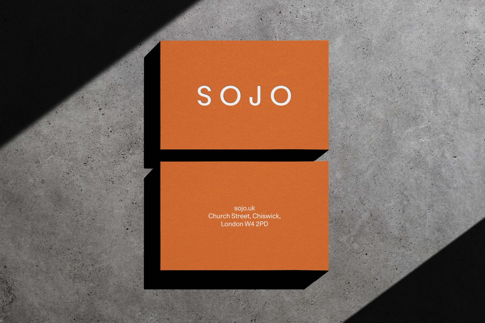
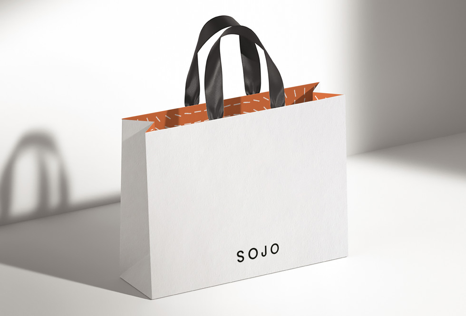
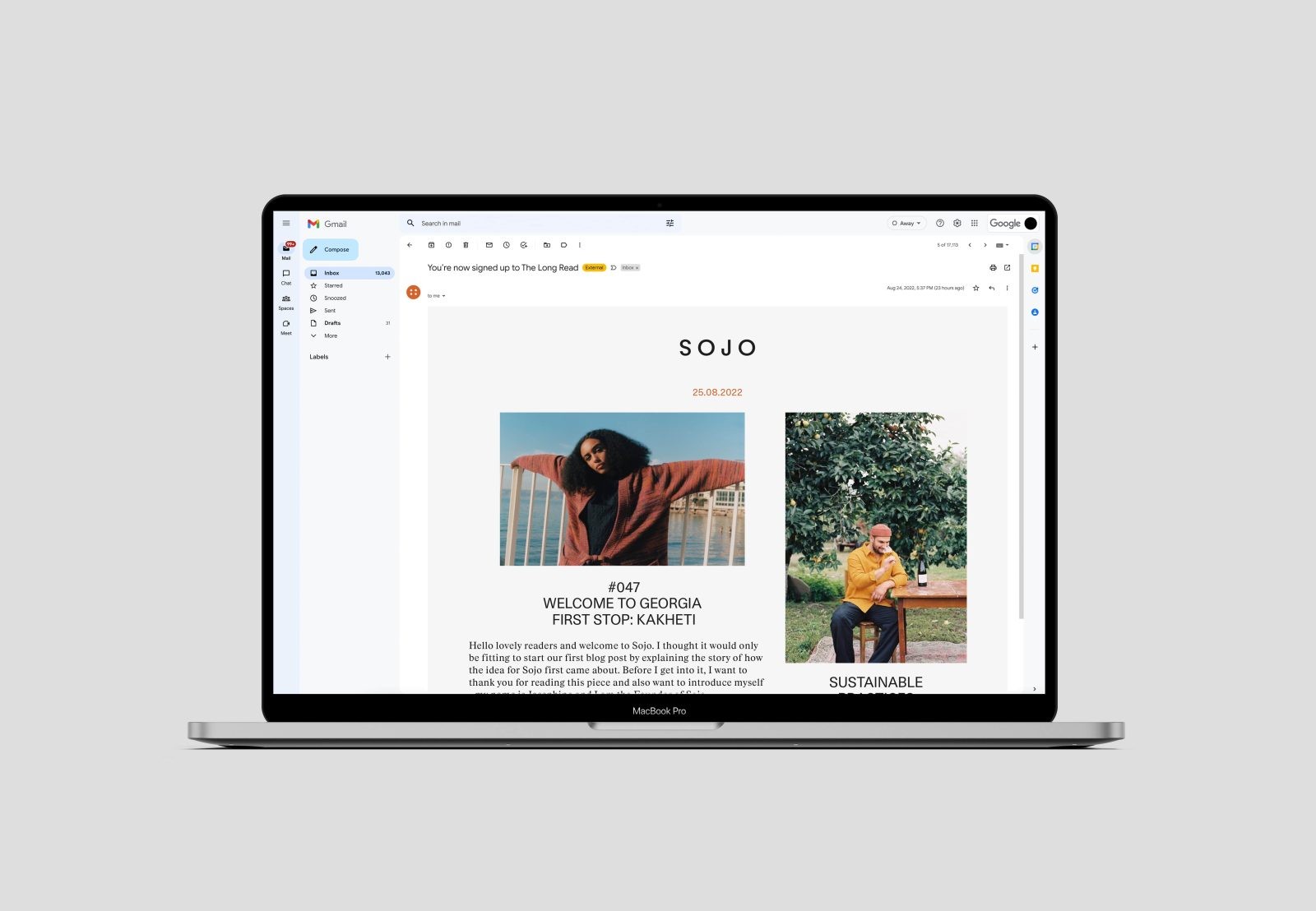
As a direct-to-consumer product, Sojo needs to be branded when it arrives at people’s houses. But as a tailoring service, the identity also needs to chime with whatever brand or product may be inside. The identity needed to be at once recognisable and unimposing. See it in the pared-back wordmark: thin, spaced out and a study in geometric design. Notice the symmetry in the S as well as the near-perfect circular ‘O’s, and an ownable return on the ‘J’.
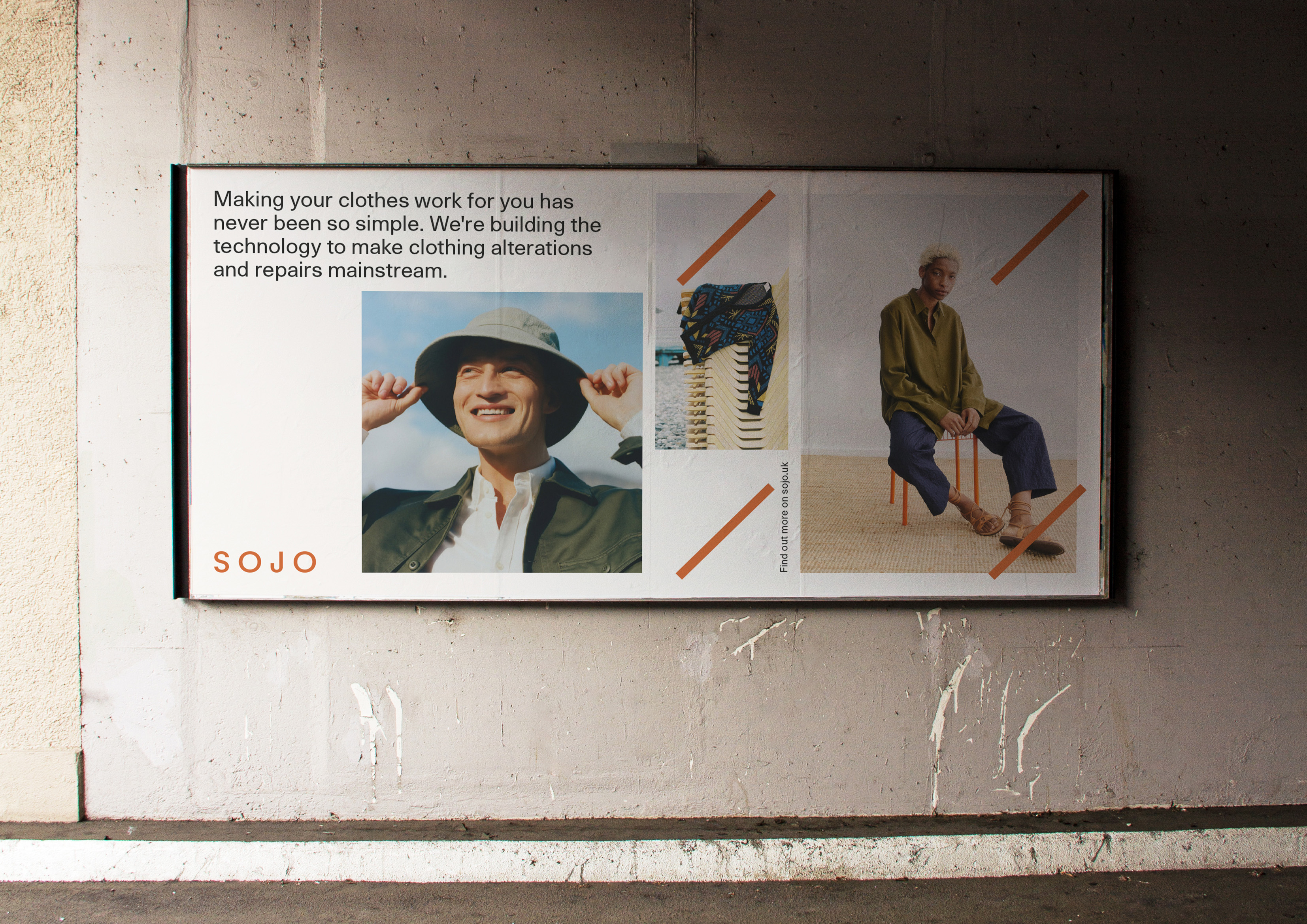
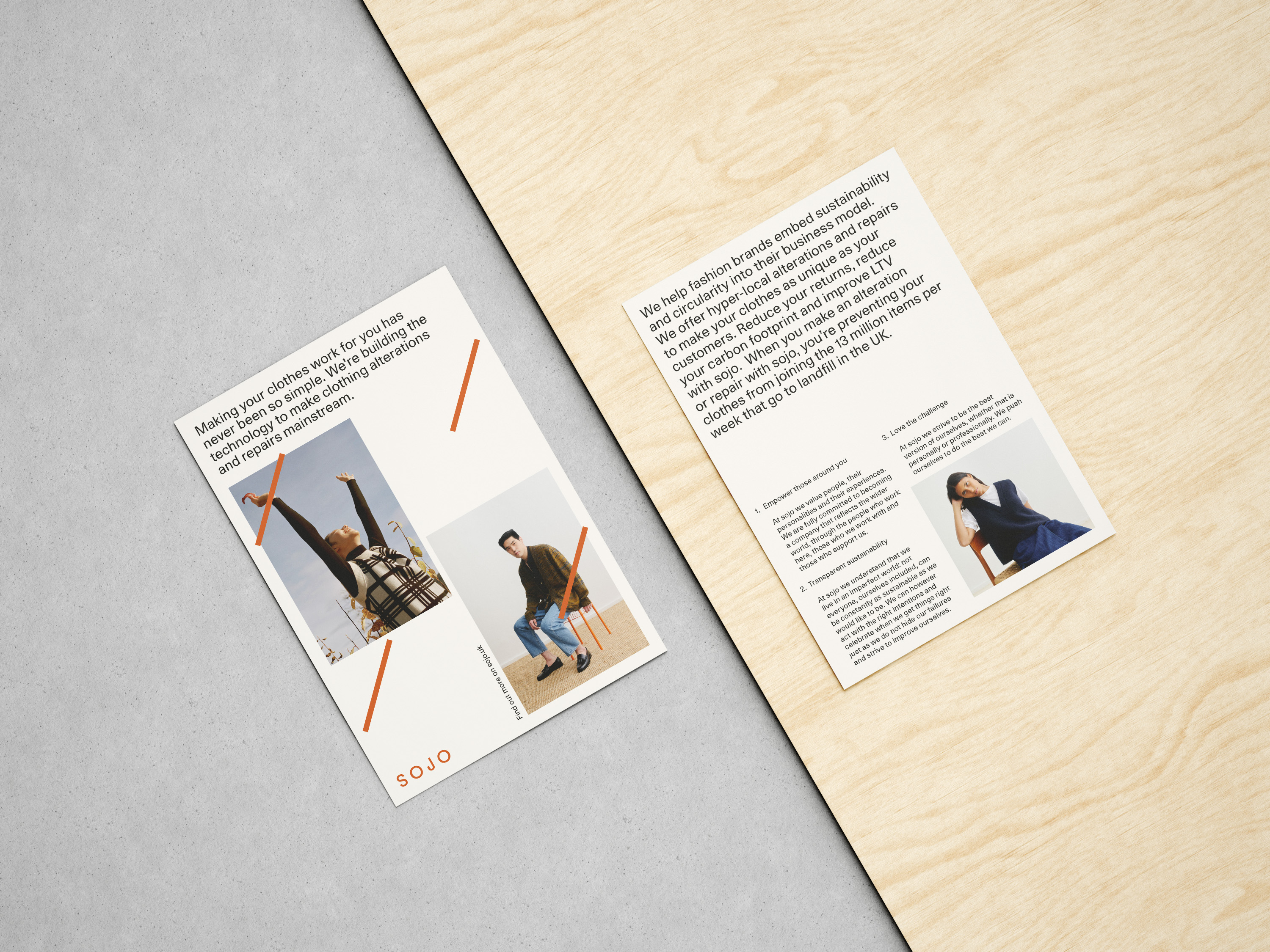
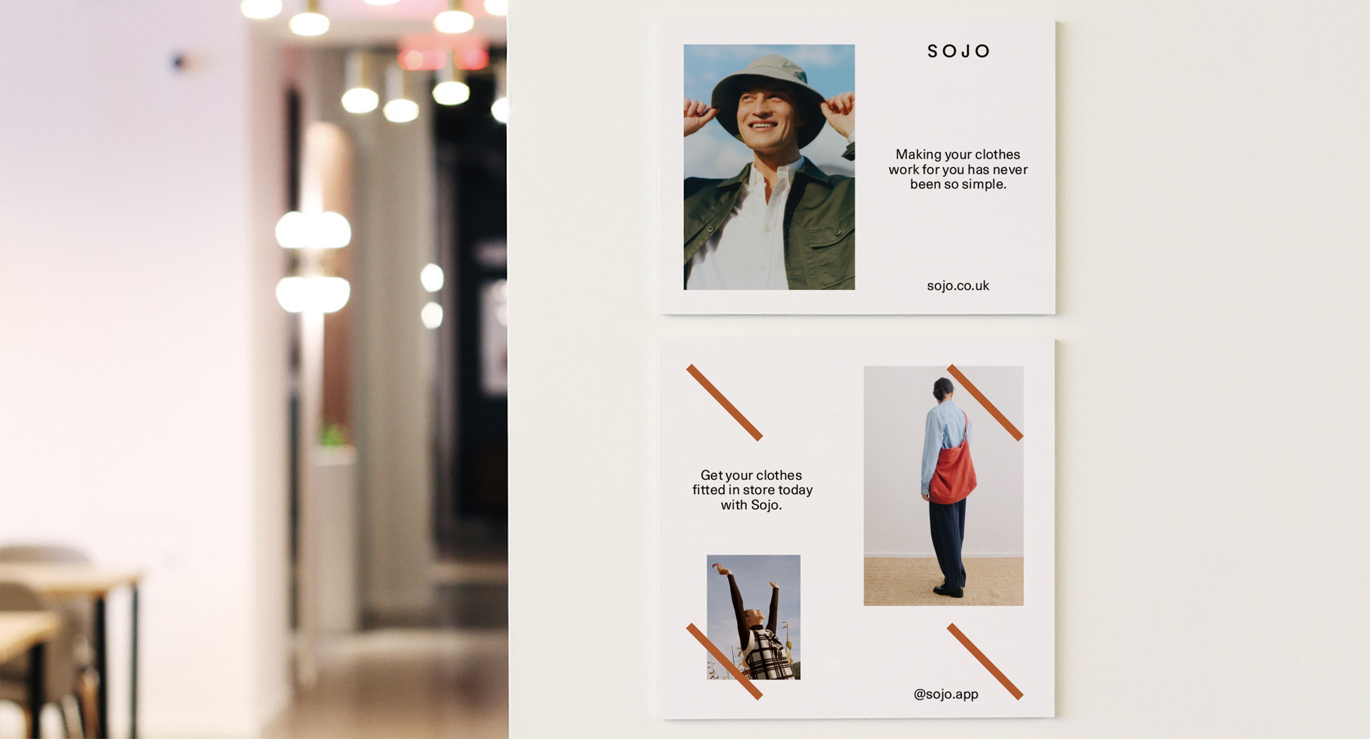
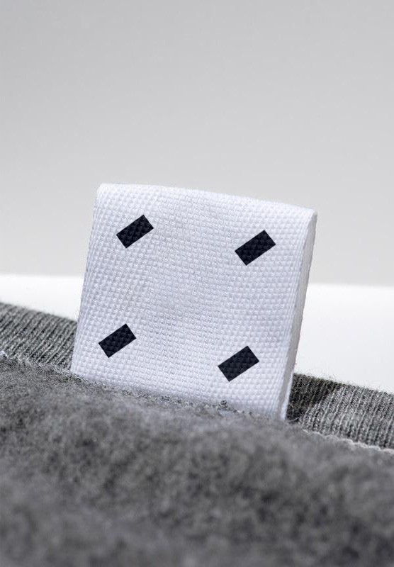
From there, we took the idea of alteration and wove it through the project. Think of the art of tailoring: every mend, every adjustment, every new element adds another layer to the piece – in both a physical and meaningful sense. That informed the framing device, with short ‘stitch’ lines laid over images.
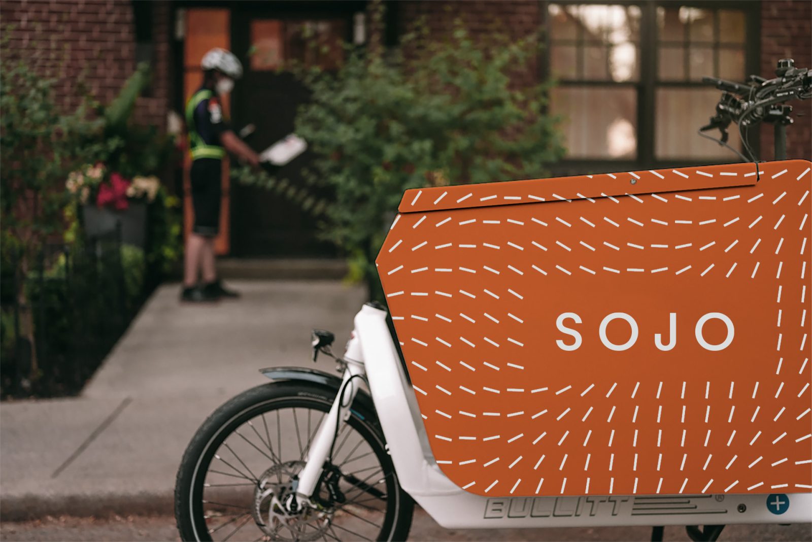
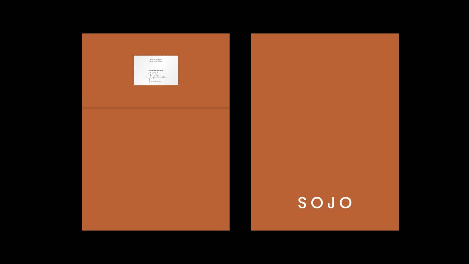
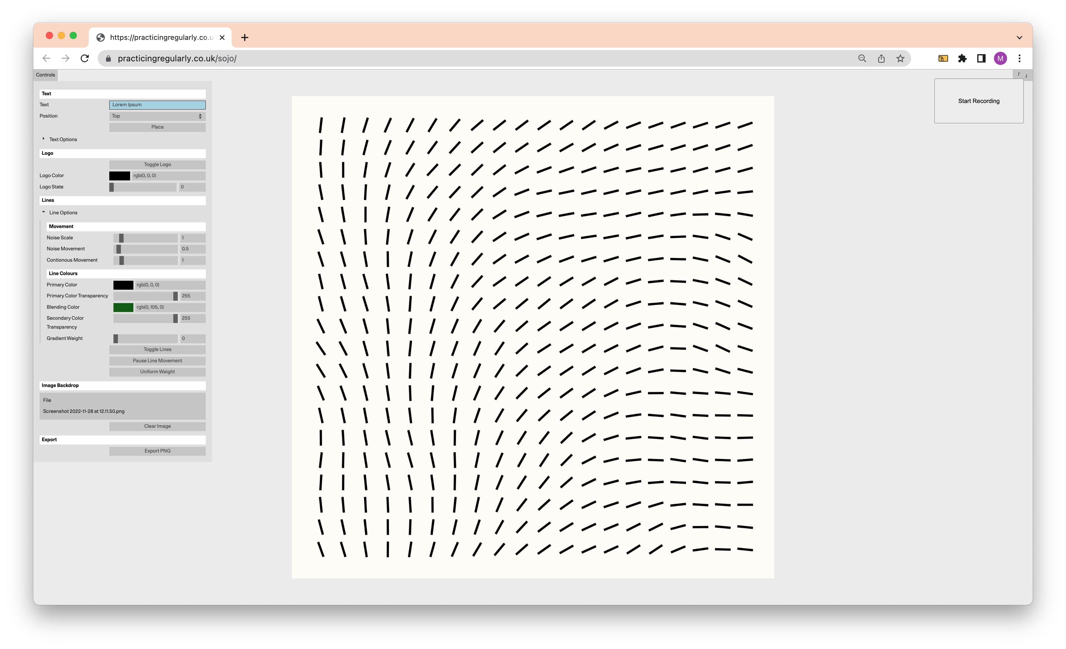
Those abstract lines have been taken into a bespoke generative tool designed to extend the longevity of the brand identity. Like the product, design embraces constant change. Set in a 18×18 grid-like pattern, the lines move with the cursor, running one after the other. It’s subtle and hypnotic, usable and ownable. The Sojo team can generate their own assets, playing with gradients, line thickness, positioning and dropping images in the background. It’s a tool that’s empowered the client to take change into their own hands, while ensuring a consistent brand identity as it’s rolled out from the website, billboards, courier bikes and boxes designed by Regular Practice and evolves in the future.
Product, positioning, identity, the very people we’re selling to – together, we are all partners in change. Willing to do what it takes, until it’s made to fit. A brand identity made to last.




CREDIT
- Agency/Creative: Sonder & Tell , Regular Practice
- Article Title: Sojo Brand Redesign
- Project Type: Identity
- Project Status: Published
- Agency/Creative Country: United Kingdom
- Agency/Creative City: London
- Project Deliverables: Brand Redesign
- Industry: Fashion
- Keywords: WBDS Agency Design Awards 2022/23
-
Credits:
Brand Strategist: Alex Ames
Freelance: Ettie Bailey-King
Account Director: Hilary Lovell
Designer: Shawn Sawyers
Desiginer: Megan Ricca


