Okno is about vintage, conscious consumption and indifference to trends. This is a brand that combines an upcycling workshop, jewelry production, clothing store and even a club.
Concept
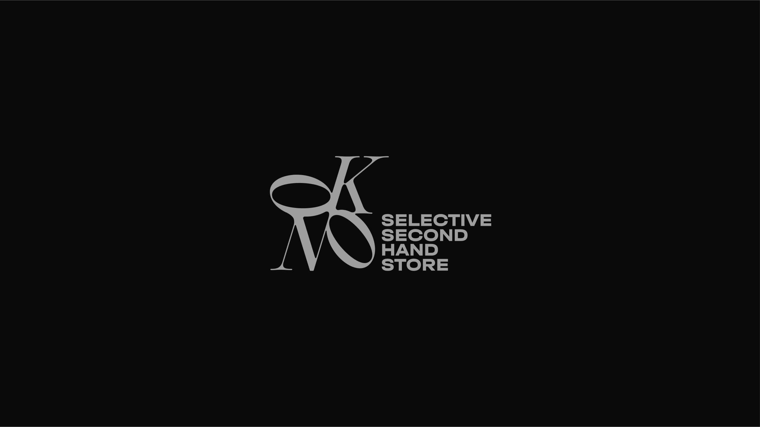
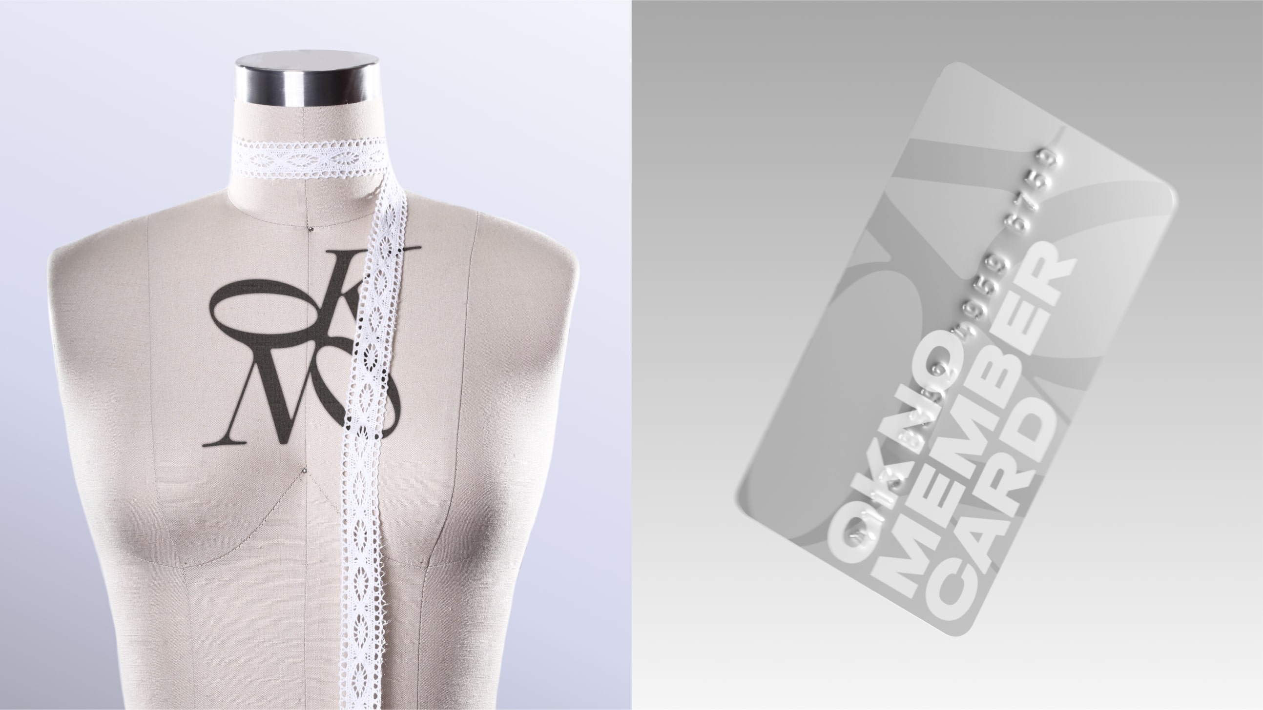
We open a “window” into alternative fashion: here a sustainable clothing store, club culture, an upcycling workshop and jewelry craft intersect. Each element of the identity reflects one of these facets, but they all come together to form a coherent system, where different energies are combined in a single visual field.
Typography
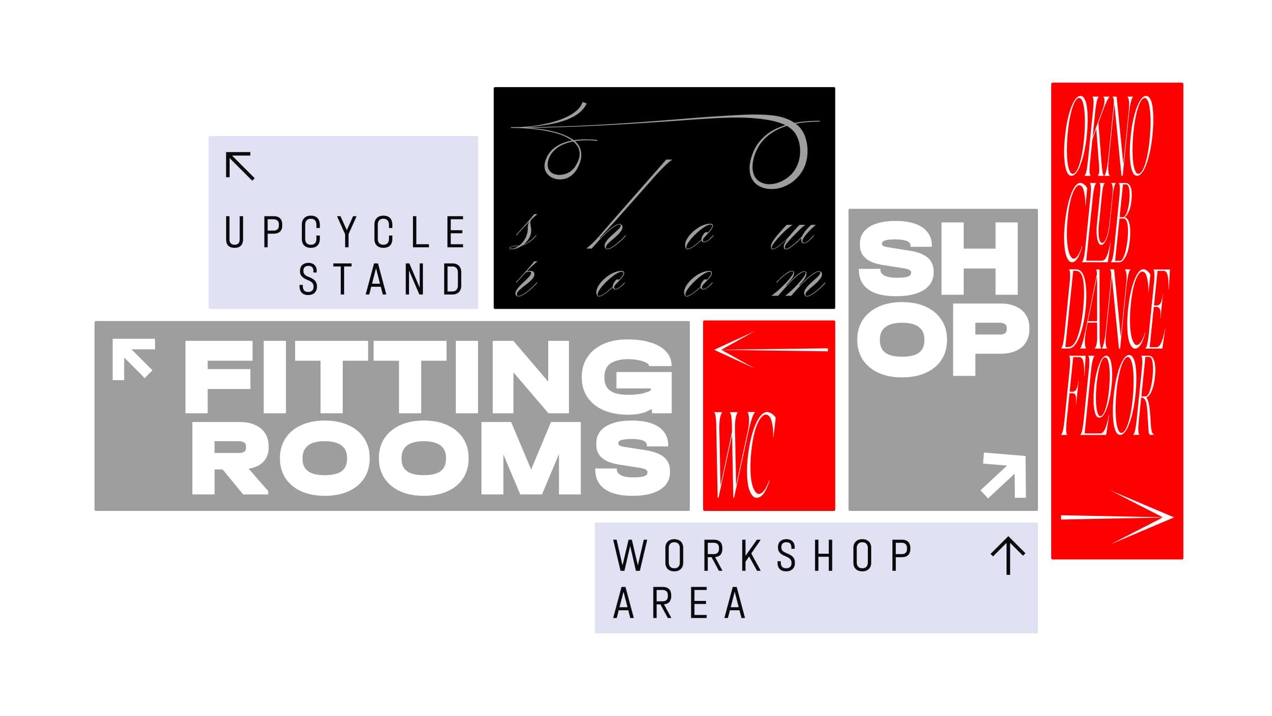
The font system is assembled like architecture:
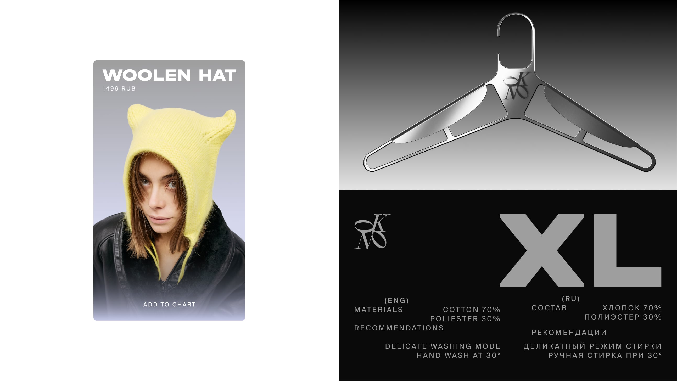
Elegant serifs – for the jewelry line, where sophistication and the heritage of craft are important. A clean, modern grotesque typeface – for the store layer, emphasizing stability, clarity and trust. Aggressive chopped accent font – club code, bold and noisy, like music on the dance floor. Crafted, rough graphics are a reference to the manual labor of upcycling. The font composition lives in a system of contrasts: hard and soft, elegant and hooligan, simple and complex.
Visual metaphor
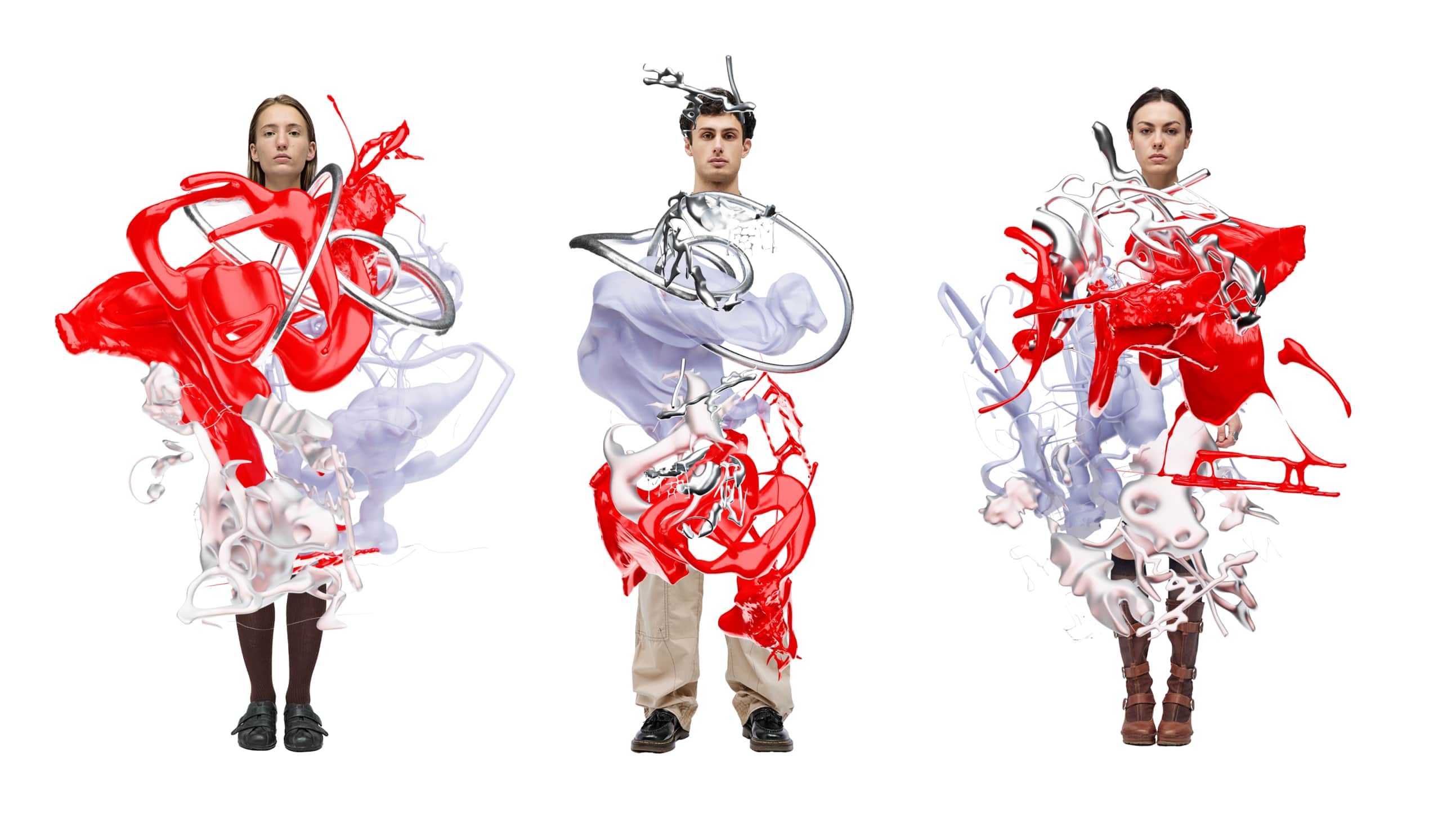
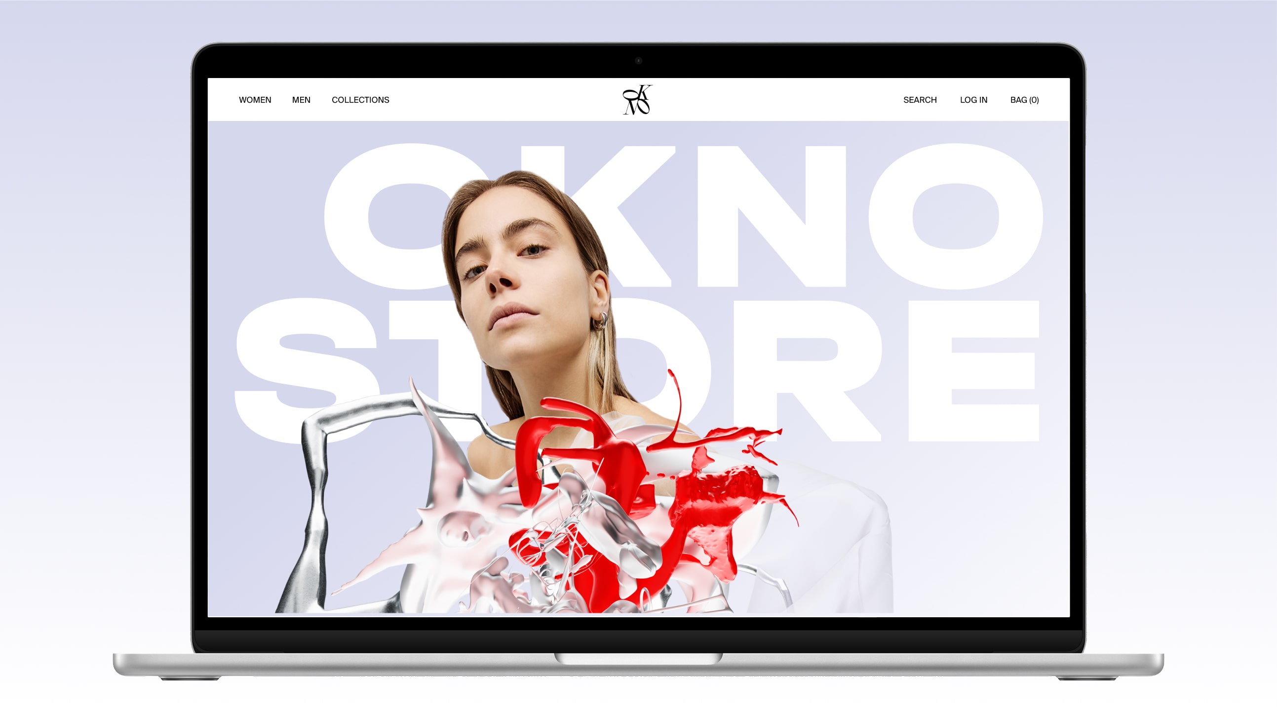
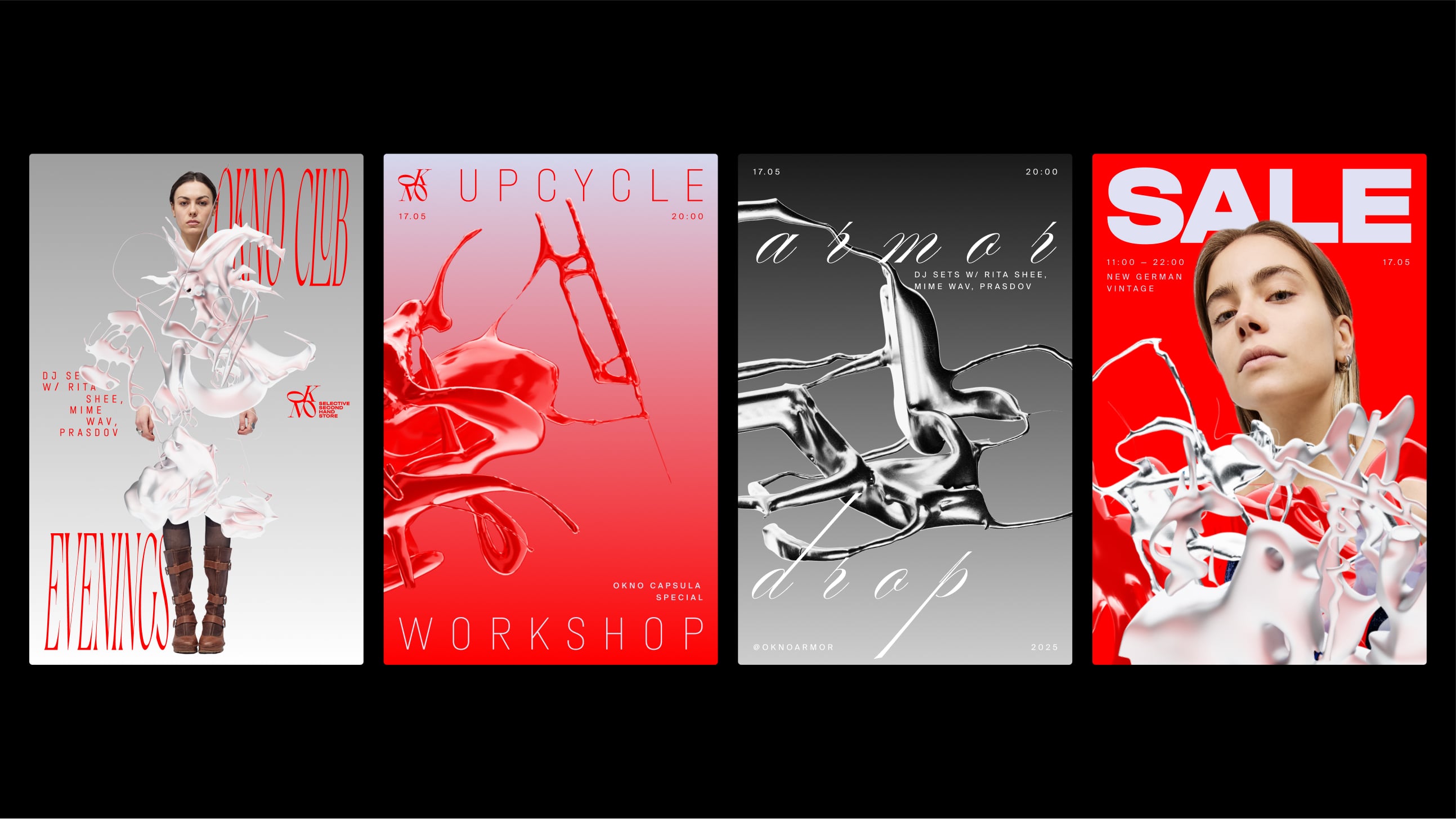
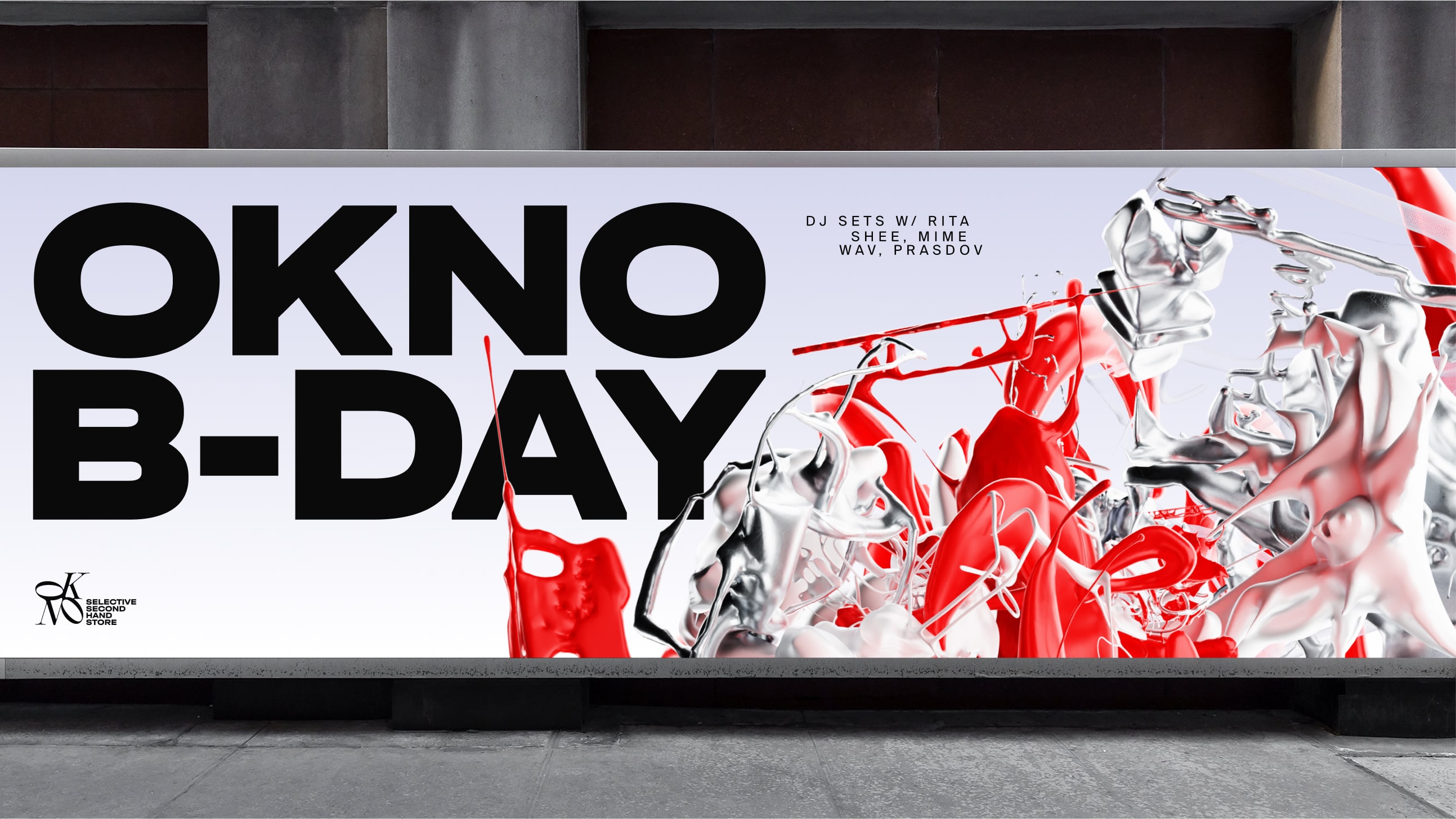
The key artistic language is abstract 3D compositions. They are multi-layered and expressive, like fabric turning into a manifesto. The forms are dynamic, fluid and structural at the same time. Each visual scene is a reflection of the character of the clients: unique, free, ready to experiment.
Four layers of identity
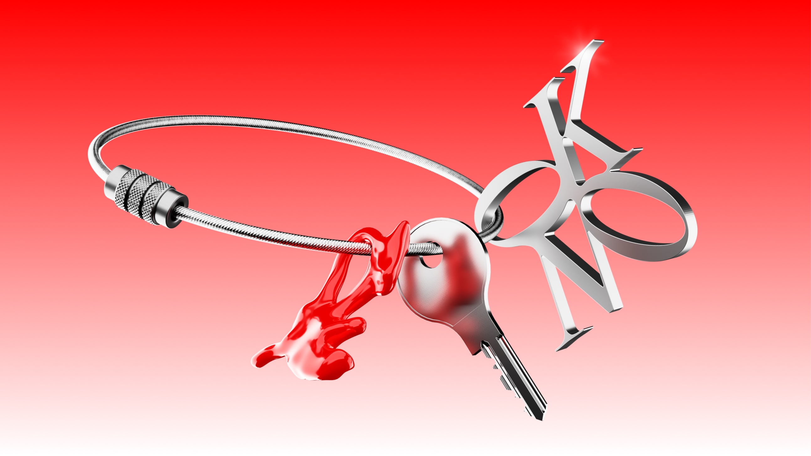
Jewelry – exquisite, minimalist, glowing with metal.
Store – fresh, neutral, sustainable, with a reference to ecology.
Club – bold, sharp, challenging, built on contrasts and provocation.
Upcycling is crafted, rough, manual, with a sense of creation and secondary value.
These layers intertwine to form a “living identity” that can change depending on the context, but always retains its character.
Photo style
Here we can see a neutral visual environment for the photographs so as not to overload perception and to give voice to the clothes and people. The models look straight into the camera – brazenly, uncompromisingly, boldly. This is the brand’s view of the world and its competitors: honest, sharp and confident.
CREDIT
- Agency/Creative: Sofia Pichevskaya
- Article Title: Sofia Pichevskaya Shapes Okno Into a Living Identity That Merges Fashion, Sustainability and Culture
- Organisation/Entity: Student
- Project Type: Identity
- Project Status: Published
- Agency/Creative Country: Russia
- Agency/Creative City: Moscow
- Market Region: Europe
- Project Deliverables: 3D Design, 3D Motion, Brand Design
- Industry: Fashion
- Keywords: WBDS Student Design Awards 2025/26 , Fashion, Second-hand, Upcycle, Club, Typography
-
Credits:
Designer: Sofia Pichevskaya


