Concept
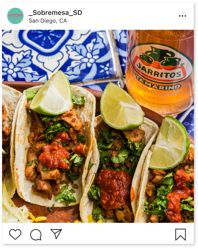
Sobremesa is a small, locally owned taco shop that offers a unique culinary experience, specializing in fresh seafood, delicious tacos, and the finest tequilas and mezcals. Inspired by the vibrant beach and desert landscapes of Baja Mexico and San Diego, Sobremesa is designed to make every customer feel at home, blending local flavors with a warm, welcoming atmosphere.
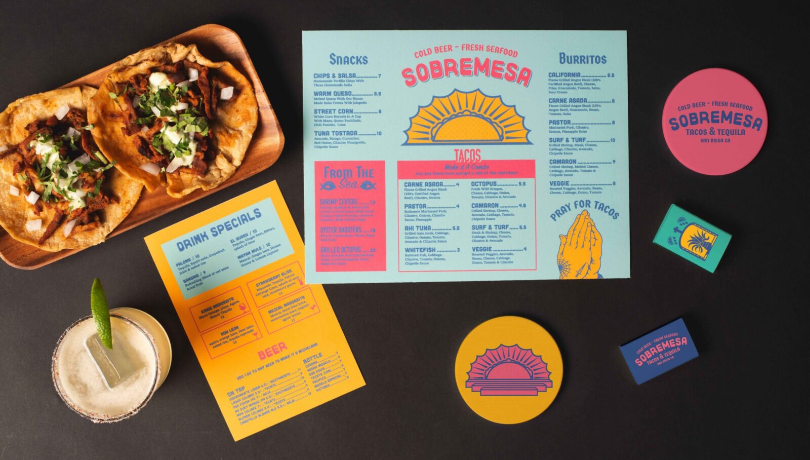
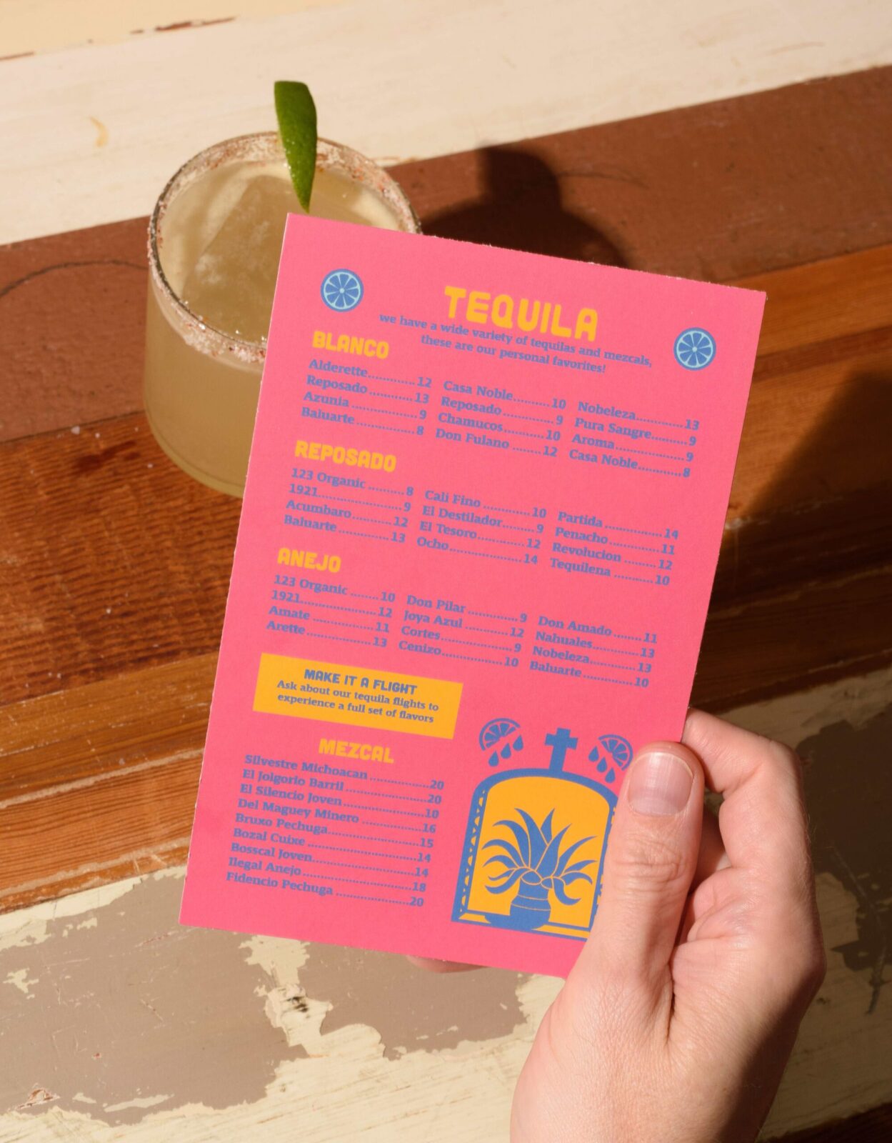
The branding for Sobremesa reflects this blend of tradition and modernity, utilizing bright colors typically found in traditional Mexican culture but with a contemporary twist. The typefaces combine rounded sans serifs with modern blackletter, creating a look that is both sharp and approachable. Custom illustrations are interwoven throughout the brand, adding a playful and engaging element that makes the brand visually appealing and memorable.
Solution
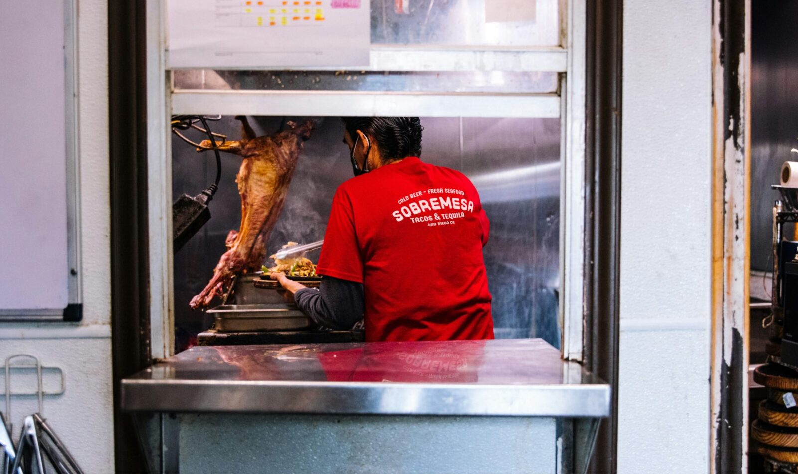
The Sobremesa crest logo is a key component of the brand’s identity, featuring fun sans serif typography with rough edges for the main wordmark. This is contrasted by sharper, more defined edges in the descriptor, creating a balance between casual and refined elements. The badge shape of the logo has a unique vintage feel, complete with hand-drawn details that enhance the brand’s authentic and rustic charm. Additionally, the identity package includes two secondary logos, providing alternative formats for different branded applications.
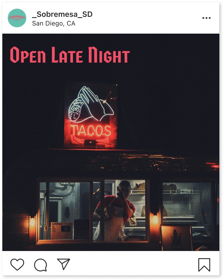
Illustrations play a central role in defining Sobremesa’s visual language, especially within the menu design. These illustrations, paired with the brand’s messaging, cleverly juxtapose religious imagery with taco-related themes, reinforcing the whimsical and light-hearted personality of the brand. The color palette is vibrant and eye-catching, featuring neon yellow, pink, teal, and medium blue, inspired by risograph printing. This palette brings a dynamic and energetic vibe to the brand, ensuring that Sobremesa stands out as a lively and inviting place to enjoy great food and drinks.




CREDIT
- Agency/Creative: Tim Burke
- Article Title: Sobremesa Beachside Taqueria Brand Identity by Student Tim Burke
- Organisation/Entity: Student
- Project Status: Non Published
- Agency/Creative Country: United States of America
- Agency/Creative City: San Diego
- Project Deliverables: Brand Identity
- Industry: Hospitality
- Keywords: WBDS Student Design Awards 2024/25 , Identity, Brand Design Creation
- Keywords: WBDS Student Design Awards 2024/25
-
Credits:
Educational Institution: San Diego City College
Educator's Name: Sean Bacon & Bradford Prairie


