Nowadays, it is not only the design that catches the eye but also the design that truly brings out the identity of the brand, because a brand stands out and becomes unique compared to other brands on the shelf when it successfully communicates its essence. In a competitive market where every product vies for attention, the packaging must do more than just look attractive—it must tell a story, evoke emotions, and establish a connection with the consumer.
So Mush Supplement is an excellent example of how a name can be seamlessly integrated with the visual identity of a product. The name “So Mush” cleverly plays on the word “mushroom,” which not only reflects one of the primary ingredients but also sets the stage for a design concept that is as functional as it is aesthetically pleasing. The unique appearance of this product, with its mushroom-inspired design, will undoubtedly catch your eye as you walk past the nearest pharmacy or health store, instantly drawing you in with its charm and natural appeal.
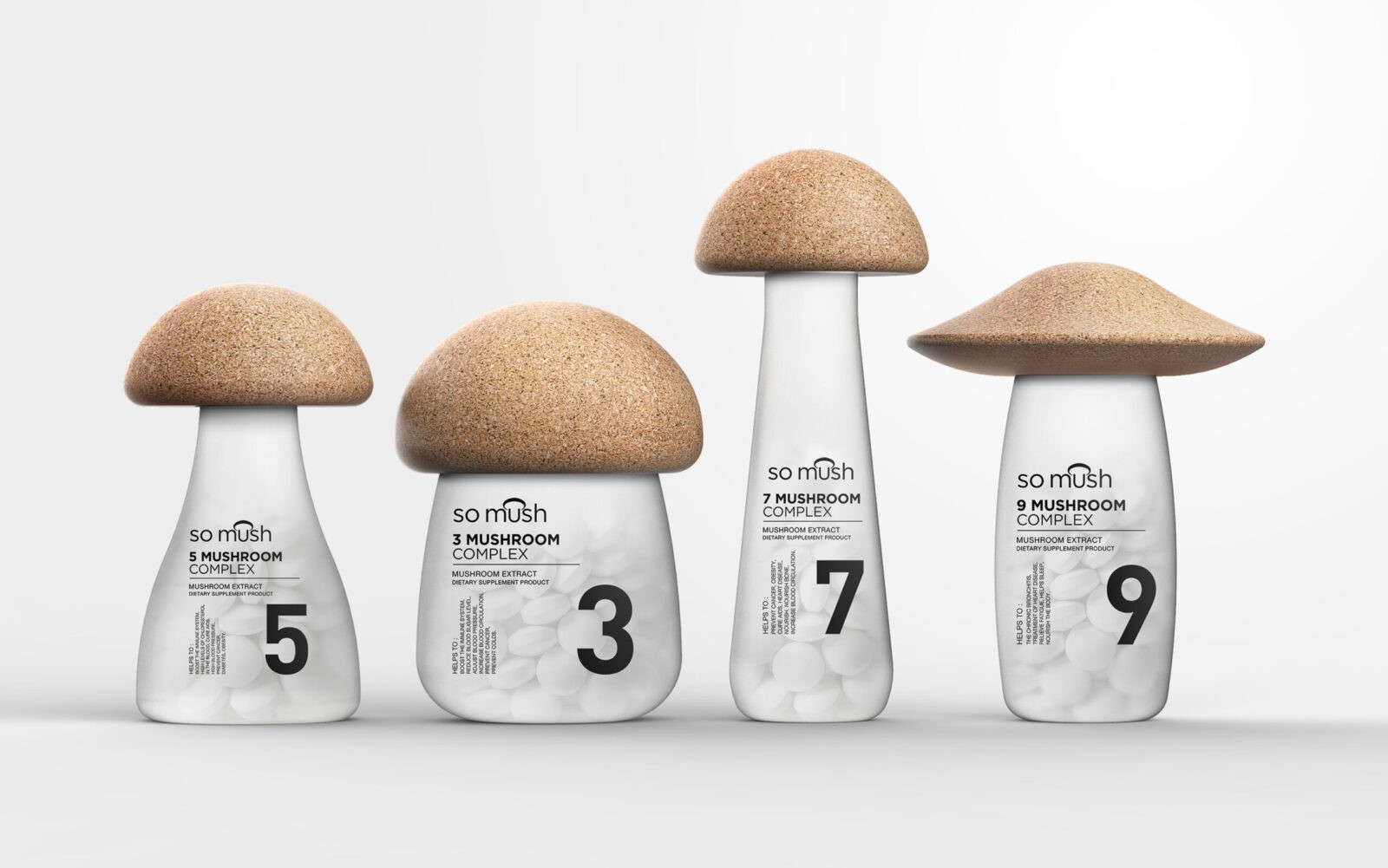
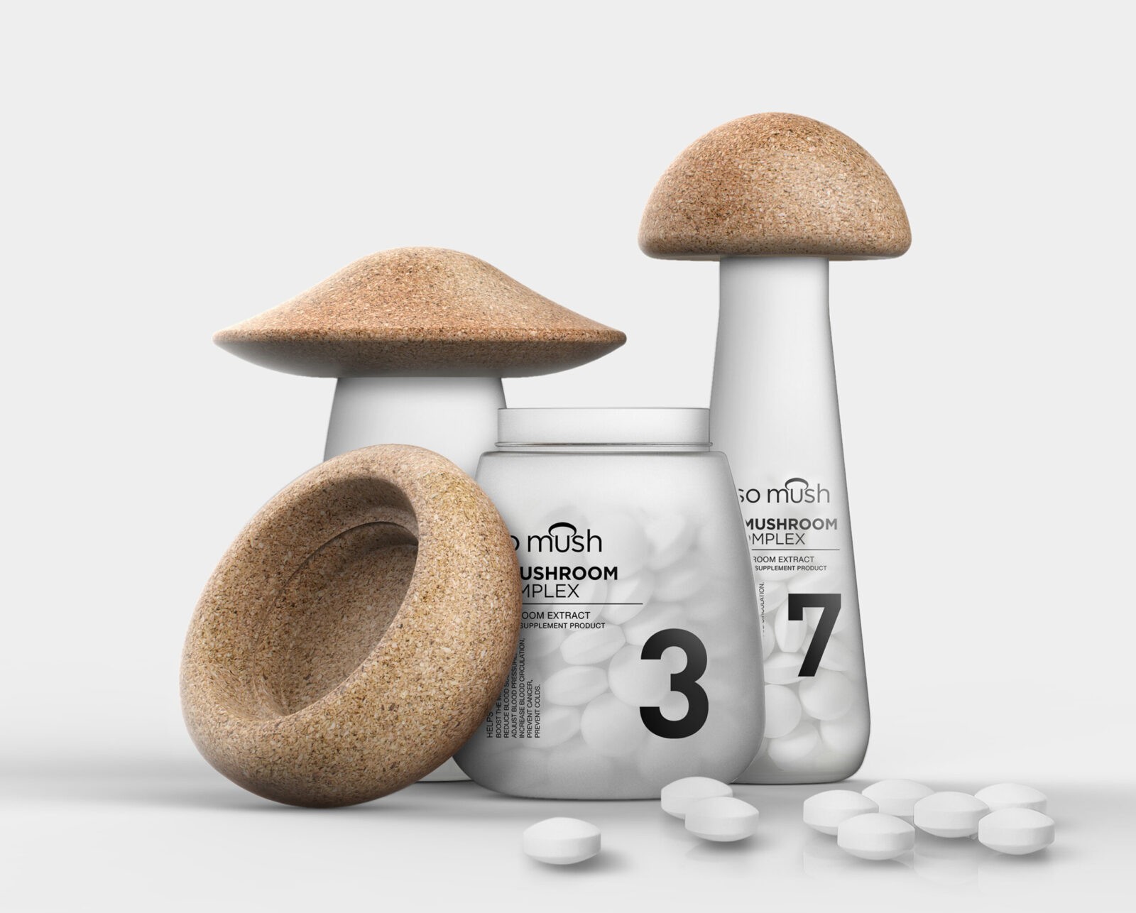
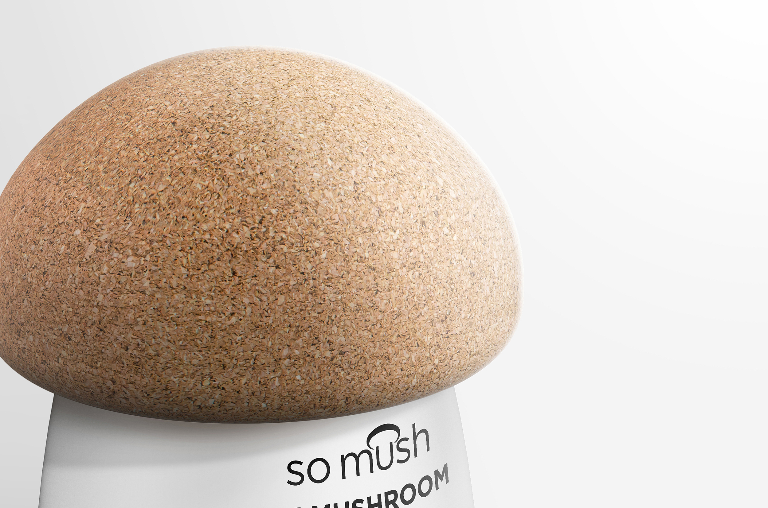
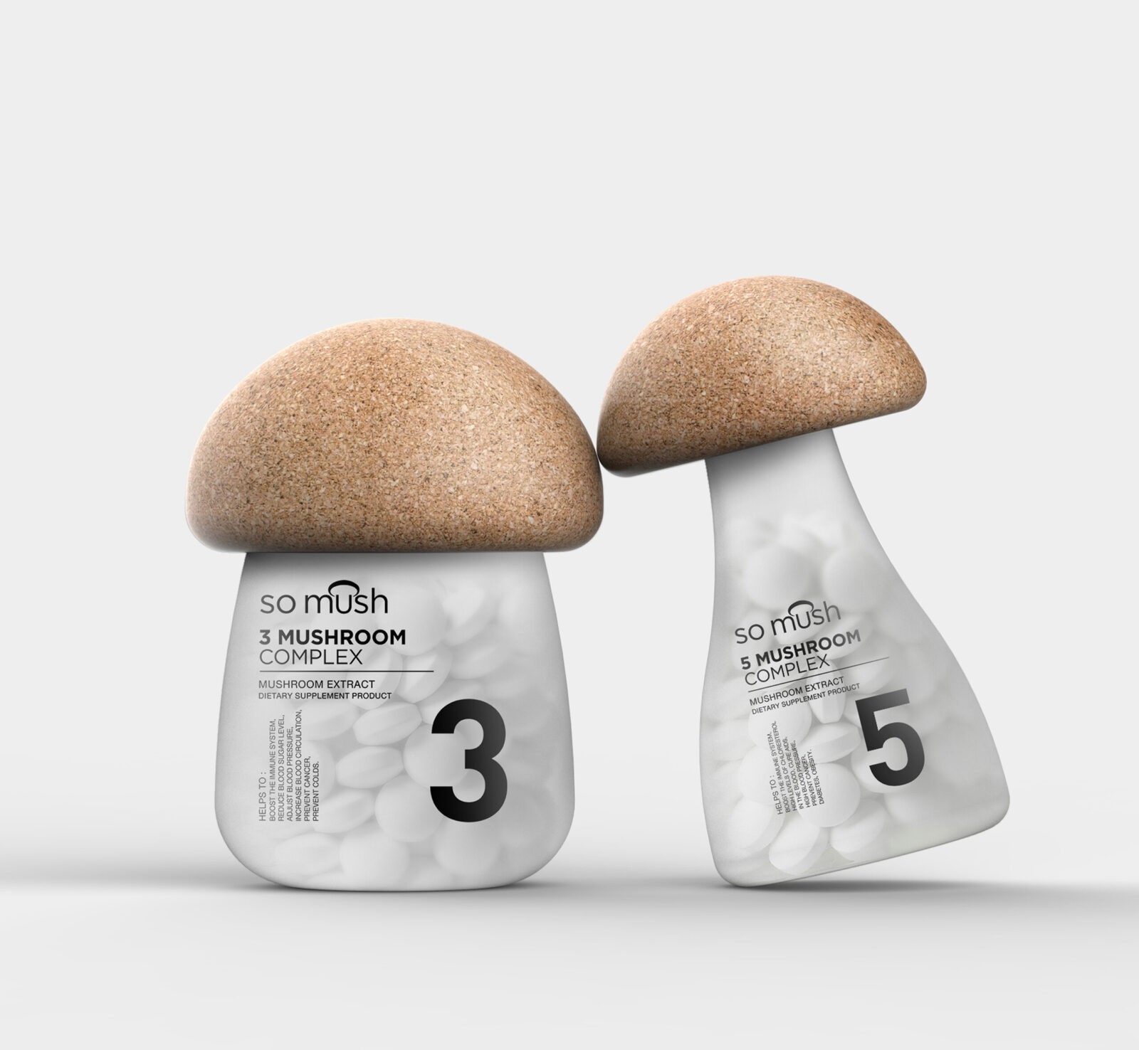
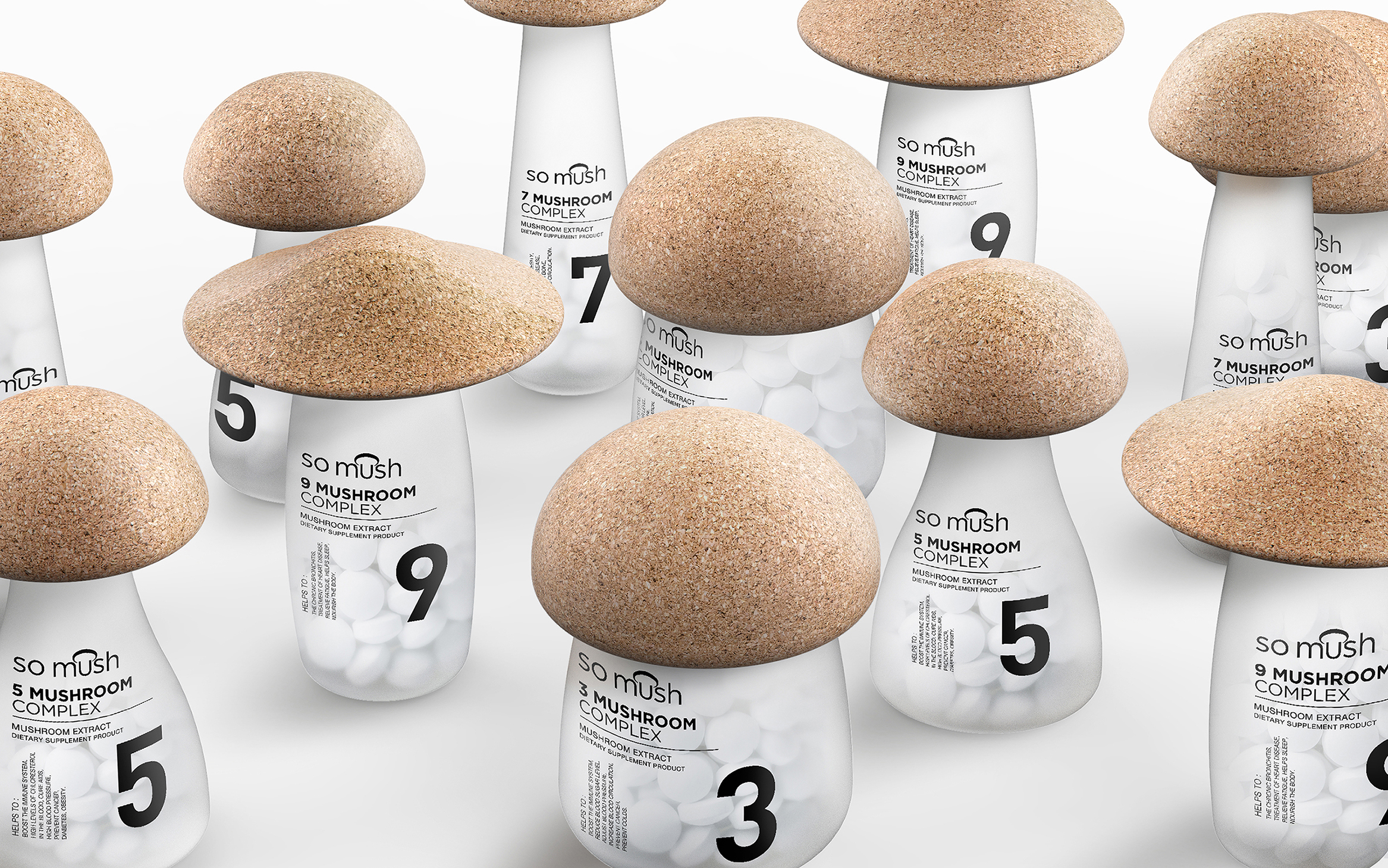
The concept behind the So Mush Supplement packaging was to create something that resonates with the product’s natural origins while also ensuring it stands out on the shelf. Mush, being one of the key ingredients, became the central motif around which the entire design revolves. The bottle cap, designed to resemble the top of a mushroom, is crafted from brown cork wood, which not only reinforces the natural theme but also adds a tactile element that consumers can appreciate. This small detail helps to create a sensory connection with the product, making it more memorable.
The body of the bottle is another thoughtful design element, made from opaque, frosted glass that gives off a soft, calming glow. This choice of material wasn’t just for aesthetic purposes; it also serves a functional role by protecting the supplement inside from light, thereby preserving its efficacy. The transparency, though subtle, allows consumers to see the contents within, giving them a sense of security and trust in the product’s quality. The numbers on the bottle are not just for decoration—they serve as a functional way to classify the different formulas of the supplement, helping consumers easily identify which variant suits their needs best. This system of numbering also adds a layer of credibility and professionalism to the brand.
Each bottle is designed not only as a container but also as a piece of art. The mushroom shape, which varies in size depending on the formula, adds a playful yet sophisticated touch. It encourages consumers to collect different bottles, not just for their contents, but also for their aesthetic value. These bottles can be displayed as decorative items, making them a conversation piece in any home.
The So Mush Brand logo was designed with a simple but meaningful idea, reflecting the product’s natural ingredients and the brand’s commitment to quality. The logo, which incorporates subtle elements of mushroom imagery, is both elegant and effective, making it instantly recognizable and memorable. Overall, the design of So Mush Supplement is a testament to how thoughtful and well-executed design can elevate a product, making it more than just another item on the shelf, but a true representation of the brand’s identity and values.
CREDIT
- Agency/Creative: Prompt Design
- Article Title: So Mush: A Perfect Blend of Functional and Aesthetic Design in Supplement Packaging by Prompt Design
- Organisation/Entity: Agency
- Project Status: Non Published
- Agency/Creative Country: Thailand
- Agency/Creative City: Bangkok
- Keywords: WBDS Agency Design Awards 2024/25 , Packaging Design: Structural Development
- Keywords: WBDS Agency Design Awards 2024/25


