Summary
The Snack POS brand was created to empower food businesses with an easy to use point of sale system. With today’s technological advancements, it can be difficult for restaurants to keep up with new aspects of management.
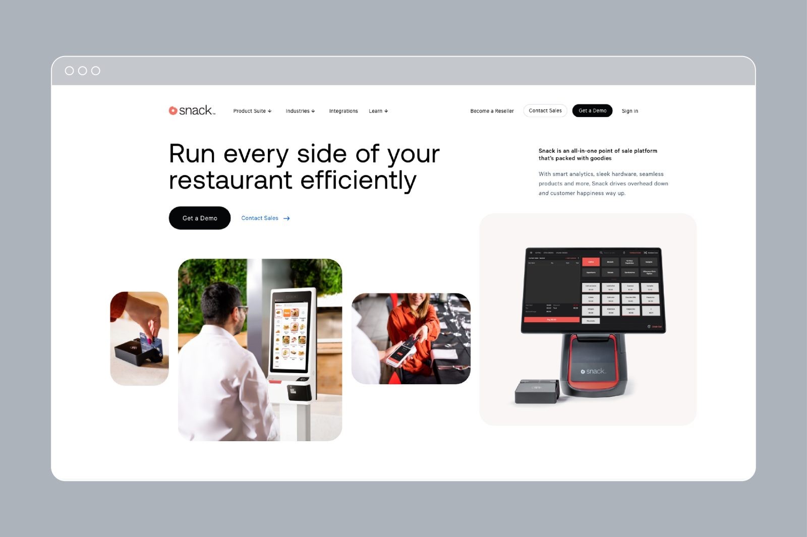
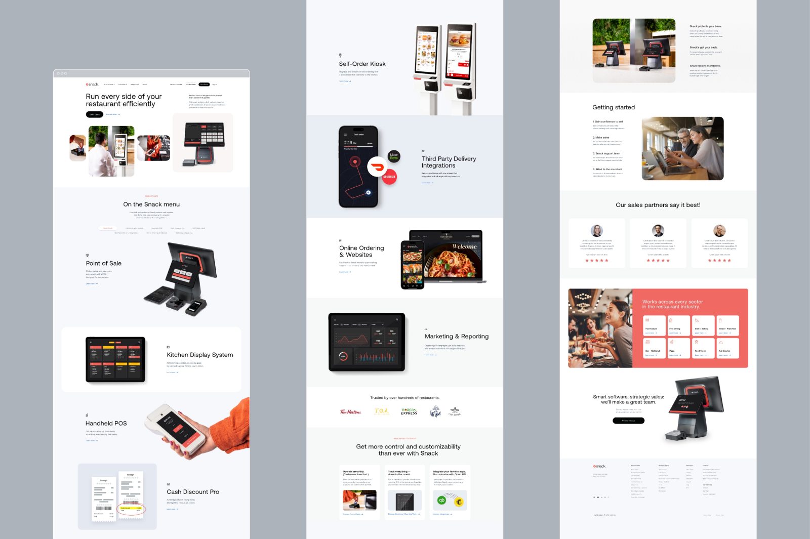
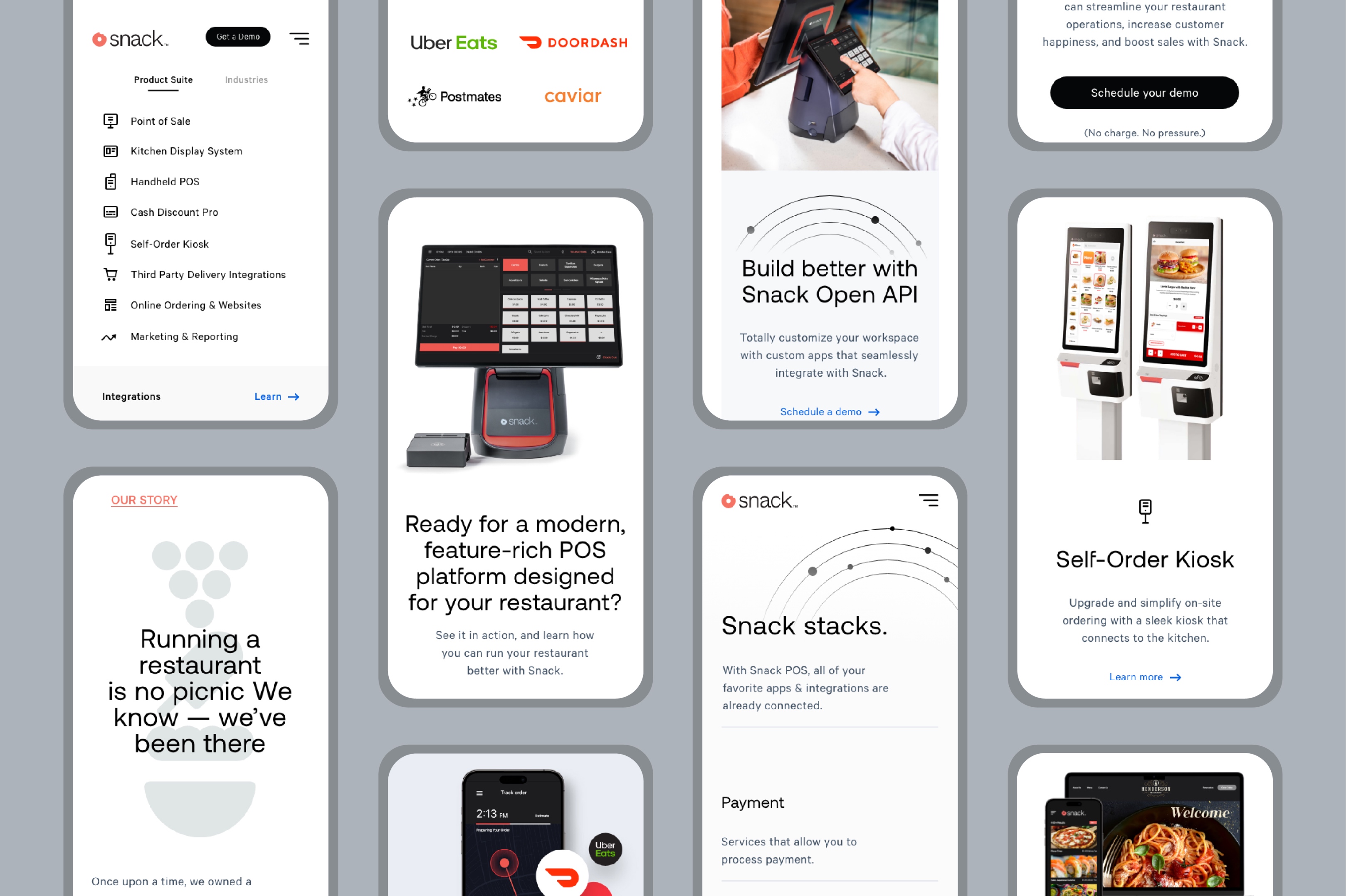
Snack’s management system has all their needs taken care of in one place. Food ordering, accounting, self-serve kiosks, mobile pay, third party delivery apps, and even data analytics are available instantly and combined seamlessly. Our goal was to get this message across quickly with a sleek, modern looking, and easy to update website that moves as fast as the food industry does.
Goals & Objectives
Developing the brand for a new company is a complex process requiring a particular skill set that GCNY Marketing has cultivated over many years. We start with a discovery phase, where we do a deep dive into the industry to gain a better understanding of the market and trends. Then figure out how to differentiate the brand.
Description
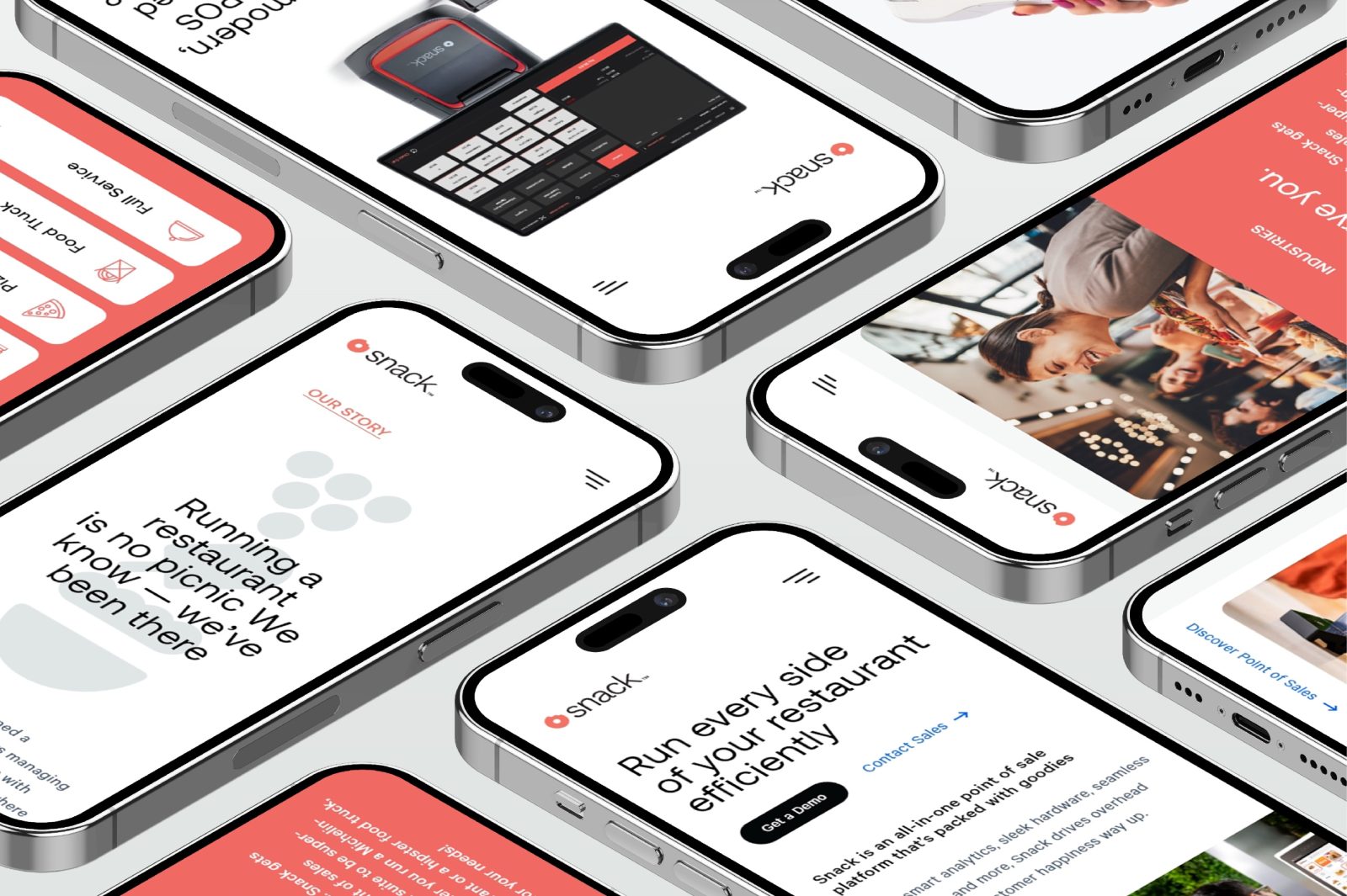
For the design process, we wanted to make it clear that any food business, big or small, could benefit from the Snack POS product. Incorporating overarching food aesthetics with a tech feel was the best way to accomplish that.
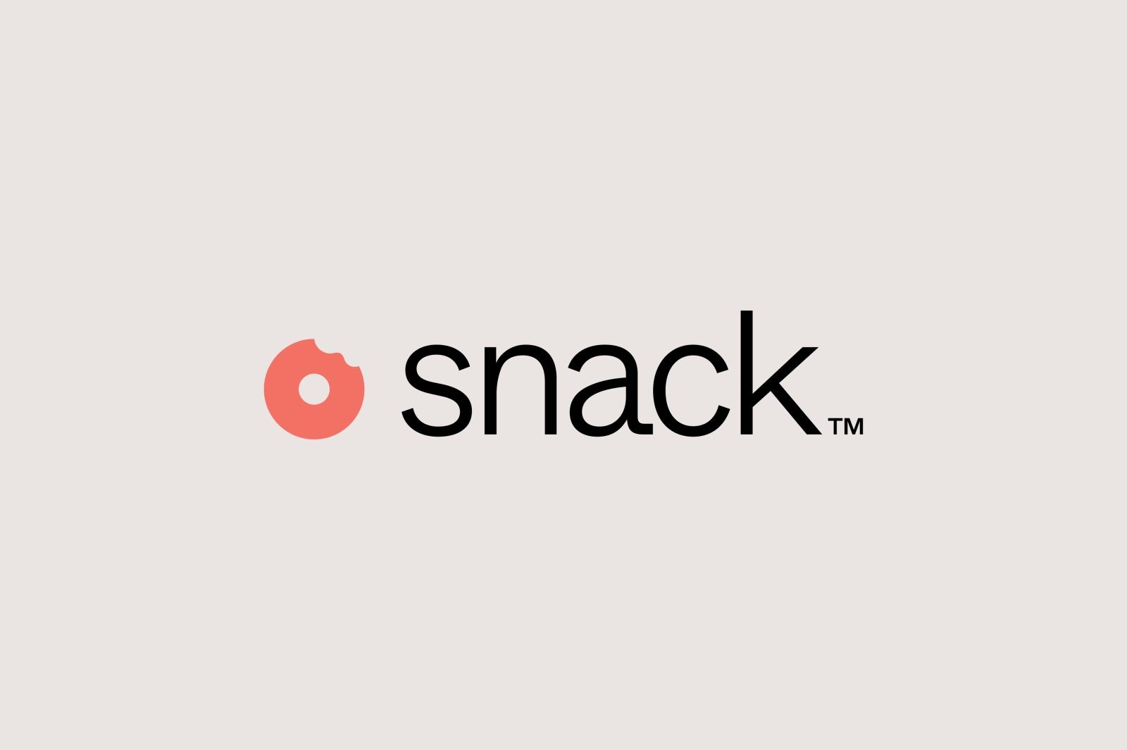
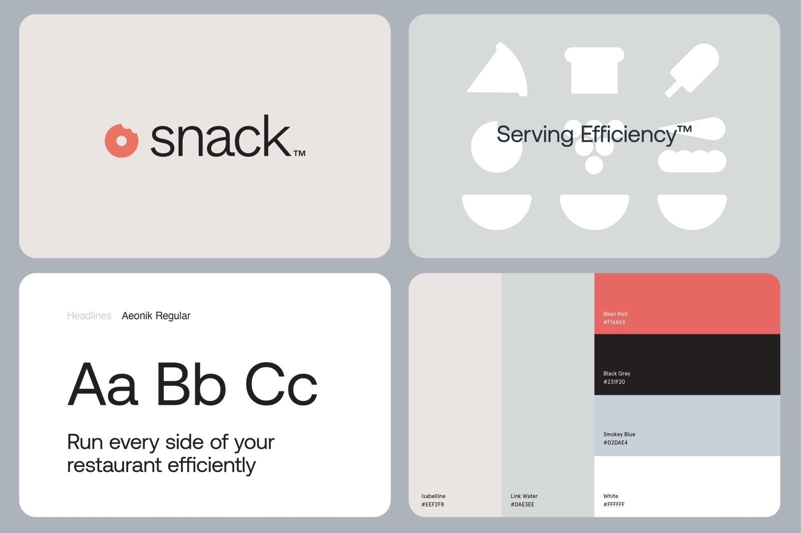
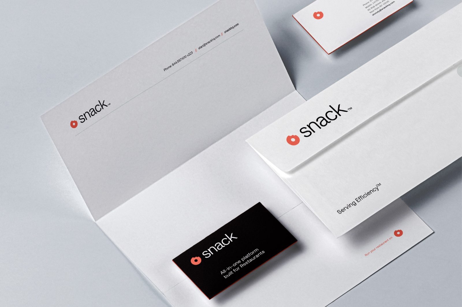
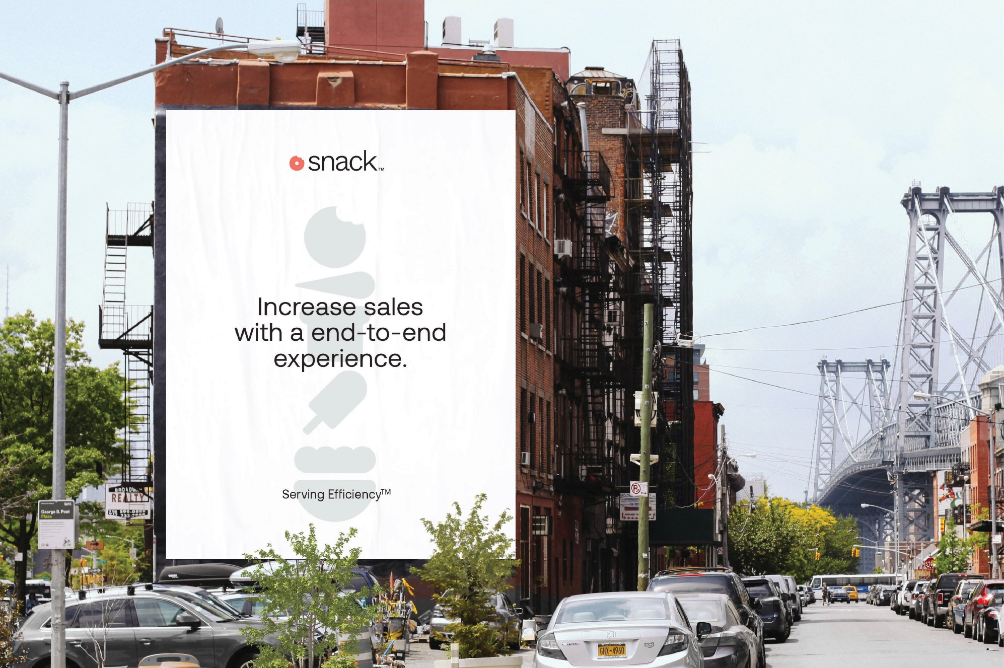
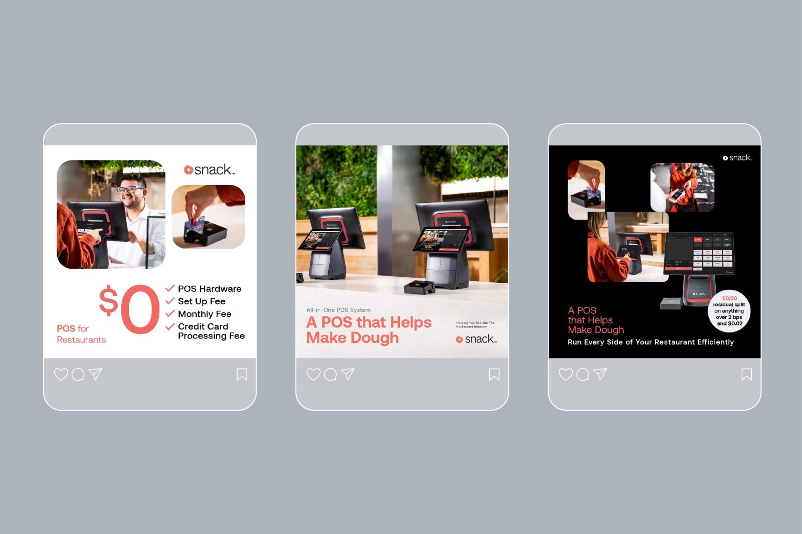
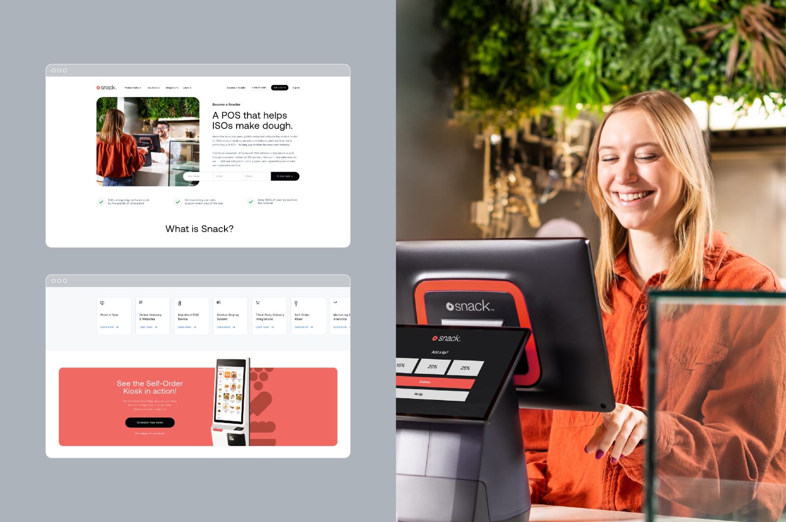
We chose a simple warm color pallet to emphasize how this is a product that is meant to make a food business easier to run. A soft red to reference the most common food coloring Red 40, with warmed black and true white to show simplicity and ease of use. Ease of use is also referenced in the logo design, the classic donut is drawn to be minimalistic and round to show a seamless circle of process. The images chosen to highlight features have pops of red and yellow and food items. It’s a subtle modern take on the classic ketchup and mustard combo. Images include action shots of the hardware in use by staff and customers, so potential clients can get a taste of what using it would look like. The website copy was written to be clear but also fun by incorporating food puns.
Result
We created a brand that speaks to clients who love what they do and want to do it better.
CREDIT
- Agency/Creative: GCNY Marketing
- Article Title: Snack POS Graphic Design for Digital Applications
- Organisation/Entity: Agency
- Project Type: Digital
- Project Status: Published
- Agency/Creative Country: United States
- Agency/Creative City: Brooklyn
- Market Region: North America
- Project Deliverables: Graphic Design
- Industry: Technology
- Keywords: WBDS Agency Design Awards 2023/24
- Keywords: Graphic Design, Digital Applications
-
Credits:
Creative Director: Joseph Blumenfeld
Art Director: Yanky Perl
UI/UX Designer: Emily Choi
Project Manager: Tzvi Koegel
Graphic Designer: Lauren Baik
Copywriter: Rivkie Lieberman
Developer: Martin Kay


