


The brand of farm dairy products “Smolyanka” got its name in honor of a peasant girl from Smolensk province. The affectionate name of the brand indicates that milk production is done with maximum love and care directly from the farms. The brand of dairy products “Smolyanka” begins its history with a small family farm, in which the main helpers were the daughters of the farm owner. It was in their honor that it was decided to name the line of dairy products.
The brand “Smolyanka” has become a symbol of quality and naturalness. Products under this brand are characterized by a high content of useful substances and the absence of artificial additives.
Gradually the brand “Smolyanka” becomes known not only in the Smolensk region, but also beyond its borders. Farmers continue to develop their business, carefully introducing modern technologies, while preserving traditional production methods.
Today the Smolyanka brand continues to delight its customers with natural and tasty dairy products. It has become a symbol of care for health and nature, as well as an example of a successful family business.
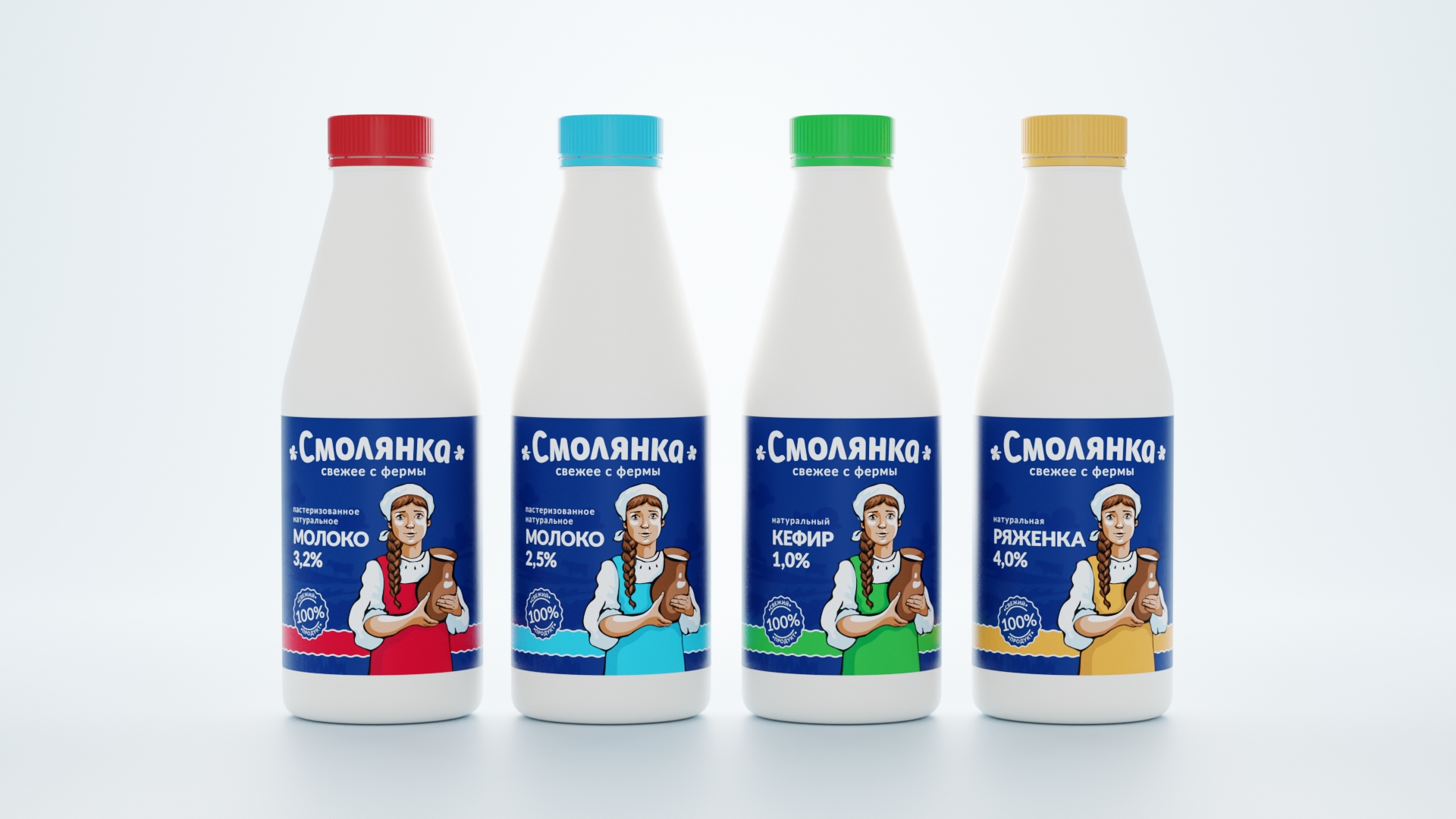
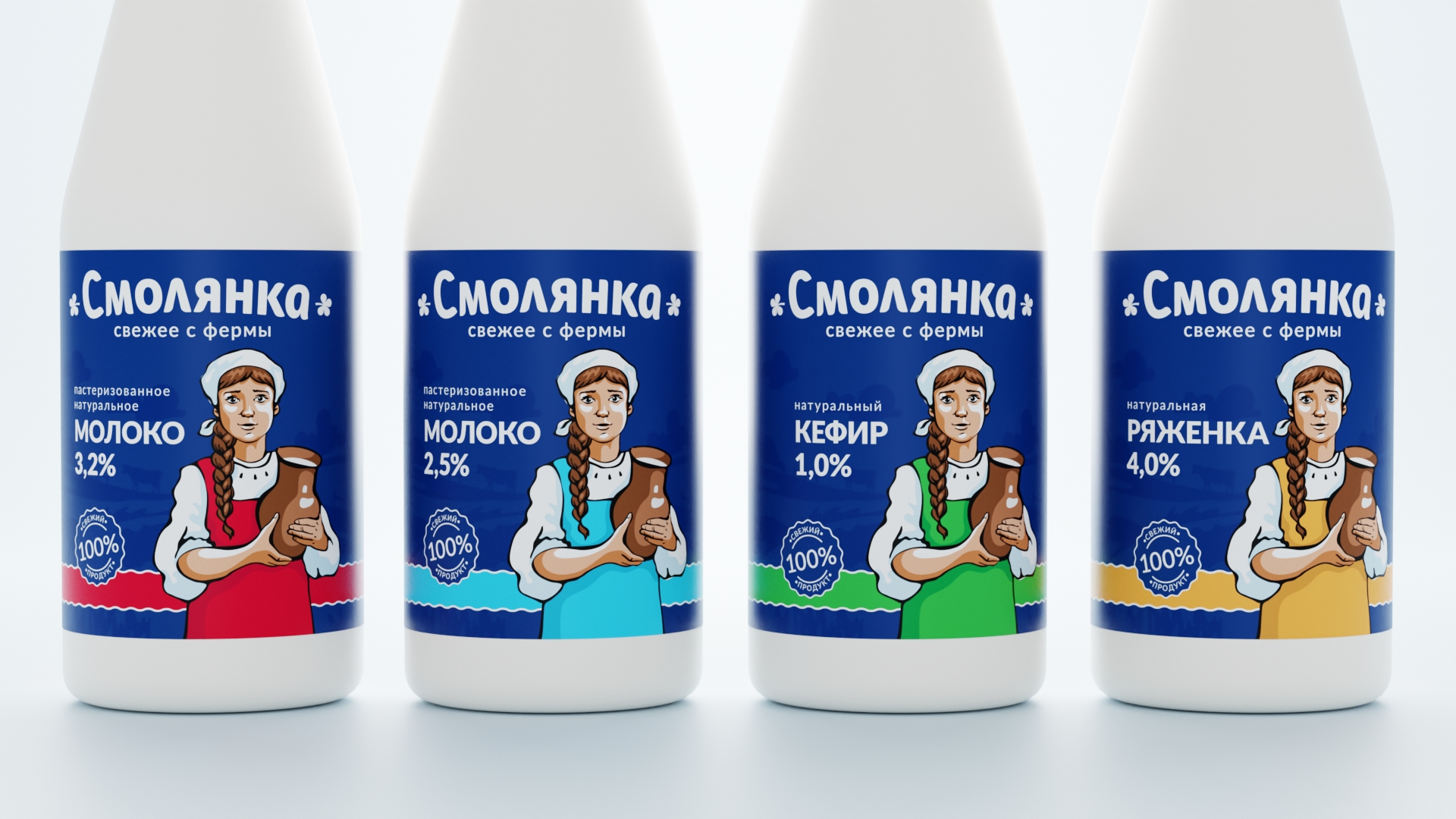
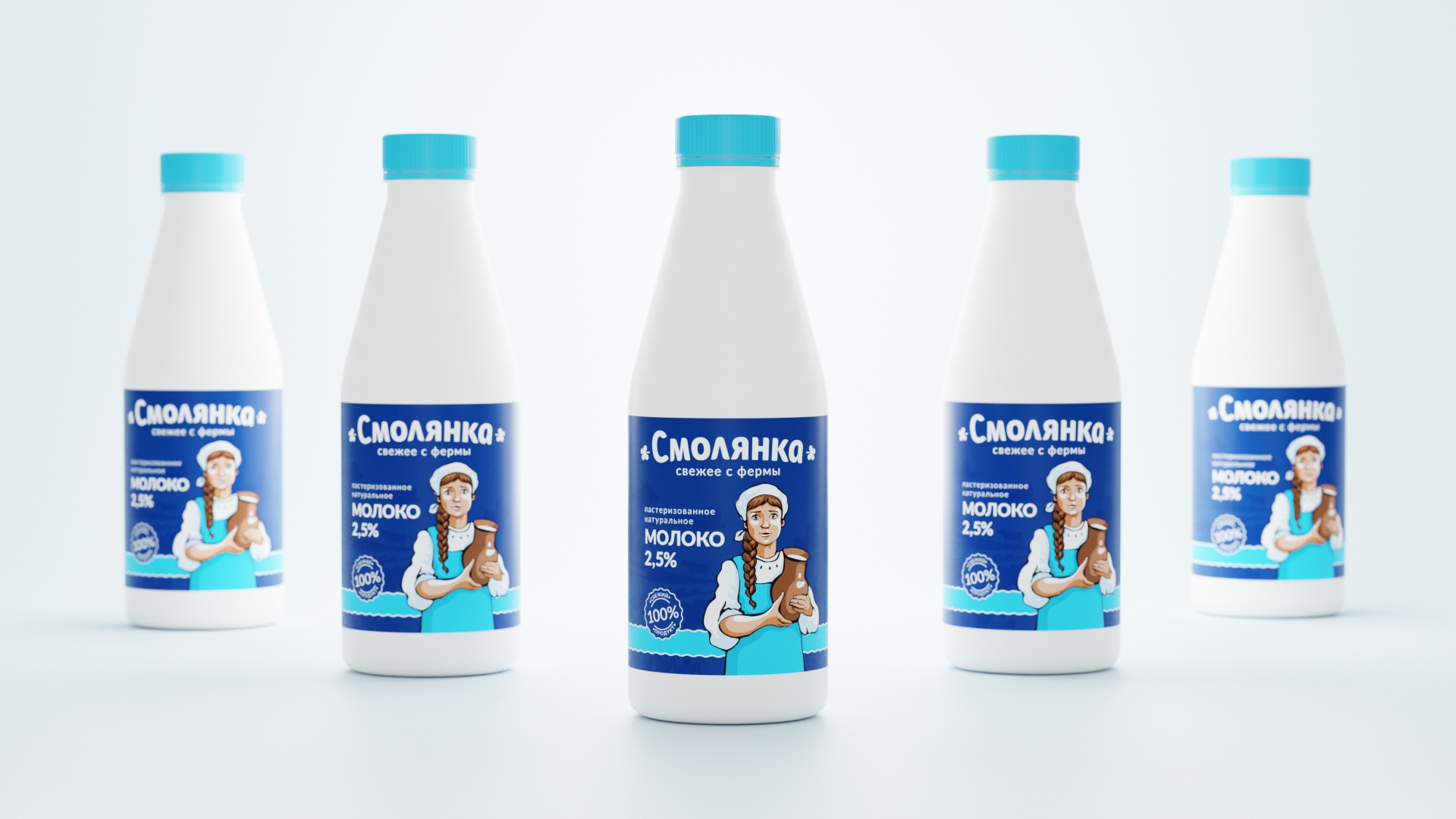
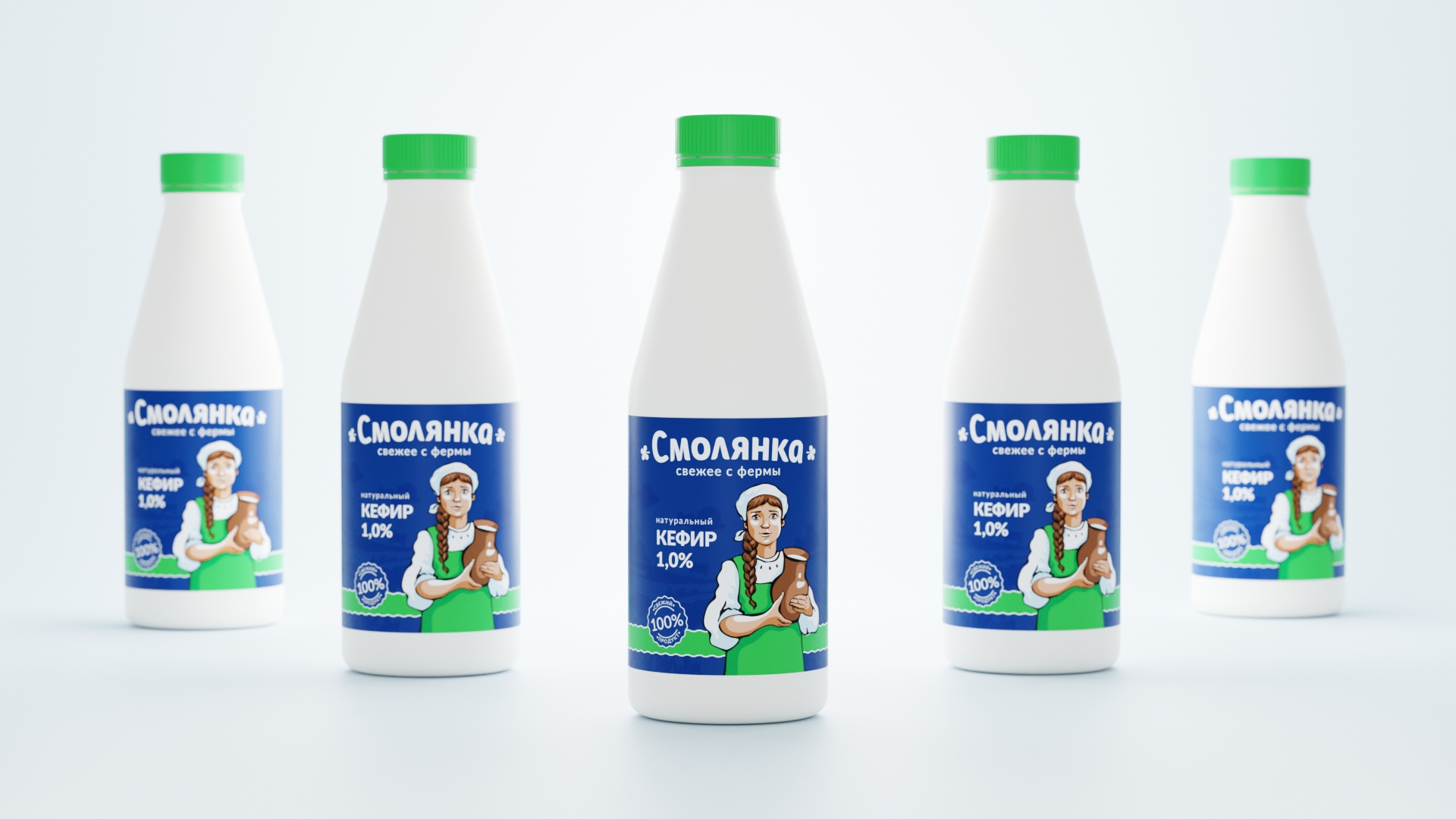
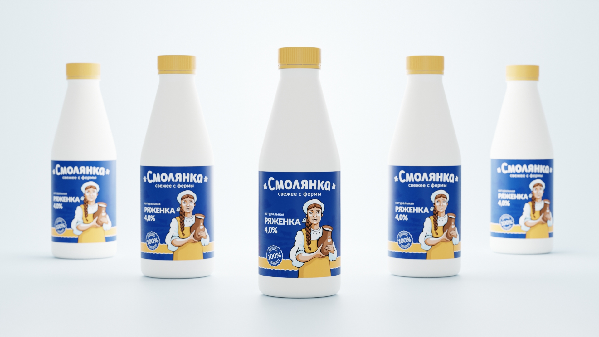
The design of dairy products packaging under the Smolyanka brand is made in a traditional style, which is intended to evoke in consumers associations with farm life, naturalness and quality of products. The main emphasis in the packaging is on a girl in a traditional Russian sundress. The color of the sundress changes depending on the product, thus differentiating the product line.
The background of the packaging depicts rural landscapes, cows in the meadow and other elements associated with rural life. This creates an atmosphere of coziness and warmth, and emphasizes the naturalness and environmental friendliness of the products.
The font, on the basis of which the brand logo is made, has rounded shapes. Thus indicating the tenderness and care with which the dairy products are produced. The clover petals in the logo further emphasize the naturalness of the products. The descriptor in the logo indicates the freshness of the products.
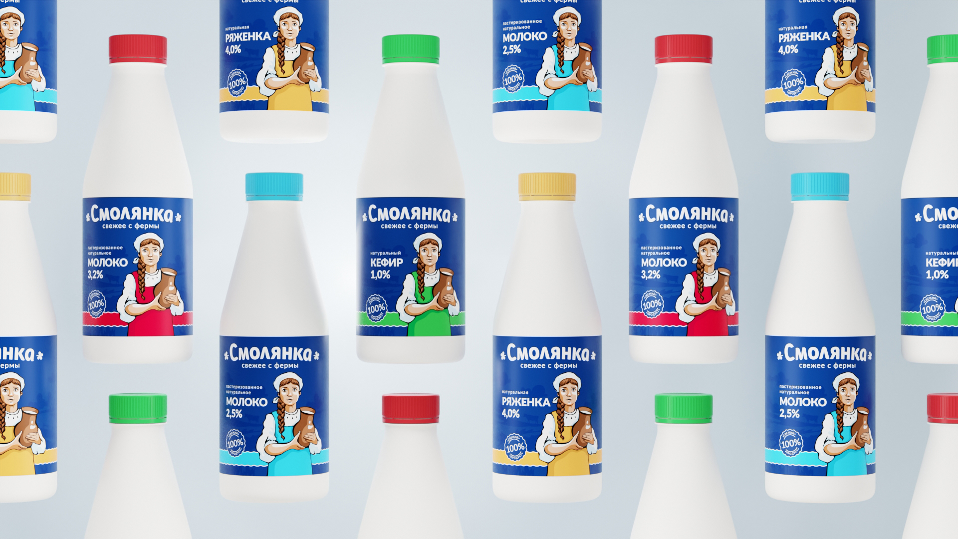
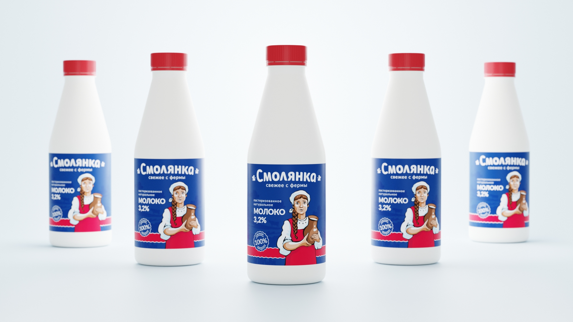
The packaging of dairy products under the brand “Smolyanka” is made of quality materials that ensure the safety of products and attractive appearance. It is convenient to use and easy to open.
The design of the packaging attracts the attention of customers and makes them want to try the products.

CREDIT
- Agency/Creative: Yeti Design Studio
- Article Title: Smolyanka Traditional Dairy Products Designed by Yeti Design Studio
- Organisation/Entity: Agency
- Project Type: Packaging
- Project Status: Published
- Agency/Creative Country: Russia
- Agency/Creative City: Lipetsk
- Market Region: Europe
- Project Deliverables: Art Direction, Brand Design, Brand Naming, Branding, Character Design, Design, Label Design, Logo Design, Packaging Design
- Format: Bottle
- Industry: Food/Beverage
- Keywords: milk, dairy, kefir, yogurt, packaging, bottle, label, design
-
Credits:
Art director & design: Igor Vetoshkin
Illustration: Kristina Vetoshkina


