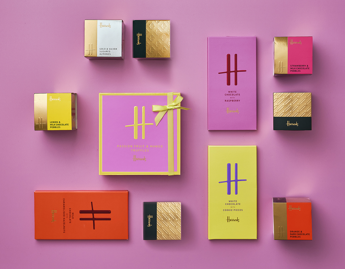
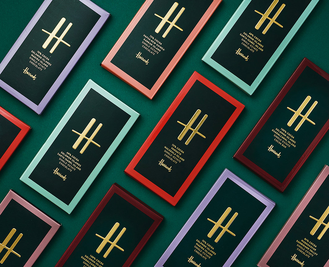
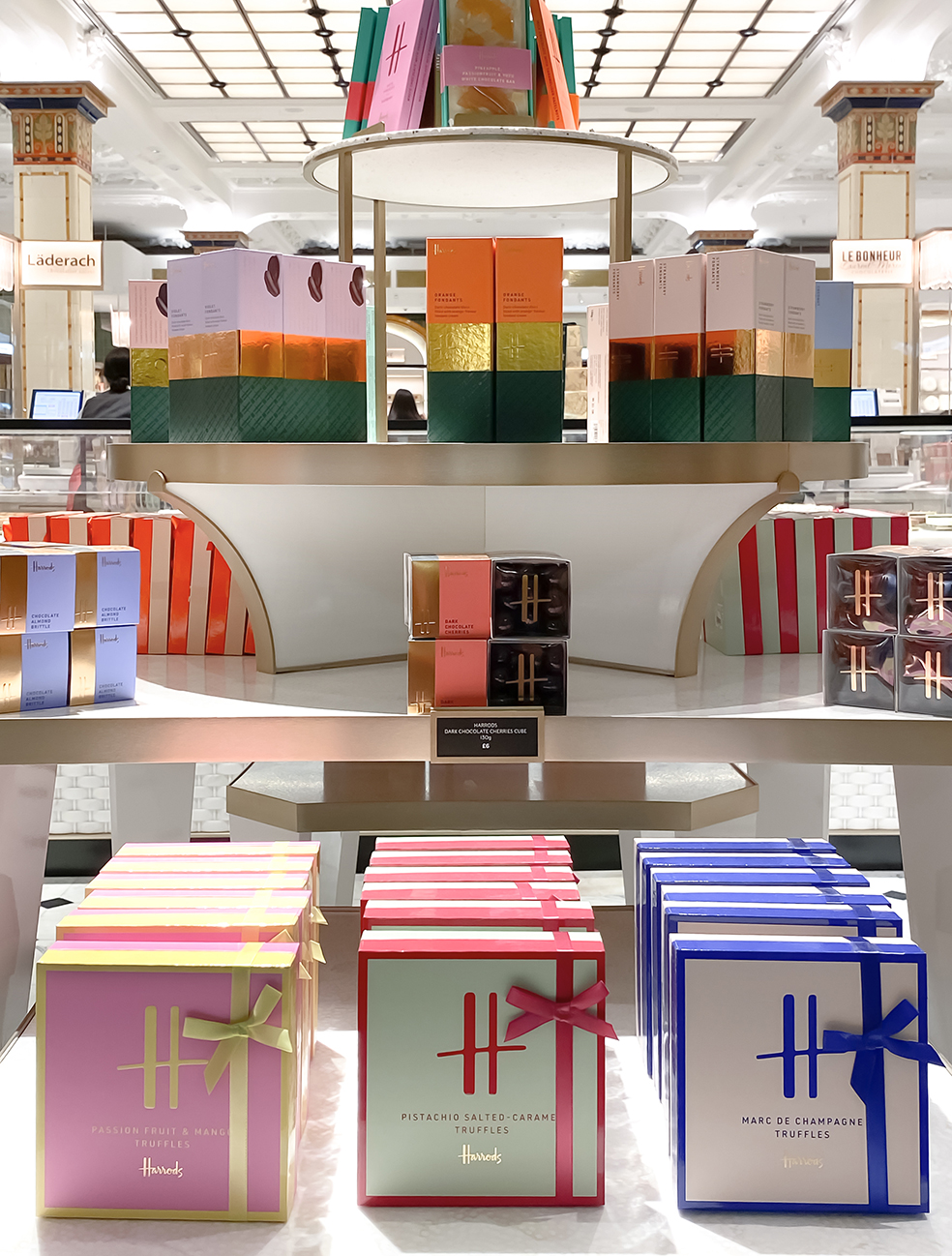
Smith &+ Village’s designs for Harrods’ own brand confectionery are sitting pretty in the London store’s revamped Chocolate Hall. Thick glossy inks, shots of neon and reflective foils are used masterfully in luxury packaging to seduce shoppers in the redesigned historic space.
For anyone who has missed the theatre of real-life shopping, the Chocolate Hall will sate their desires. Visitors can see artisans at work making bonbons, filled bars and other delights, with live demonstrations from Harrods’ in-house chocolate masters. And of course the hall houses the crème de la crème of chocolate brands, from Pierre Marcolini, William Curley and To’ak, whose Guayasamin Art Series bars retail at £350 for 50g.
“Harrods is famous throughout the world for being the home of super brands, and we knew we needed to create a super brand out of confectionery.” Says Richard Village, Strategy Director of Smith&+Village. “We made very sure that the design of the new packaging followed the principles of a super brand and conveyed the same opulent look and feel. Using beautiful materials, beautiful brand pattern and the big ‘H’ monogram, it has made something uber-luxurious and seductive that sits happily among other luxury chocolate brands and feels like a world-class leader of this fabulous category.”
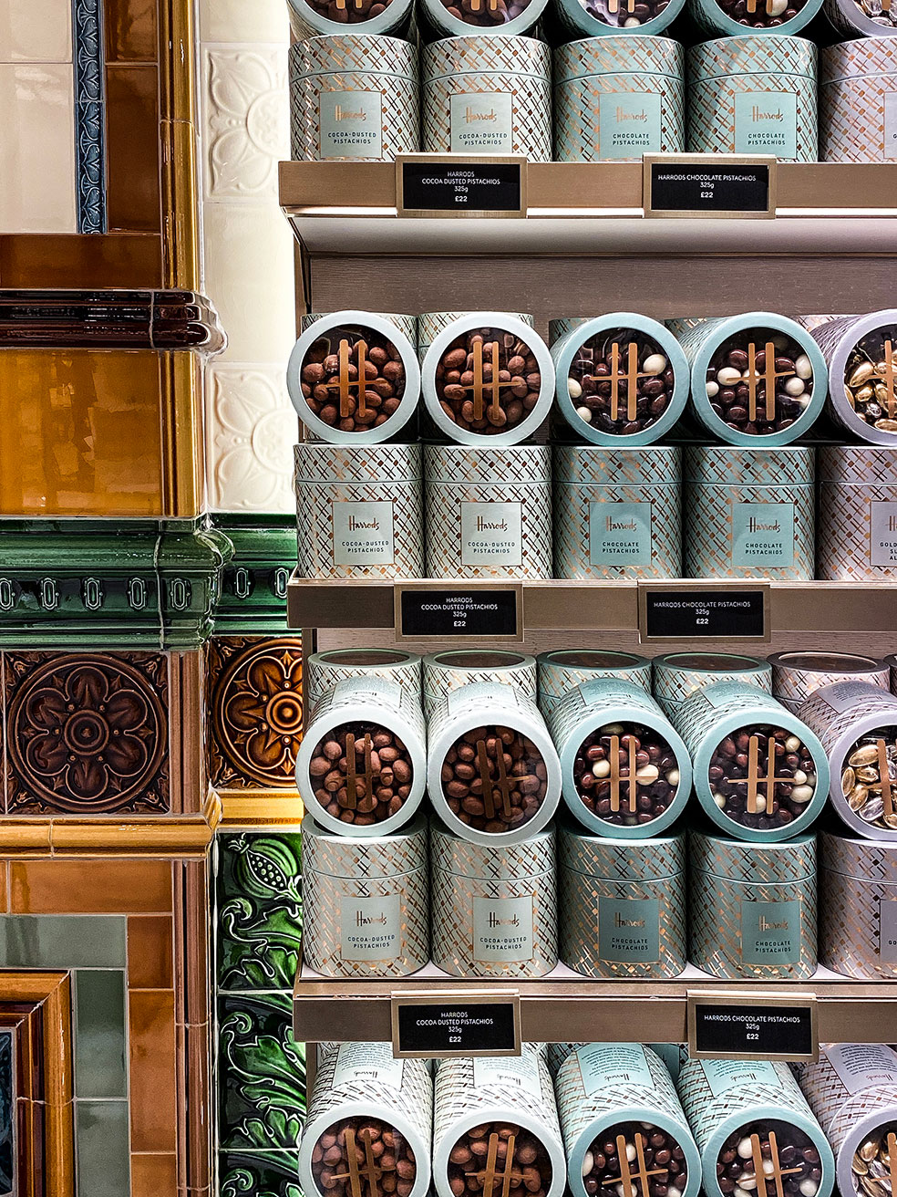
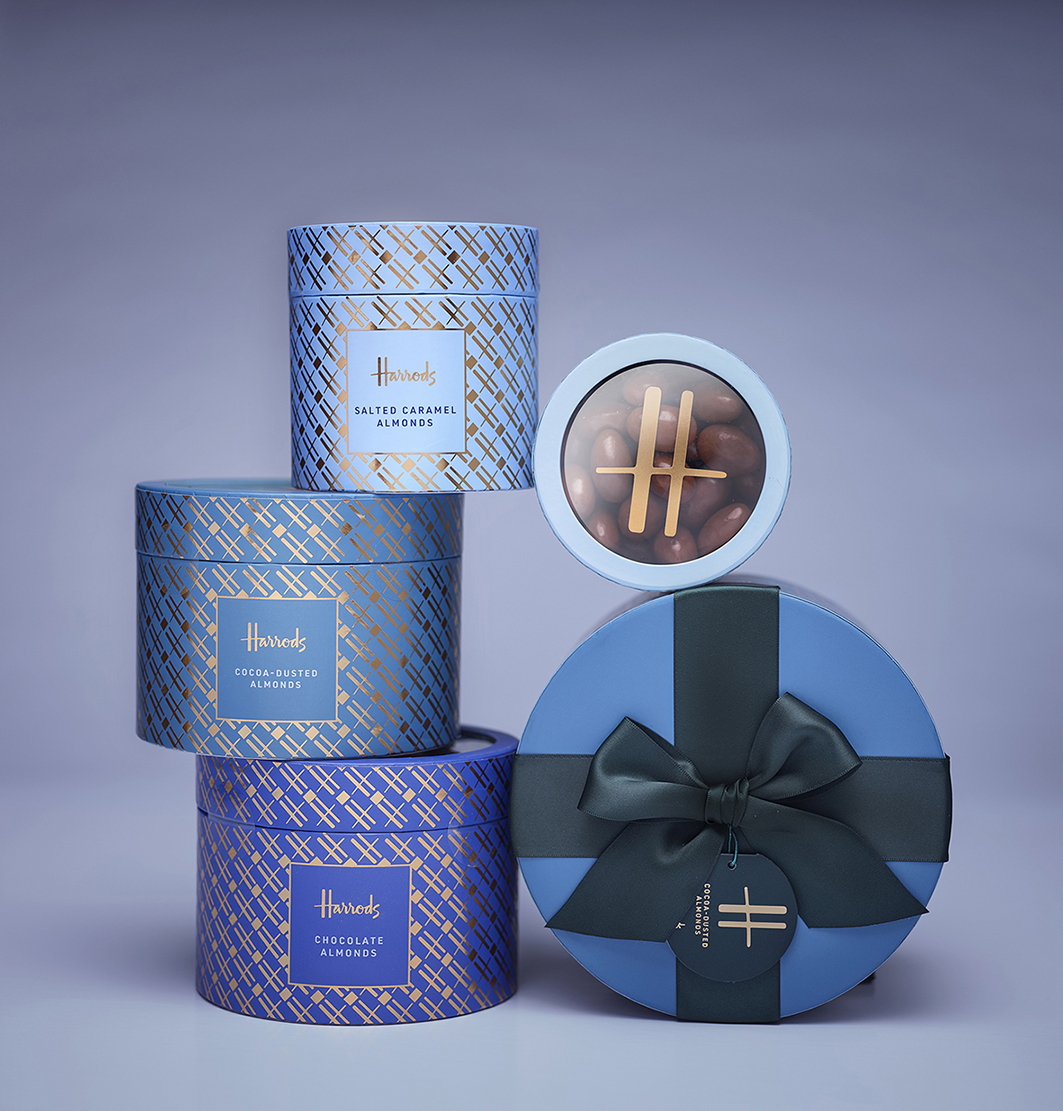
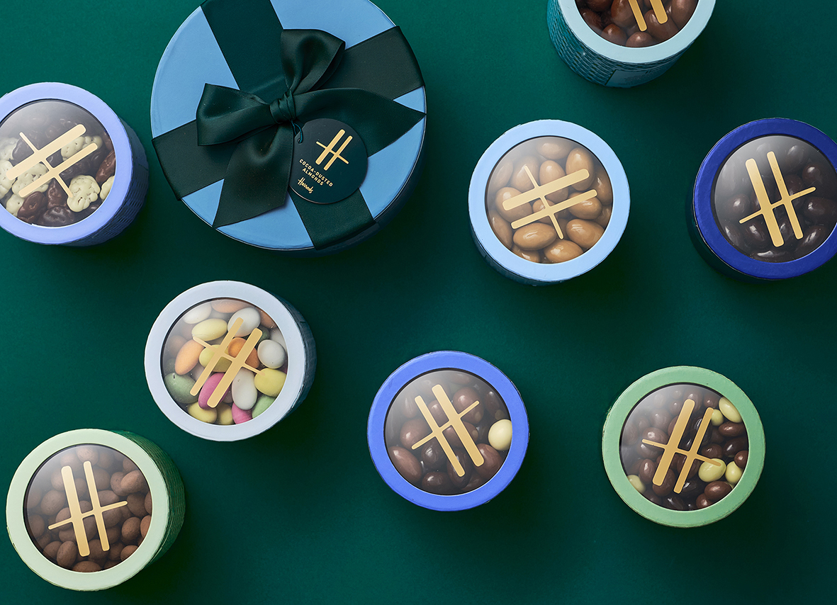
The revamped Chocolate Hall recognises the importance the building’s Grade I-listed status, while incorporating modern materials and technology. Taking the stage alongside the beautifully restored Edwardian tilework, Smith&+Village’s tubs of cocoa dusted fruit and nuts are a symphony of variegated colours, somehow managing to be both understated and celebratory. They work beautifully as active elements of the store’s visual language and as individual covetable gifts.
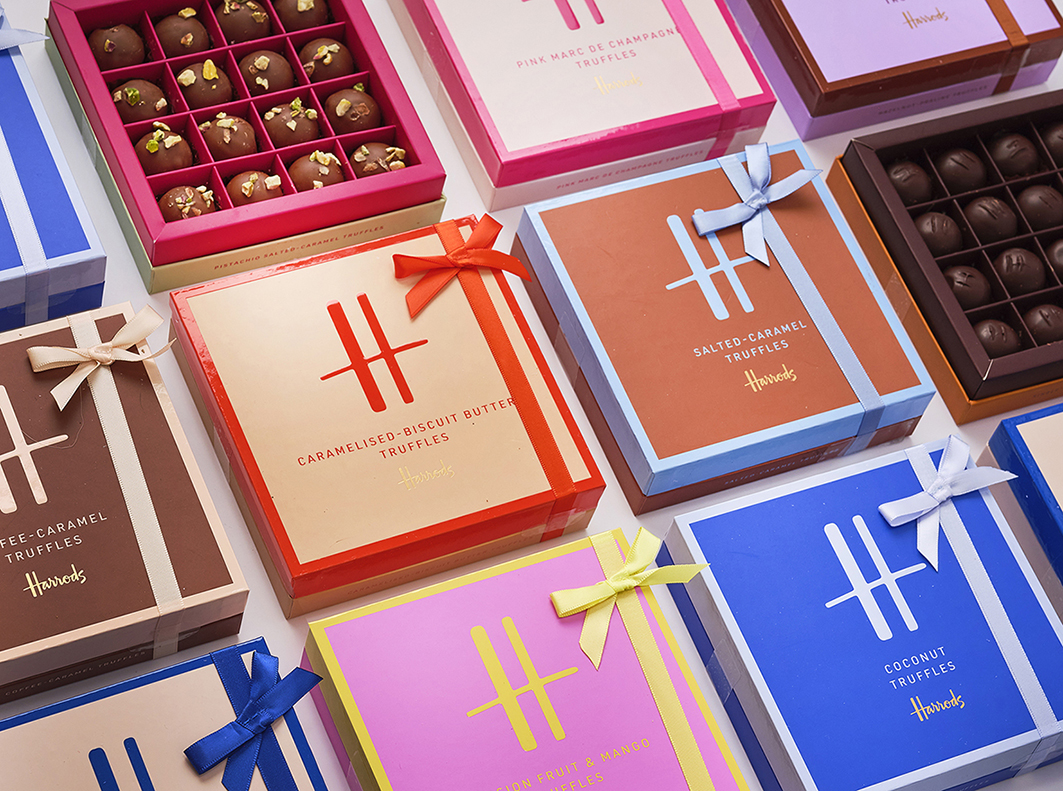
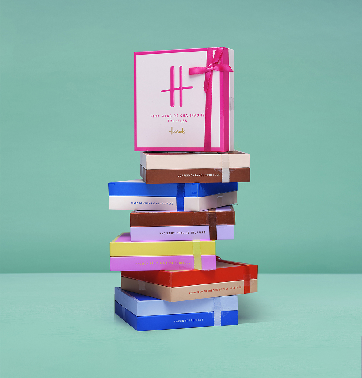
Debrah Smith, Creative Director, Smith&+Village said: “We wanted the design to be a statement, a bold, undeniably modern take on the Harrods mark. Our packaging has to sit in Harrods Chocolate Hall, one of the world’s most iconic and historic rooms, full of complex pattern and decoration. I thought about how contemporary art pieces sit so magnificently in intricate baroque rooms, like Jeff Koons at the Palace of Versailles or Anish Kapoor at Chatsworth House. So I decided that bold and modern, with thick glossy inks, shots of neon and reflective foils was the way to go. It’s that mix of historic and contemporary that I find so inspiring and tried to capture in the chocolate ranges.”
Richard added: “These rooms are incredibly impressive and we needed to having something that both echoed the grandeur of the Chocolate Hall and would also be contextualised within it, so that it all tells a seamless Harrods story.”
As well as the chocolate coated fruit and nuts, the range includes single estate chocolate bars, truffles, Turkish delight and old fashioned sweetshop favourites like bonbons and sugared almonds. The ‘H’ monogram repeated in gold against a delicious colour palette becomes a kind of house check pattern, conveying the finesse of the treats within.
Harrods first sold chocolate bars back in 1870, before beginning to make its own in-house chocolate in 1897. Smith&+Village is proud to be part of the latest chapter of Harrods’ story, helping secure it status as a world-leading chocolate maker and purveyor. This new range of luxury packaging enhances the pleasure of gifting and delivers the joyful anticipation of good taste.
CREDIT
- Agency/Creative: Smith&+Village
- Article Title: Smith&+Village’s Bold, Modern Take on the Historic Harrods Mark
- Organisation/Entity: Agency
- Project Type: Packaging
- Project Status: Published
- Agency/Creative Country: United Kingdom
- Agency/Creative City: London
- Market Region: Global
- Project Deliverables: Brand Redesign, Packaging Design
- Format: Box
- Substrate: Pulp Board
- Industry: Food/Beverage
- Keywords: #chocolate #packagingdesign #luxury #foodanddrink #harrods
-
Credits:
Creative Director: Debrah Smith
Strategy Director: Richard Village


