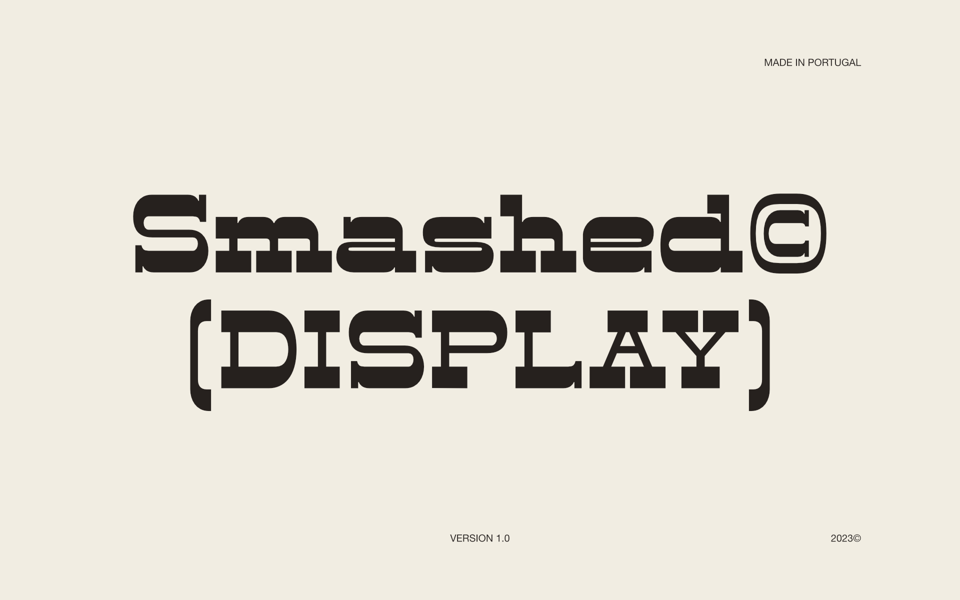
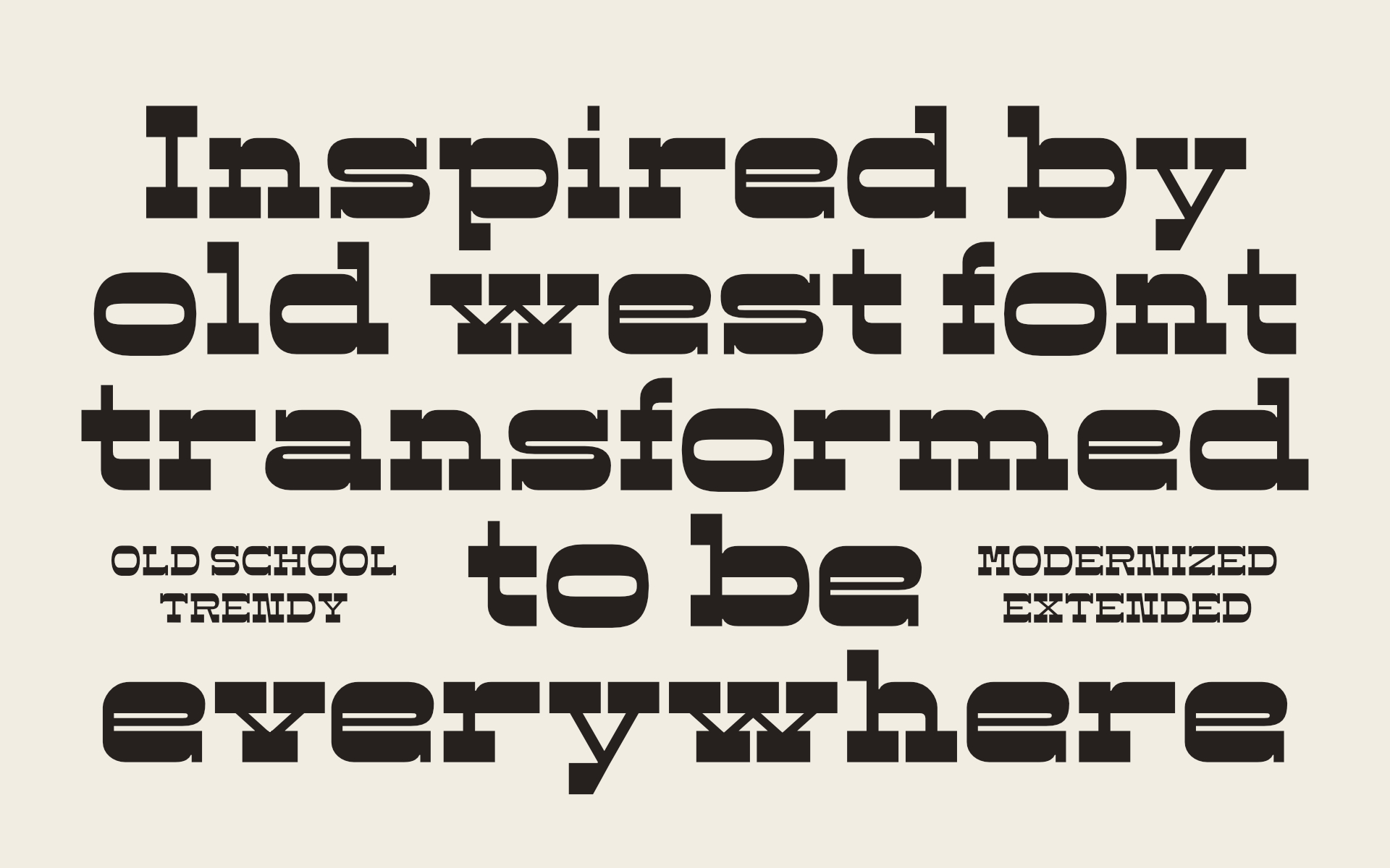
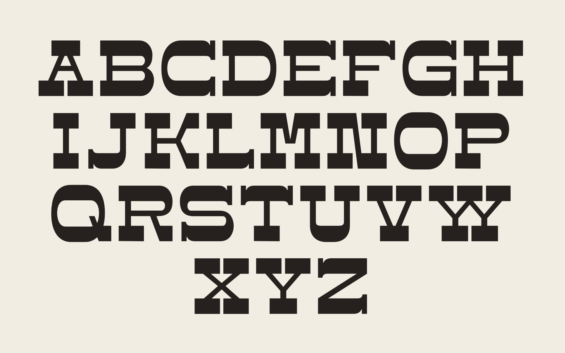
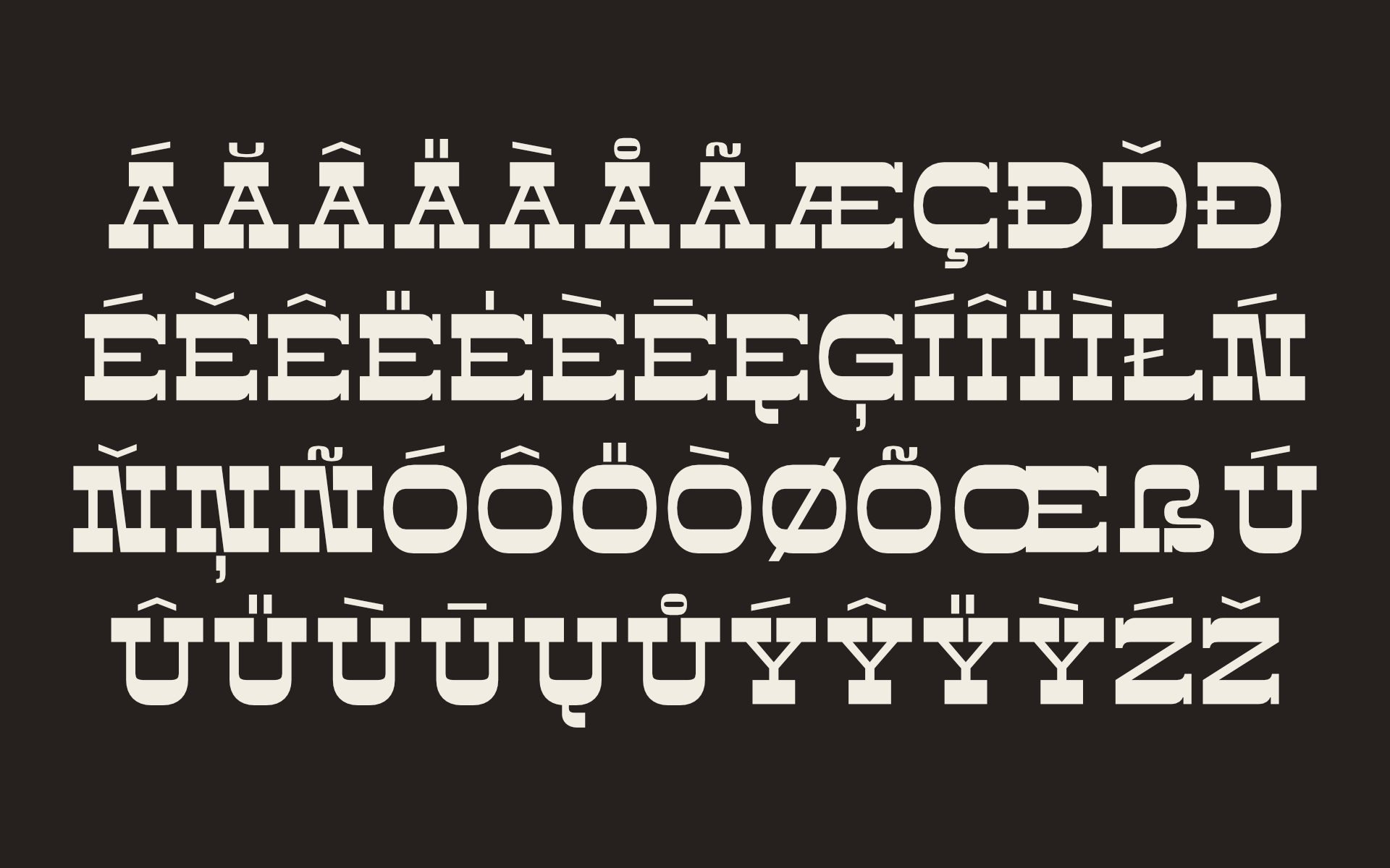
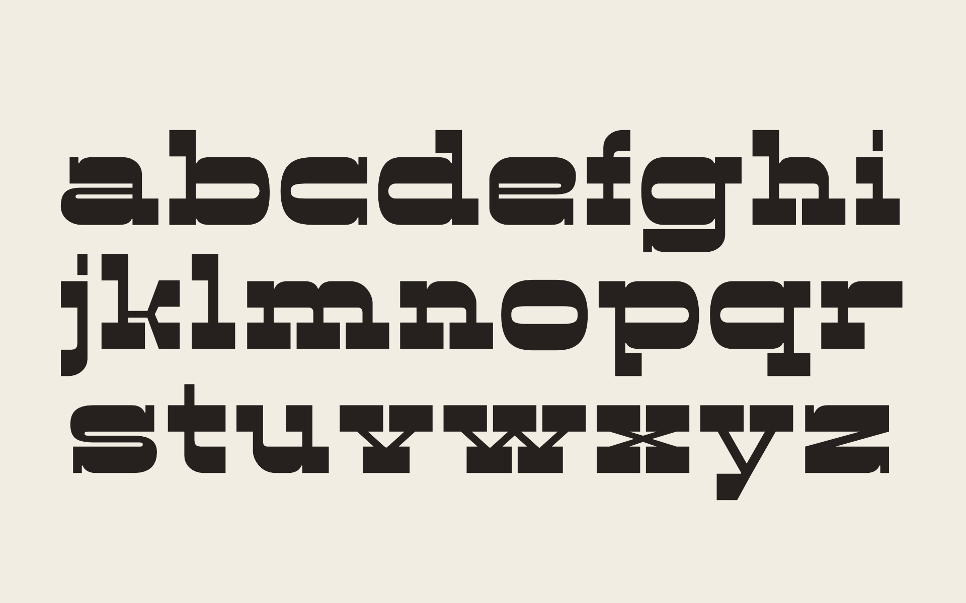
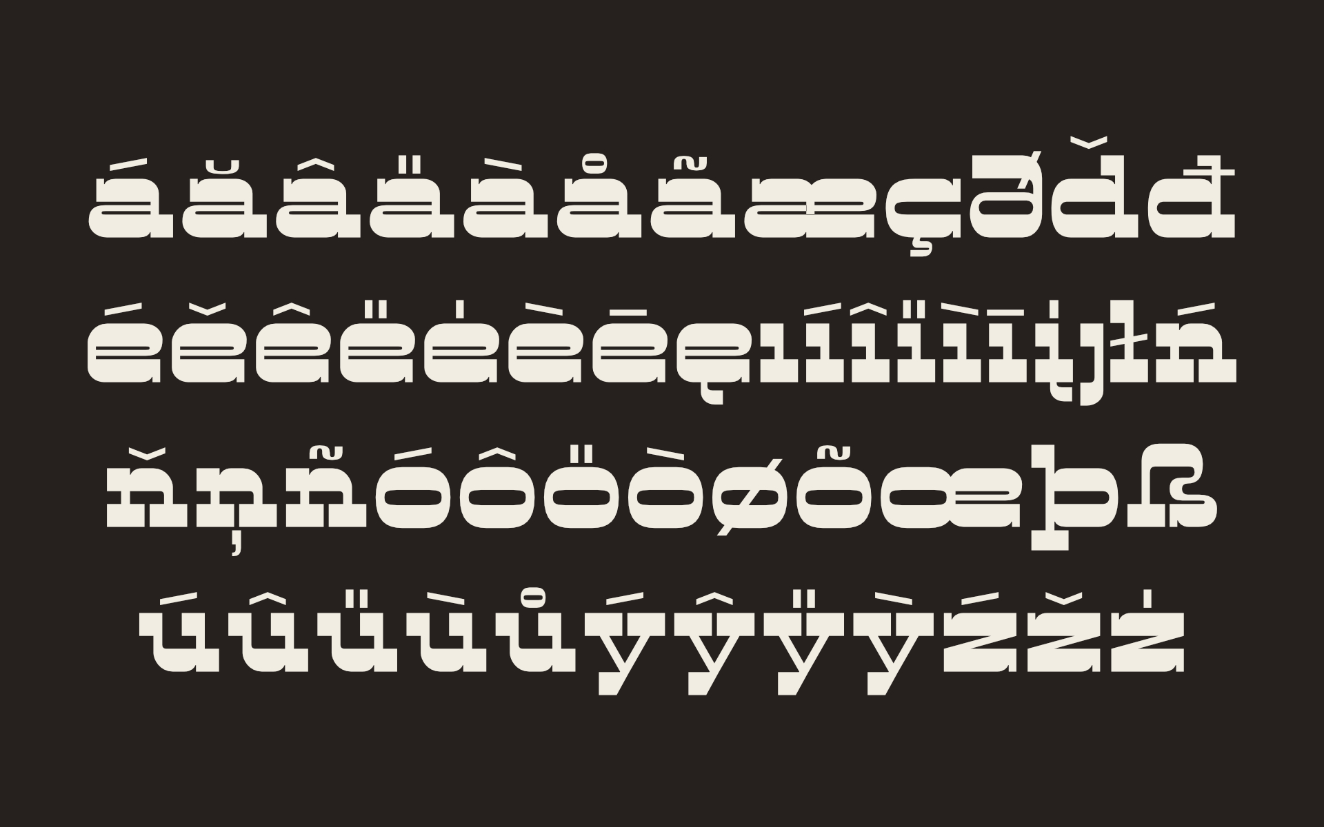
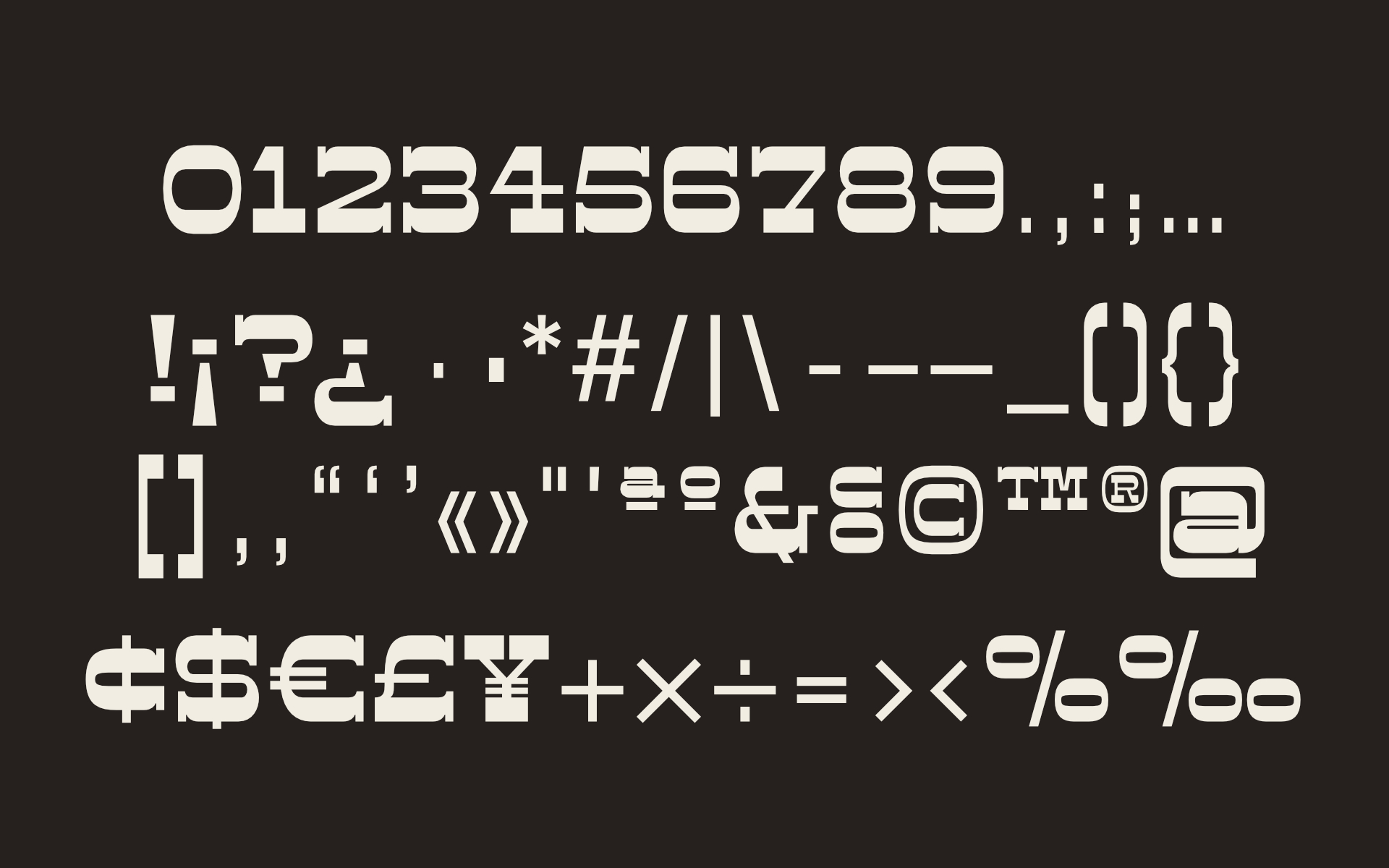
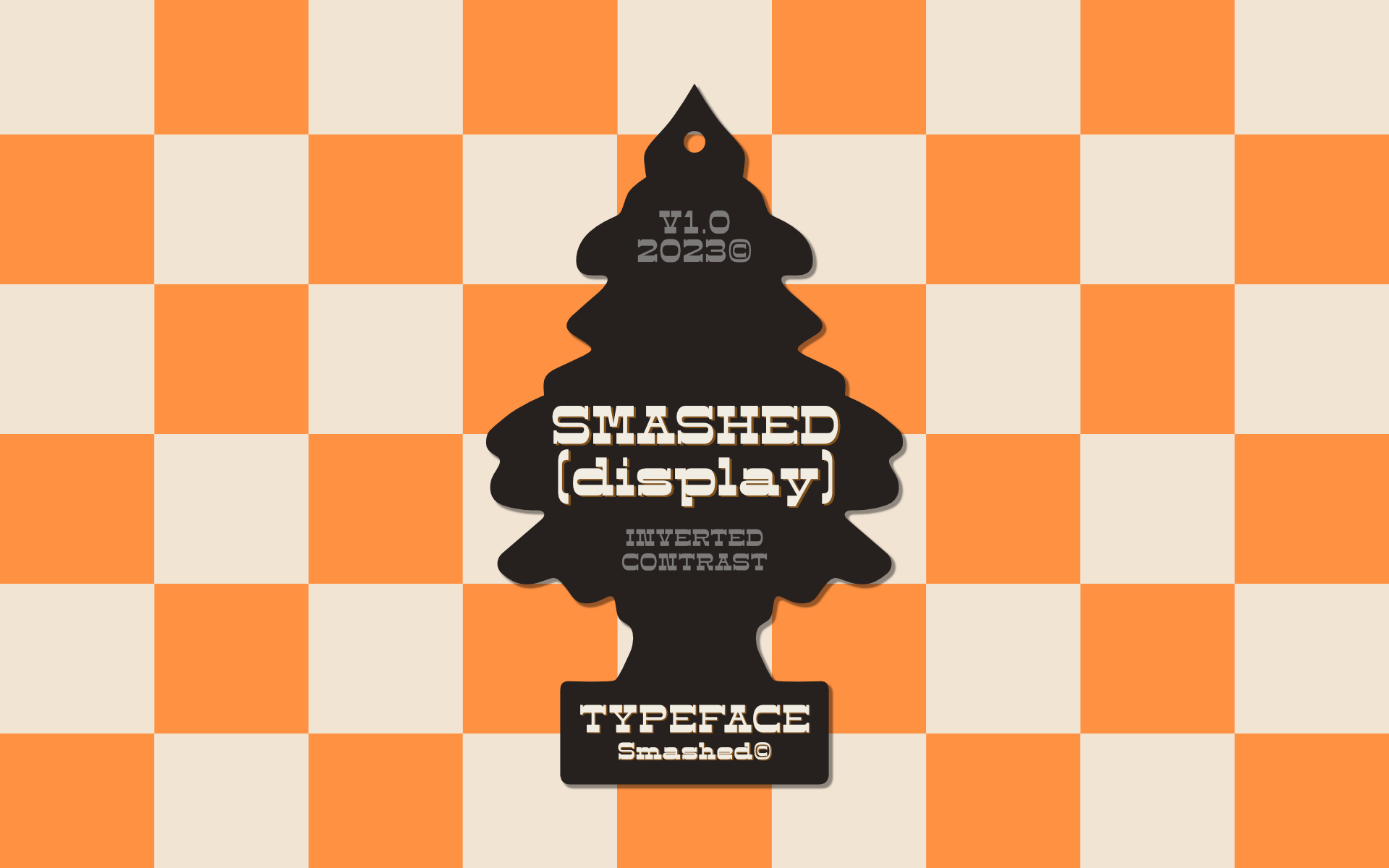
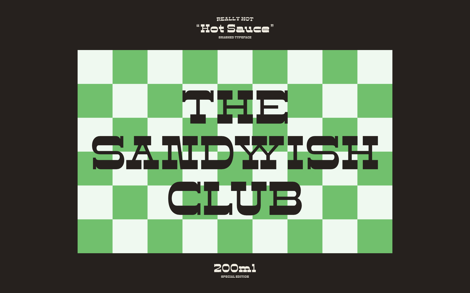
Smashed Typeface is a reversed-contrast, slab serif, display font. Was inspired by the old west days that we can often see in printing, circus posters and wanted notices in western movies, even tho the style was really used in many parts of the world during that period. This style is sometimes called as “circus letter” too. Was designed to have a modern look, using straighter lines and an extended style, can be used on various situations like posters, logos for restaurants, alternative business like an old washing station (as you can see on the next images), music bands etc. I believe that is a promising typography that can be used by various designers in a lot of diverse project.
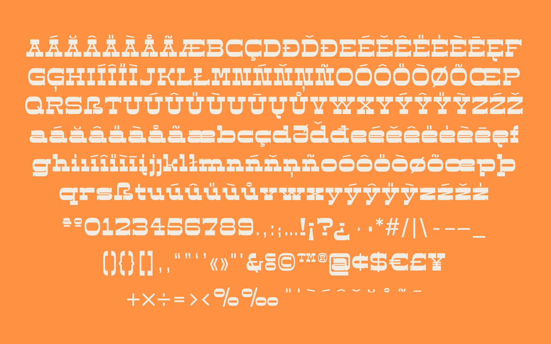
It counts with 226 multi language characters, one weight on version 1.0, on a next version I hope to take this project to another level, creating a variable typeface from condensed to really extended weights. It would complete this typography and eliminate the limits of use.
Was created as a side project, available to buy soon on the usual platforms, creative market, MyFonts etc. Through this process, I learned a lot about the method of creating a font, Its like building lego we have to think about every detail and in the end everything comes together. With this project was able to merge my love about the history of typefaces and graphic design. I really enjoyed to see the final result with all the characters together and create some examples of application, really gives my vision of the variety design projects that can be applied.
CREDIT
- Agency/Creative: Raquel Fernandes
- Article Title: Smashed Typeface Display
- Organisation/Entity: Freelance
- Project Type: Typography
- Project Status: Published
- Agency/Creative Country: Portugal
- Agency/Creative City: Rio Maior
- Market Region: Global
- Project Deliverables: Typography
- Industry: Food/Beverage
- Keywords: typeface, font, typography, old west, trendy, modern font
-
Credits:
Graphic Designer: Raquel Dionísio Fernandes


