


Since the beginning of 2020, GloraX has launched an IT accelerator and has collected a lot of expertise. There was a change of team, a change of attitude to the product, an understanding that it was necessary to move away from the creation of separate projects, to come to standardisation, which presupposes a certain level of quality that customers should receive. Any buyer has to be sure that they are buying a Glorax project that has high quality characteristics. That led to the realization that rebranding was necessary. GloraX wanted to show the market and the consumer that the whole philosophy of the company and the positioning had changed.
The big idea — GloraX is an accelerator of experience, multi-experience, boosting both residents and technologies within its projects. GloraX already has real cases in project acceleration. In four years, they have launched 12 services and applications in innovations area. Multi-experiencing by GloraX is above all an extension of the developer’s role itself, and a new spelling with an accented X was one of the important outcomes of the brand’s redefinition.
The target audience: Young families, Young professionals, Wealthy people (singles and couples), Old people, Investors, Students, Entrepreneurs (mostly from Moscow and other cities) and Freelancers, bloggers, local celebrities
The residents are progressive, aimed at self-fulfillment in conditions that meet the standards of modernity. These are self-sufficient and active individuals. They are accustomed to taking responsibility for themselves, their well-being and their own happiness, to respecting themselves and others, and to making informed and faithful choices.
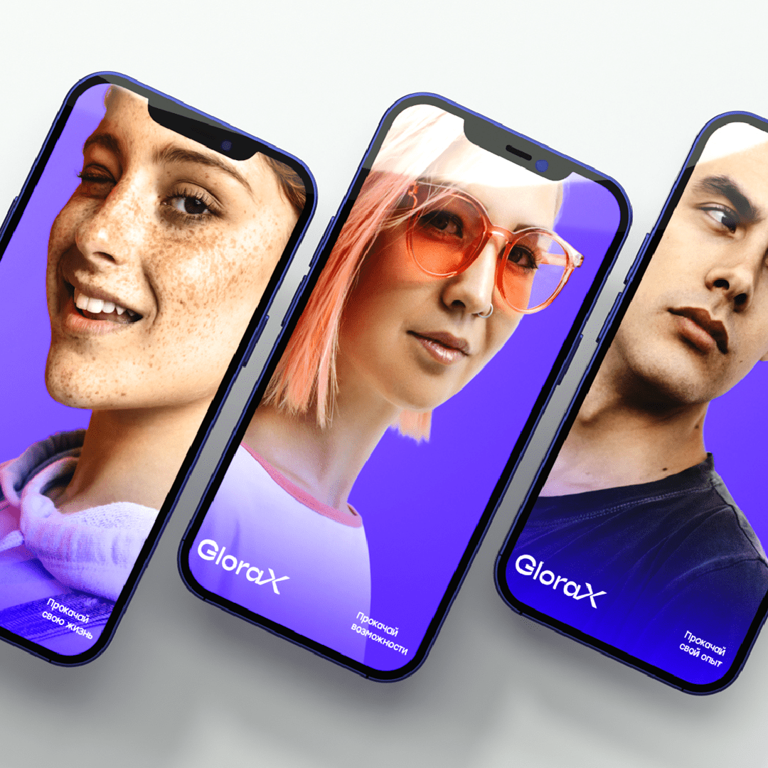
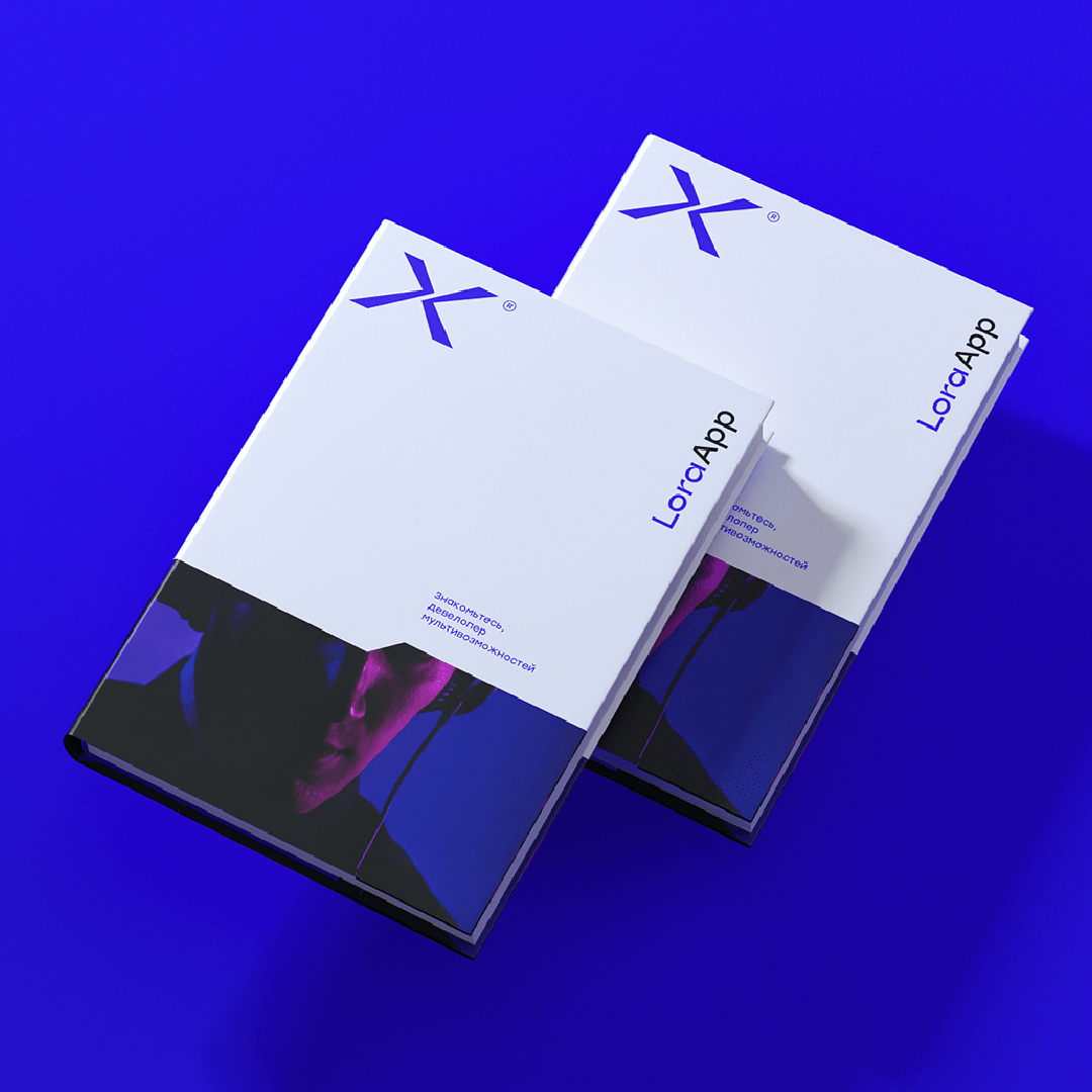
Creating the branding strategy and corporate identity, the aim was to highlight the progressivity and innovativeness. Brand architecture includes 4 branches: City, Air, Aura and Space. All of them are united by a common philosophy GloraX Life, that aims to create and provide the housing community with everything they need for a happy life by means of new smart technologies. GloraX became the first Russian developer to create its own personal digital assistant Lora which “lives” in GloraXApp. Plus, GloraX is developing its own community of bright people of the city by means of GloraX Life.
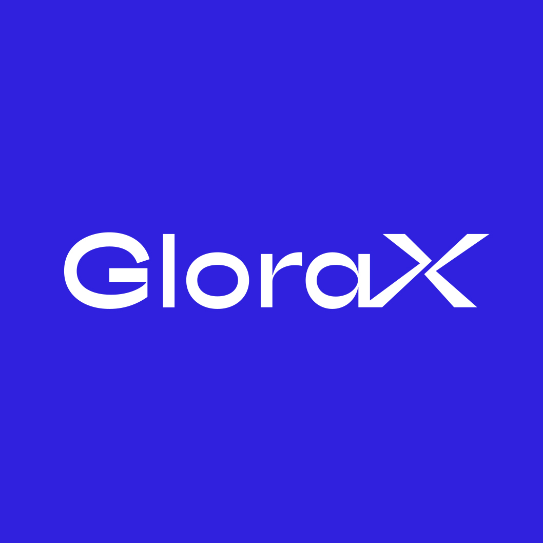
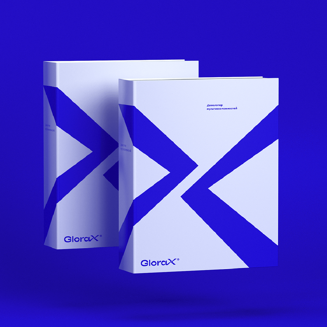
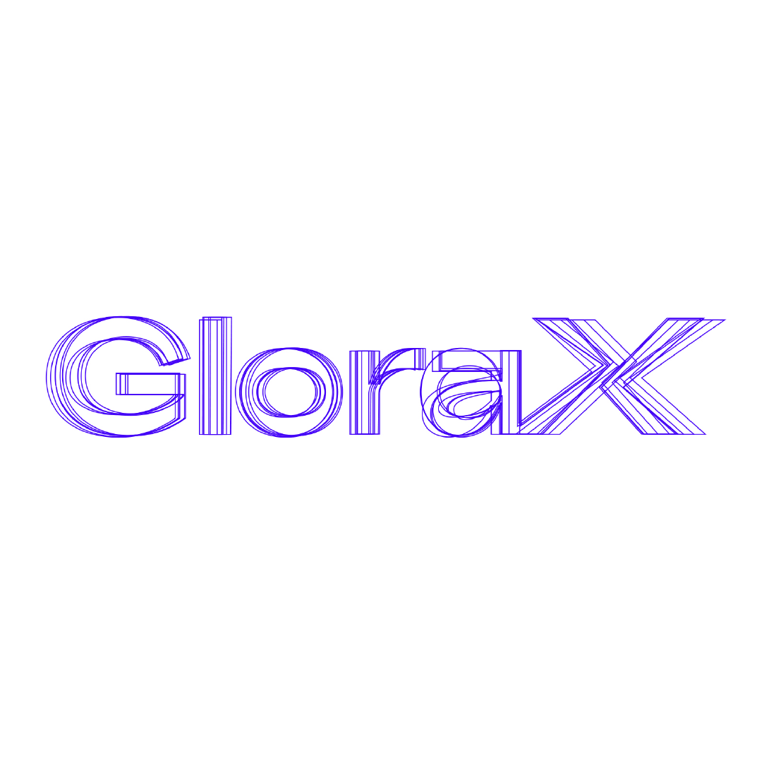
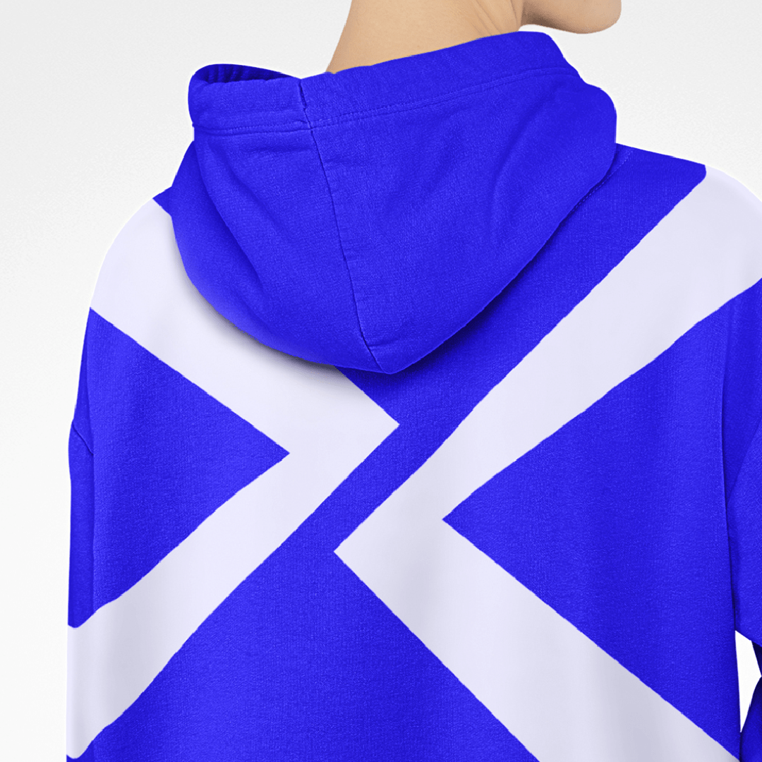
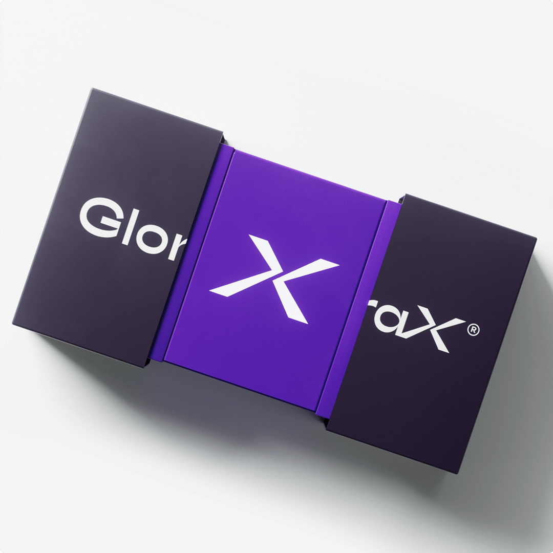
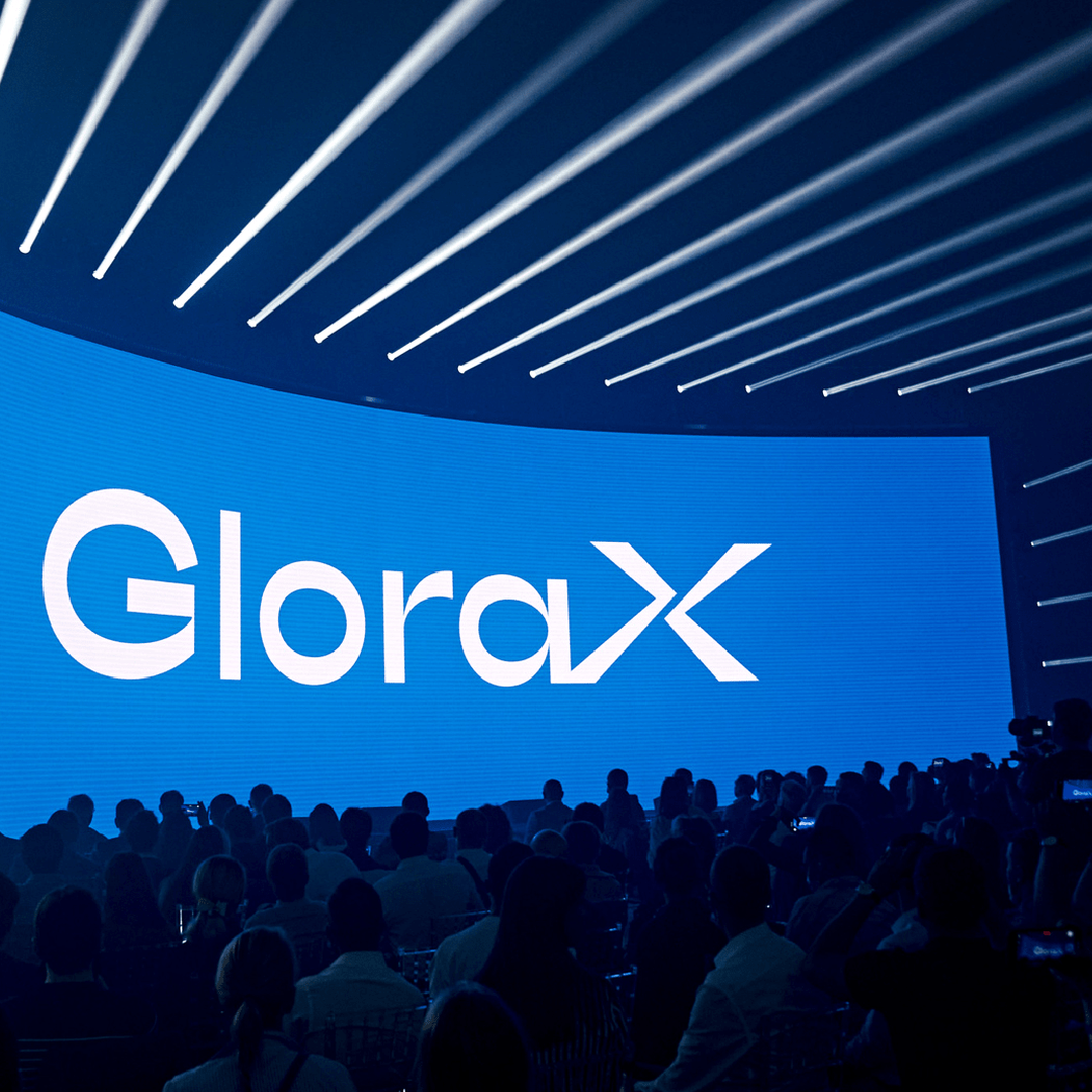
The GloraX logo has acquired an expressive typography and powerful sign “X”. Together, they give the impression that you have a brand that is both about IT, sports and innovation. The new brand and platform are imbued with a history of movement, activity on the edge of extreme. GloraX’s corporate identity turned out to be out of the box, standing out from other developers.

CREDIT
- Agency/Creative: SmartHeart
- Article Title: SmartHeart Rebranding of GloraX
- Organisation/Entity: Agency
- Project Type: Identity
- Project Status: Published
- Agency/Creative Country: Russia
- Agency/Creative City: Moscow
- Market Region: Europe
- Project Deliverables: Brand Architecture, Brand Creation, Brand Guidelines, Brand Identity, Brand Redesign, Brand Strategy, Brand Tone of Voice, Branding, Design, Identity System
- Industry: Real Estate, Technology
- Keywords: Rebranding, Development, SmartHeart, GloraX, Accelerator
-
Credits:
Creative Director: Stanislav Okrukh
Art Director, Designer: Alexandr Oreshonok
Account Manager: Anna Dokunina
Account Manager: Daria Khalepa
PR, Copywriting: Taisiya Rozhkova


