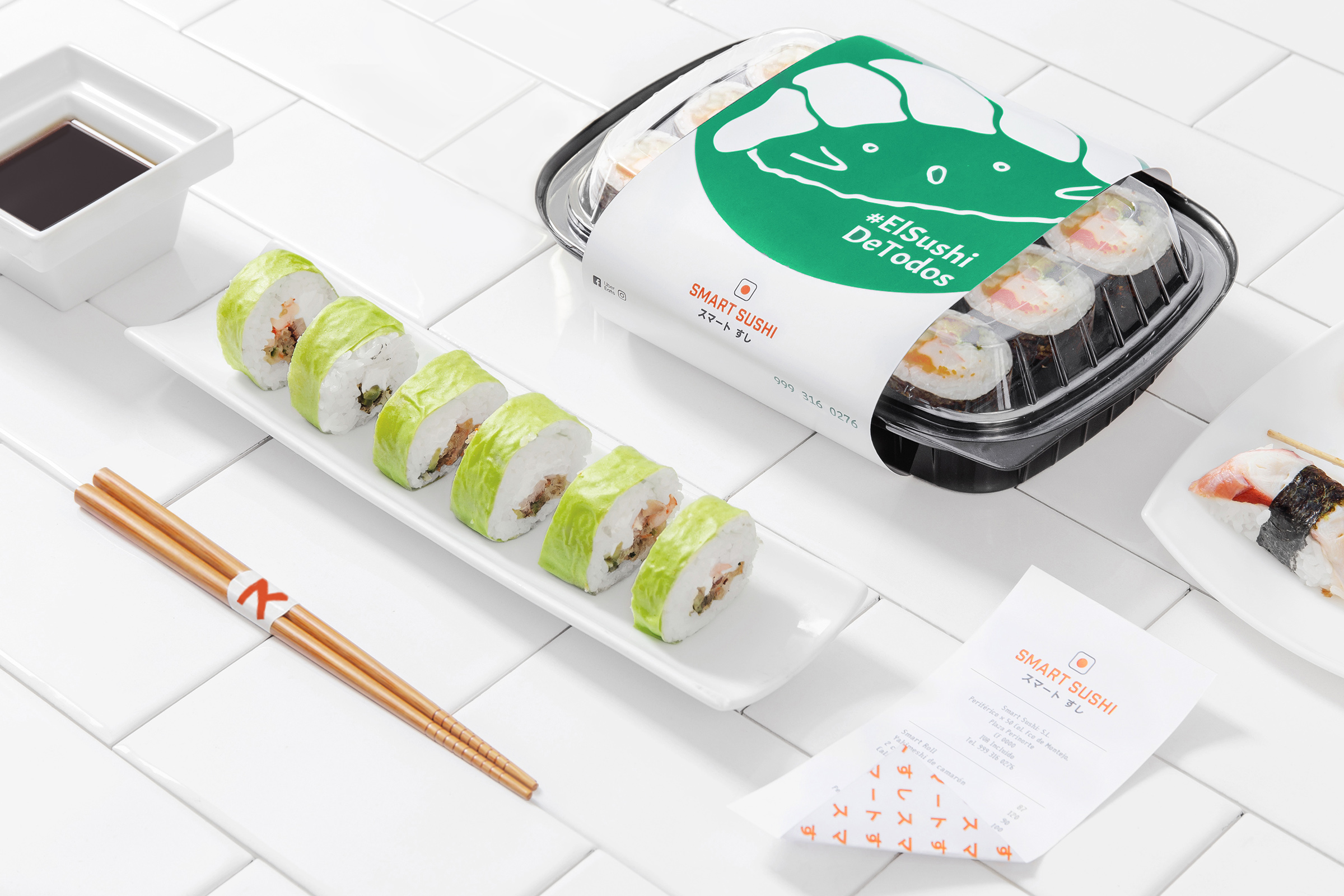
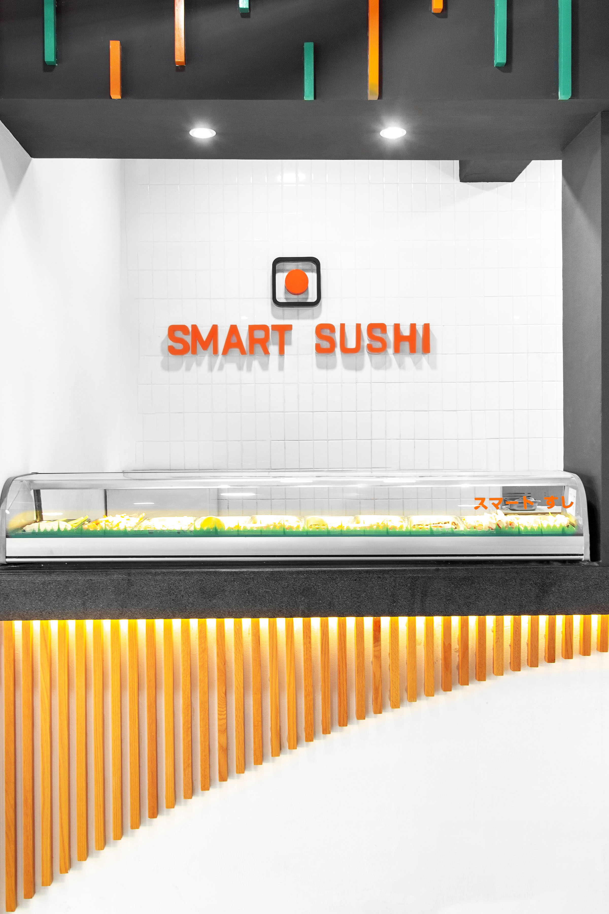
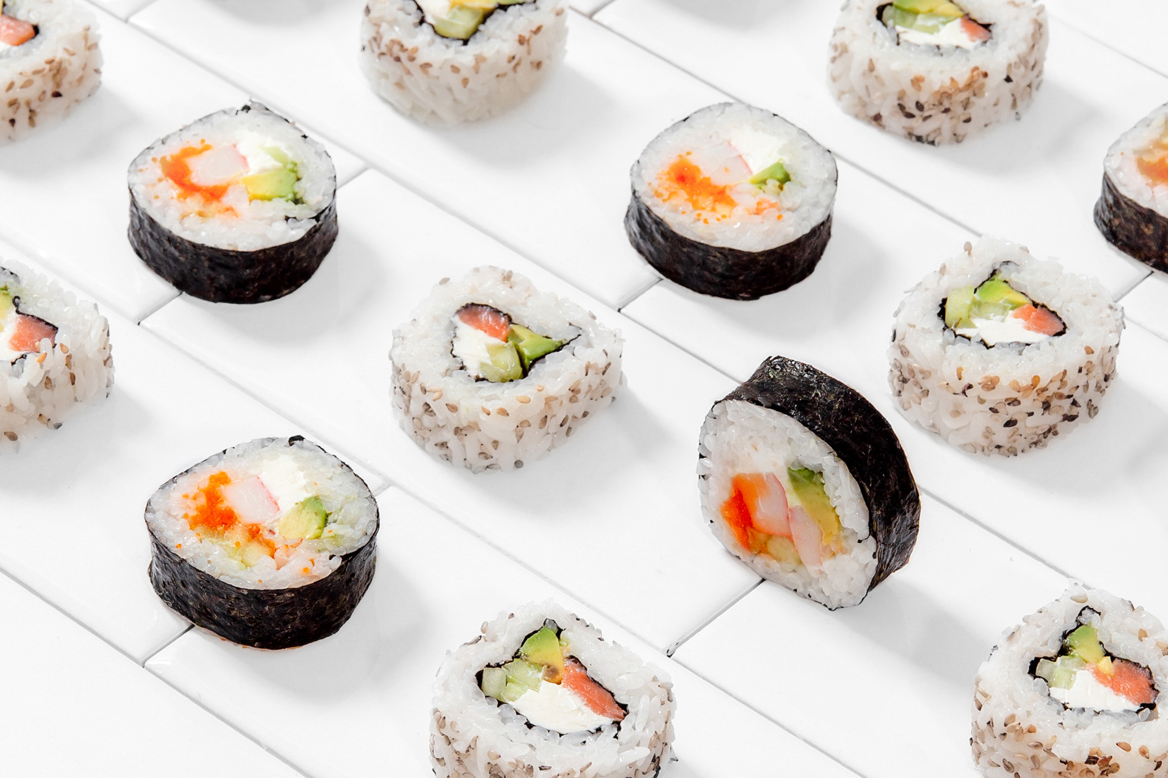
Smart Sushi® is a young Japanese restaurant that stands out for its modern style, friendly character, and versatile dishes.
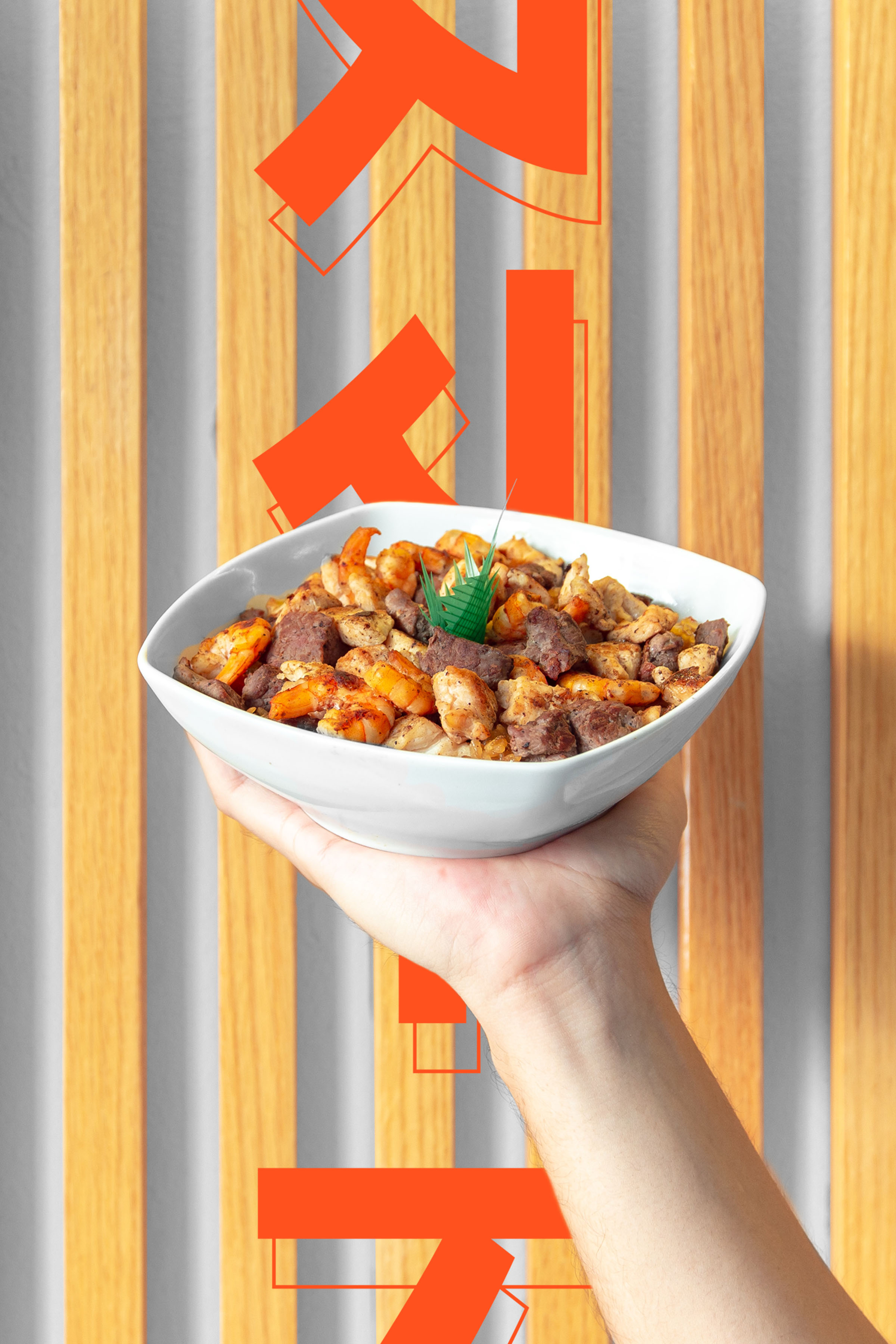
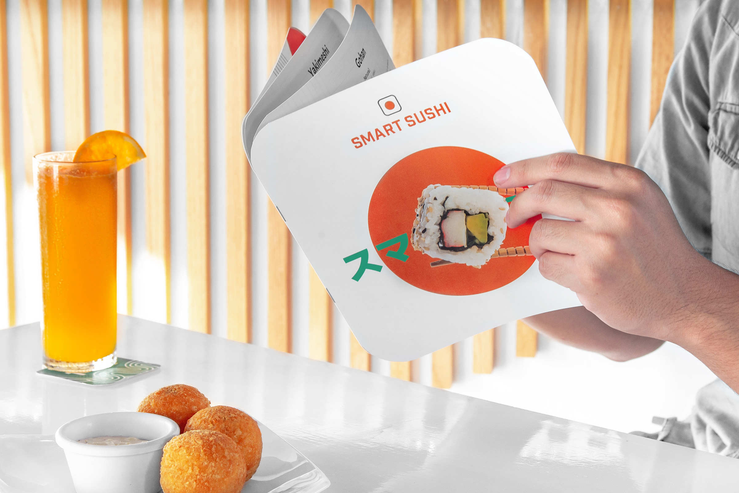
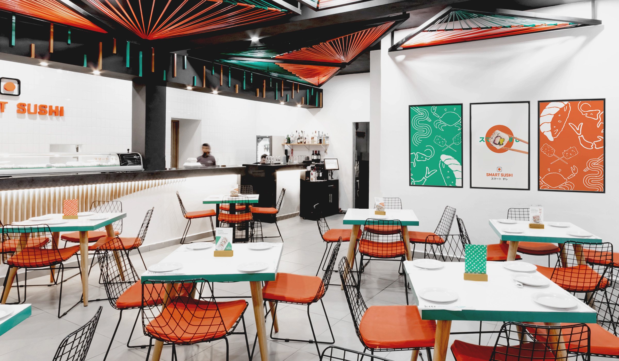
The minimalism of the Japanese aesthetic and the vitality of the Mexican style coexist in a clean, vibrant and accessible identity that complements the atmosphere of the place: an environment inspired by oriental culture with a Mexican twist.
The rebranding of Smart Sushi® responds to the need for intelligent, trendy and modern design.
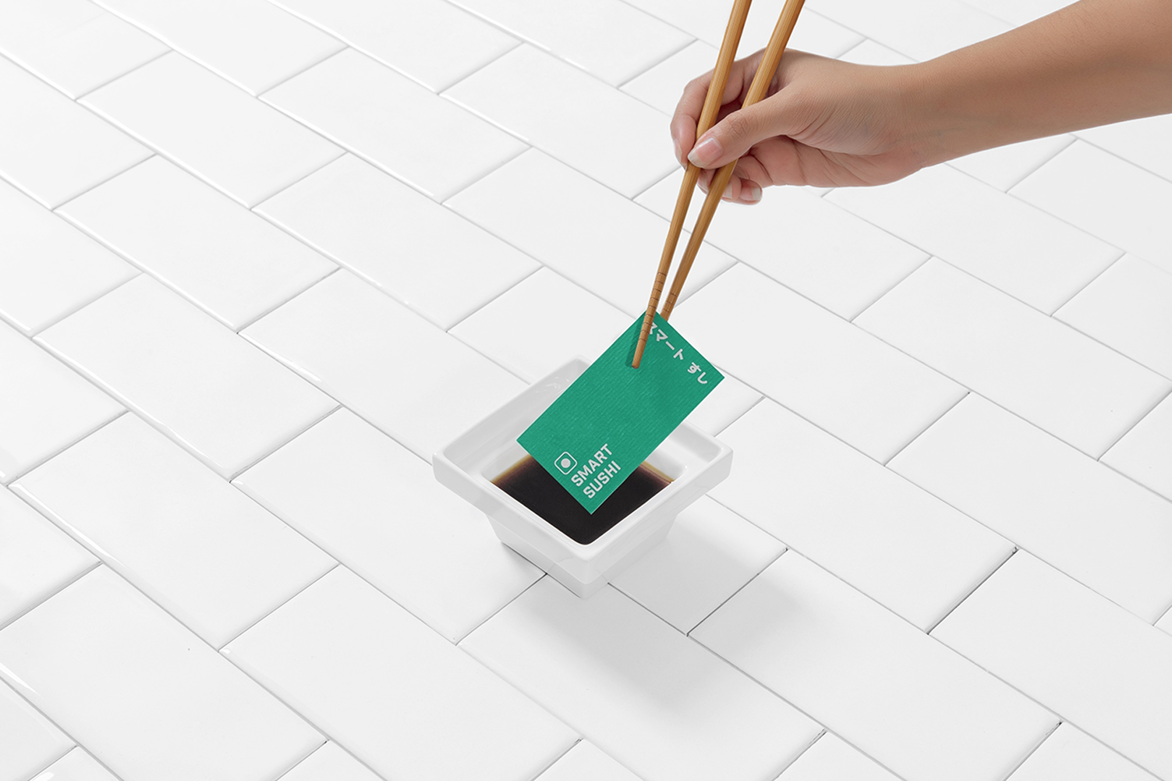
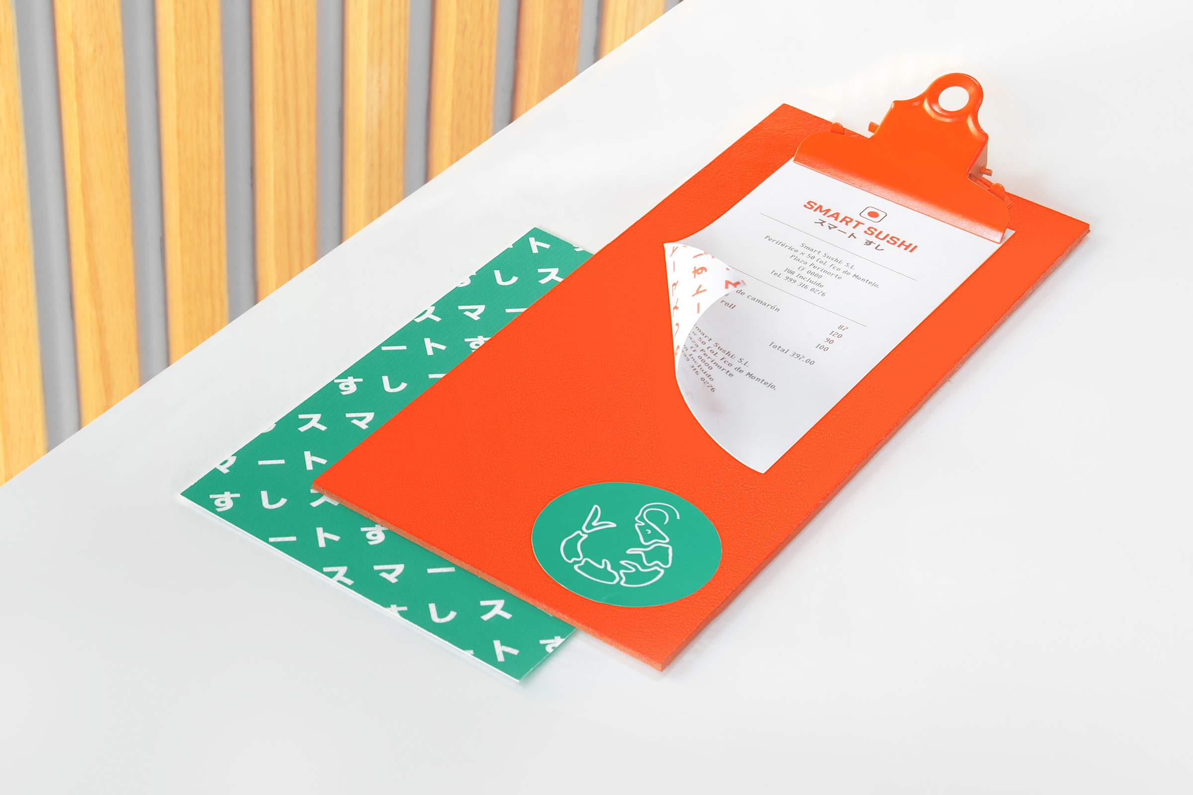
The wide variety of rolls on the menu was part of the inspiration for the new logo. The isotype is an abstraction of two important elements of Japanese culture: its flag and sushi. The simplicity and color of the logo refer to the rising sun and a salmon maki roll.
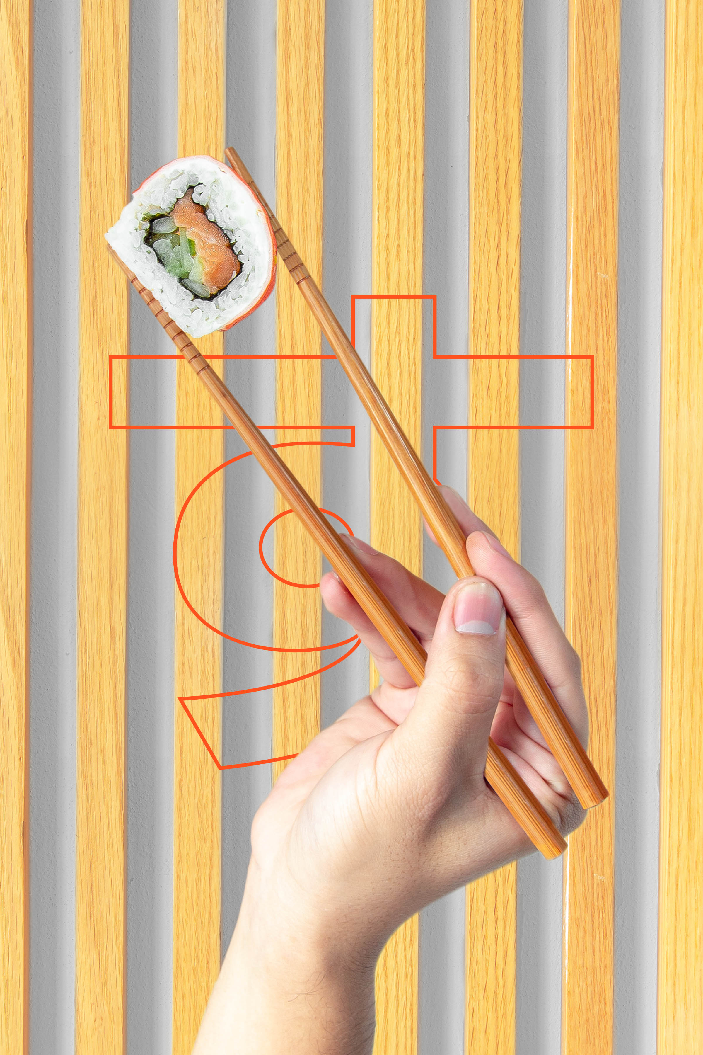
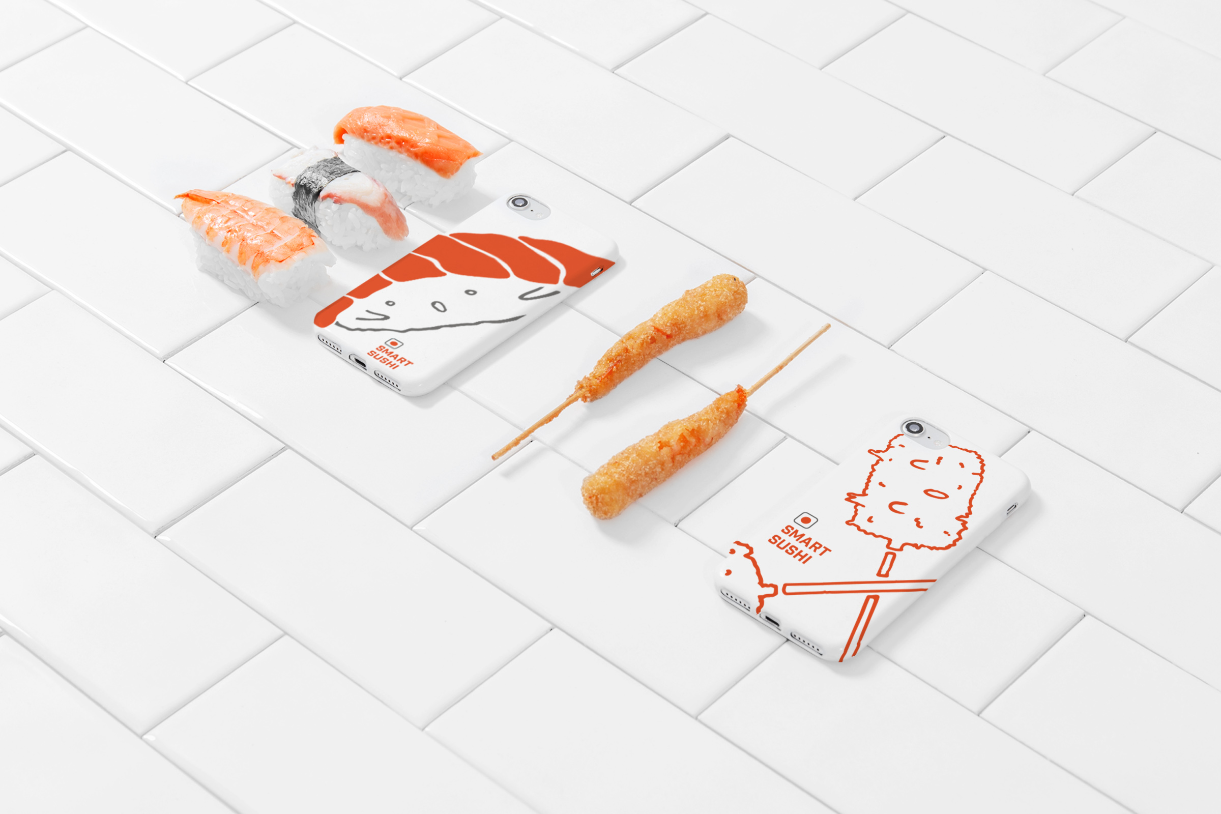
As complementary graphics, we created illustrations of popular ingredients and dishes of oriental cuisine, with strokes that allude to the calligraphic brush, representative of Japanese culture, in addition to adding a youthful touch inspired by the Kawaii style.



CREDIT
- Agency/Creative: Mantra
- Article Title: Smart Sushi Rebranding by Mantra
- Organisation/Entity: Agency, Published Commercial Design
- Project Type: Identity
- Agency/Creative Country: Mexico
- Market Region: North America
- Project Deliverables: Brand Advertising, Brand Architecture, Brand Guidelines, Brand Identity, Brand Strategy, Brand World, Graphic Design, Identity System, Illustration, Photography, Rebranding, Tone of Voice
- Industry: Food/Beverage
- Keywords: Rebranding, Branding, Brand. Restaurant, Sushi, Japanese, Japan, Mexican, Mexico, Kawaii, Mantra


