


Nolano Packaging Design Case Study
Project Overview
Nolano, a premium Italian tomato brand, partnered with us to reimagine its product packaging, aiming to unify its brand across two key lines: a traditional range rooted in heritage, and an organic offering appealing to today’s health-conscious consumer. The goal was not just visual refreshment, but to create a system that communicates authenticity, origin, and quality at first glance—on shelves crowded with competitors.
Challenge
The challenge was twofold:
Create a strong, cohesive visual identity that could adapt to multiple products and lines.
Establish clear visual separation between the traditional and organic ranges—each with its own consumer base—while keeping the overarching Nolano identity intact.
Design Approach
Our strategy was grounded in minimalism. We aimed to strip away any visual noise and let form, color, and small, thoughtful details speak volumes. This meant relying on a reduced palette, selective typography, and restrained illustration—yet all executed with precision and intention.
Visual Language & Color
The final solution leaned heavily on color to create distinction:
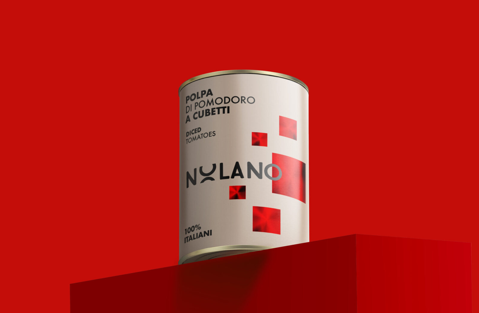
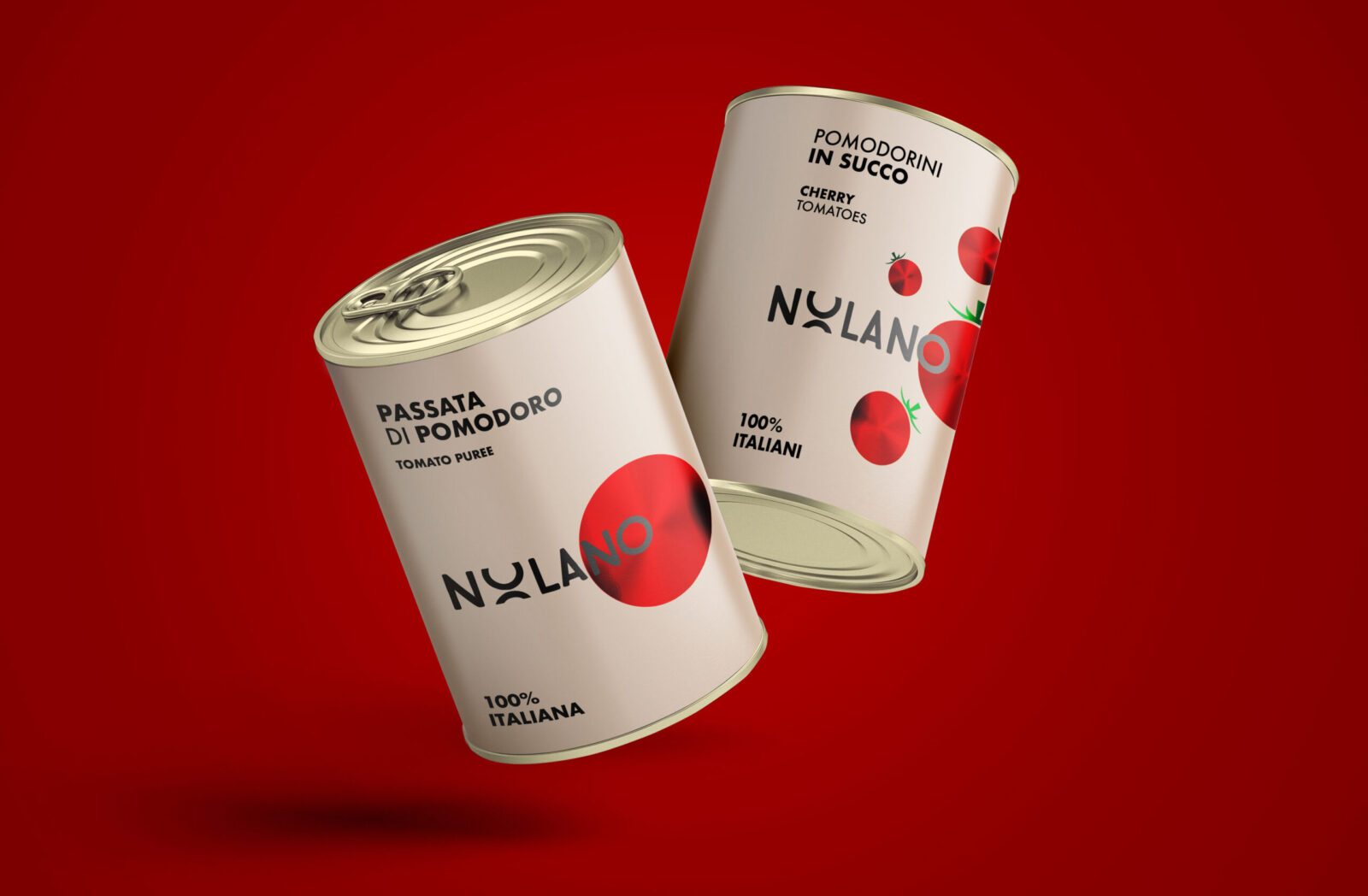
Traditional Range
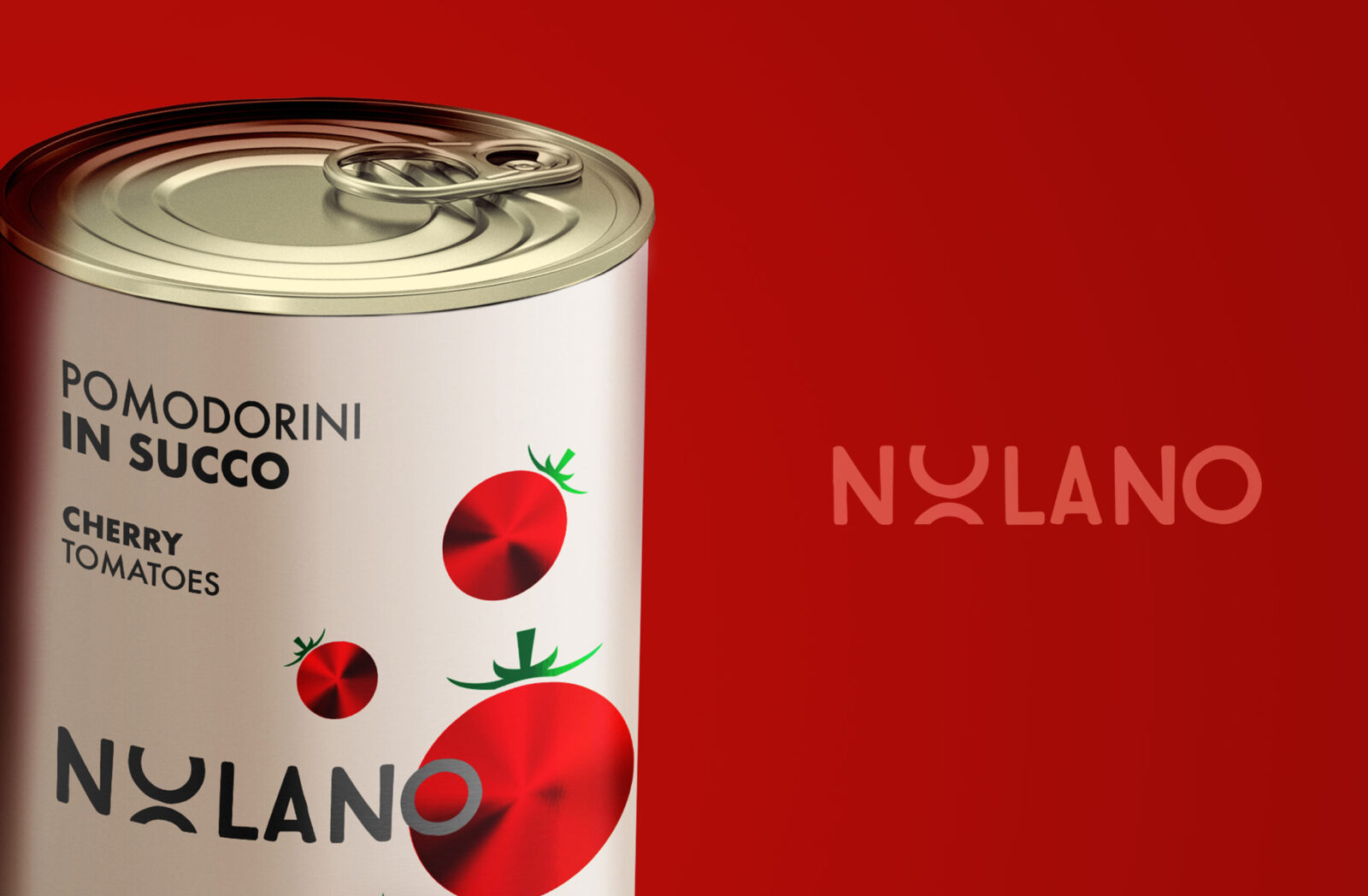
A soft beige background creates an elegant, timeless tone. Accents of deep red—rendered as geometric, diced motifs—connect directly to the product type (in this case, diced tomatoes). This subtle graphic choice balances abstraction and recognizability. The high-contrast typography gives the product clarity and shelf presence, while the refined palette evokes craftsmanship and history. Gold foil detailing around the rim and in the Nolano logotype adds a quiet but unmistakable sense of luxury.
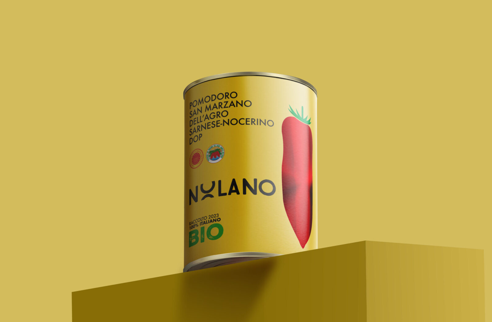
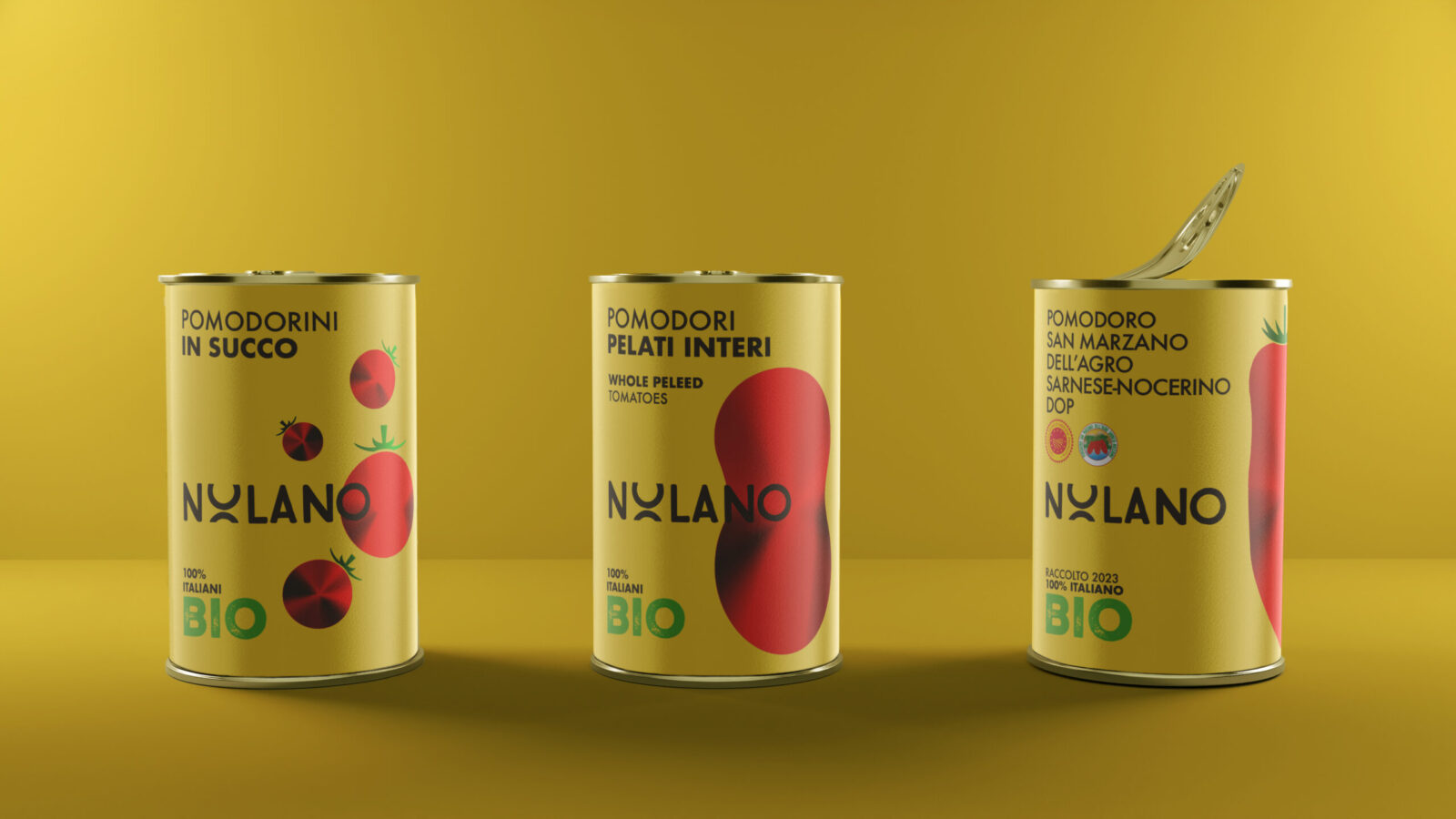
Organic Range
A bold shift to sunny yellow immediately sets the organic line apart. This tone was chosen not only for its warmth and optimism, but also to symbolize freshness and ecological commitment. A hand-illustrated San Marzano tomato sits prominently, rendered in a clean, modern style with foil-enhanced shading. The typography remains consistent with the traditional range to ensure brand continuity, while green “BIO” markings clearly communicate the product’s organic status.
Typography & Branding
The Nolano logotype was custom-modified to include soft geometric cuts and rhythm, reflecting both the structured nature of traditional branding and the modernity expected in today’s market. It remains central and always black—an anchoring element on every variant.
Supporting typography is set in a clean, sans-serif face, laid out with generous spacing for maximum legibility and a sense of airy refinement.
Illustration & Symbolism
Rather than literal imagery, we employed minimal, stylized illustrations—such as:
Abstract tomato cubes for diced varieties (Traditional Line)
A singular, elegant tomato silhouette for organic produce (Organic Line)
These illustrations use rich red foiling to catch light and attention, enhancing visibility while preserving elegance.
Materials & Finishing
All cans use matte backgrounds contrasted with metallic foil accents, not only adding tactility but also reinforcing Nolano’s dual values of simplicity and quality. The gold foil detailing on the traditional line adds heritage cues, while the organic line’s use of green text and certification stamps brings forward ecological credibility.
Outcome & Impact
The new packaging system has:
Elevated Nolano’s visual identity across all channels.
Improved shelf recognition through distinct color codes and minimal yet expressive graphics.
Created a unified brand family with room to scale for future SKUs.
Received positive early response from retail partners and end consumers alike, with increased engagement on social media and in-store visibility.
Nolano’s new visual identity is more than a packaging solution—it is a storytelling system. It reflects the brand’s values of craftsmanship, authenticity, and innovation. By blending traditional cues with contemporary aesthetics, we’ve helped Nolano find its voice in a saturated market—and ensured it stands out not just through words, but through every detail on the shelf.
CREDIT
- Agency/Creative: SM ADV
- Article Title: SM ADV Unifies Nolano With a Minimal and Strategic Italian Tomato Packaging System
- Organisation/Entity: Agency
- Project Status: Published
- Agency/Creative Country: Italy
- Agency/Creative City: Angri
- Project Deliverables: Packaging Design
- Industry: Food/Beverage
- Keywords: WBDS Agency Design Awards 2025/26 Packaging Design, Nolano, Food, Tomato industry, Creative
-
Credits:
CEO: Sabato Manzo
Graphic Designer: Roberto Savarese
Illustrator: Vincenzo Tortora


