


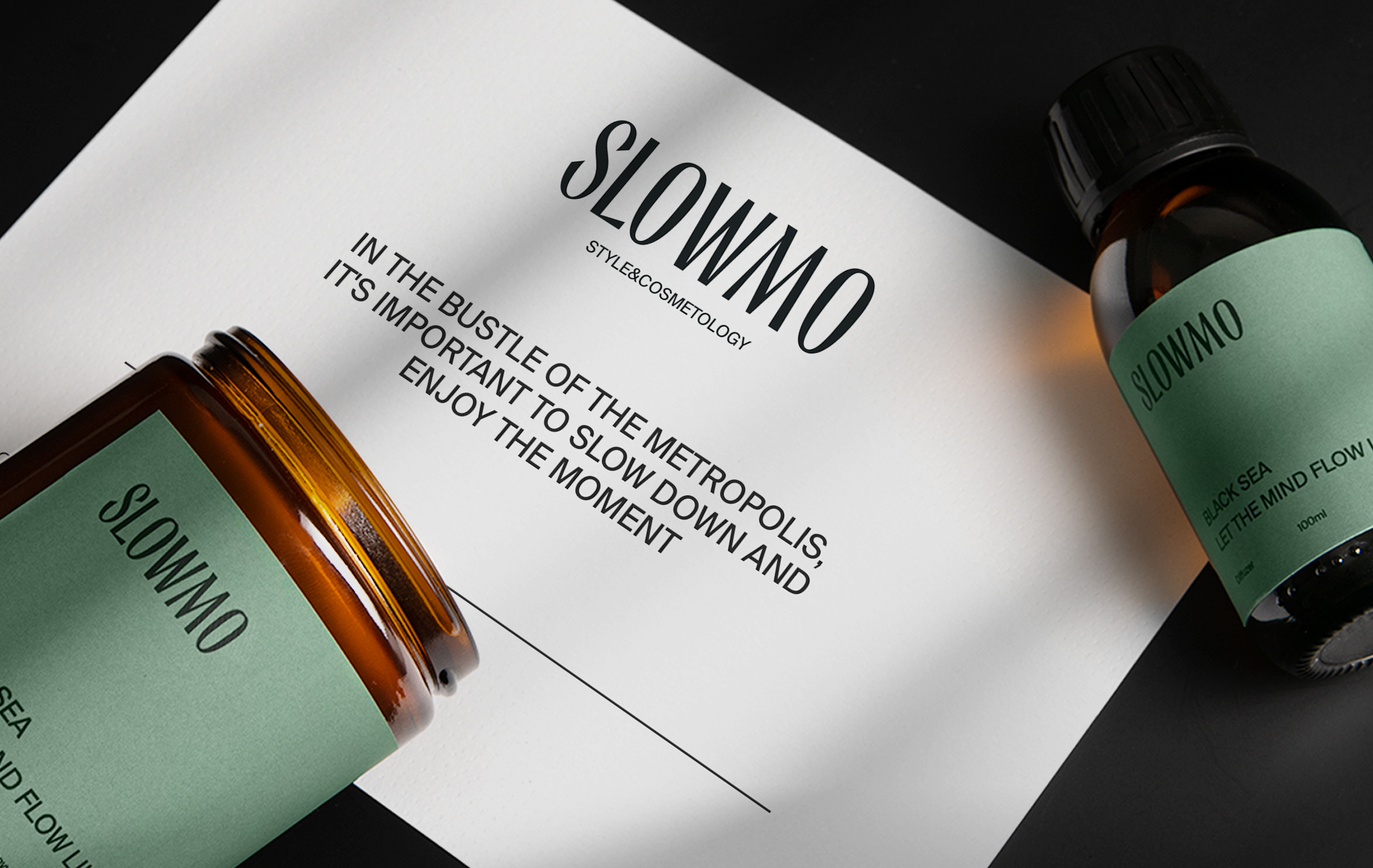
In the hustle and bustle of the metropolis, it is so important to let yourself slow down. A place where you can slow down, relax becomes Slowmo Beauty & Cosmetology is a new unique beauty spaces. We have developed a naming, tagline and visual identity for the brand.
The naming of Slowmo is developed as a part of «Special Atmosphere».
The metaphor of time dilation has two meanings here. In such space, you can forget about the eternal race for a while, escape from deadlines, traffic jams, family affairs and routine — switch to Slowmo mode.
On the other hand, one of the brand’s goals is to slow down the physiological processes associated with age—related changes of skin.
The founder of the beauty spaces network and entrepreneur Olga Tarasova characterizes the company’s activities as the main factor:
“Slowmo’s mission is to influence the biological process of human aging and “support” physiological changes in order to prolong youth, which is possible today thanks to innovative technologies, advanced equipment and discoveries of leading cosmetic laboratories in the beauty industry. We are “breaking” the stereotype that humanity has no power over time in the awareness of the visual factor.”
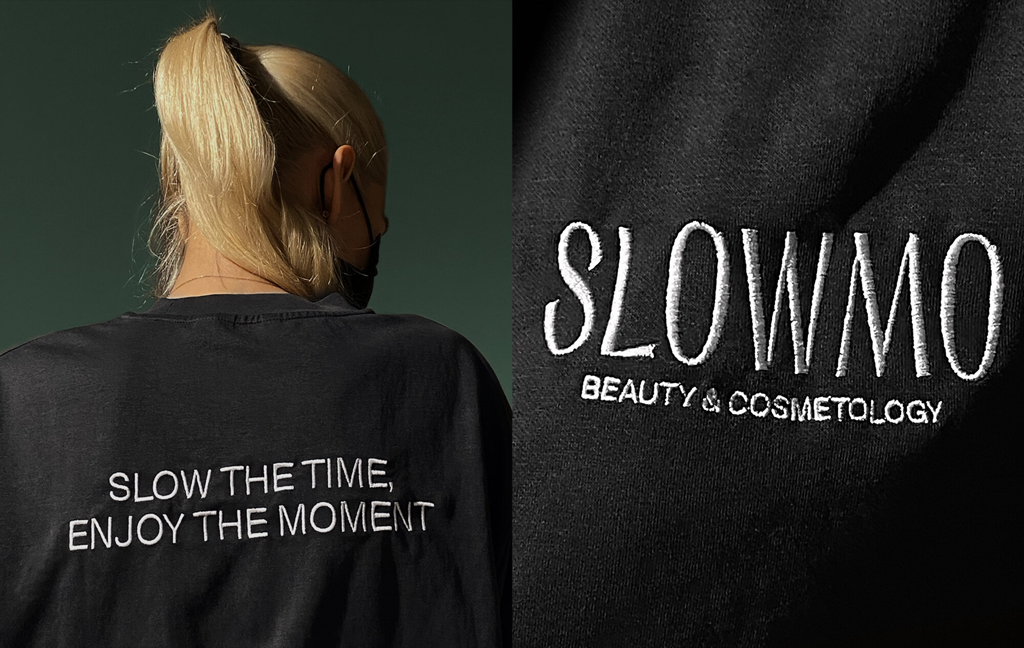
The slogan is «Slow the time». «Enjoy the moment» develops the idea of slowing down, enjoying, when the value of every minute is felt.
Starting the design development, we noticed a feature in the architecture of the flagship showroom — the glass of the showcase has a green tint.
We realized that this color logically describes the concept of Slowmo — it is a deep, natural color; it evokes sensual associations with moss, forest, nature. It’s a kind of meditation inside the city.
In addition, it was important to maintain the codes of premium, conciseness, refinement in the identity. The green shade in combination with the main black color corresponds to these parameters.
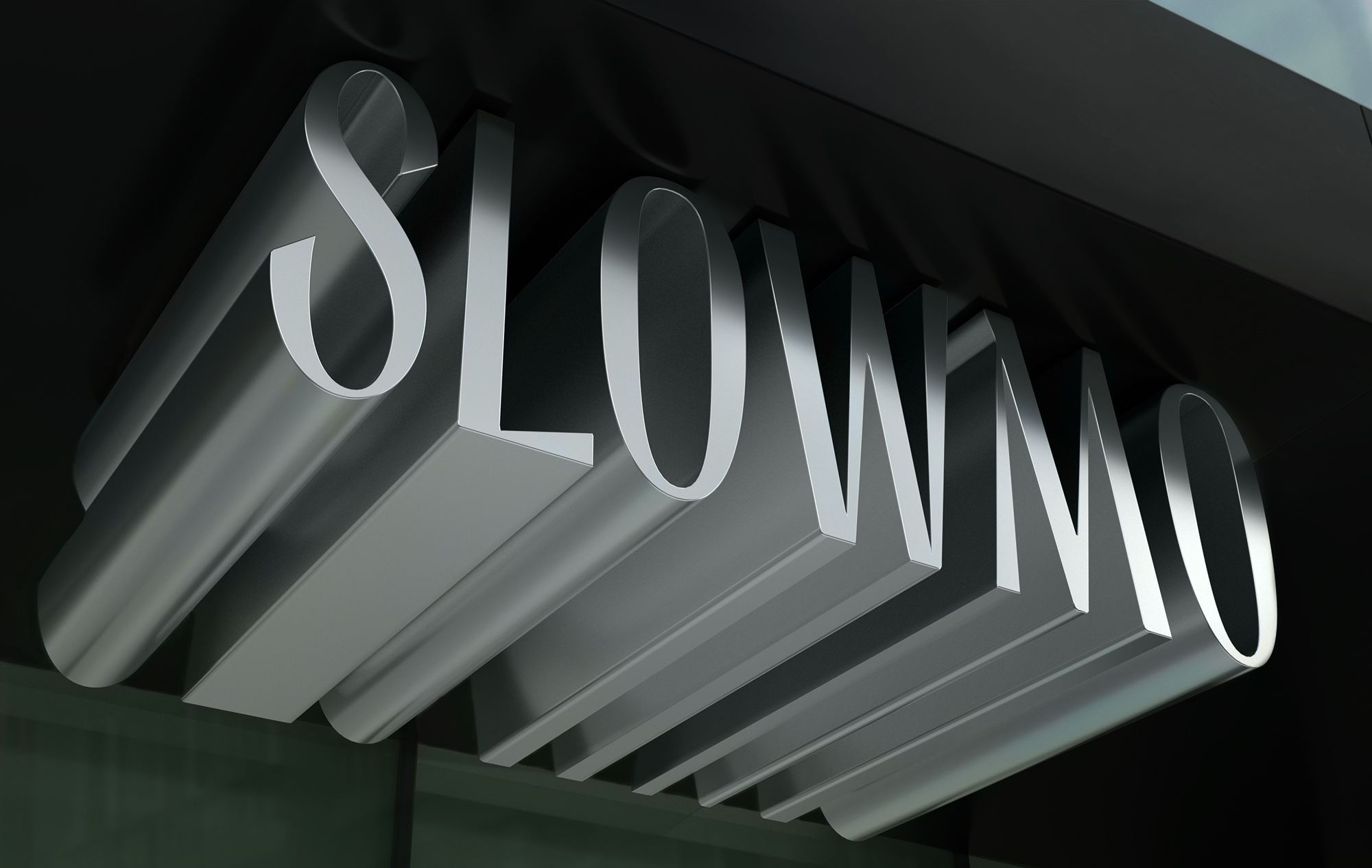
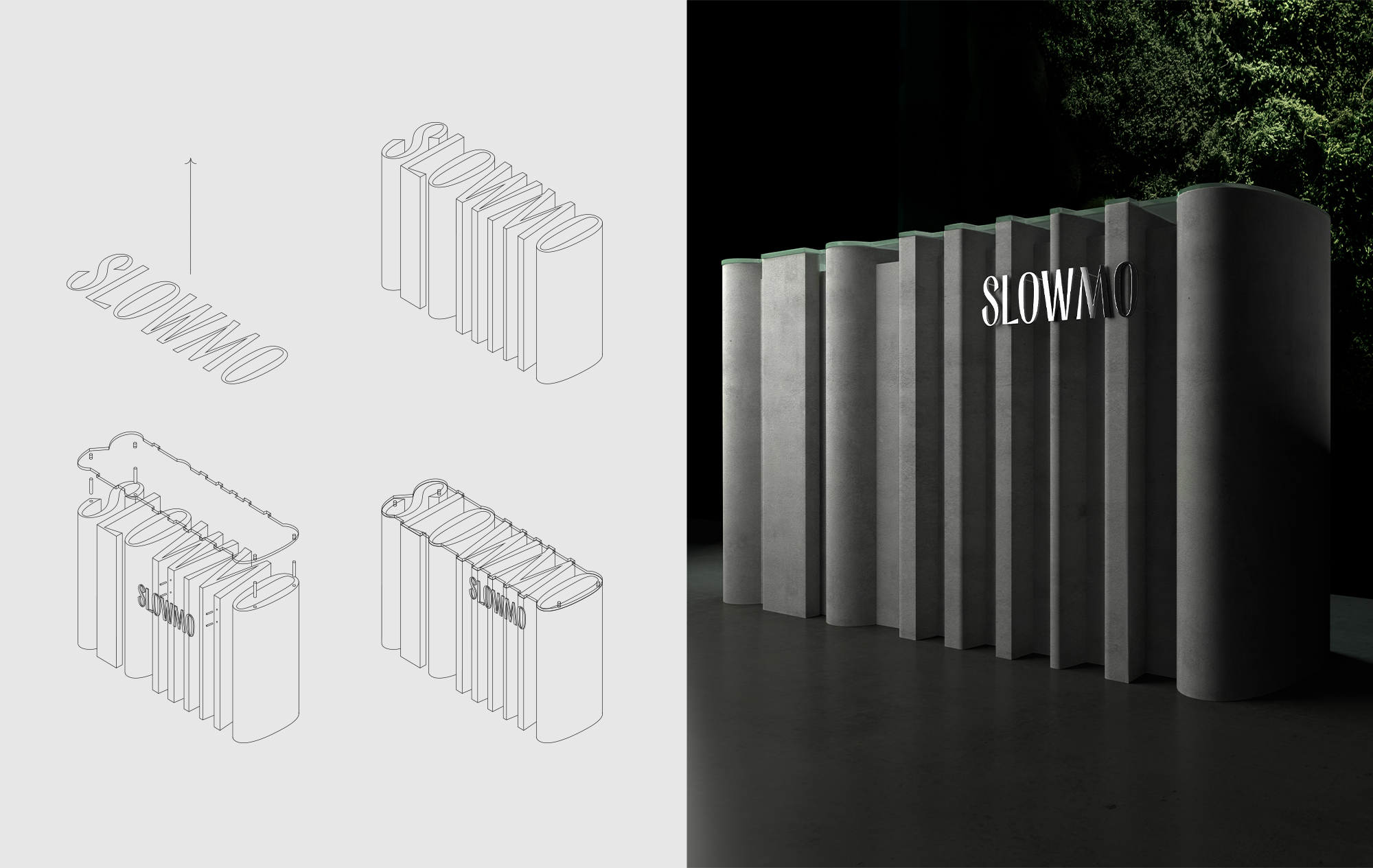
A unique lettering was developed for the Slowmo logo. This is a flexible element — the letters of the font can be transformed, forming new architectural forms.


CREDIT
- Agency/Creative: Depot branding agency
- Article Title: Slowmo Beauty & Cosmetology Brand Design by Depot Branding Agency
- Organisation/Entity: Agency
- Project Type: Identity
- Project Status: Published
- Agency/Creative Country: Russia
- Agency/Creative City: Moscow
- Market Region: Asia, Europe
- Project Deliverables: Brand Identity, Product Naming
- Industry: Health Care
- Keywords: Cosmetics, Pharmacy
-
Credits:
Branding agency: Anastasia Tsirkina — creative Director, Anastasia Tretyakova — managing Creative Director, Raushan Sultanov — creative Director, Alexander Shibaev — designer, Evgenia Struk — creative Director, Anna Kalinicheva — development Director, Irina Zavtoni — commercial Director, Daria Mukhina — PR manager, Elya Poghosyan — trainee, Tatiana Lebedeva — trainee, Alexey Andreev — CEO, Anna Lukanina — CEO, Ksenia Parkhomenko — Executive Director, Daria Vedernikova — Director of Communications and PR.


