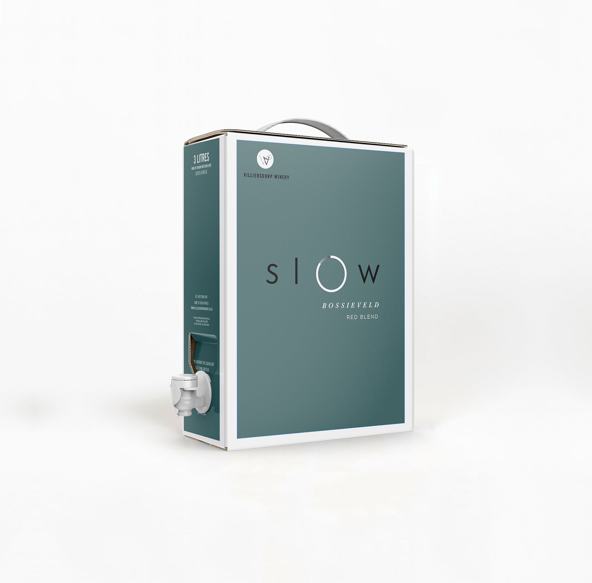
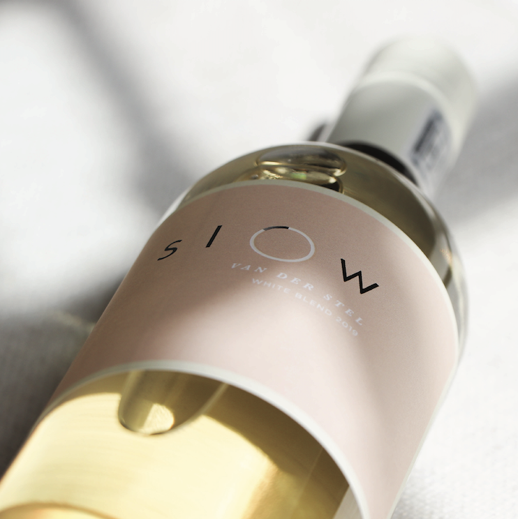
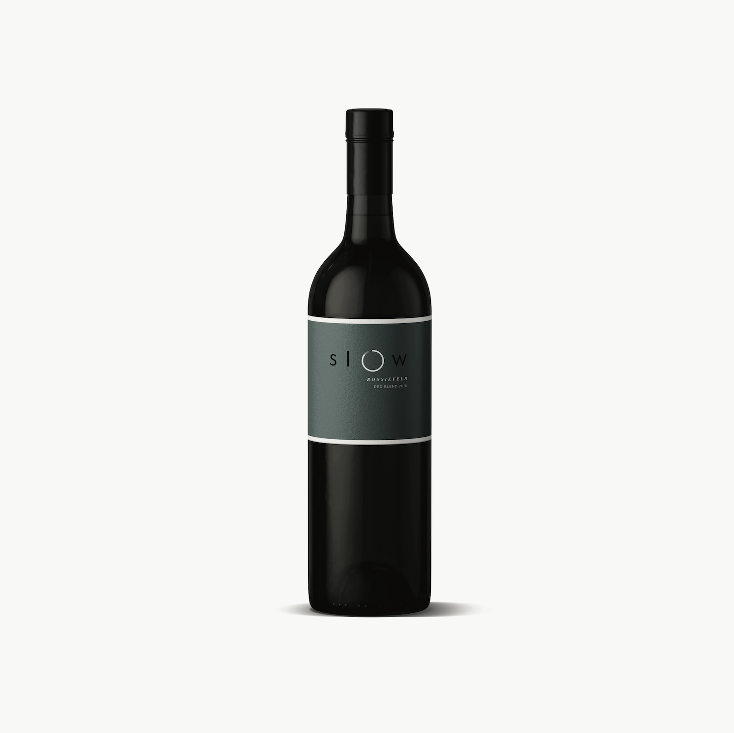
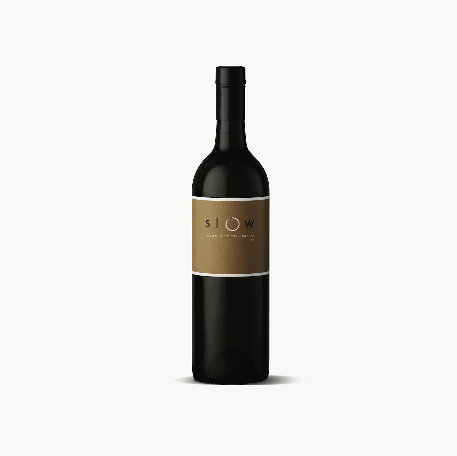
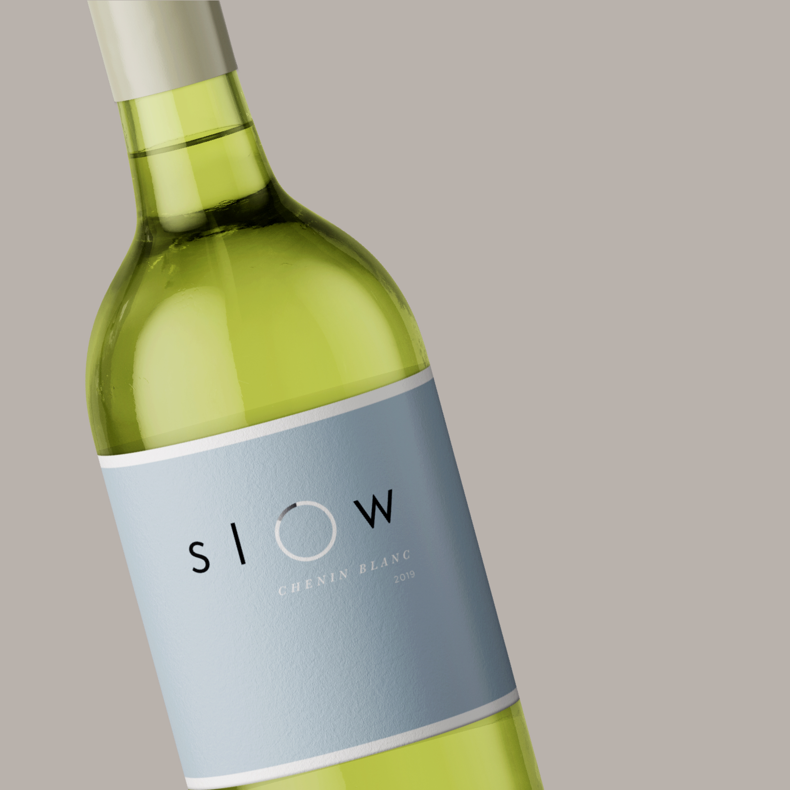
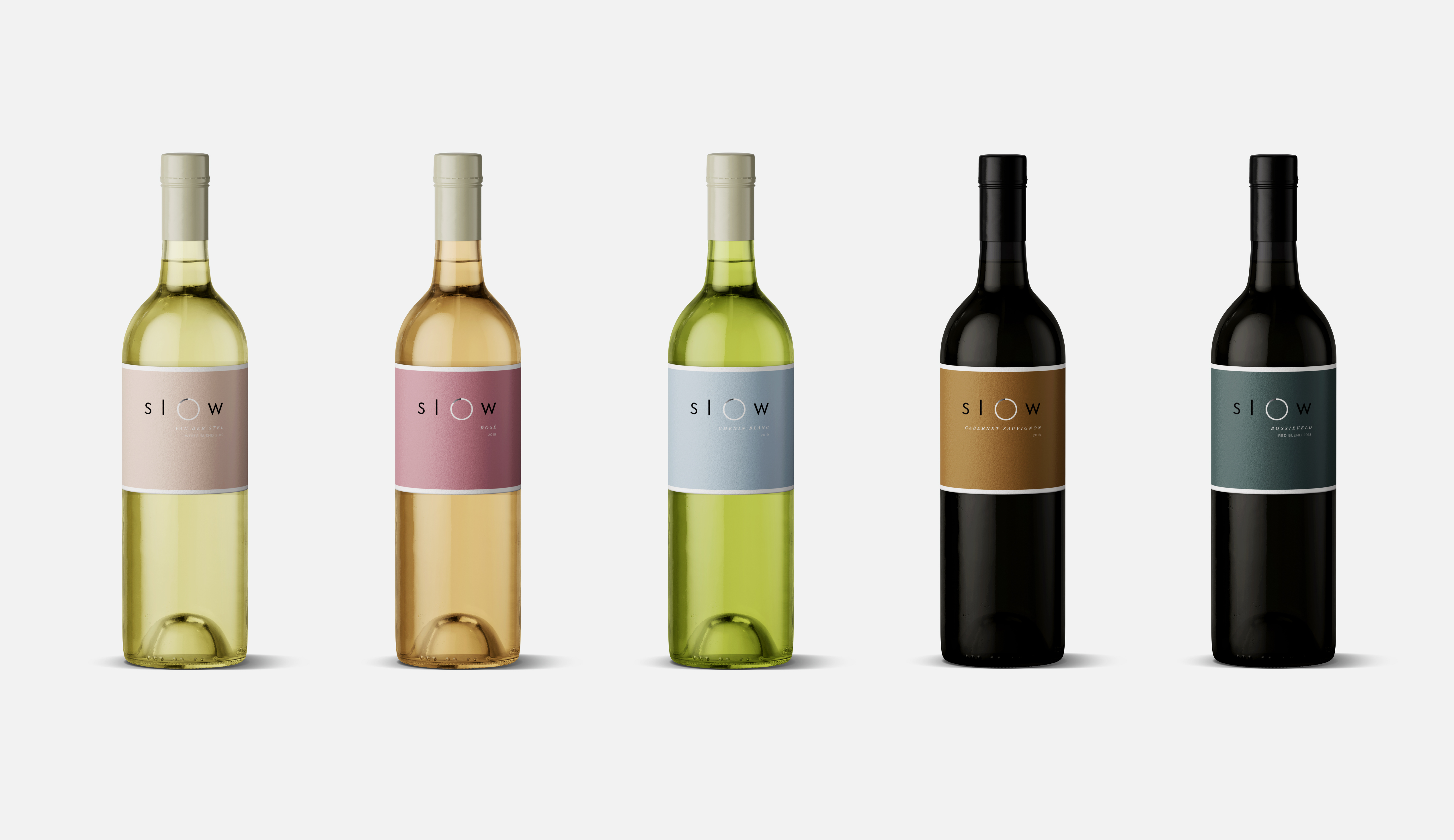
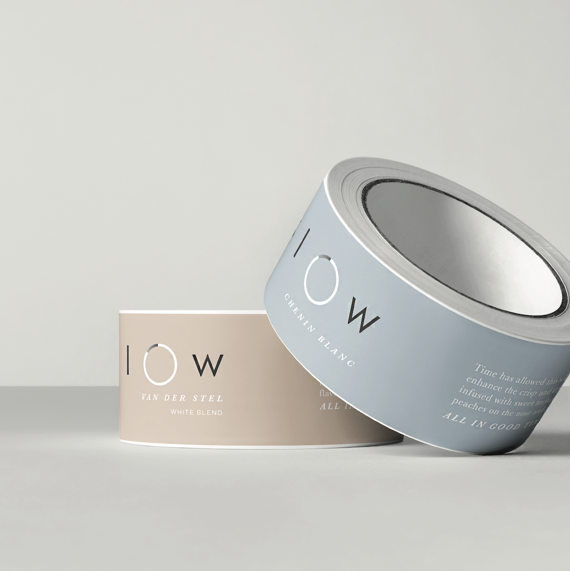
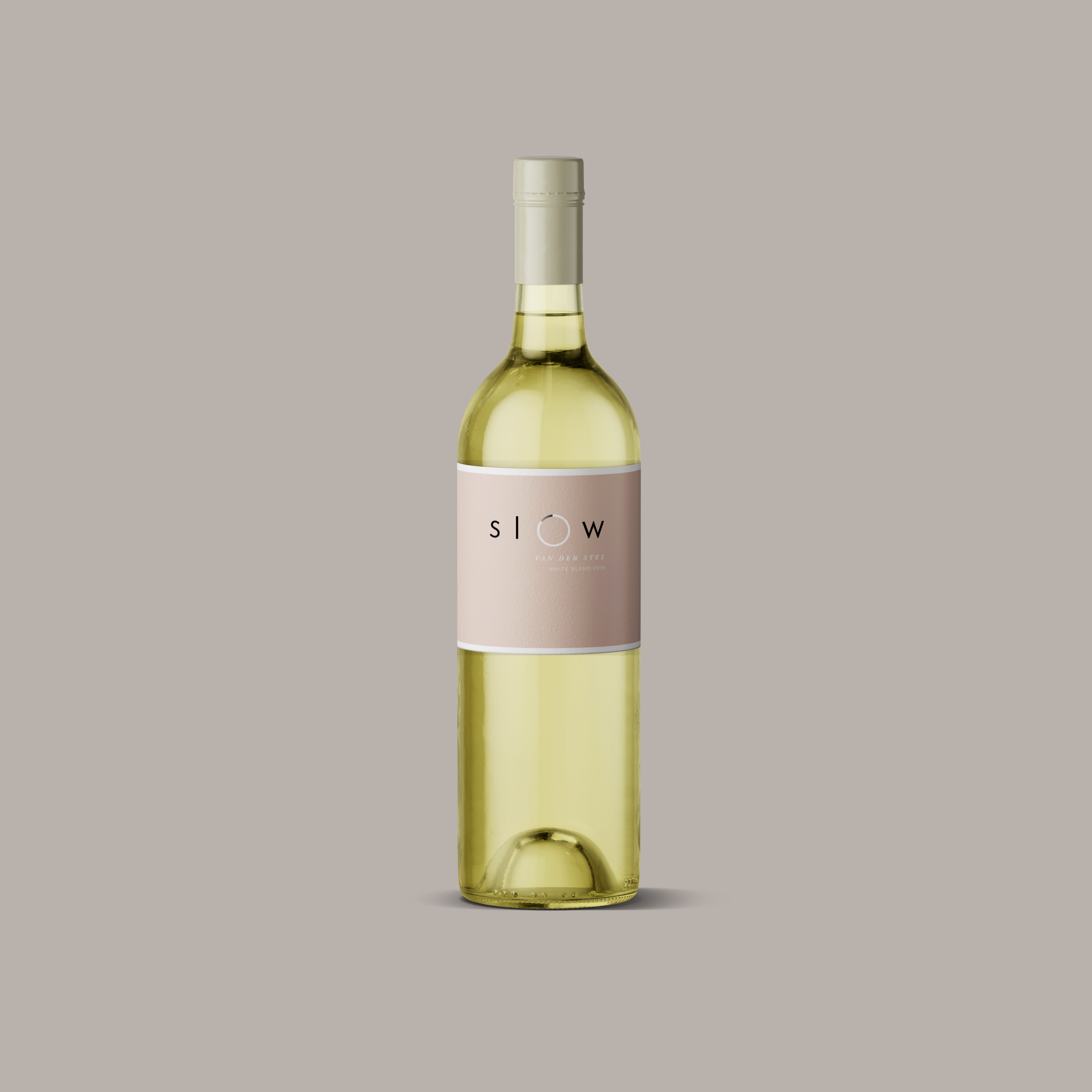
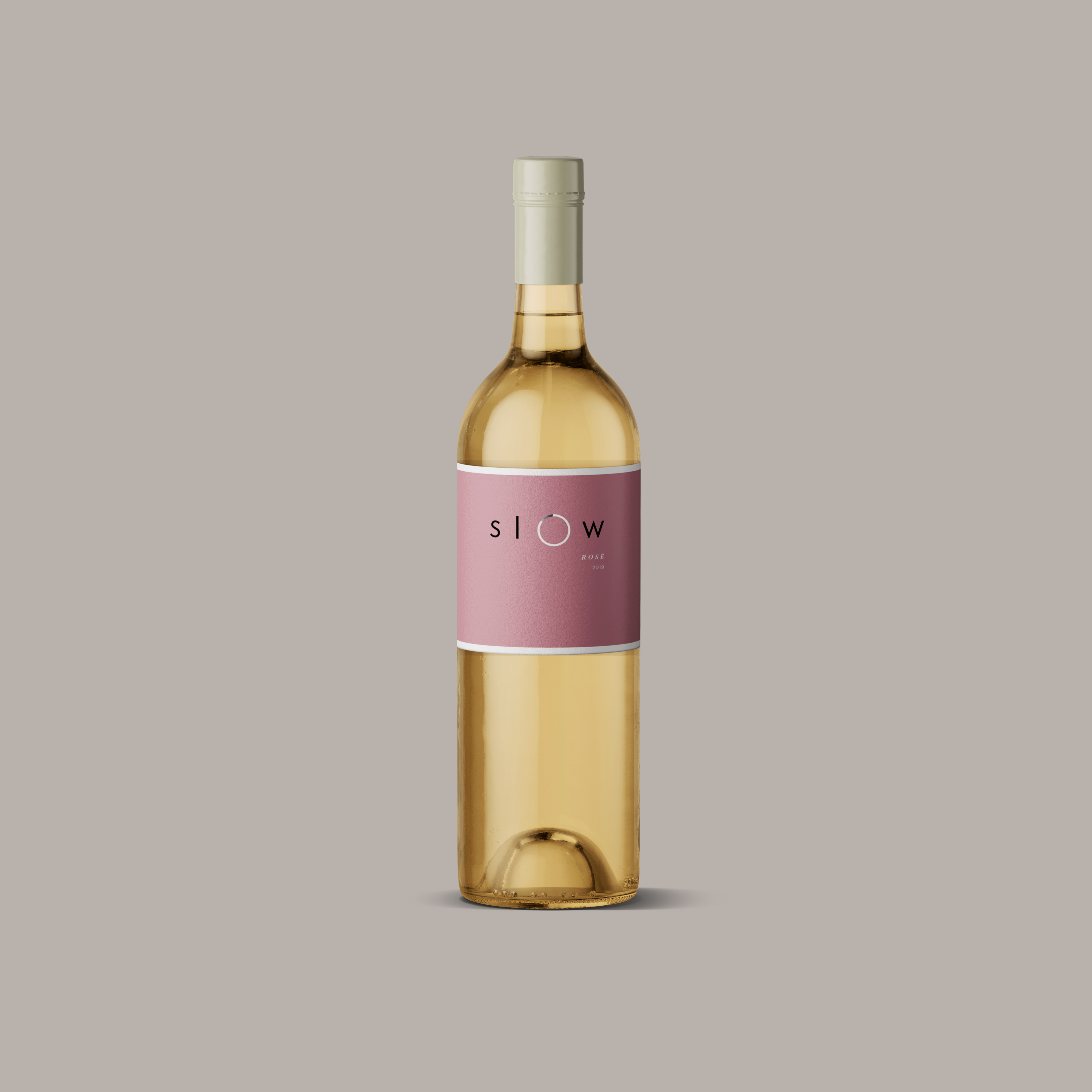
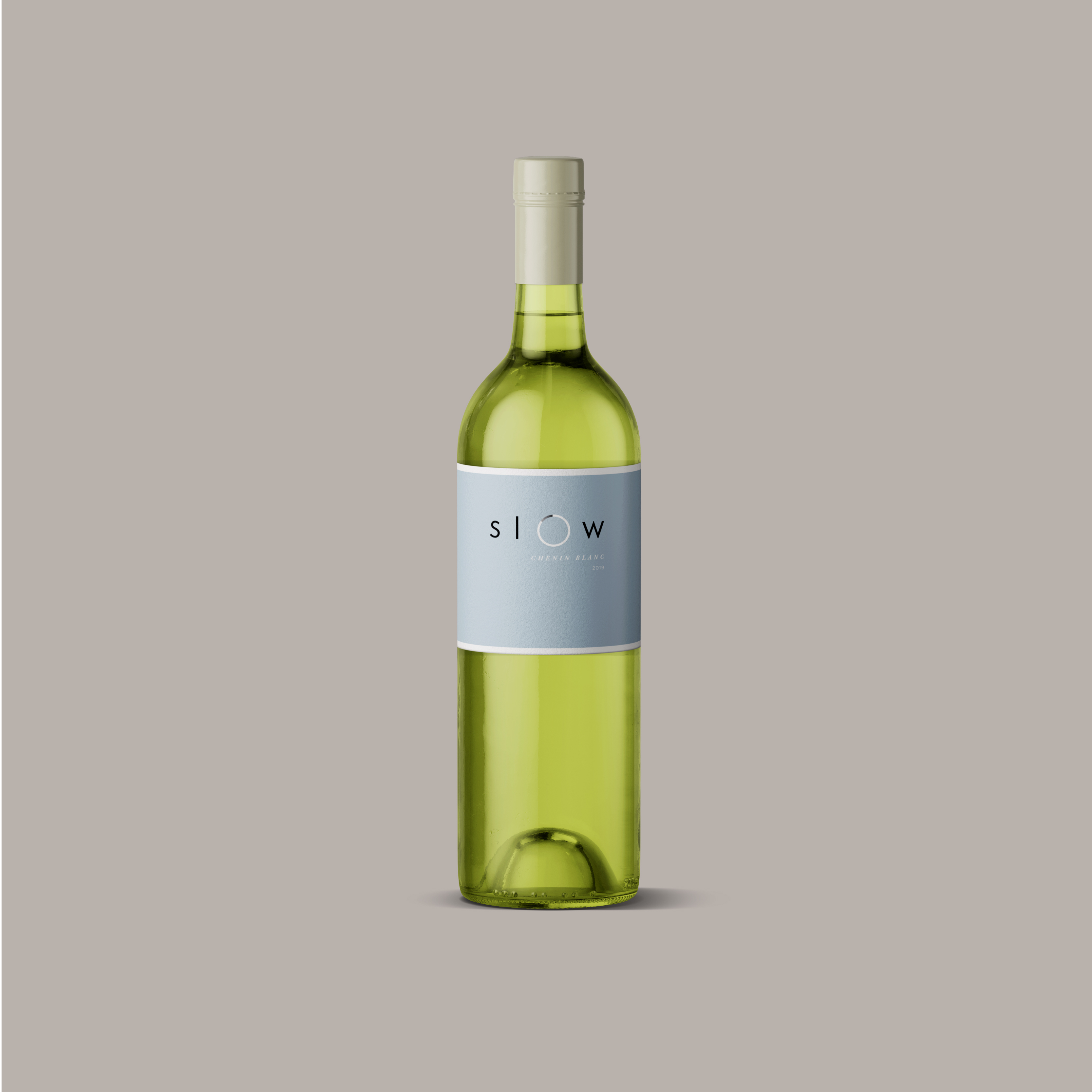
Our design aims to articulate that Slow wine is about time – the time it takes to grow cool climate wines and visually show the concept of time moving slowly using the well-known loading icon. The colour palette was chosen to represent the relaxed emotions and communicate this to the target audience through appeal. This was an update of an existing brand from Villiersdorp Winery. The range serves as the Entry-level wines and therefore had to still be playful by nature, but show that the wines have time, effort and careful planning that went into the winemaking itself. The minimalist look of the labels came from eliminating all unnecessary elements as we believe that the visuals should always have a function and meaning behind them. The success of a brand is determined through the consistency of its expression, which is achieved throughout phases of branding – brand thinking, creation, on-going brand development and management.
CREDIT
- Agency/Creative: Graft Branding Studio
- Article Title: Slow Wine Packaging and Label Design
- Organisation/Entity: Agency, Published Commercial Design
- Project Type: Packaging
- Agency/Creative Country: South Africa
- Market Region: Africa
- Project Deliverables: Brand Identity, Brand Redesign, Brand Strategy, Graphic Design, Packaging Design, Rebranding, Research, Retail Brand Design
- Format: Bottle, Box
- Substrate: Glass Bottle


