


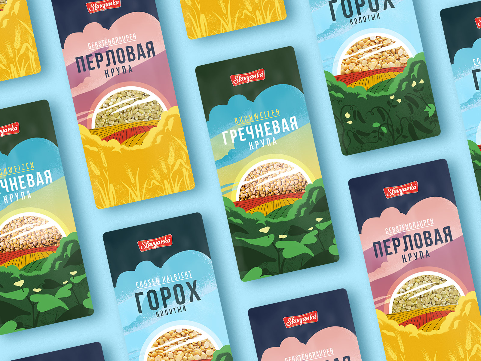
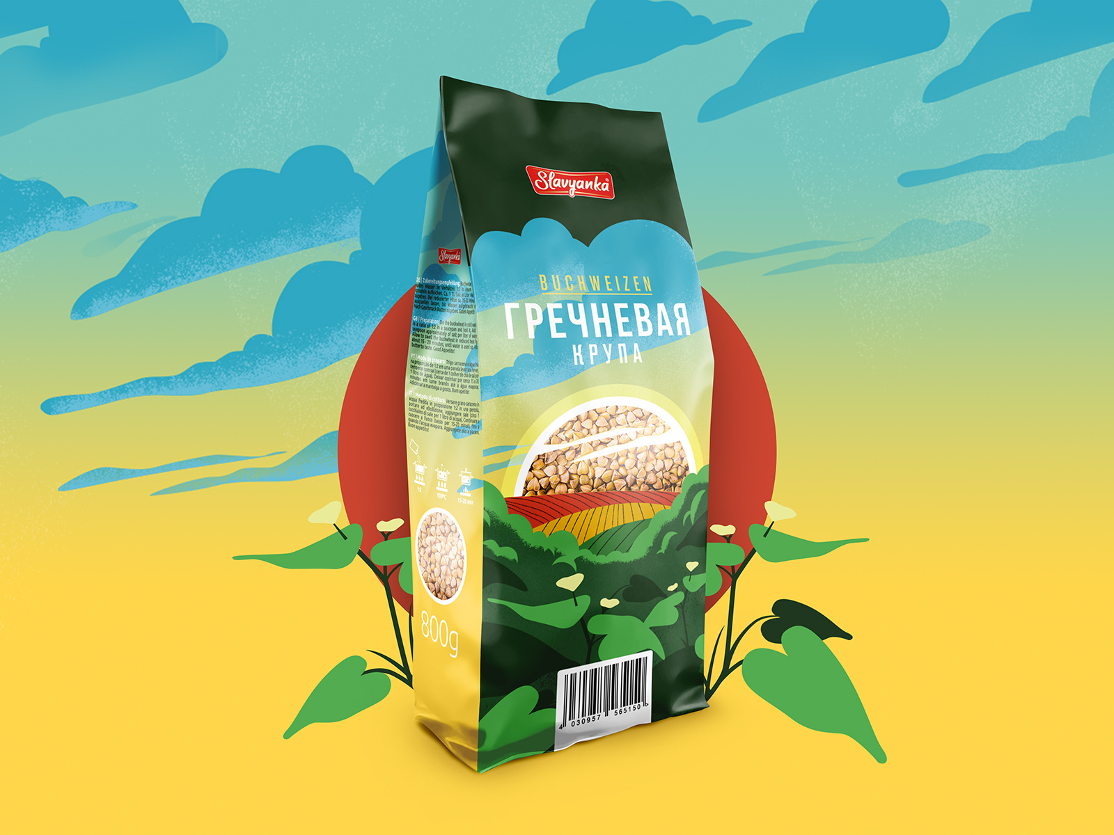
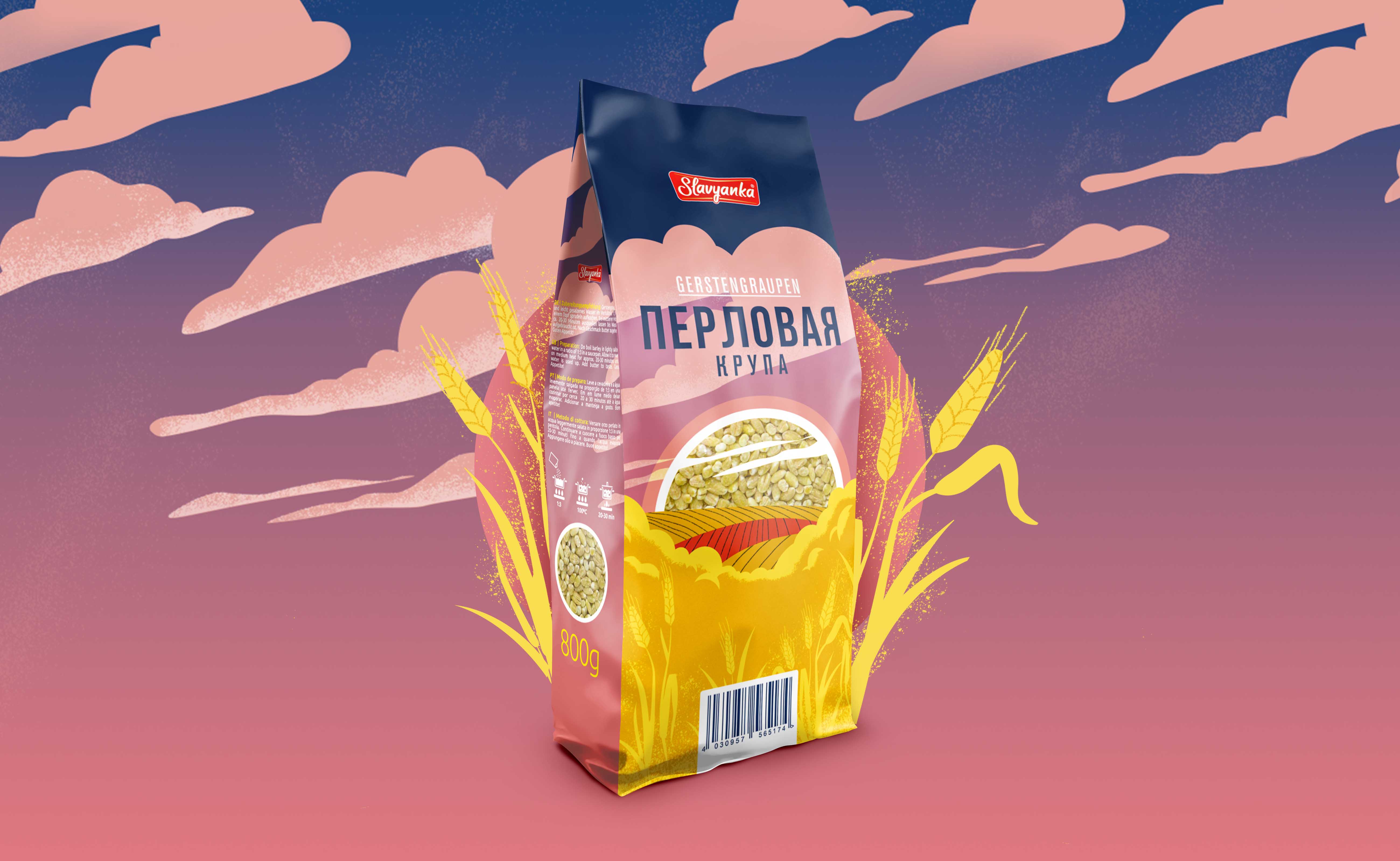
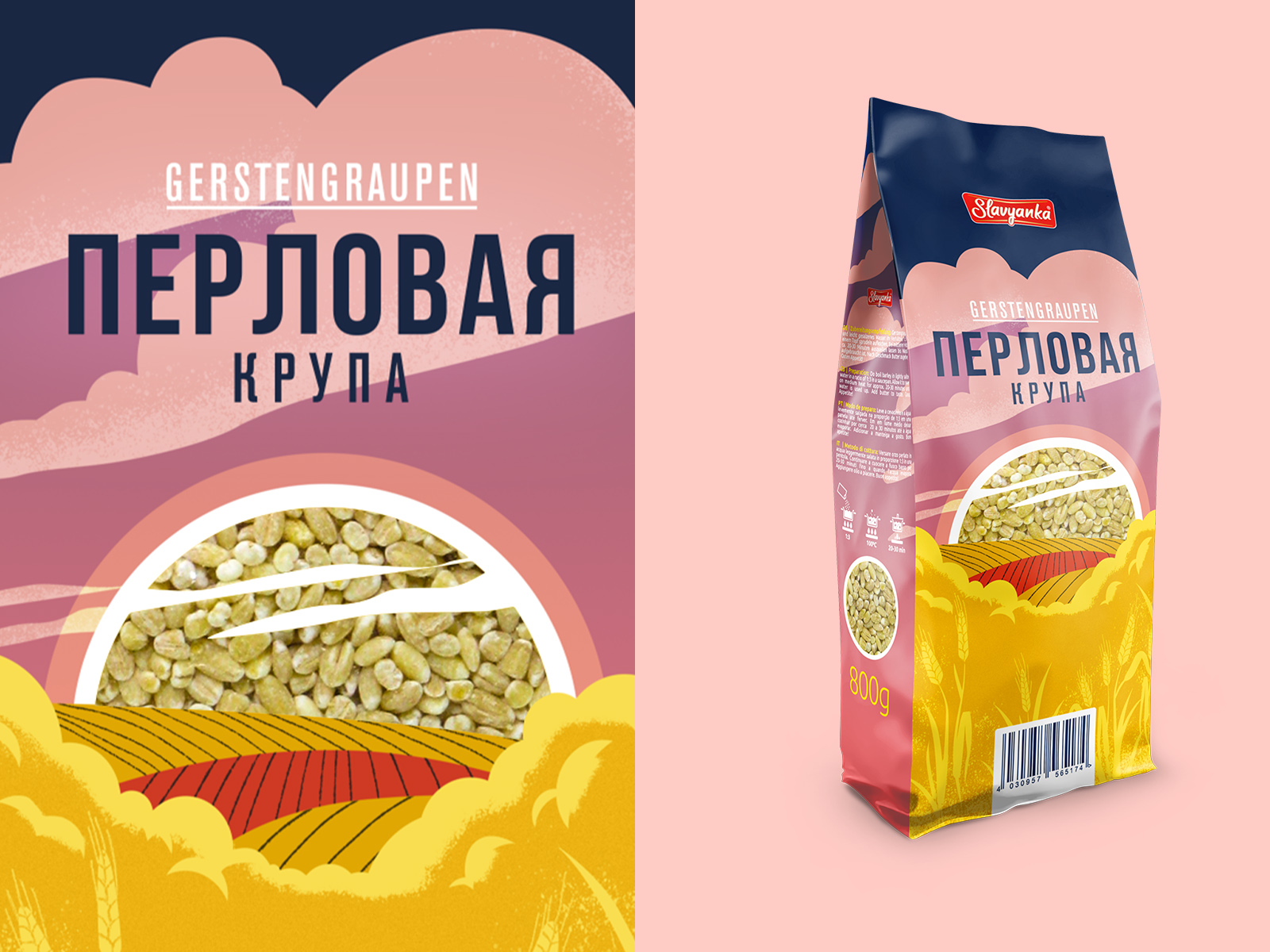
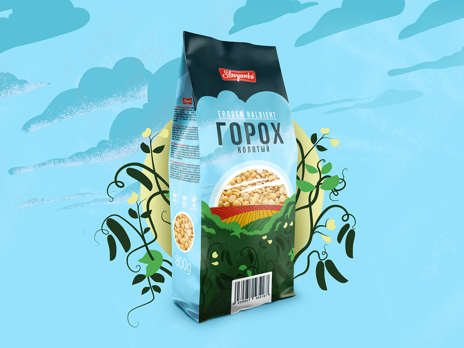
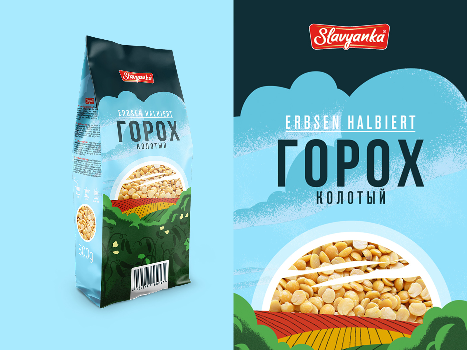
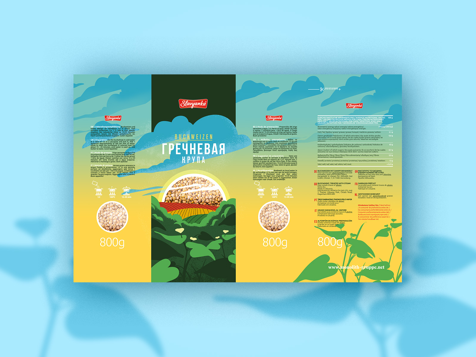
The design had to be sustained in one concept, but also visually highlight each product in the line. We achieved this effect with the idea of changing the time of day, using a color palette that is typical of each time of day.
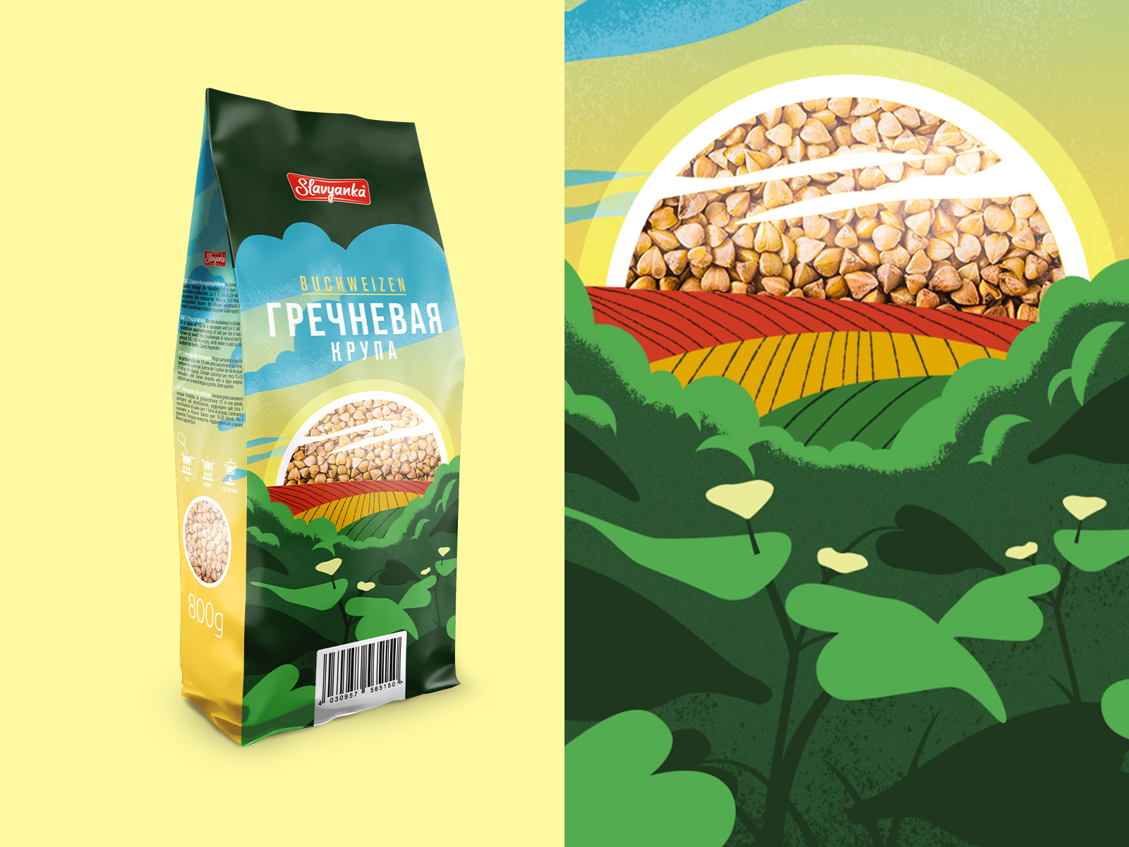
In the design we kept to the natural motives. Nature is associated with eco-friendly direction, because the packaging contains a natural product. This perfectly characterizes buckwheat, pearl groats and peas.
It was important to show the product itself in its packaging. For this purpose, we used an “viewing window”, through which the customer can see the product inside. This window is made in the form of the sun, which gives dynamism to the whole illustration.
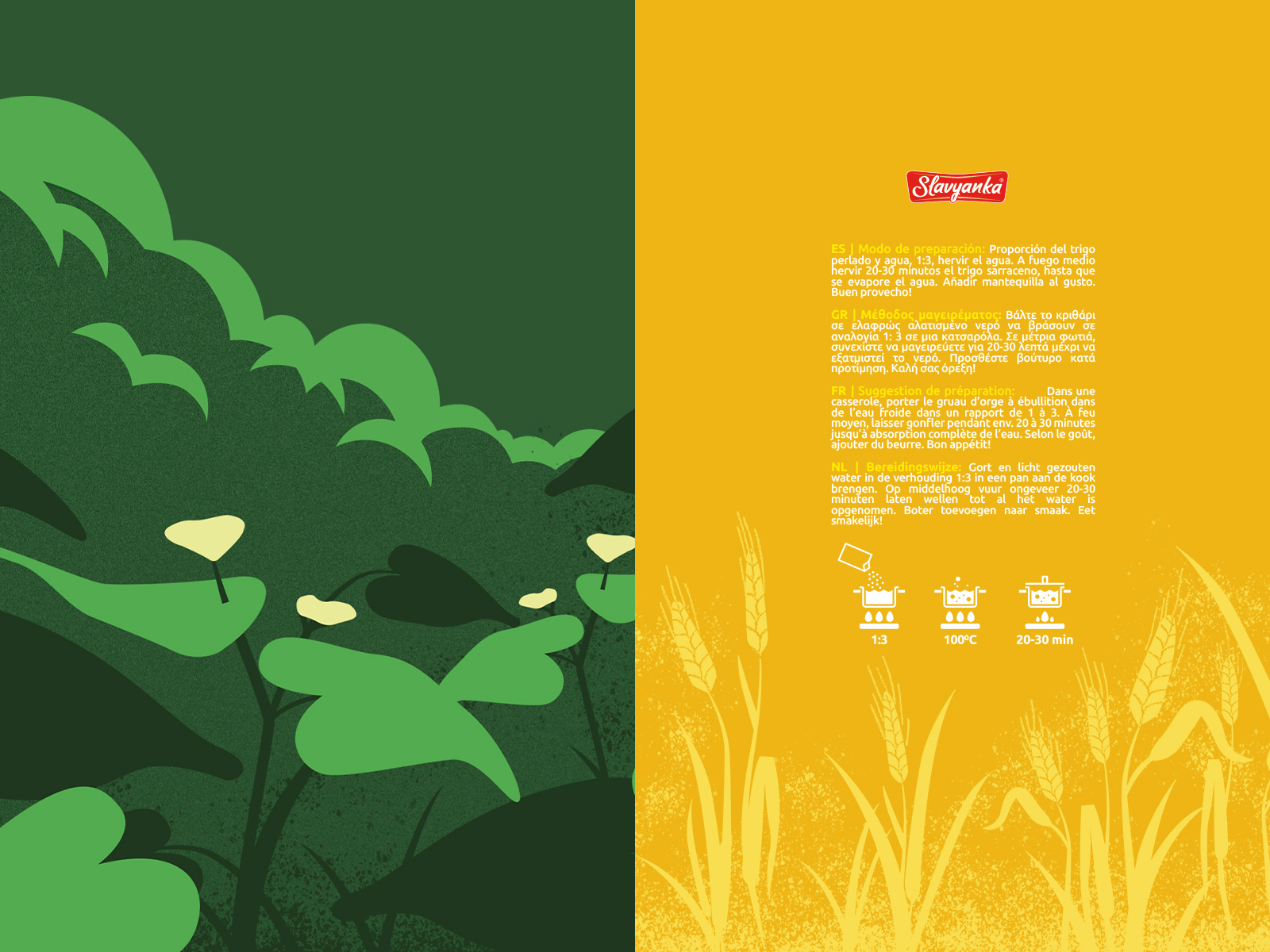
We chose a font for packaging that was easy to read and concise, since a lot of text had to be placed on the label. This includes composition, recipes with illustrations and other markings.
The peculiarity of the text part is that it had to be presented in several languages, because Slavyanka cereals are sold all over Europe.
CREDIT
- Agency/Creative: Creative agency "Молоко"
- Article Title: Slavyanka Cereals Packaging
- Organisation/Entity: Agency, Published Commercial Design
- Project Type: Packaging
- Agency/Creative Country: Belarus
- Market Region: Europe
- Project Deliverables: Graphic Design, Illustration, Packaging Design, Product Architecture
- Format: Bag
- Substrate: Plastic


