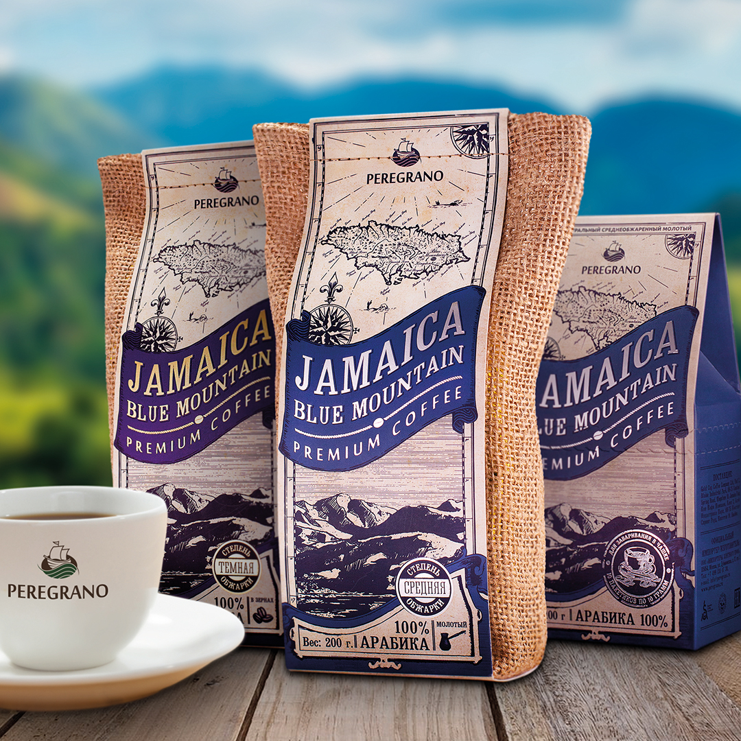
Challenge:
Peregrano is a new brand of importer and coffee roasting company. The name is a combination of Spanish words Peregrino (wandering; perfect) and Grano (grain) literally can be translated as a grain of a wanderer or perfect grain.
Own roasting and packaging plant, high-class specialists, trust of suppliers and customers. The expert community appreciated the uniqueness and quality of the products.
The challenge was that the product from the shelves attracted the attention of connoisseurs of rare and high quality coffee.
Solution:
As a result of the audit and research it was revealed that the main consumers are true coffee connoisseurs who are well versed in tastes, varieties and ready to pay significant sums for a quality product. For this category of customers, the entourage is important, an interesting story, purposefulness, but at the same time sophistication and premium offer.
On the shelves in this category, packages with typical styles of design prevail. We had to do differently. Based on the portrait and preferences of our target audience, as well as the features of the product itself, we came to the theme of romance of distant wanderings and adventures of the times of great geographical discoveries.
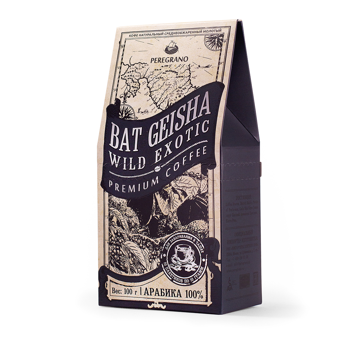
The jute bag came best for this task, which causes associations with the goods transported in the holds of merchant ships and the image of an old map.
All the blocks in the packaging design structure were decorated as elements of real map:
• The map shows a region and place of varieties grown.
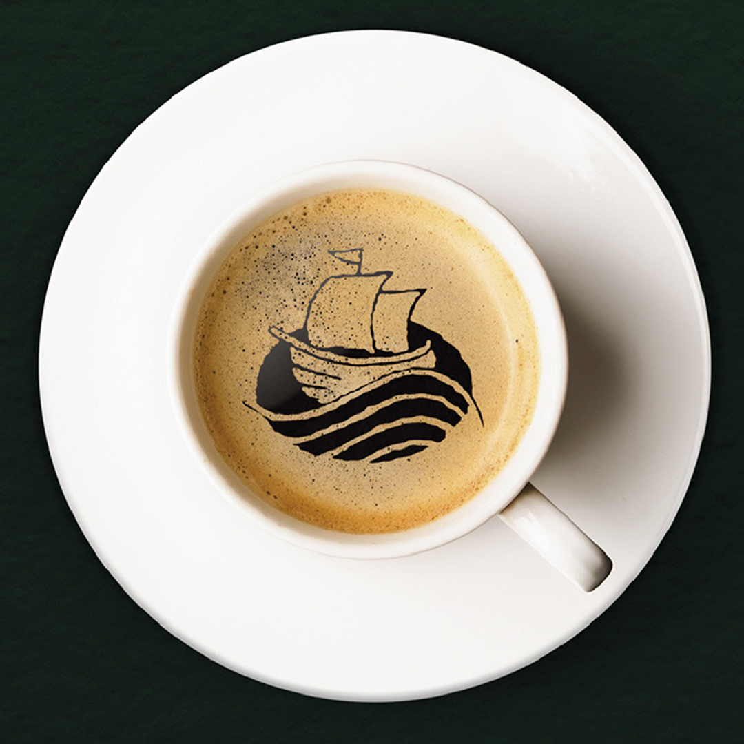
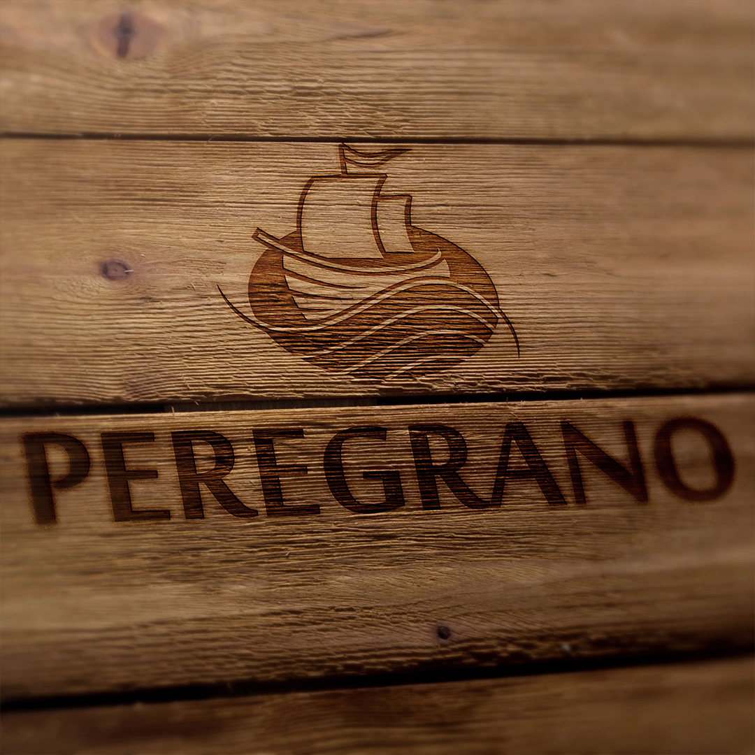
• A small brand-zone is conditioned by the idea of harmonious embedding of the logo, into the map. The logo is symbolized a sailboat sailing westwards, for the rare varieties of coffee on all sails, and the hull of the ship and the sea waves form a coffee bean.
• The ribbon (flag), which was decorated by the name of the map, contains the name of the variety.
• An illustration made in the style of engraving, is a symbol of coffee variety that is inside.
• On old maps, a cartouche carried the clarifying information, and on the package, it contains data on the type of coffee, weight, roasting and grind size.
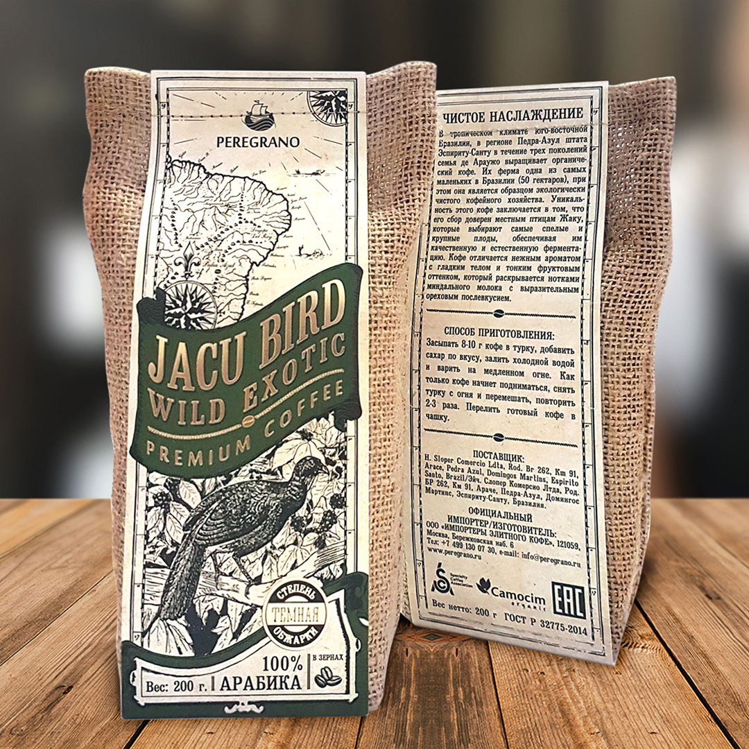
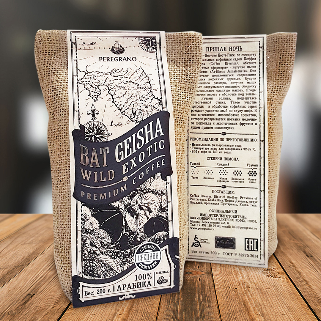
• The back surface is an information block with a small number of stylized elements and infographics on the degree of grinding and the methods of preparation.
• The barcode is located at the bottom of the package, so as not to disturb the visual unity of the design.
Result:
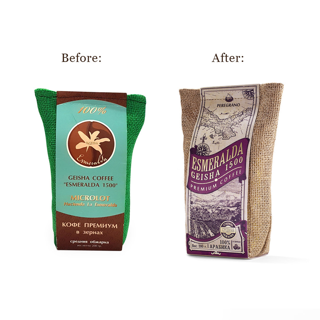
Coffee, sold under the brand Pergrano is a rare and expensive product. After updating of the package design, sales from the shelves increased even during the season of the traditional sales decline in its category. Due to the new design, the brand managed to stand out from competitors, at the same time, without going beyond the traditions, to attract more attention of the target audience.
CREDIT
- Agency/Creative: Kharlamov Slava
- Article Title: Slava Kharlamov Creates New Coffee Brand from Russia: Peregrano
- Organisation/Entity: Agency, Published Commercial Design
- Project Type: Packaging
- Agency/Creative Country: Russia
- Market Region: Europe
- Project Deliverables: Brand Identity, Brand Naming, Brand Redesign, Brand Strategy, Branding, Graphic Design, Identity System, Packaging Design, Product Naming, Research
- Format: Bag
- Substrate: Pulp Carton


