


Designing for Rico Rolls was more than just creating a logo. It was about crafting an experience. From the very beginning, the idea wasn’t to design something that merely looked good on a storefront, but to build a brand that felt alive — one that rolled together personality, playfulness, and flavour into a single, unified identity.
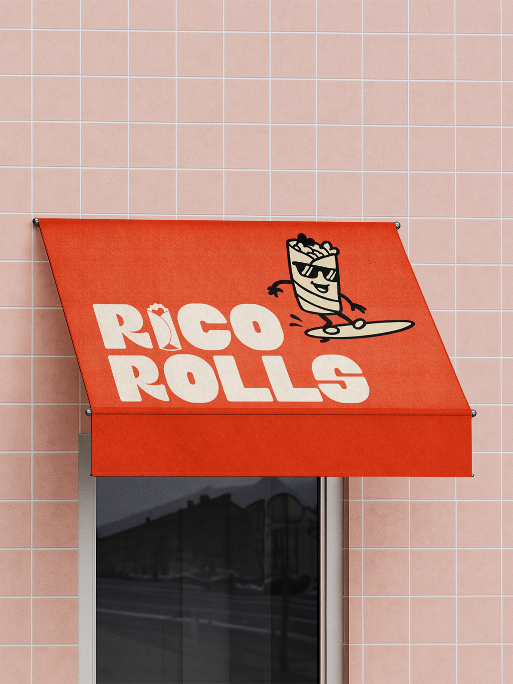
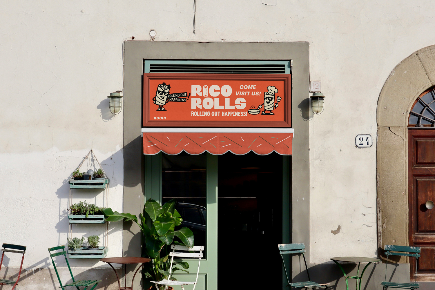
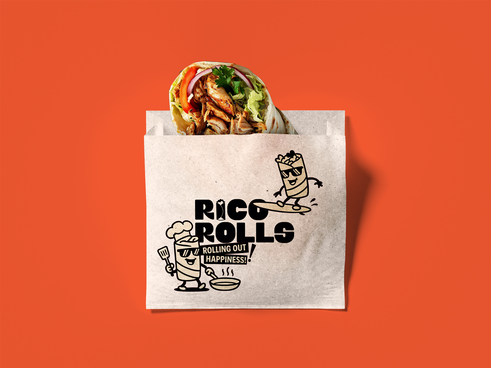
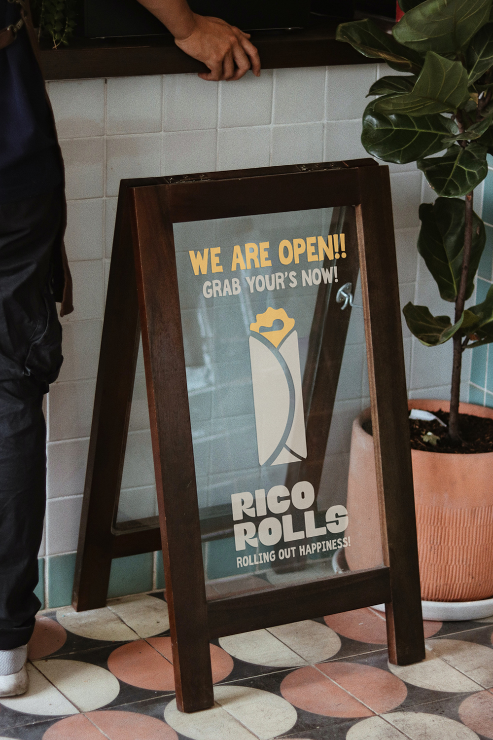
Rico Rolls is a fast-food brand that thrives on energy, quick bites, fun moments, and a flavour that lingers. So, the identity needed to reflect exactly that: fast, bold, and instantly memorable. The kind of brand you spot from across the street and instinctively feel drawn to. Every visual cue…from the typography to the colours to the character…was designed to create that instant, emotional connection.
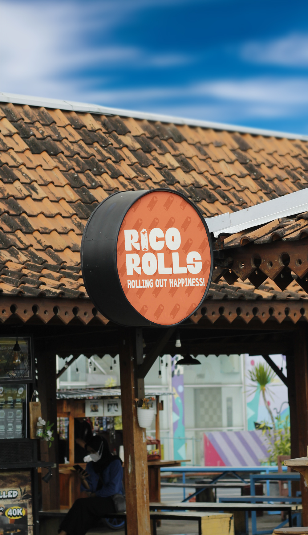
The logo itself captures the spirit of speed and spontaneity. The bold typography carries a sense of motion and energy that is friendly, confident, and impossible to miss. It’s strong enough to stand on its own, yet approachable enough to make you smile. Complementing it is the character illustration, a playful roll brought to life. This small yet powerful detail adds humour and warmth — something that gives the brand a personality of its own. It reminds people that Rico Rolls isn’t just another fast-food place; it’s a brand with soul, flavour, and a sense of fun baked into its DNA.
From colours inspired by street food culture to the expressive shapes that evoke dynamism, every element was chosen to make the brand feel vibrant and human. The visual identity doesn’t whisper, it speaks confidently, with flavour in every curve and personality in every stroke.
Like all meaningful design work, this project came alive through collaboration — between creative minds who believe that great design sits at the intersection of storytelling and detail. Design by Sidharth, strategy by Abhishek — each element crafted with care to ensure that what you see isn’t just design, but emotion turned visual.
Working on Rico Rolls reminded us of something powerful: great branding doesn’t just show what you sell, it makes people feel what you stand for. It’s not just about colours, fonts, or symbols. It’s about capturing the soul of a brand and translating it into something people can connect with, remember, and love.
CREDIT
- Agency/Creative: Slash Design Studio
- Article Title: Slash Design Studio Brings Energy and Flavor to Life in the Rico Rolls Branding
- Organisation/Entity: Agency
- Project Type: Identity
- Project Status: Published
- Agency/Creative Country: India
- Agency/Creative City: Kerala
- Market Region: Asia
- Project Deliverables: Brand Identity, Logo Design, Packaging Design
- Industry: Food/Beverage
- Keywords: Brand Identity Design, Logo Design, Food Branding, Restaurant Branding, Mascot Design
-
Credits:
Designer: Sidharth P K
Strategist: Abhishek A G
Designer: Sreerag A G


