


SKNLY is a premium, Gen-Z focused skincare brand built around the belief that skincare does not need complexity to be effective. The brand was conceived in response to a market increasingly dominated by over-engineered routines, aggressive claims, and visually overwhelming packaging that often creates confusion rather than confidence for first-time and burnout skincare users.
The core challenge was to design a packaging system that communicates clarity, restraint, and trust in a highly saturated skincare category, while still achieving strong shelf presence and commercial readability. Many skincare brands either lean too clinical and intimidating, or overly aesthetic and trend-driven, sacrificing long-term credibility. SKNLY required a visual identity that could balance clinical clarity with emotional calm, without appearing cold, generic, or ornamental.
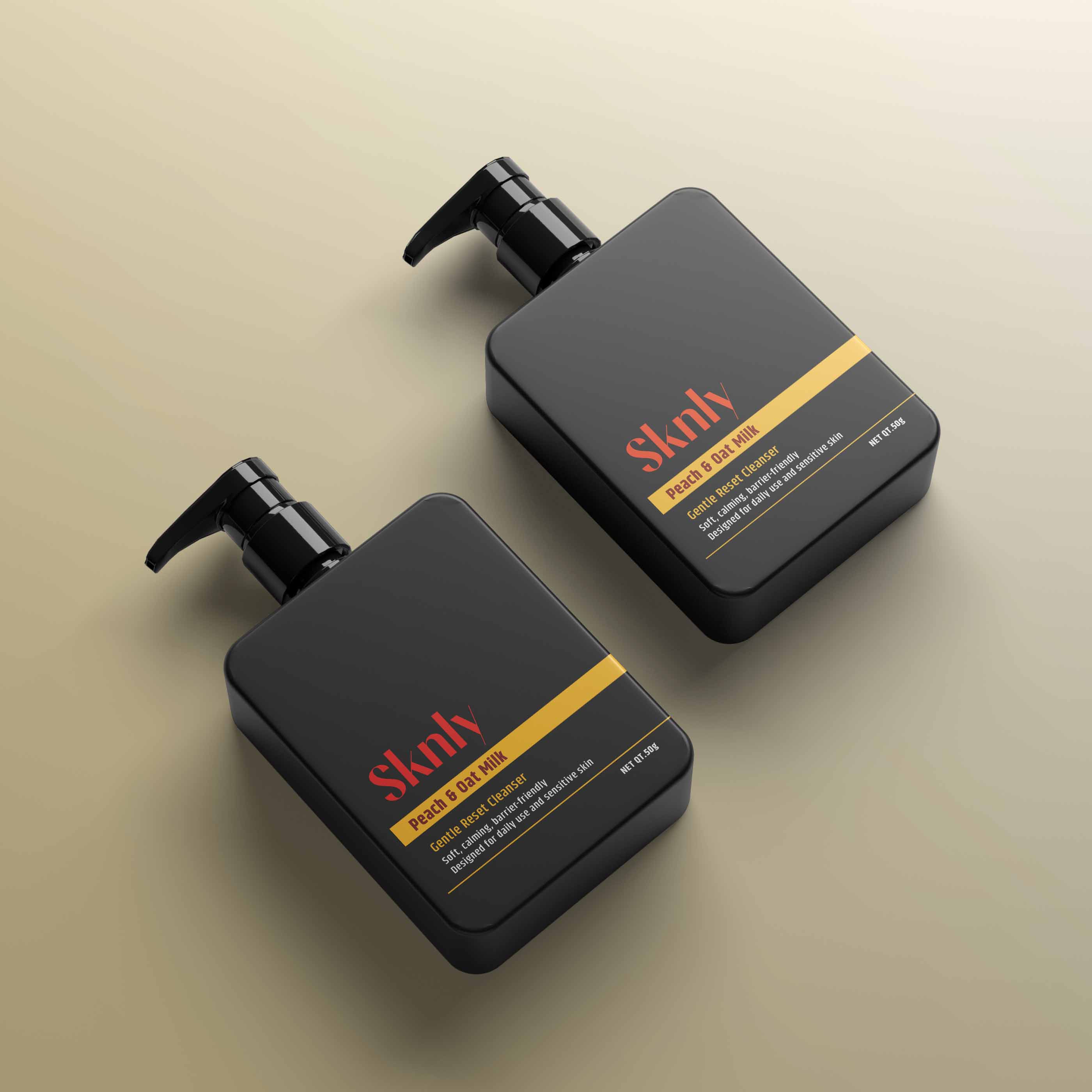
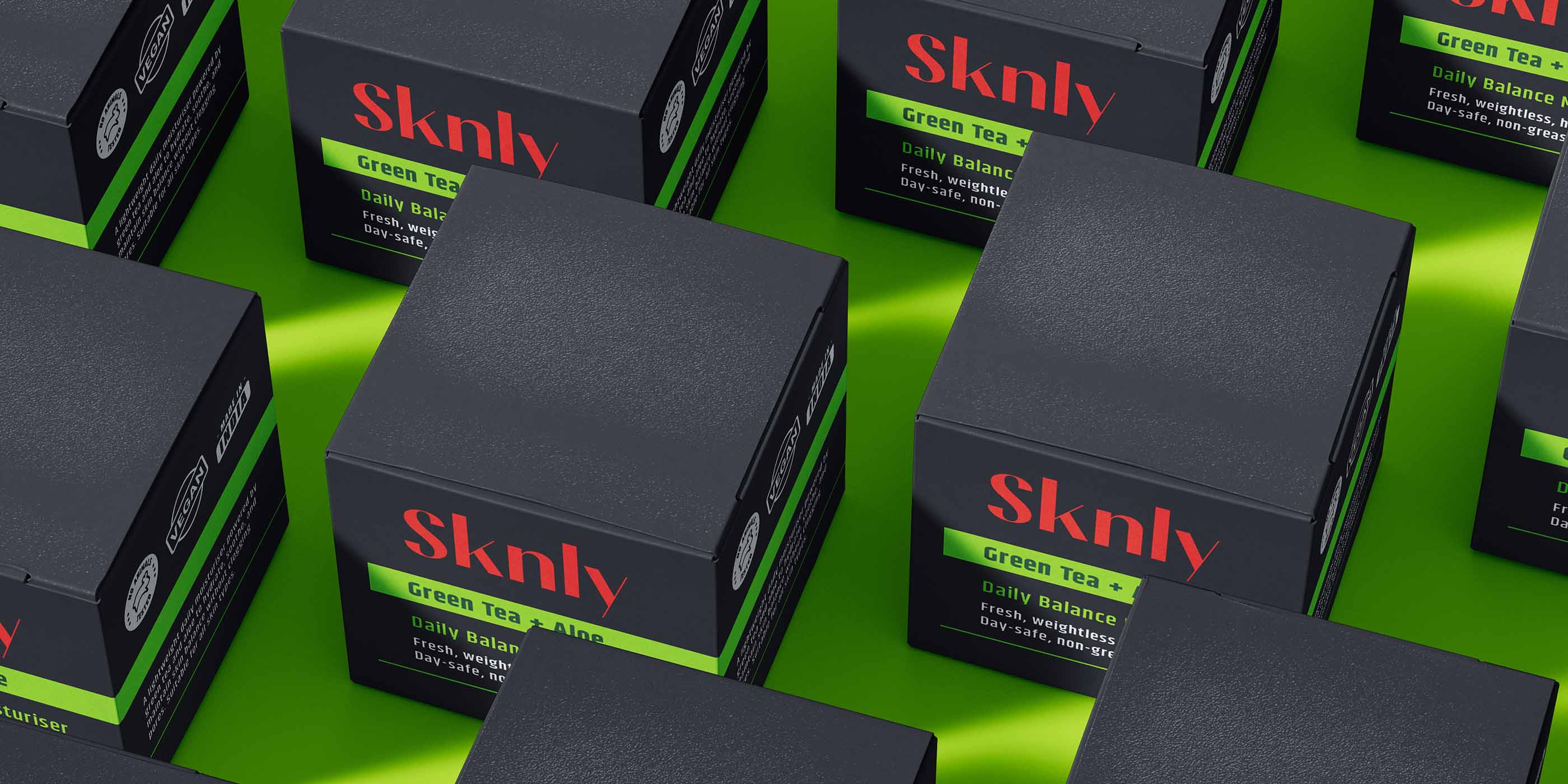
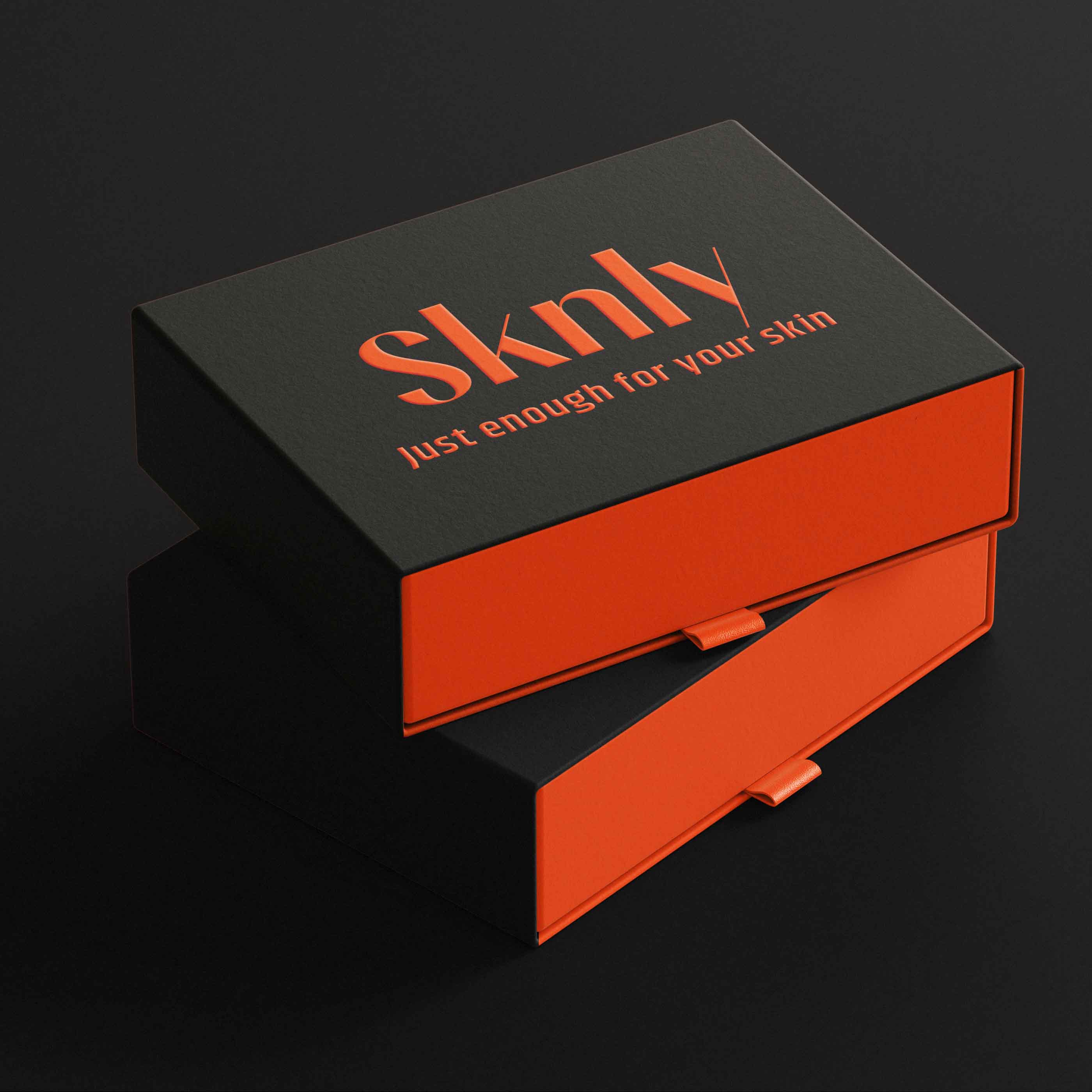
The design solution focuses on a disciplined typographic system, strong information hierarchy, and a muted base color palette that reduces visual noise at arm’s length. Primary packaging elements emphasize product name, skin concern, and ingredient transparency, allowing consumers to understand usage quickly without reading dense instructions. Flavour and ingredient references are introduced through controlled accent colors, ensuring differentiation between SKUs while maintaining system consistency across the range.
Material choices were intentionally minimal and responsible. Amber glass and recyclable HDPE were selected for their functional and environmental credibility, while outer cartons use low-ink coverage to support a quiet, non-performative sustainability approach. Decorative finishes were avoided to ensure the brand communicates confidence through clarity rather than embellishment.
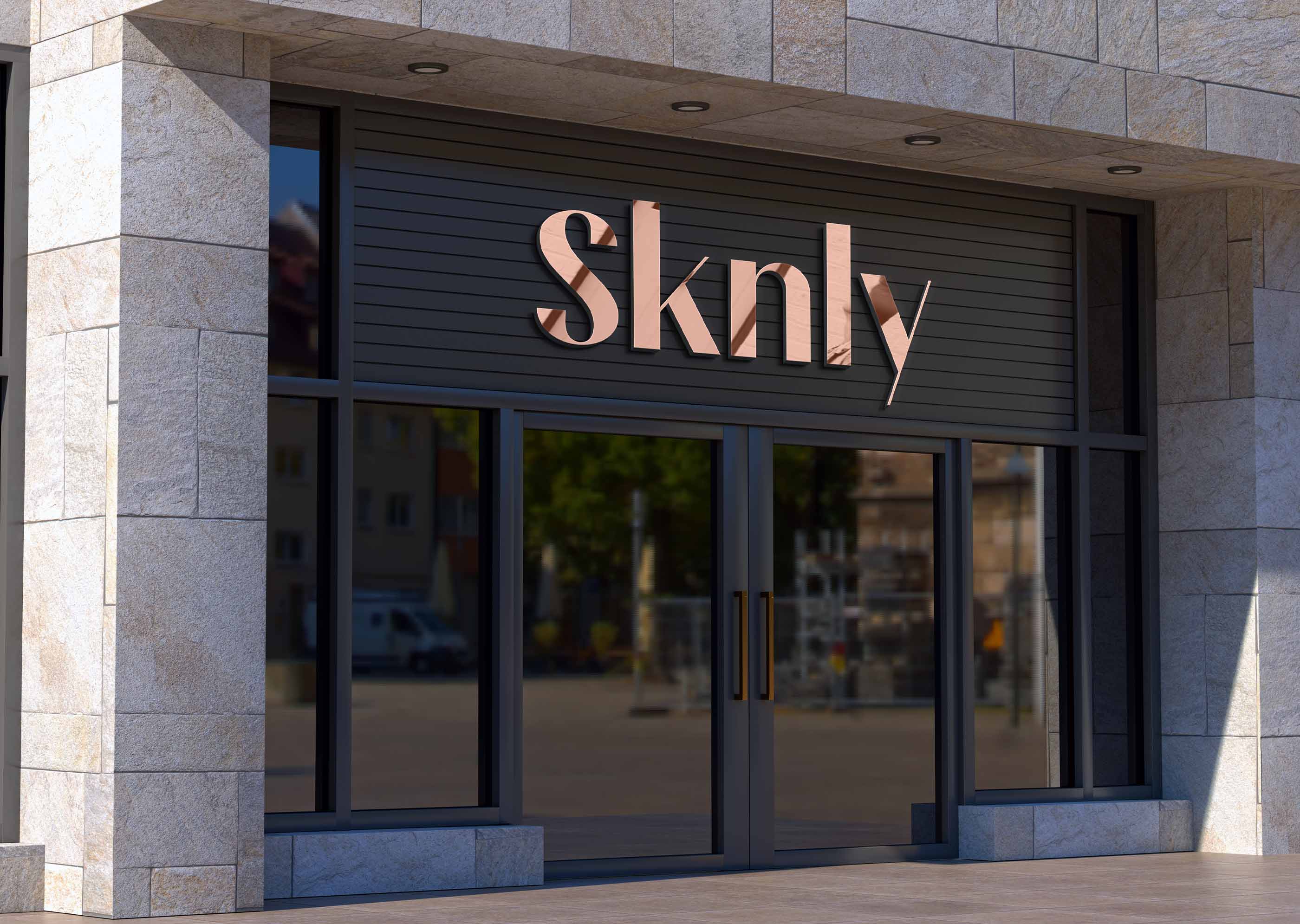
The result is a cohesive branding and packaging system that feels premium yet approachable, modern yet human. SKNLY reads clearly in-store, translates seamlessly to e-commerce, and aligns with the expectations of design-aware, value-driven consumers seeking simplicity over excess. The project demonstrates how restraint, hierarchy, and thoughtful system design can create strong brand presence without visual overload, positioning SKNLY as a trustworthy everyday skincare brand rather than a trend-led product.


CREDIT
- Agency/Creative: Surjyakanta Pradhan
- Article Title: SKNLY Premium Skincare Branding and Packaging Design by Surjyakanta Pradhan
- Organisation/Entity: Freelance
- Project Type: Packaging
- Project Status: Published
- Agency/Creative Country: India
- Agency/Creative City: Jharsuguda, Odisha.
- Market Region: Global
- Project Deliverables: Brand Identity, Brand Strategy, Branding, Logo Design, Packaging Design
- Format: Bottle, Box, Jar, Tube
- Industry: Beauty/Cosmetics
- Keywords: Skincare Packaging, Skincare Branding, Premium Skincare, Premium Skincare Branding
-
Credits:
Brand & Packaging designer: Surjyakanta Pradhan


