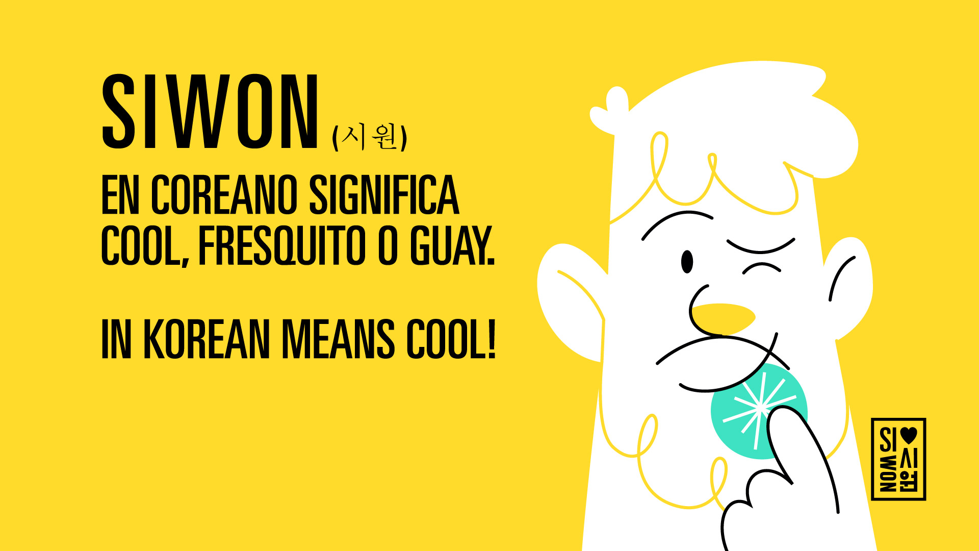
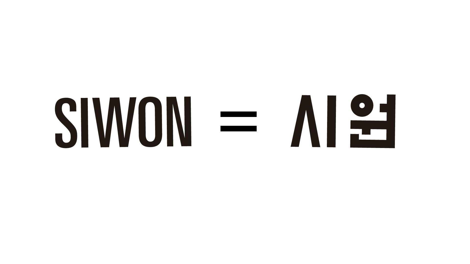
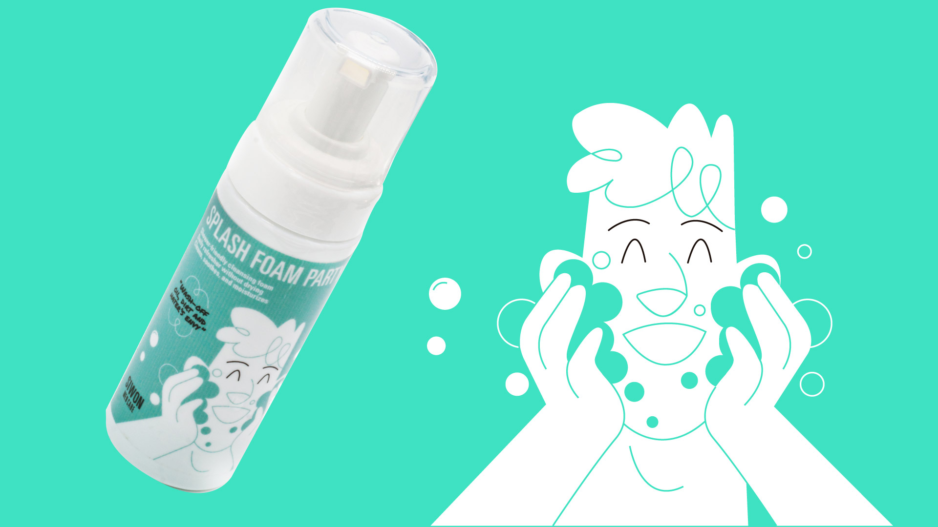
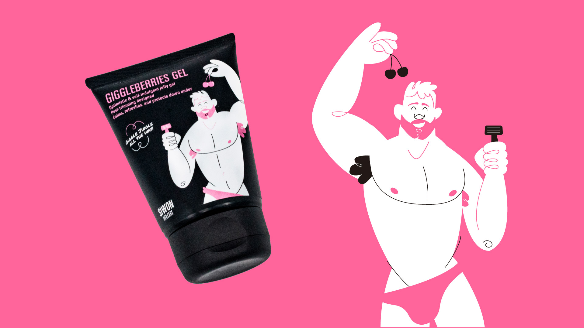
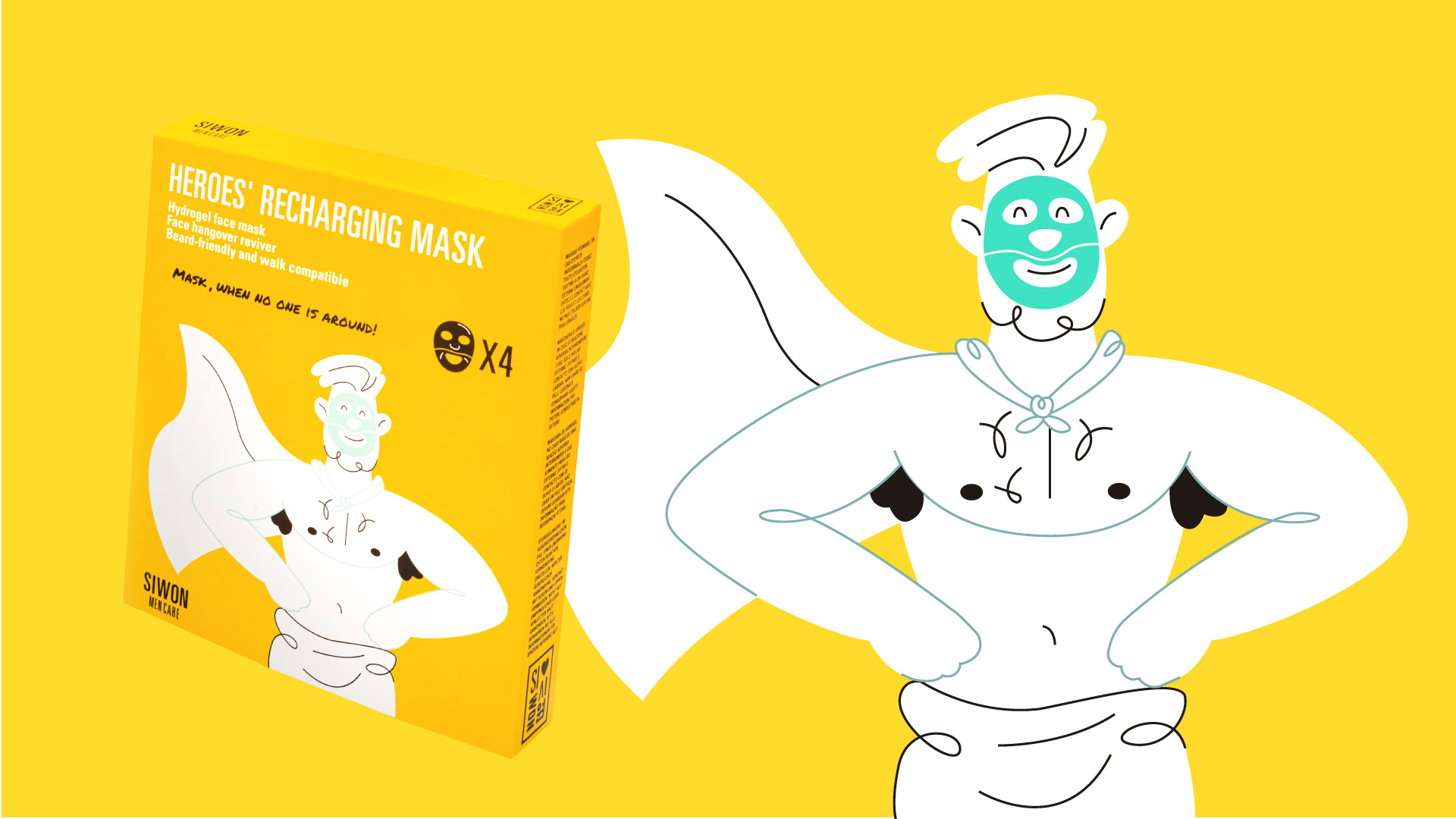
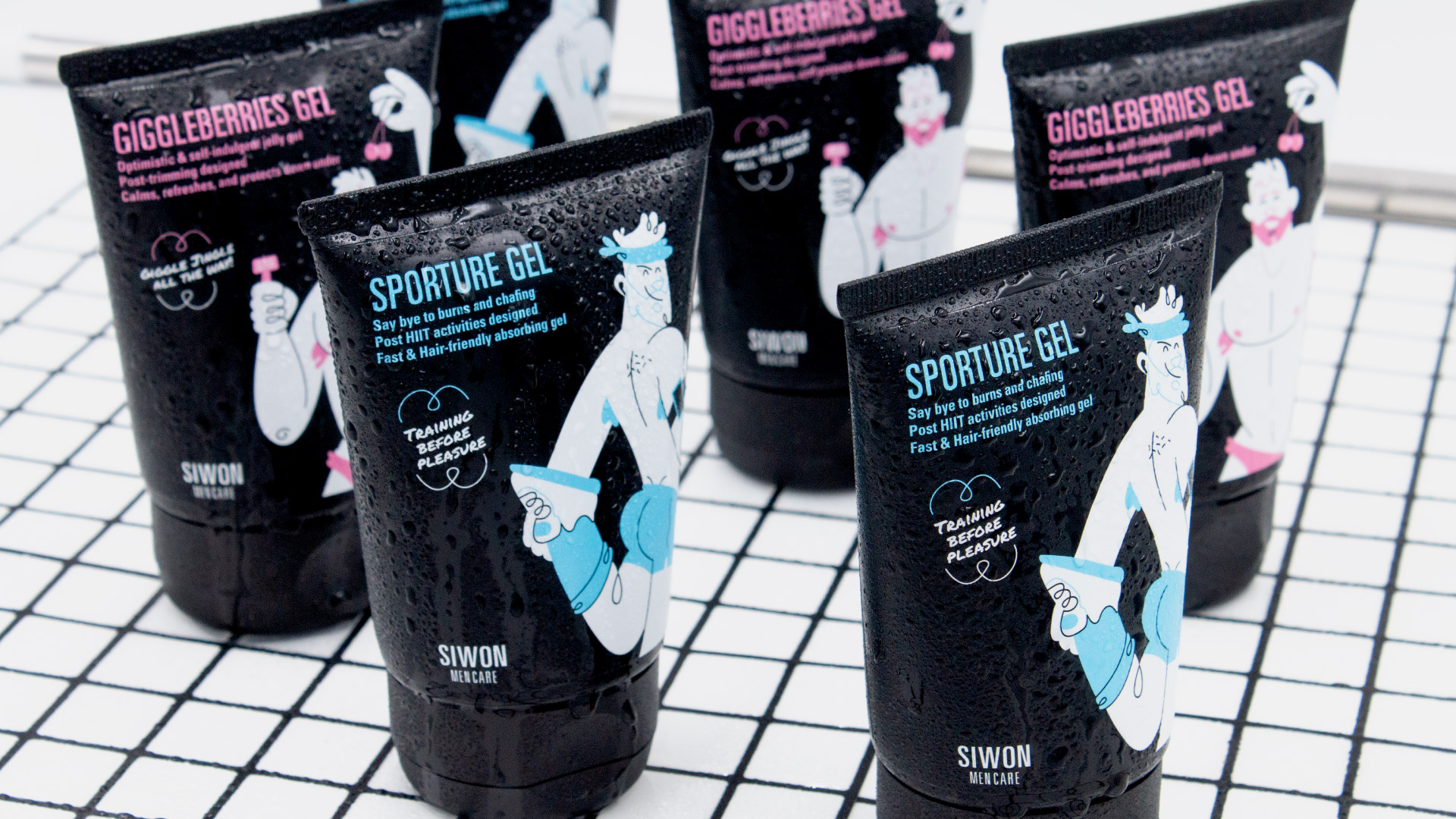
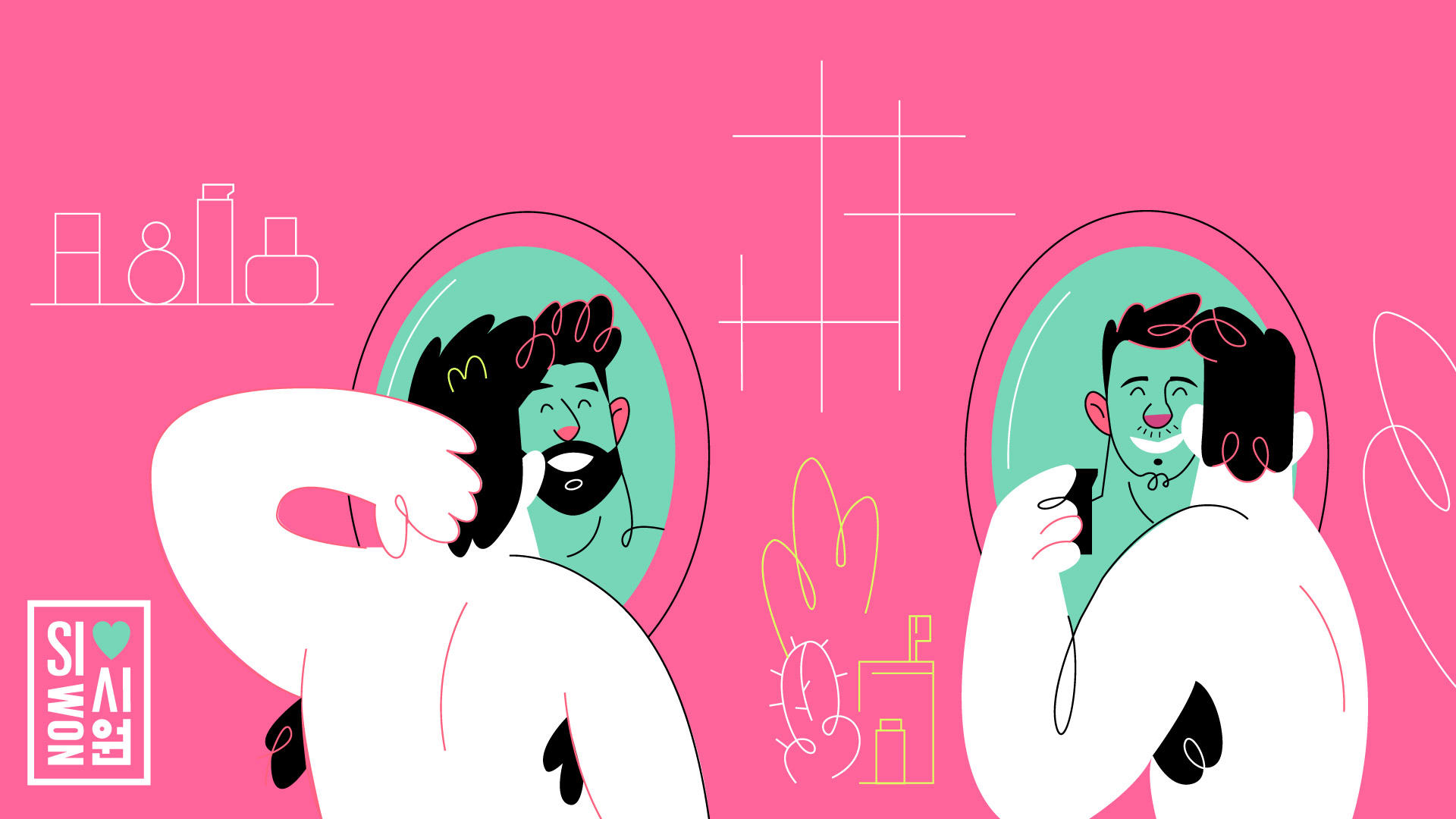
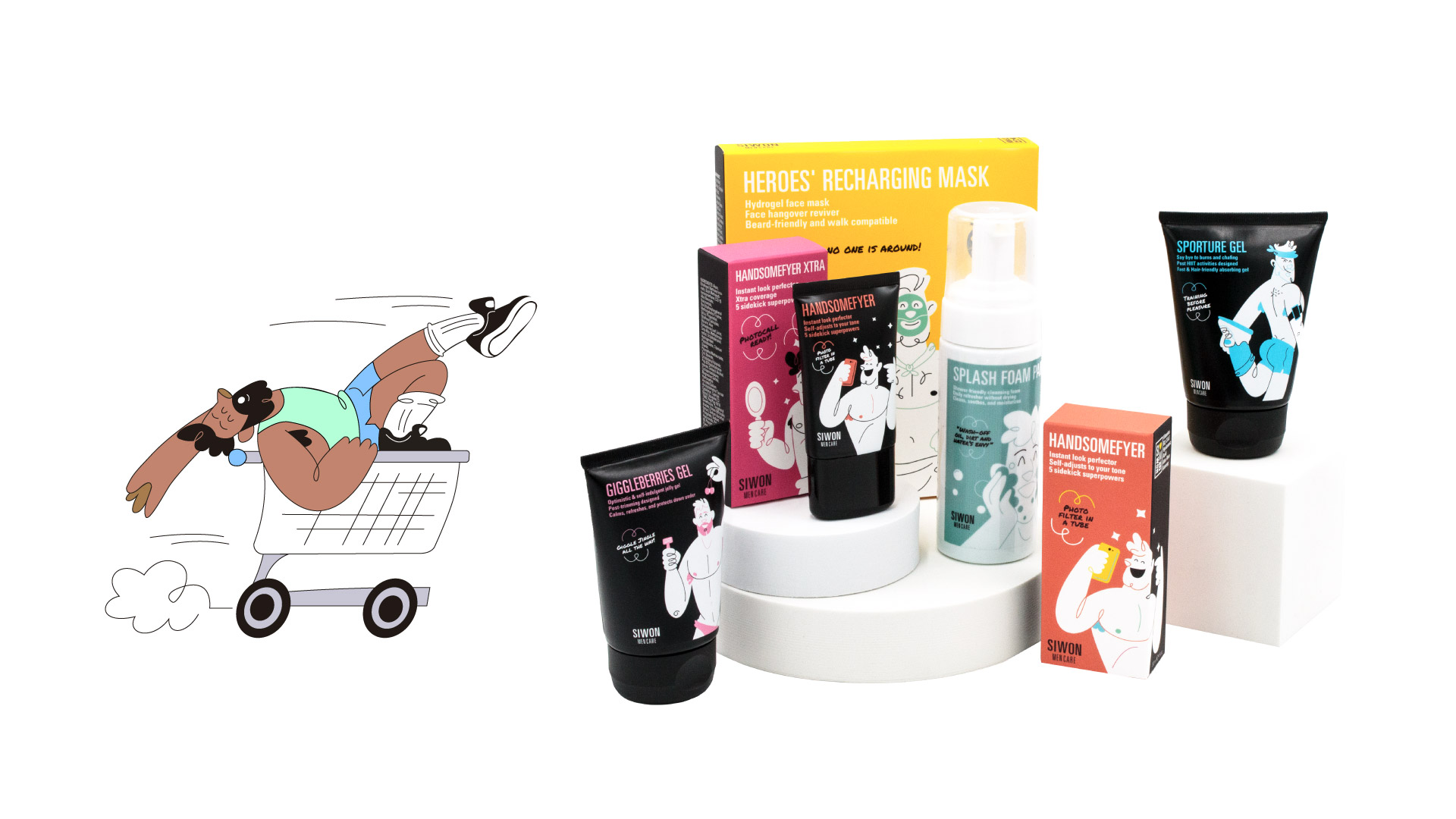
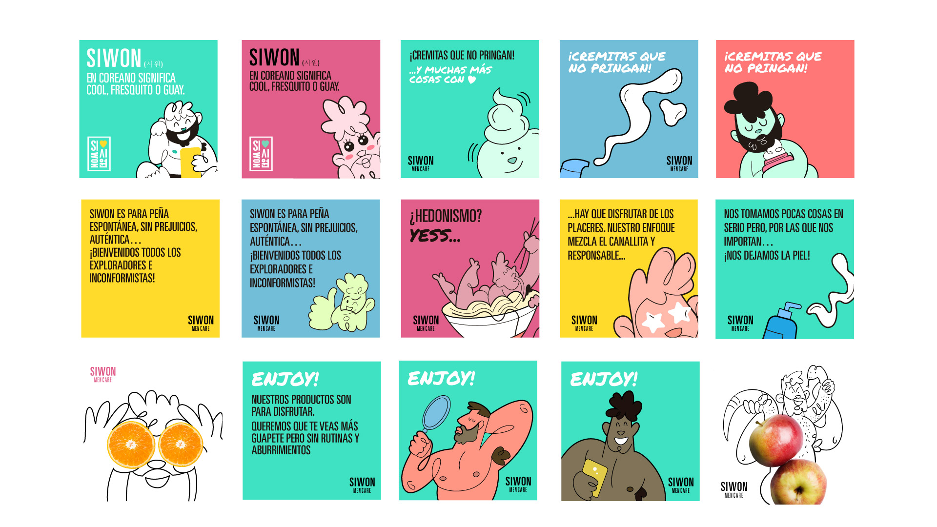
In Korean, Siwon means ‘cool’, ‘trendy’, and even ‘fresh’, so you can tell what it’s about. Siwon is a brand for dirty-minded, yet conscience clean, people. For those of us that want to take care and improve with actual results but carefree of obsessions.
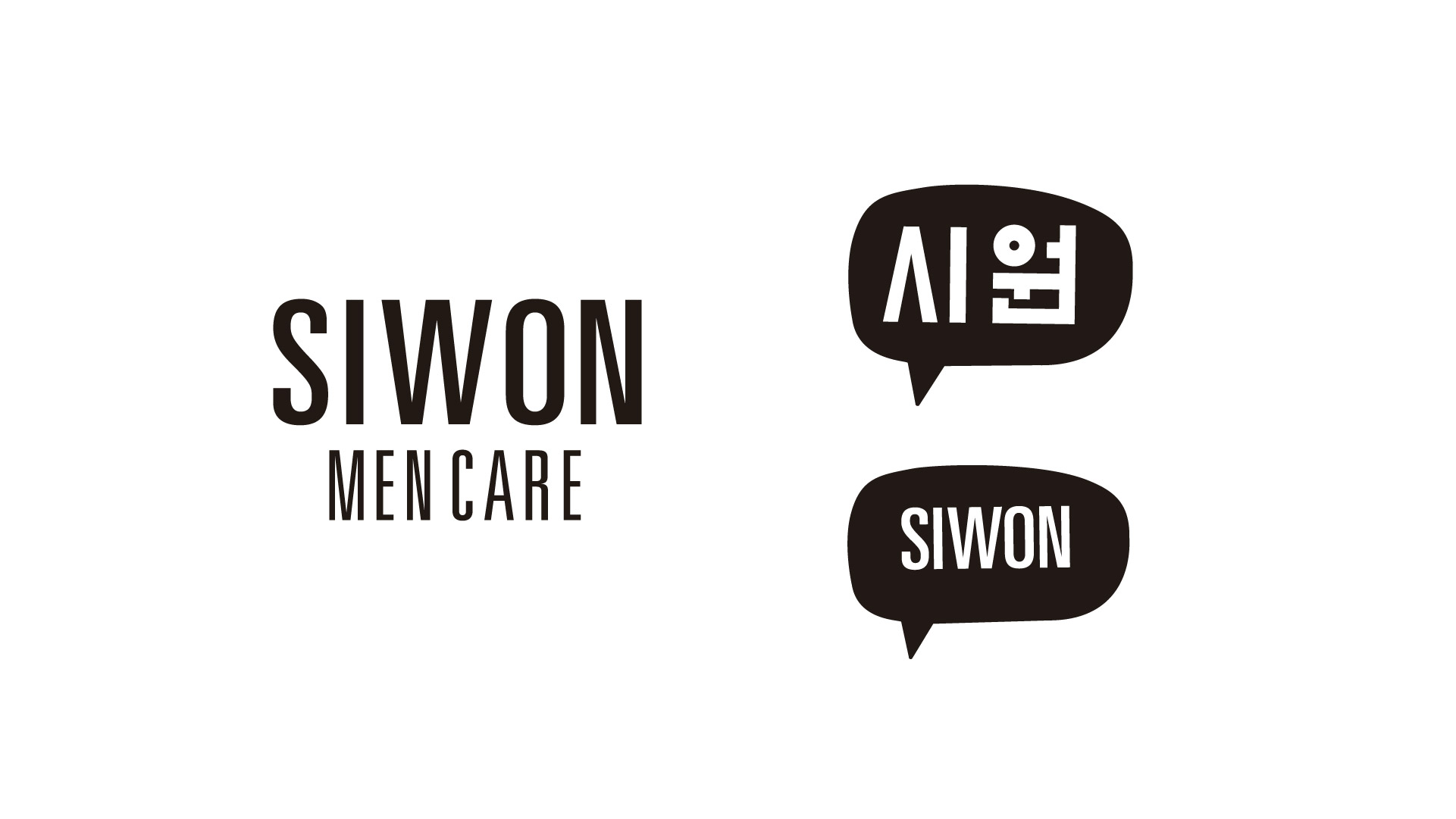
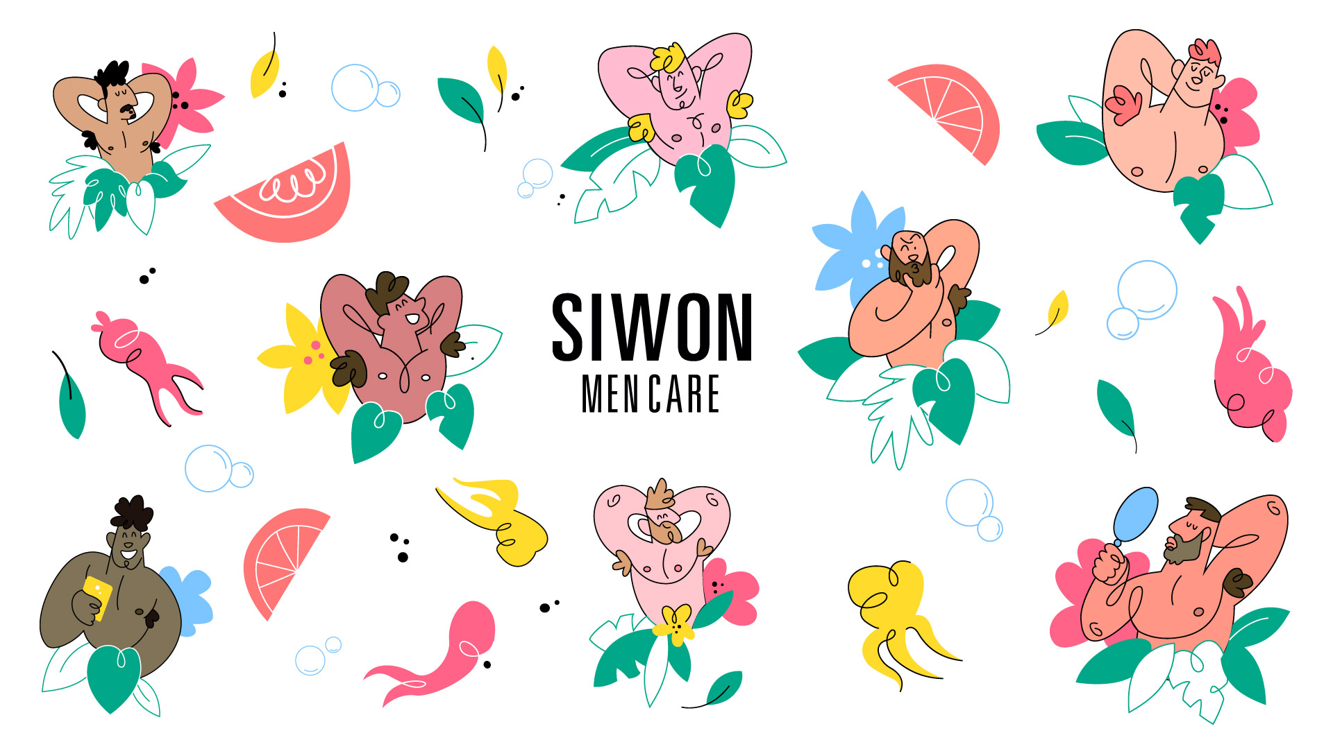
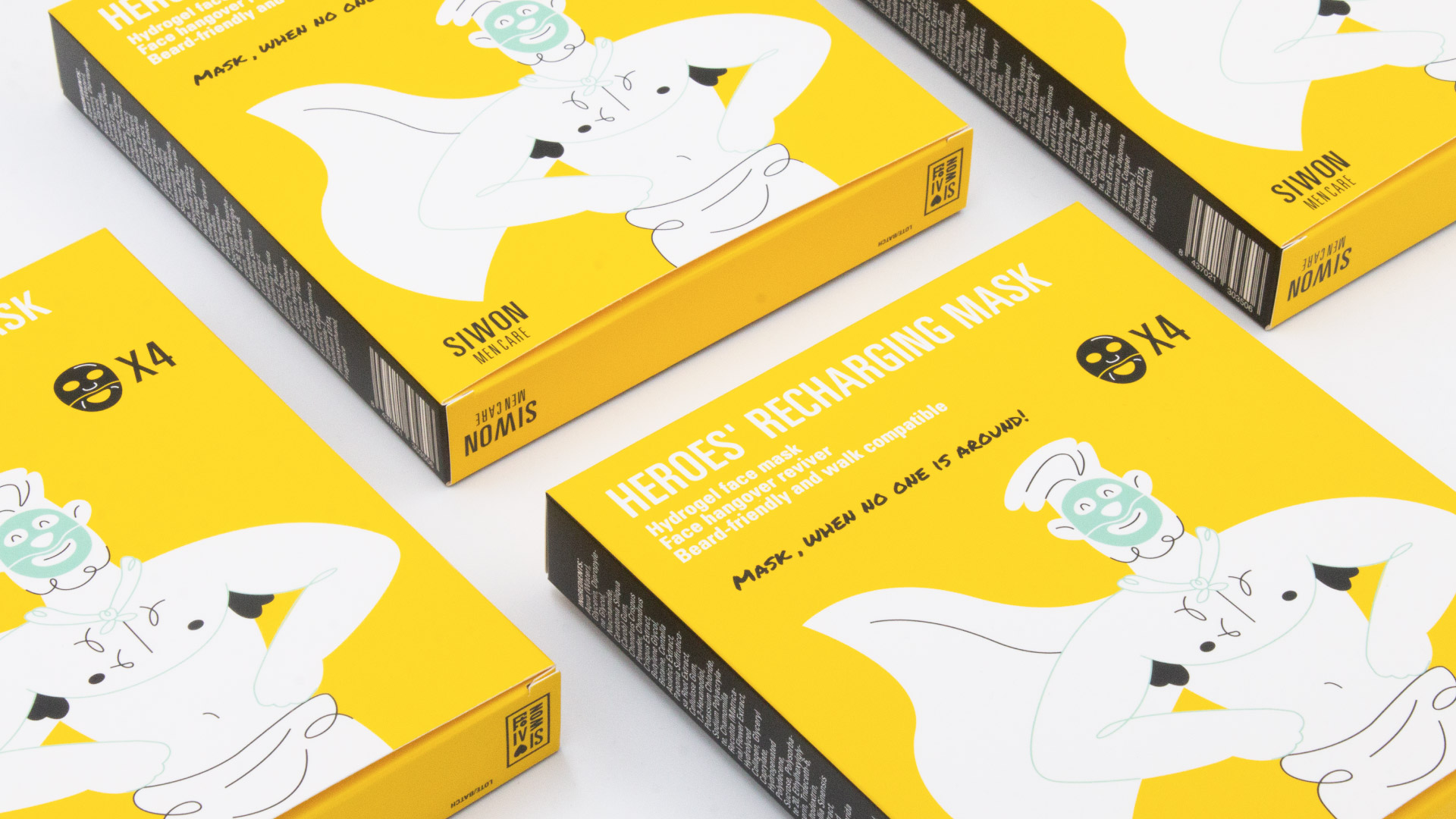
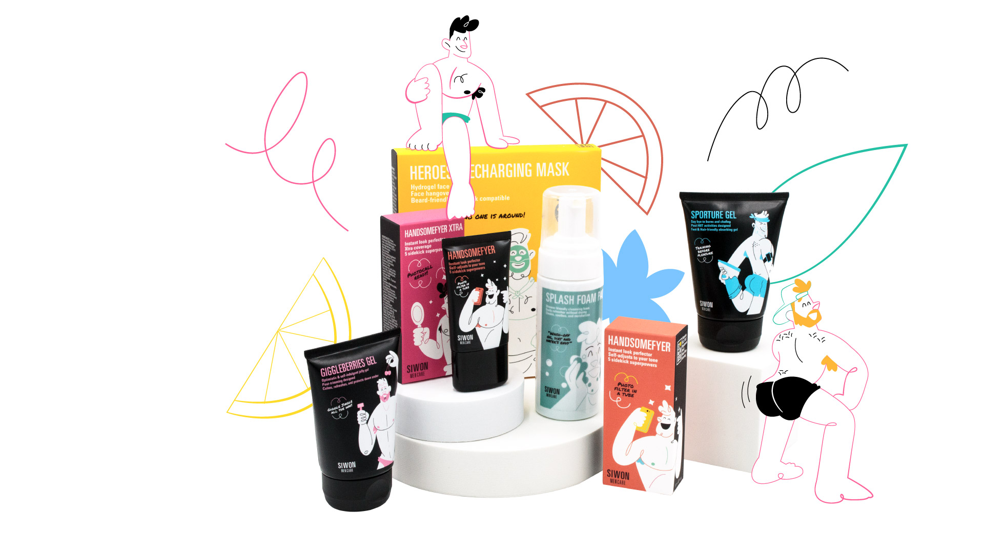
Men’s care products could also be funny and cool. It all started when the client came to me with a proposal to illustrate their packaging but after the first contact, we all agreed on the sketch of the Logo they had needed a full design. We used a sans font for the logo combined with a script font on the rest of the elements of the brand.
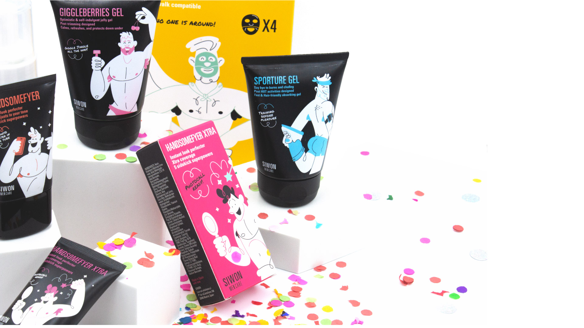
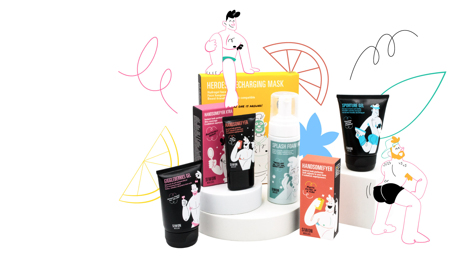
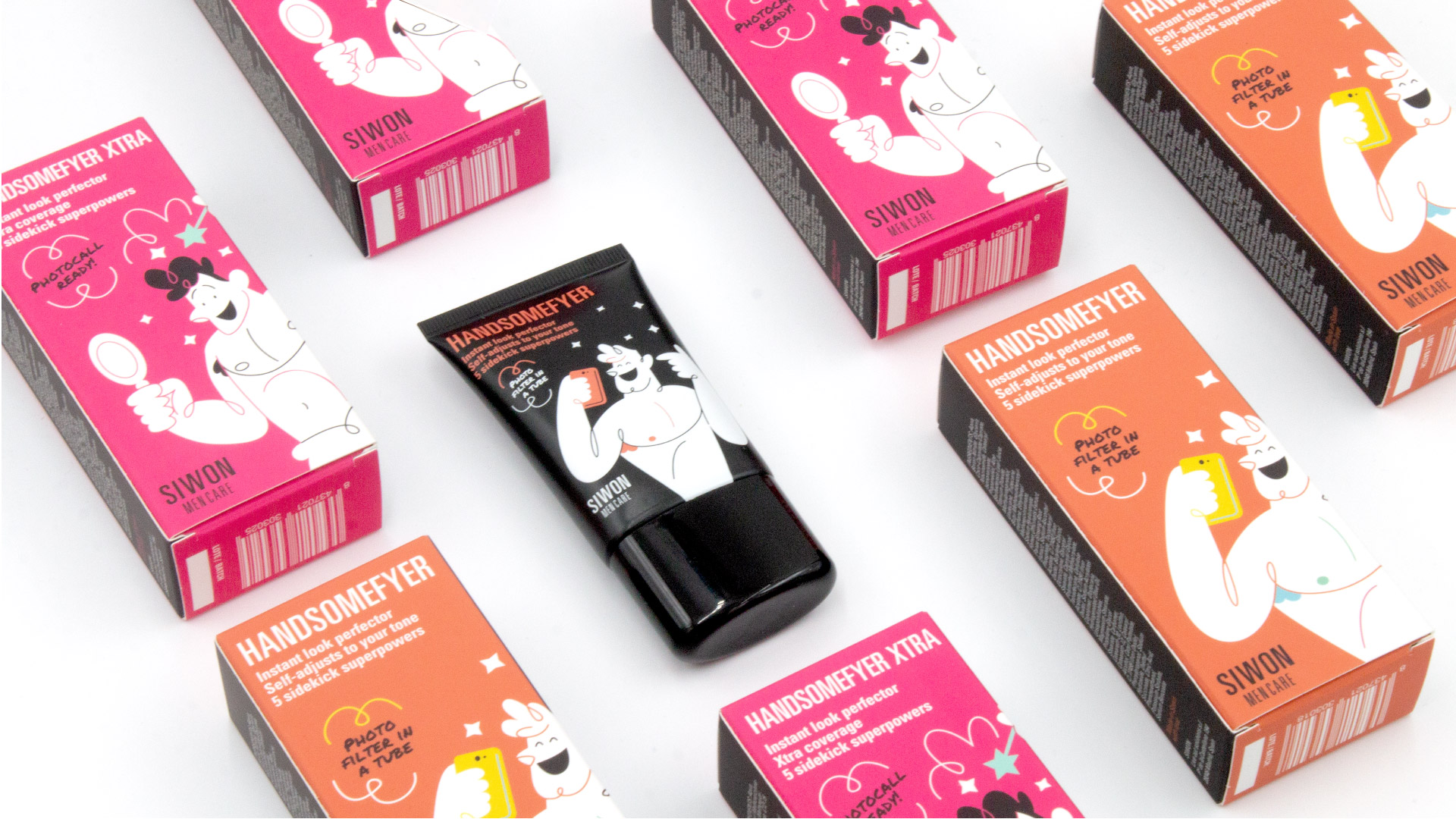
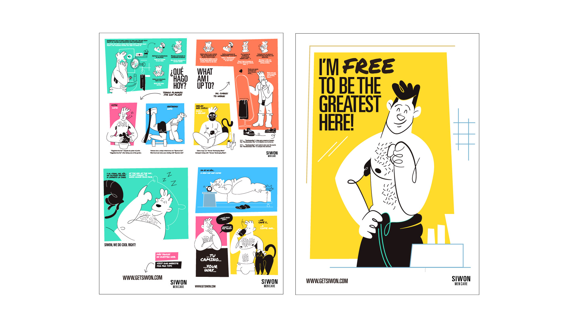
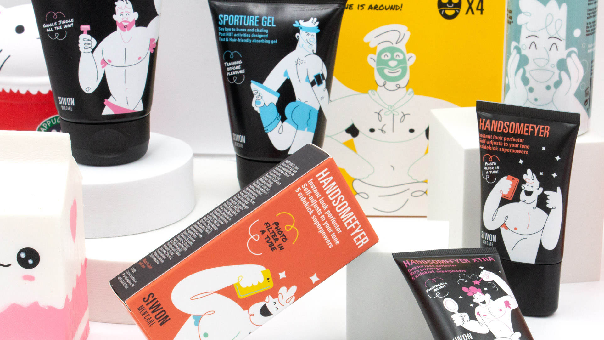
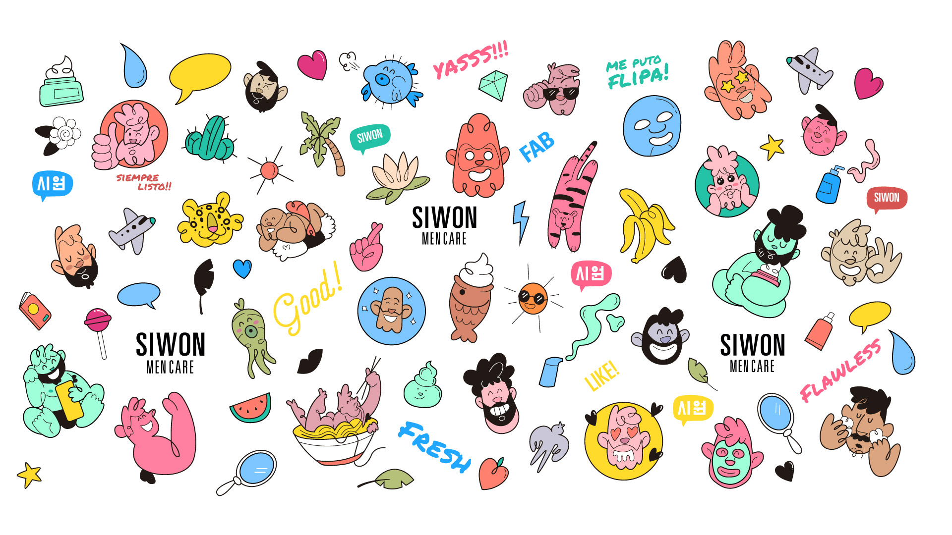
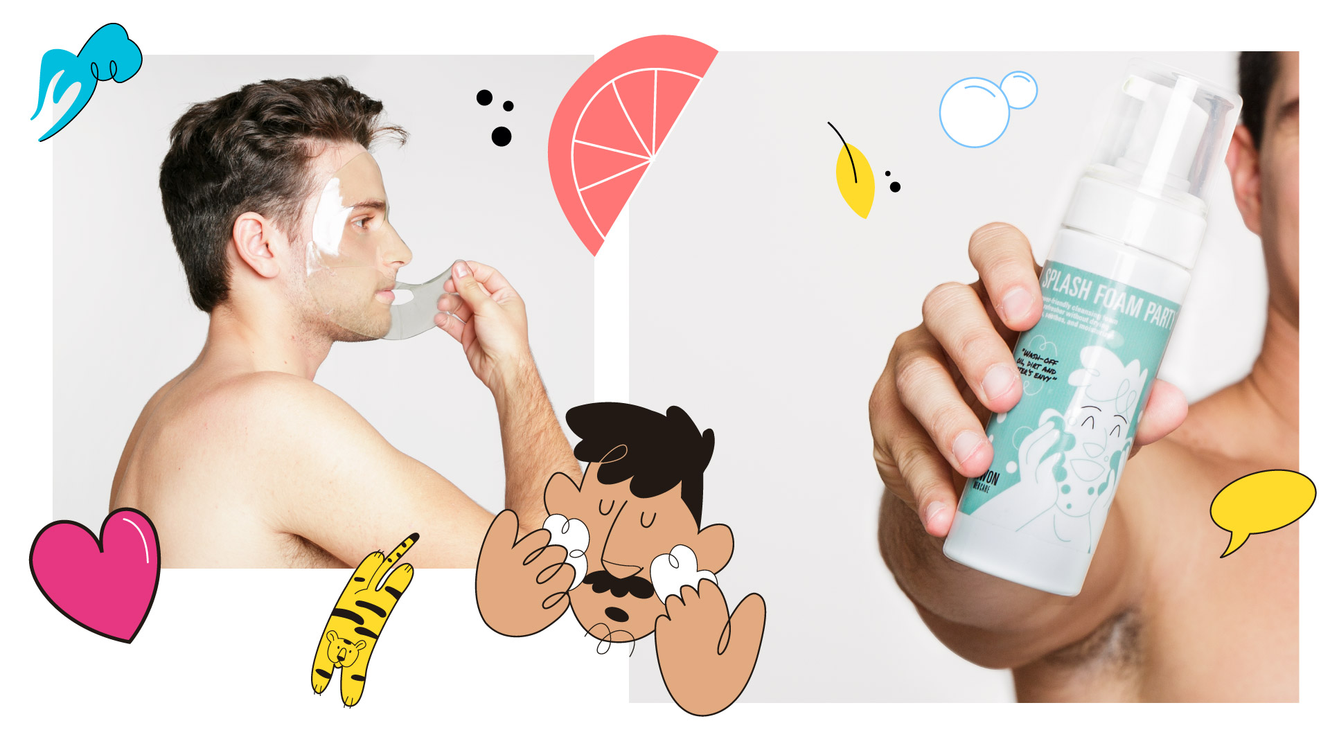
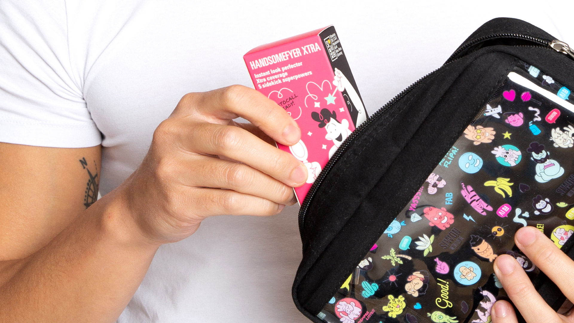
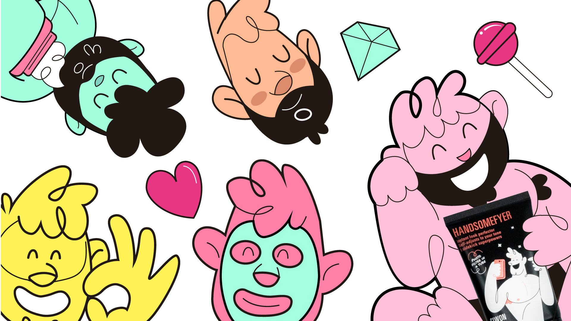
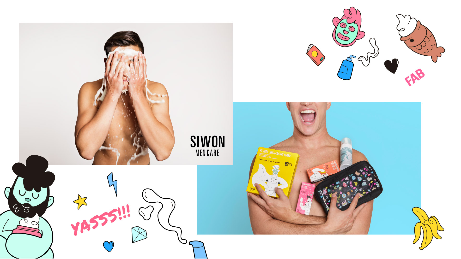
The client wanted a big weight on the illustration for the project so I kept simple with the logo and give a lot of energy to the illustrations. Which are present on the Packaging, website, and merchandise.
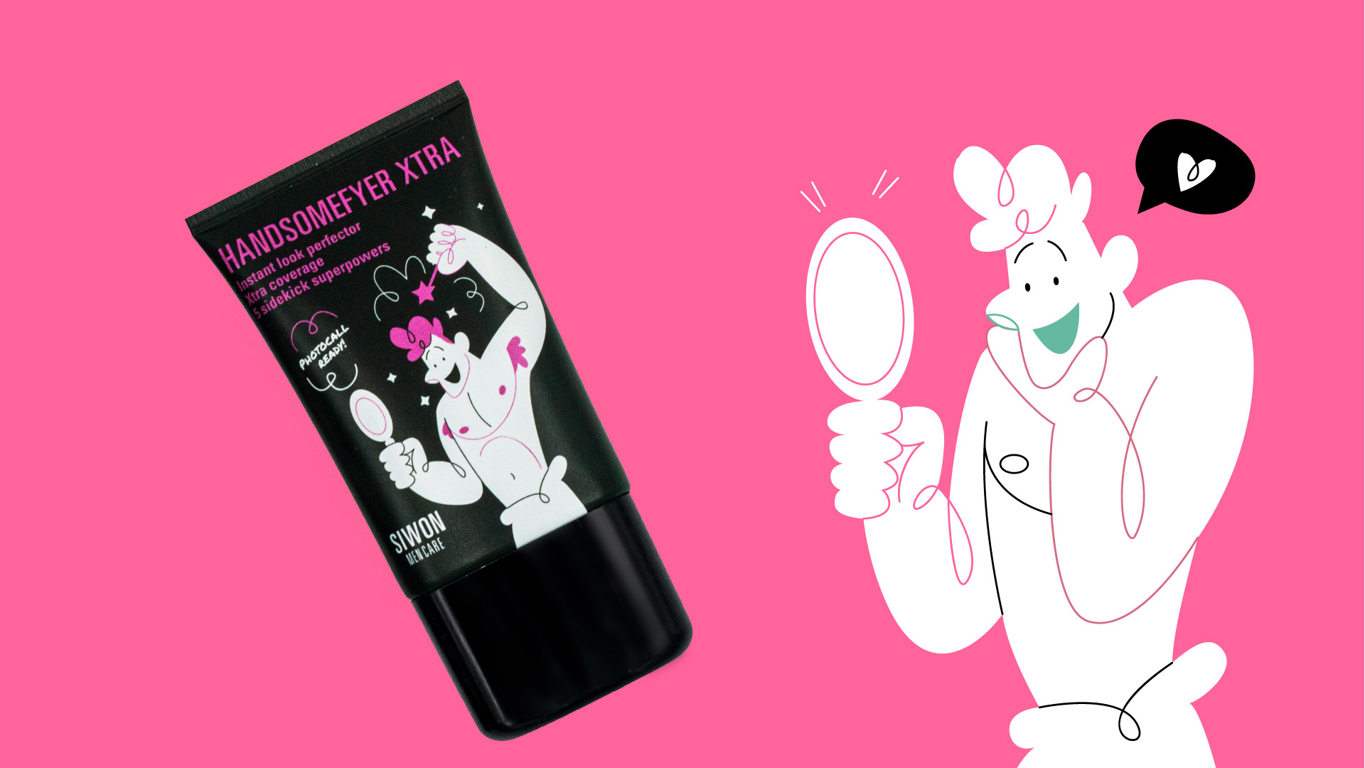
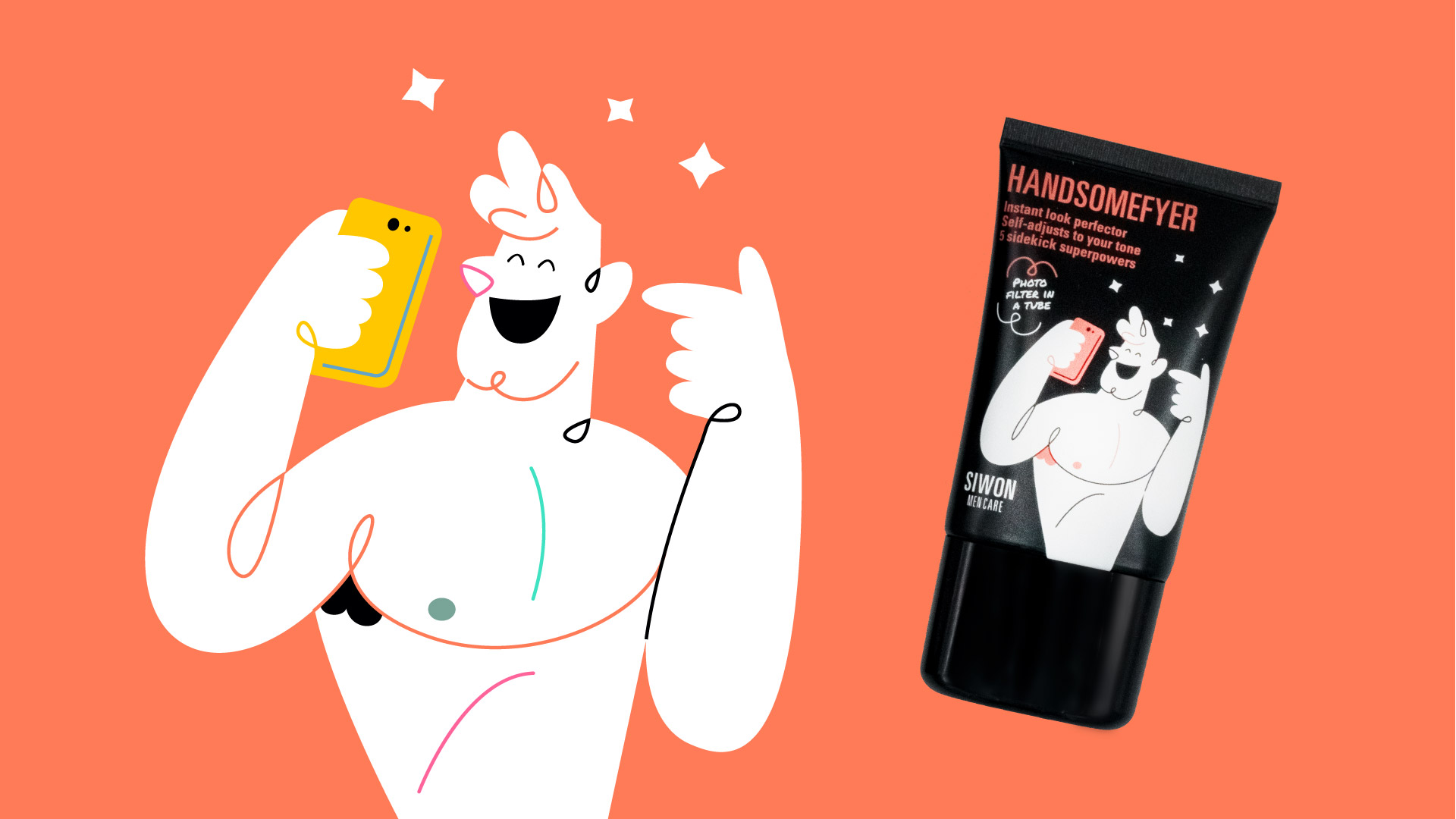
They represent diverse men and celebrate beauty in all of us. Each tube has its own protagonist. We wanted to play the double senses game and It’s funny to see how they become real. The brand is full of Joy and love.
CREDIT
- Agency/Creative: Jaime Hayde Montiel
- Article Title: Siwon Men Care Product Range Illustration and Packaging Design
- Organisation/Entity: Freelance, Published Commercial Design
- Project Type: Identity
- Agency/Creative Country: Spain
- Market Region: Global
- Project Deliverables: Brand Creation, Brand World, Branding, Identity System, Illustration, Packaging Design
- Industry: Retail
- Keywords: Beauty, Men , mencare , beauty brand.


