


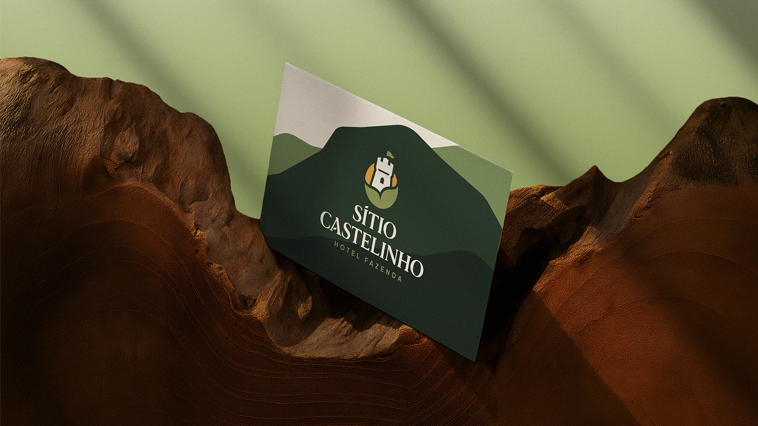
With over a decade of history, Sítio Castelinho introduces a new visual identity that marks a significant chapter in its brand journey. Nestled in the countryside of São Paulo, Brazil, the retreat has long been recognized for offering a welcoming, rustic experience rooted in nature and tradition. Over the years, it has evolved from a rural getaway into a destination that blends comfort, charm, and curated experiences for families, couples, and nature seekers alike.
As its audience has grown more discerning, seeking not only relaxation but also refinement and authenticity, the brand found itself at a turning point. The decision to undergo a rebranding process came as a natural response to this shift — a way to reflect the transformation of the space itself and the aspirations of the people it serves. The new identity embraces this evolution while maintaining the core values that have always defined Sítio Castelinho: hospitality, simplicity, and emotional connection.
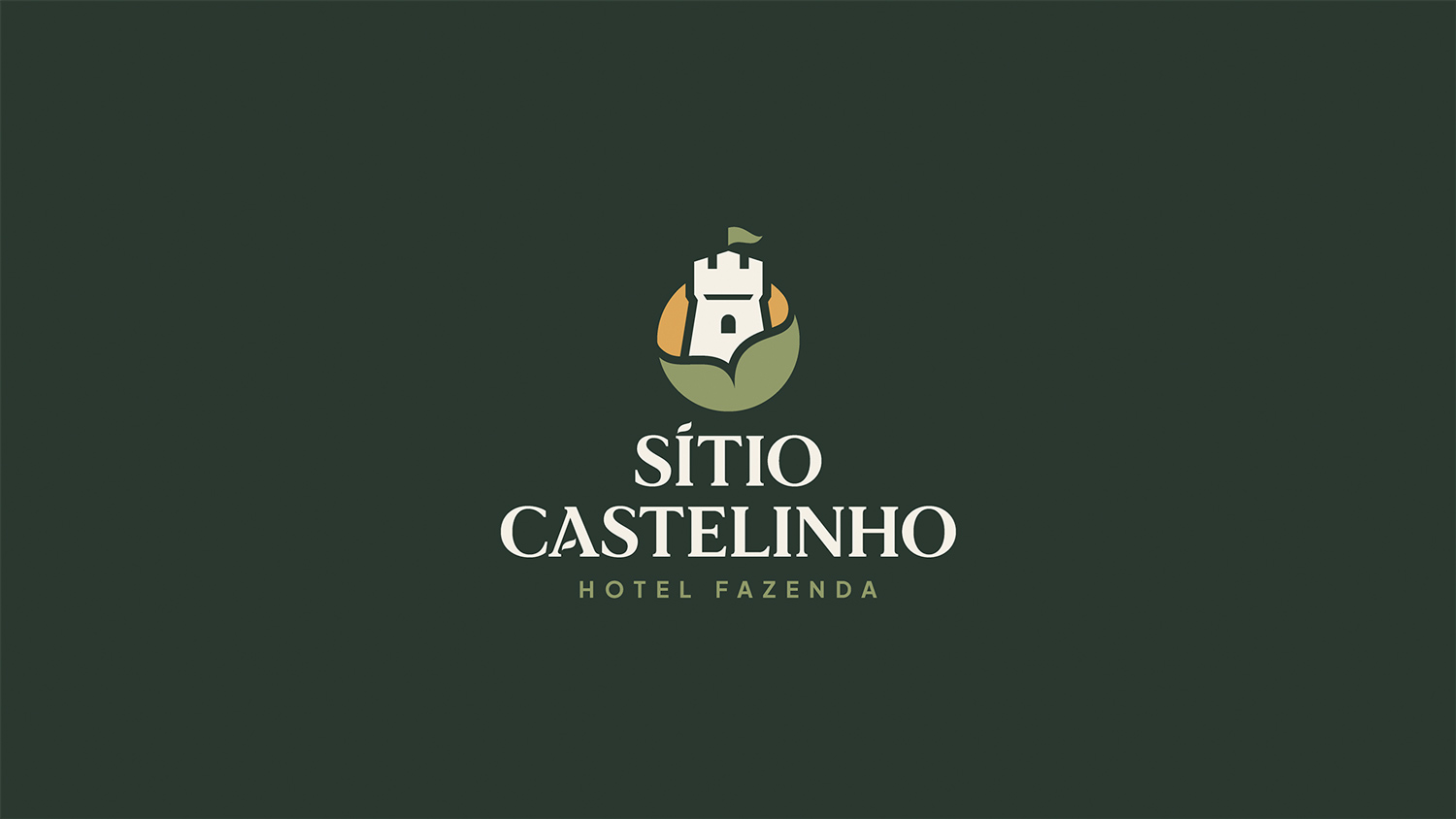
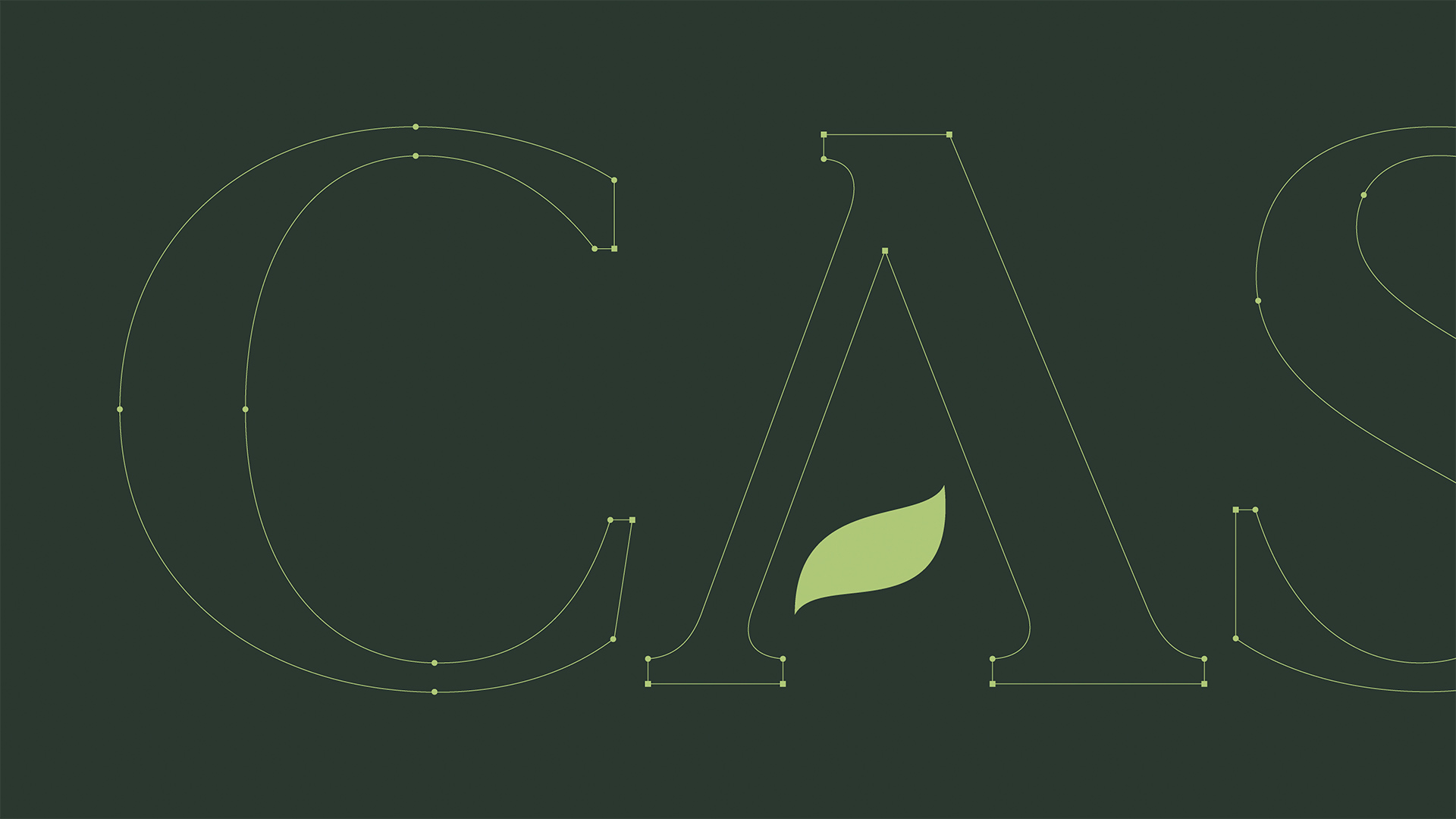
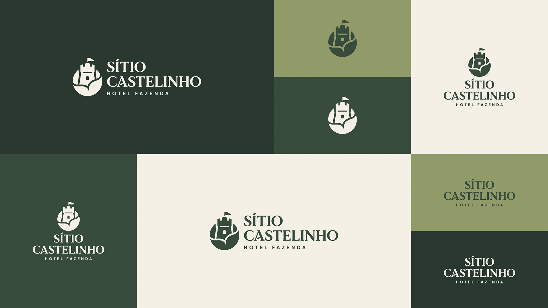
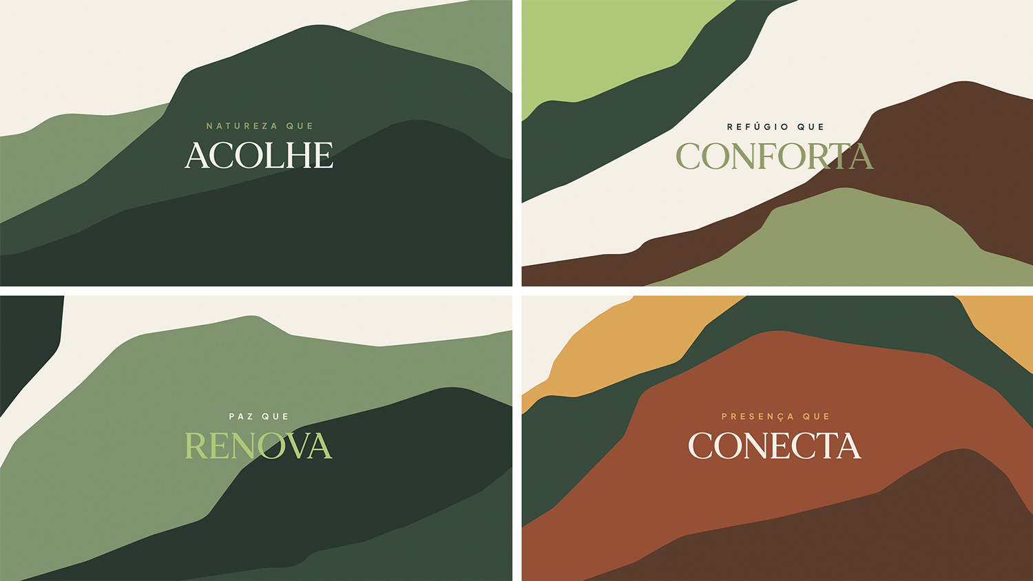
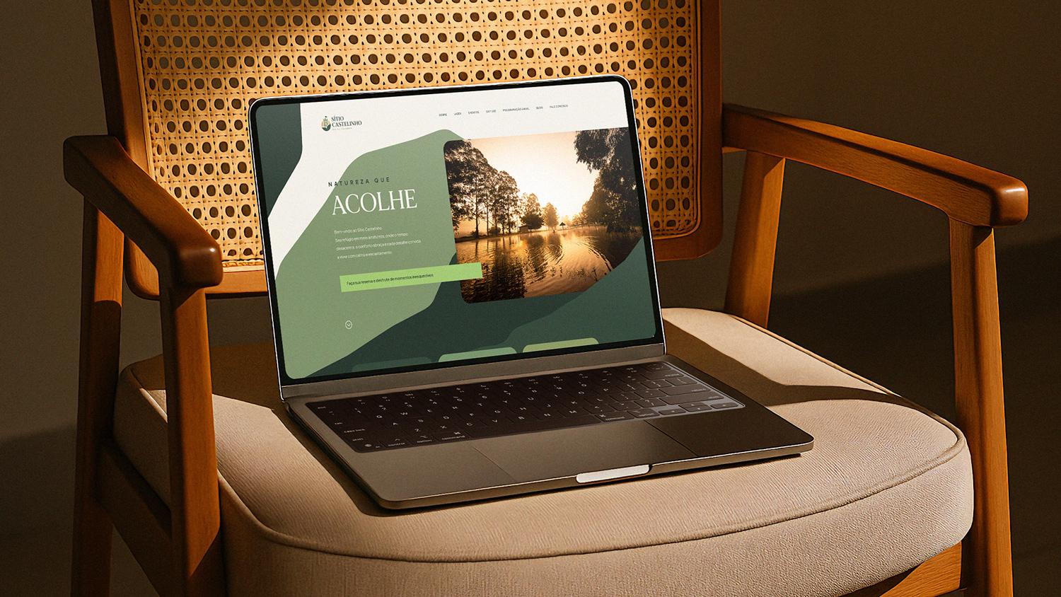
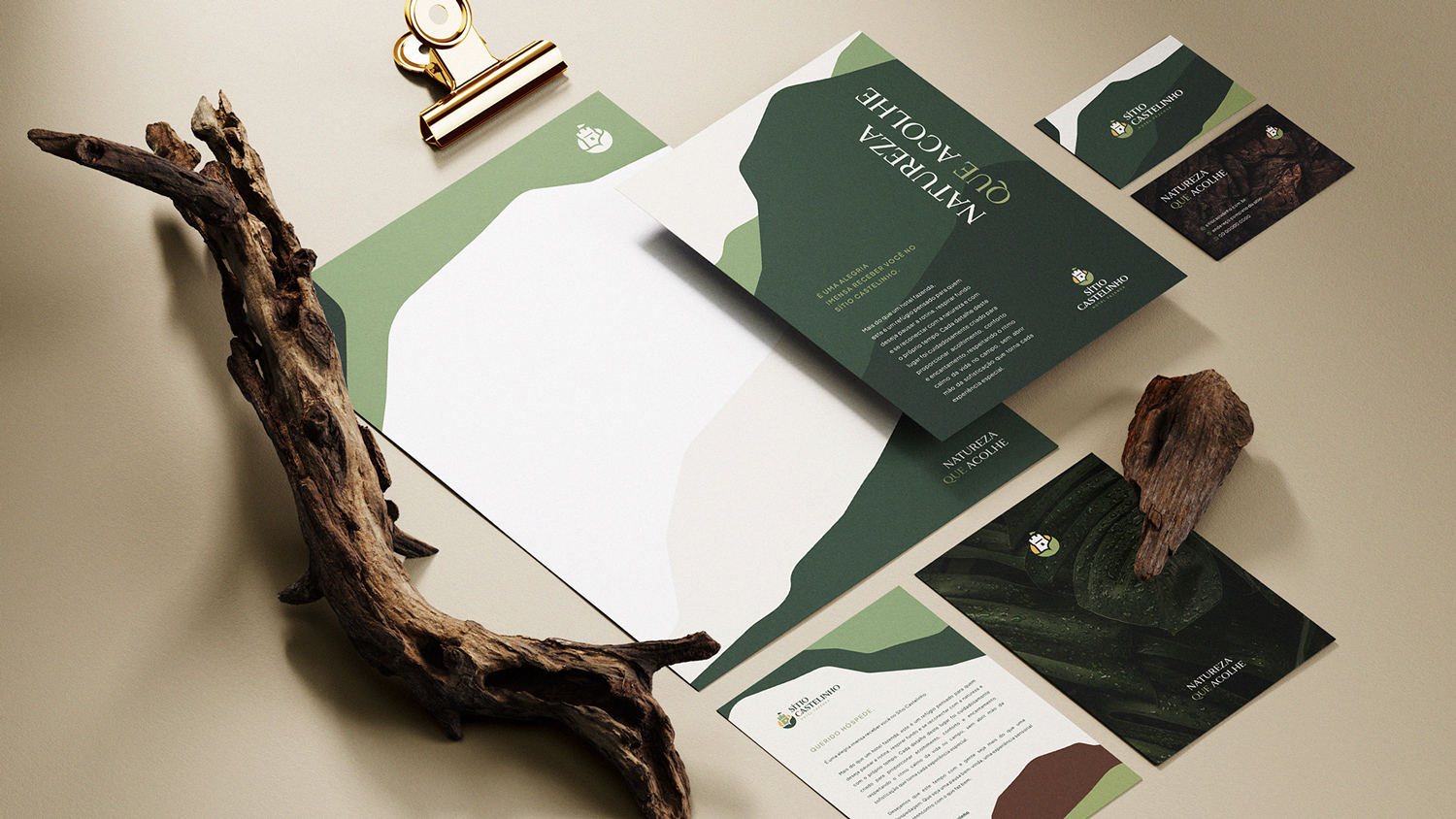
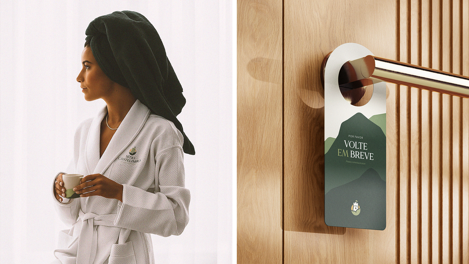
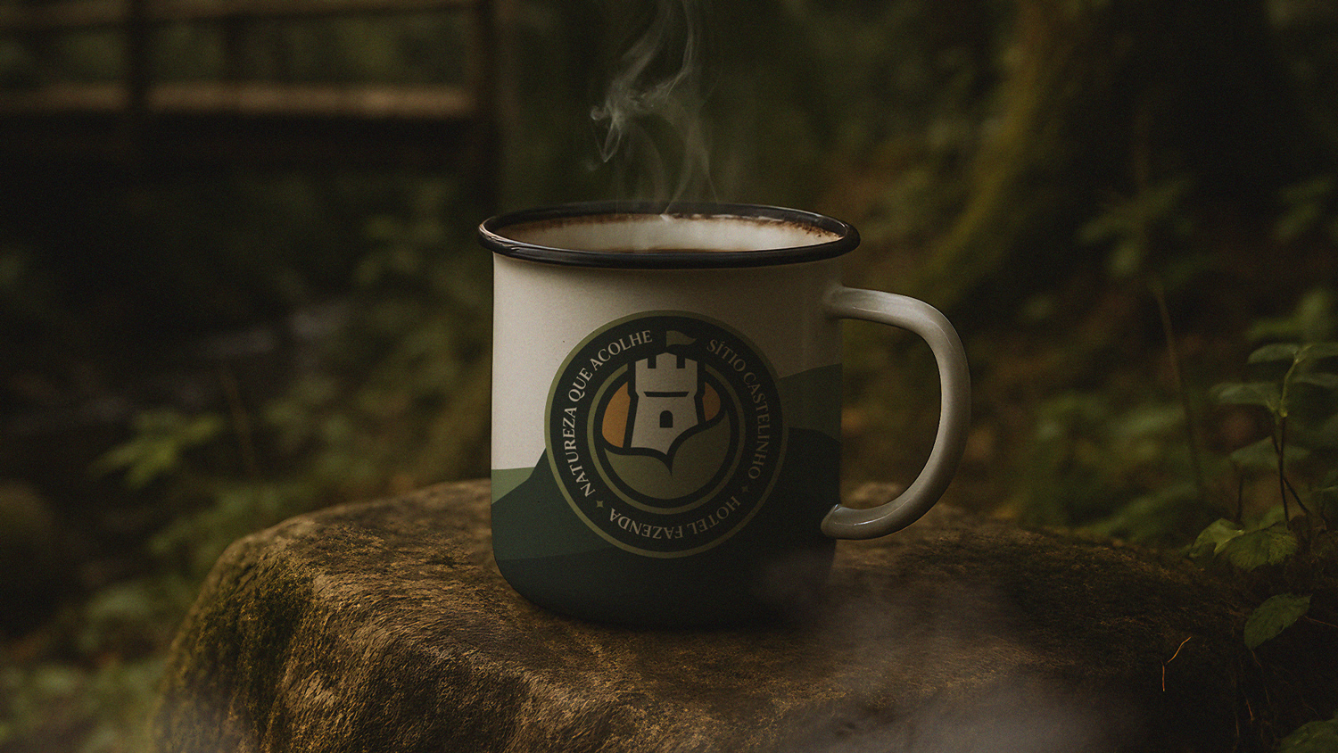
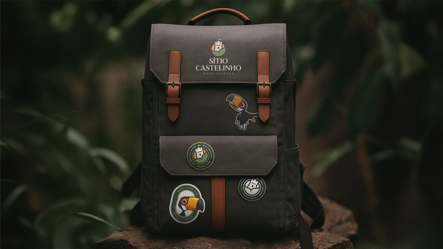
The updated brand language was thoughtfully developed to project a more mature and sophisticated image. While details such as color palette and typography were carefully considered, the overarching goal was to communicate a deeper message — that Sítio Castelinho is more than just a countryside hotel. It is a place to reconnect with what truly matters, to experience calm with elegance, and to celebrate life’s essential pleasures in a beautifully designed environment.
The new visual identity seeks to strengthen the emotional bond between the brand and its guests, reinforcing its positioning as a premium rural experience. It also prepares the brand for future growth, enabling consistent communication across all platforms while aligning the visual language with the elevated experiences now being offered on-site.
This transformation reflects not only a strategic move but a symbolic one. It’s a reaffirmation of purpose — to continue offering meaningful experiences rooted in nature, enhanced by design and care. As Sítio Castelinho steps confidently into this new era, it remains grounded in its origins, yet ready to meet the expectations of a new generation of travelers seeking authenticity, serenity, and timeless sophistication.
CREDIT
- Agency/Creative: MDOM Brands
- Article Title: Sítio Castelinho Unveils a Refreshed Visual Identity to Strengthen Its Roots and Connect With a More Sophisticated Audience
- Organisation/Entity: Freelance
- Project Type: Identity
- Project Status: Published
- Agency/Creative Country: Brazil
- Agency/Creative City: Campinas, São Paulo
- Market Region: South America
- Project Deliverables: Brand Architecture, Brand Creation, Brand Design, Brand Identity, Brand Mark, Brand Redesign, Brand Strategy, Graphic Design, Logo Design, Rebranding
- Industry: Hospitality
- Keywords: rebranding, visual identity, brand design, hospitality, nature, hotel branding, strategic design, brand refresh, experience, authenticity
-
Credits:
Visual Identity: MDOM Brands


