


This brief came to the agency from an entrepreneur who wanted to bring to reality his idea of ice cream with alcohol for adults, in total 3 proposals were submitted (this one of them) to see the feasibility of making the packaging and the material that was most suitable for the production process. After several tests and a change in the name, the brand went to the market and extended its portfolio since the idea of an ice cream with alcohol was liked by the young public of the city.
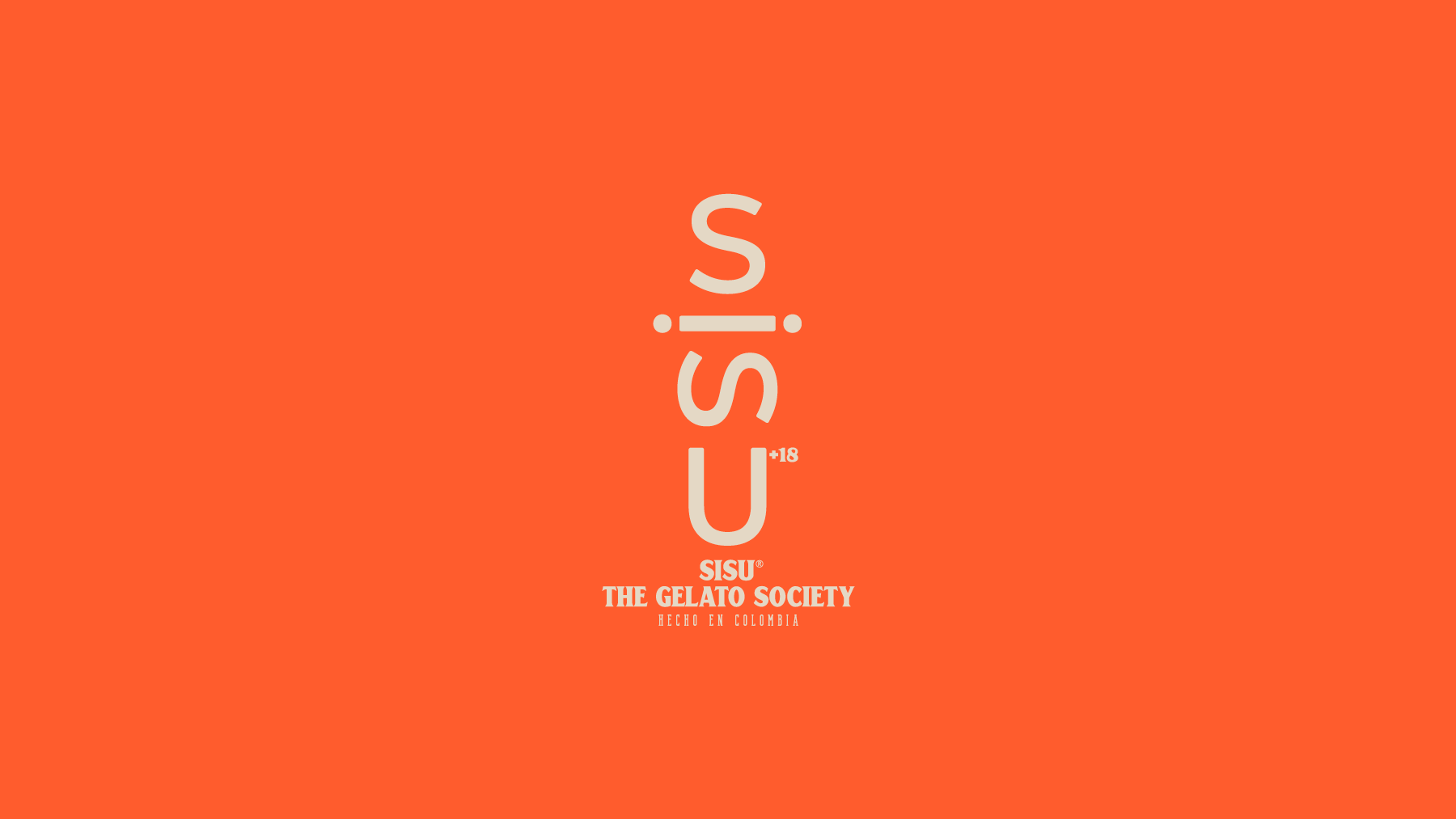
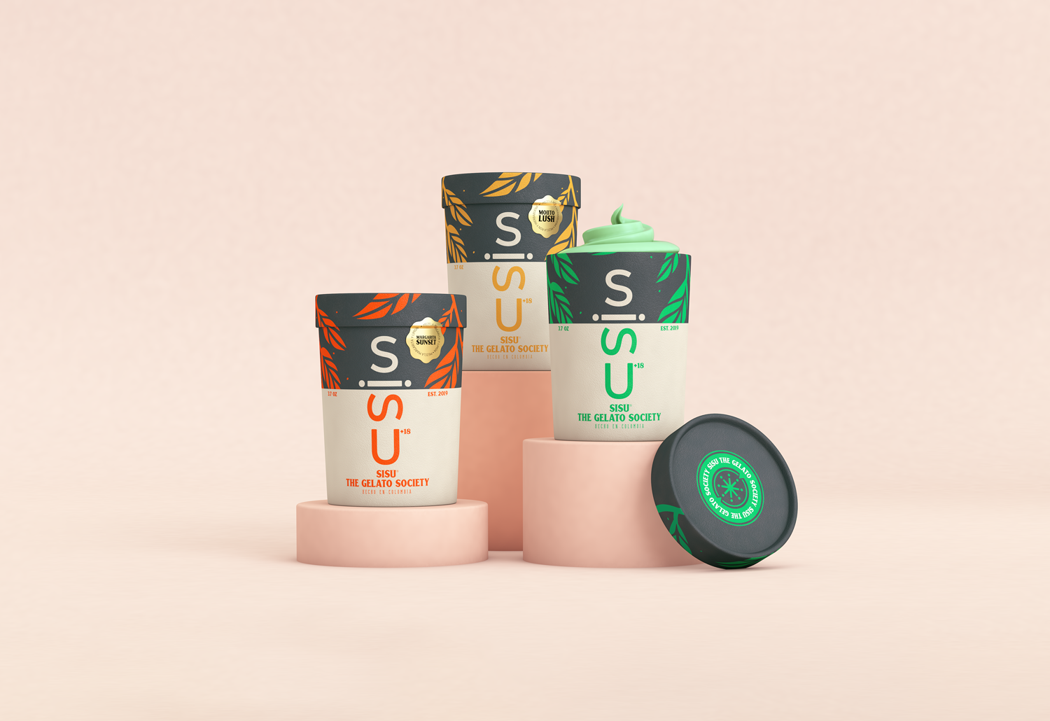
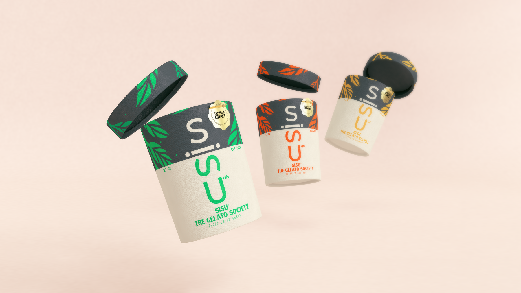
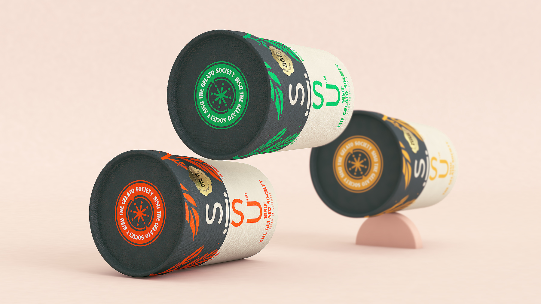
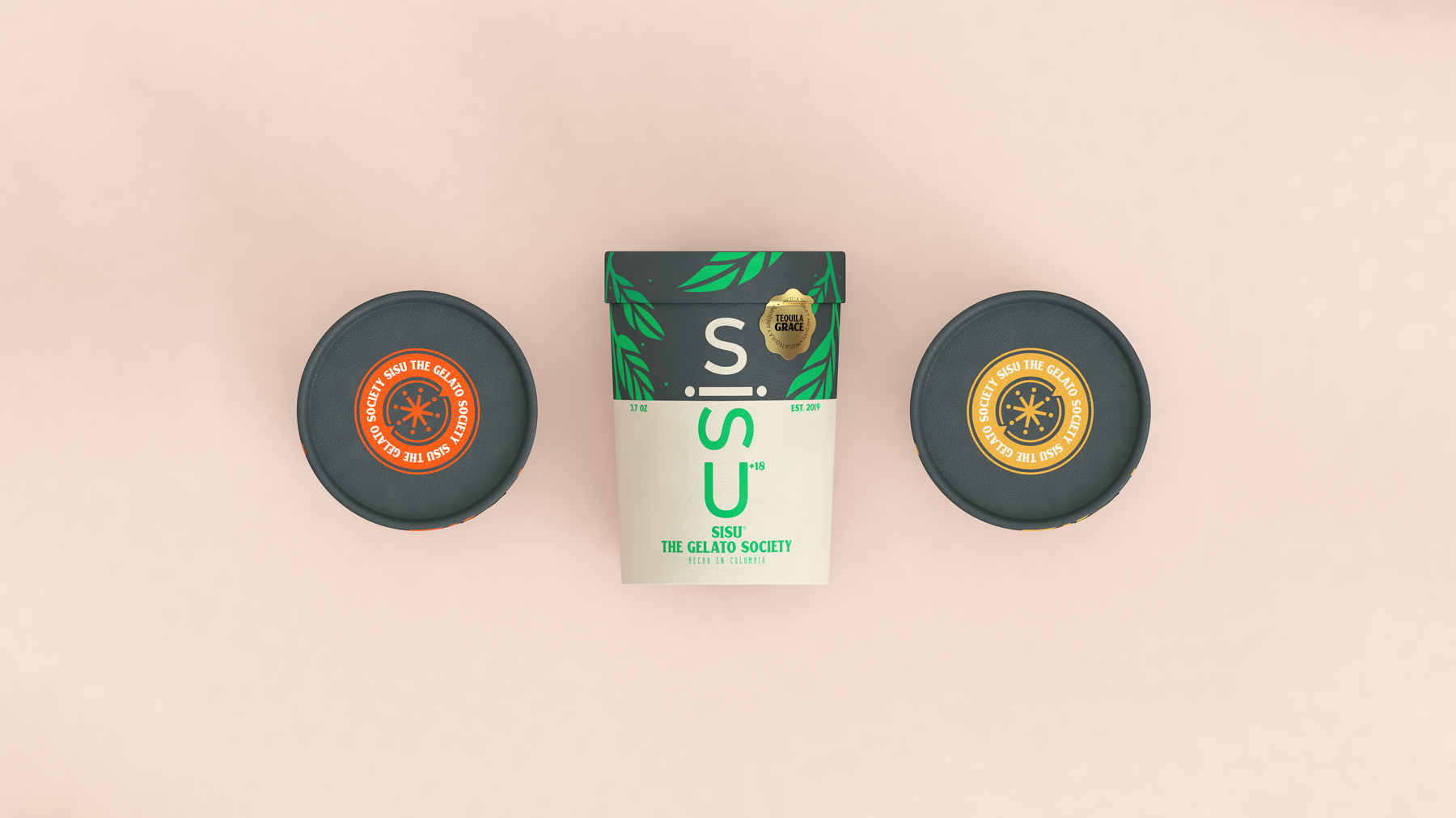
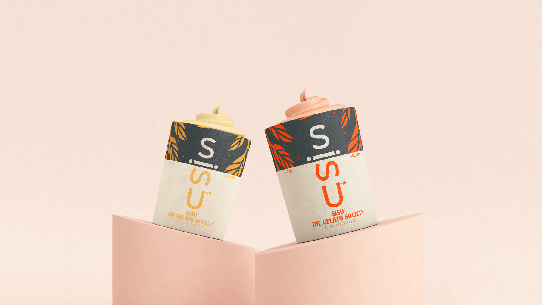
The design evokes the mountains and plants of Finland, where the word “SISU” comes from, meaning strength and perseverance, because the owner of the brand provided this information and wanted the name to be remembered for something other than alcohol. This was the first concept, the brand went to market and is a success.
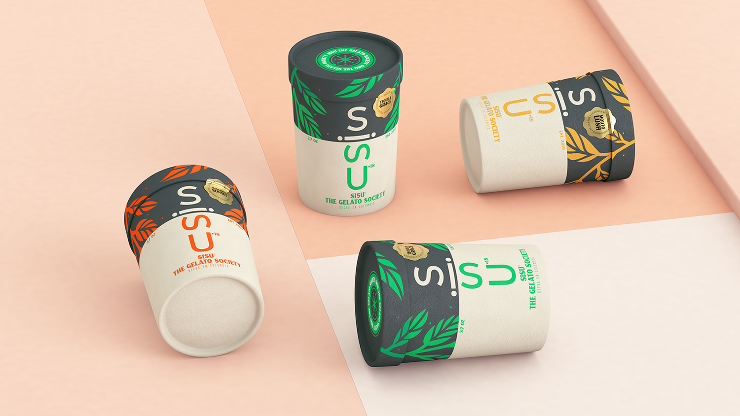
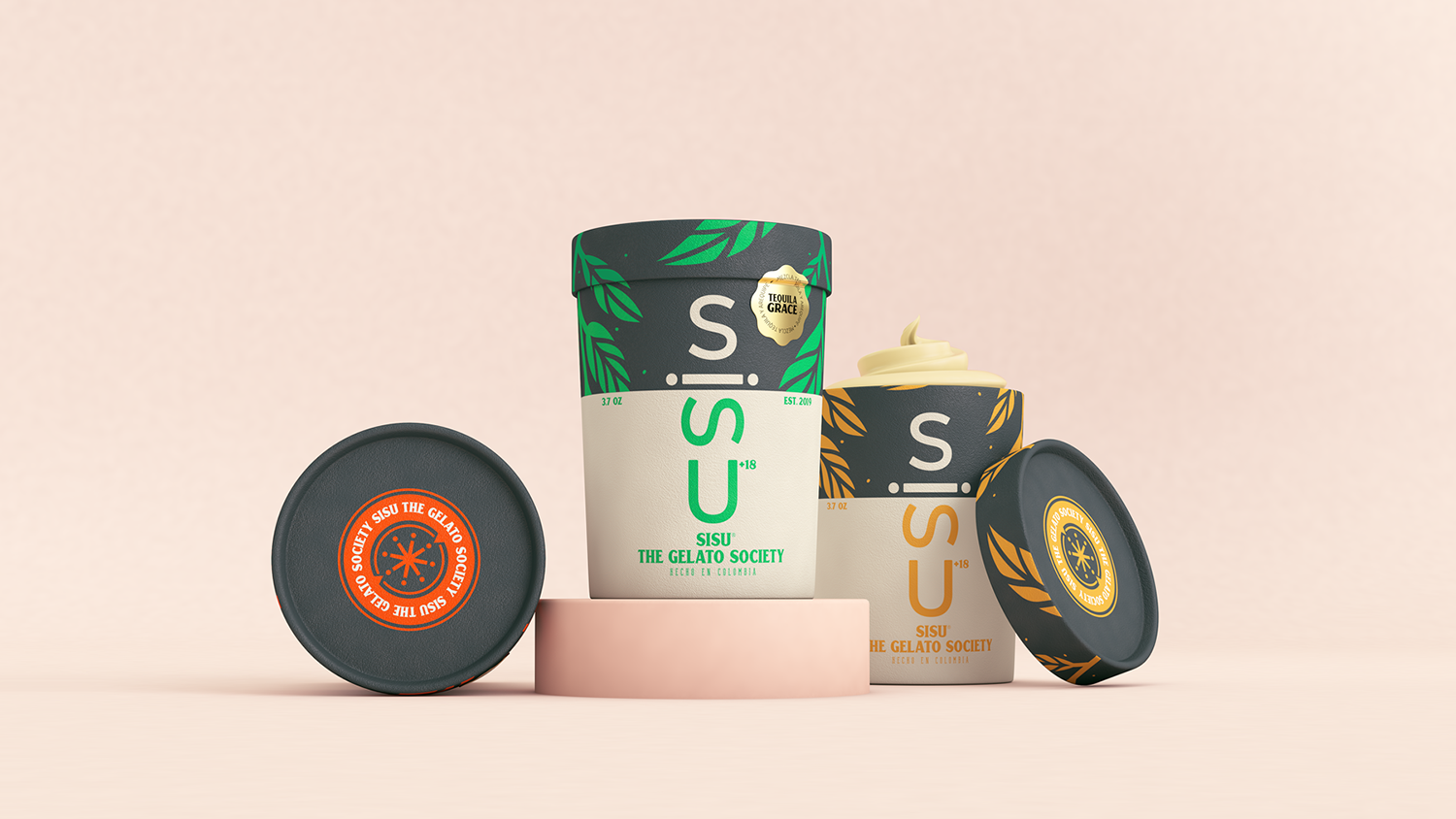
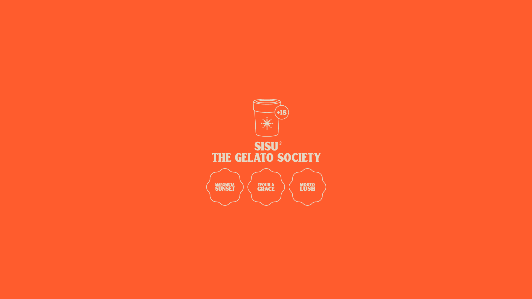
This product is aimed at people over 18 years of age who like to enjoy a rich flavor, but with some spice, although it is not only for the parties as it is currently sold for plans such as watching series or heartbreak. These are the initial 3d and the idea was to have for each flavor a color that would identify it and a special name that would define the flavor of the ice cream and the cocktail of which it is composed. One of the main challenges was that people did not confuse it with a simple ice cream, so sub-names were created so that the public would associate the ice cream with alcohol and more with the mixtures of recognized cocktails such as the Margarita.
A product with these characteristics had not been marketed in Colombia before and it has been very well received since it is an innovative idea. As for the packaging material, we proposed a matte material so that the seal that joins the lid of the bottle, which was gold in color, would have more relevance and would not leave aside the elegance and sobriety that was requested in the brief. For the presentation we decided that the background color would be flat, as well as the geometric figures to give more prominence to the packaging since it is very sober and minimalist, but that was the concept we wanted to have because the target audience of the product required it.
CREDIT
- Agency/Creative: Mullen Lowe 43
- Article Title: Sisu Gelato Society Concept Brand and Packaging Designed by Mullen Lowe 43
- Organisation/Entity: Agency, Non Published Concept Design
- Project Type: Packaging
- Agency/Creative Country: Colombia
- Market Region: South America
- Project Deliverables: Brand Identity, Brand World, Branding, Packaging Design
- Format: Can, Cup
- Substrate: Plastic, Pulp Moulded Fibre


