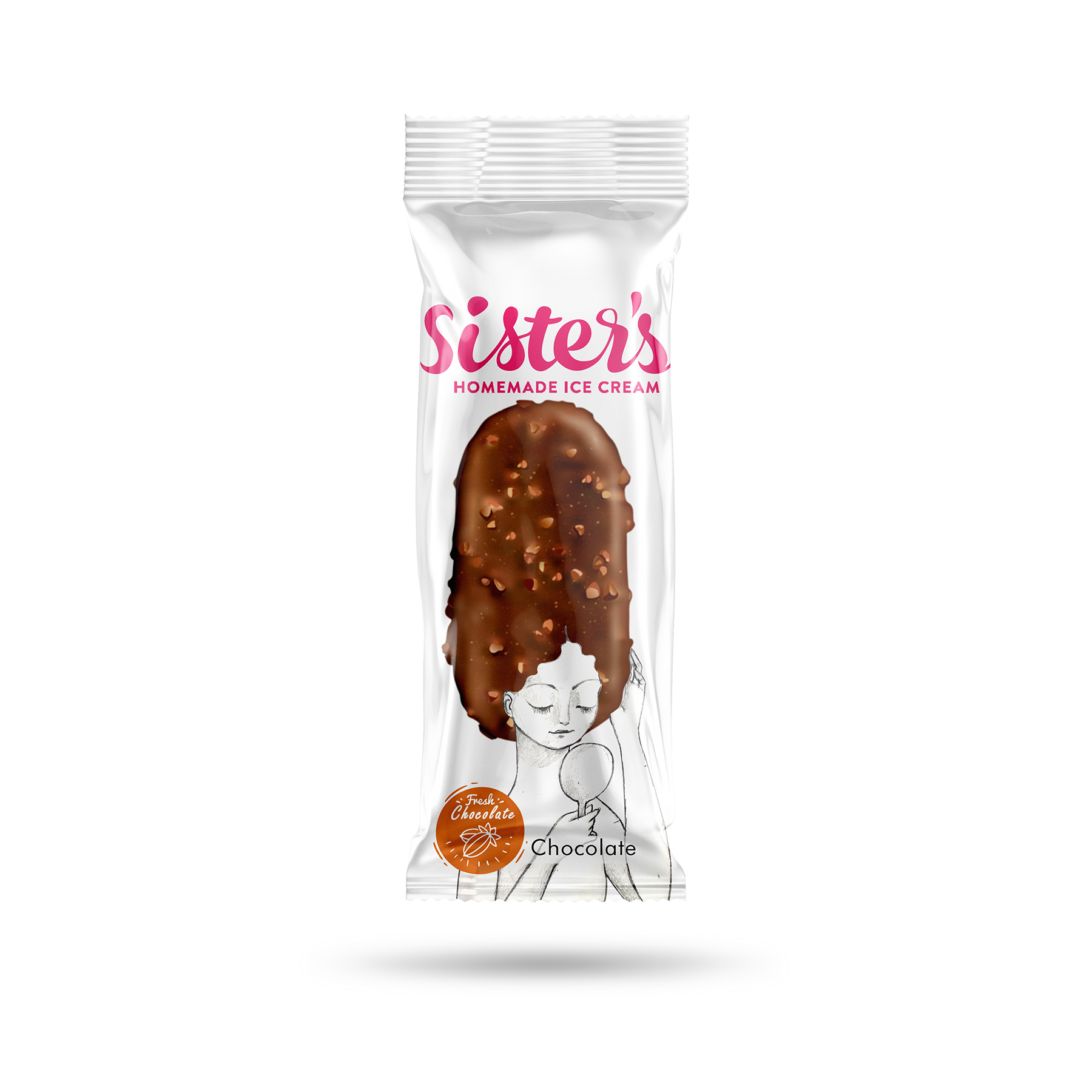
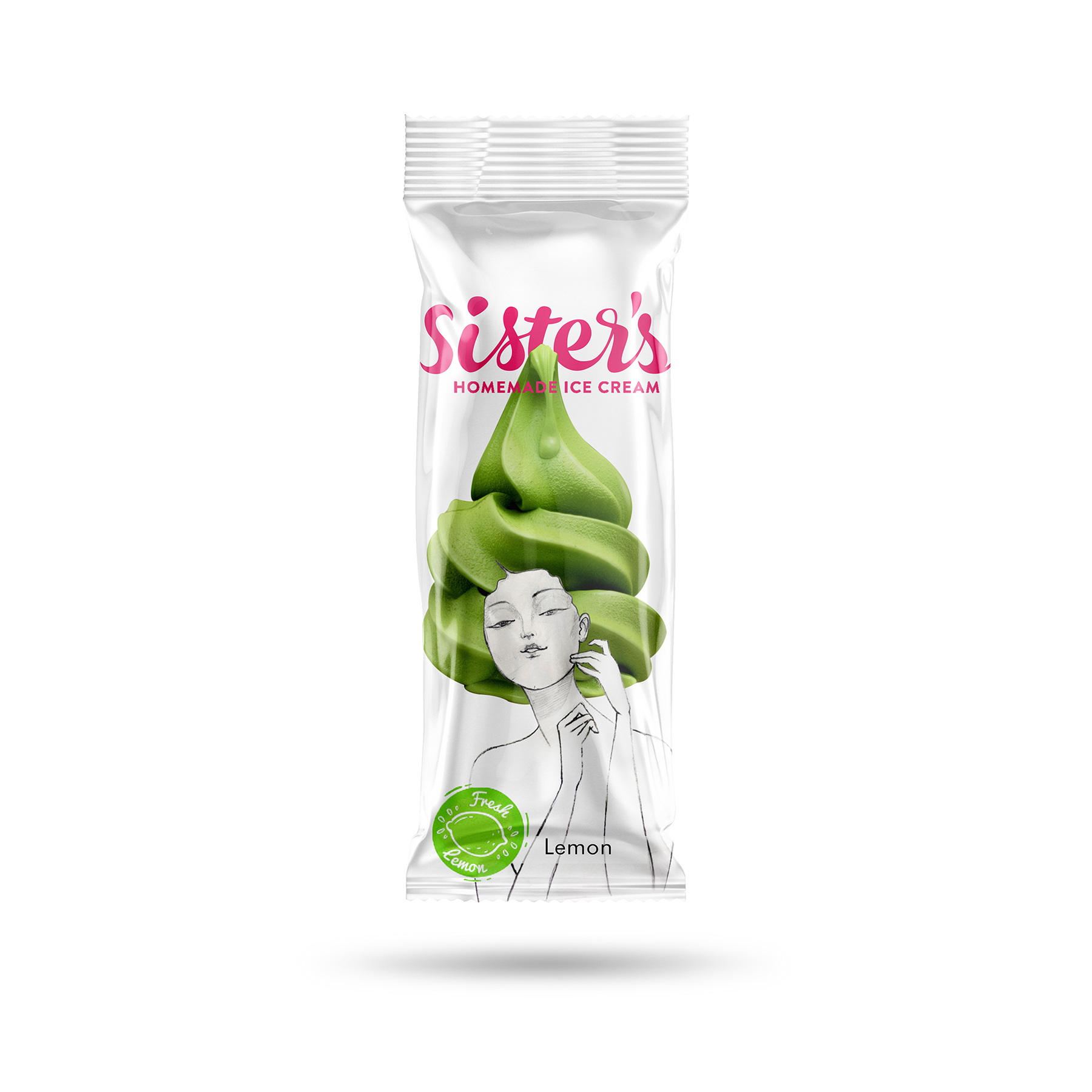
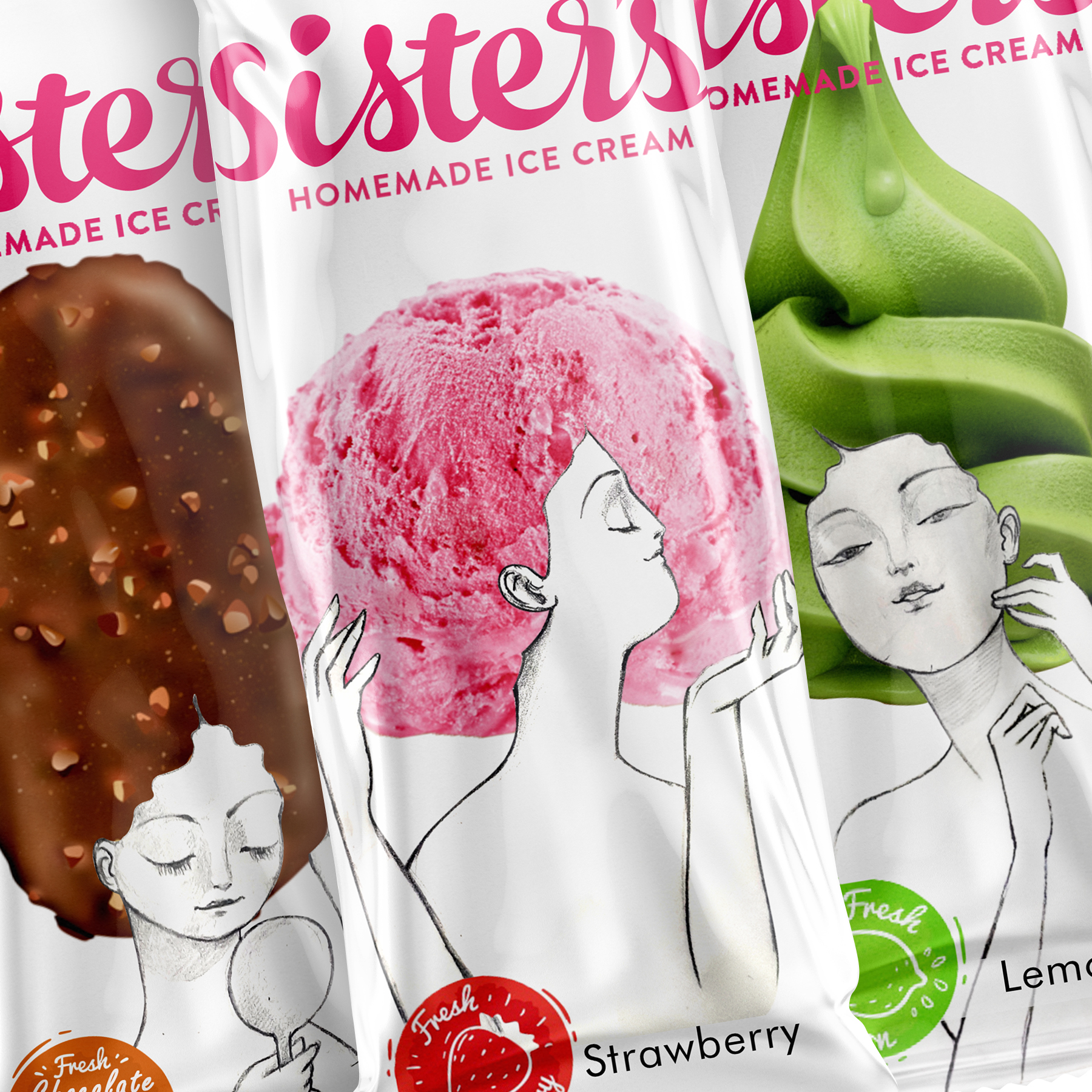
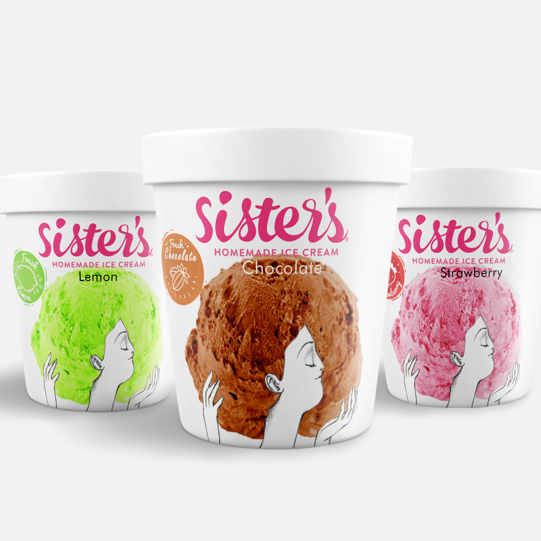
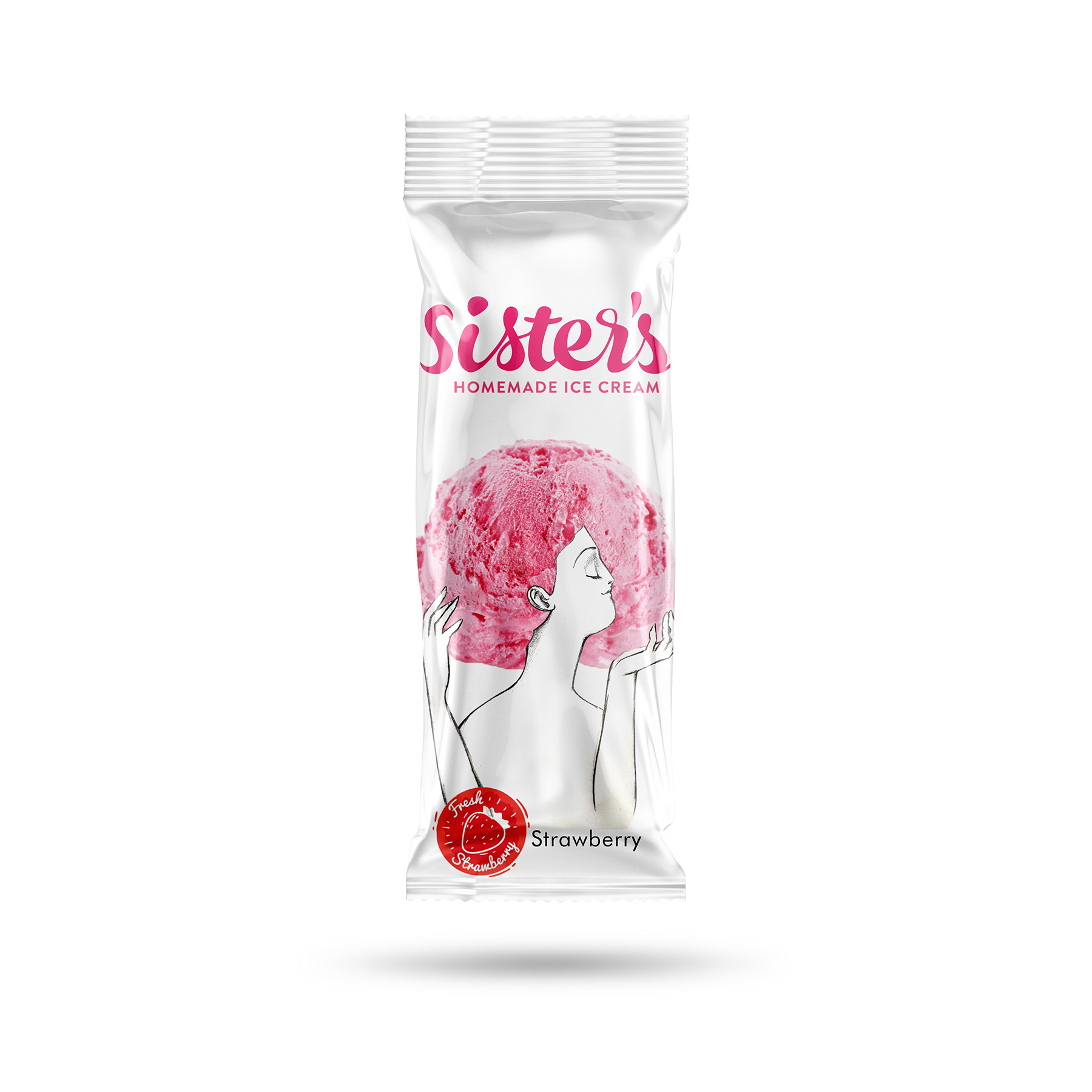
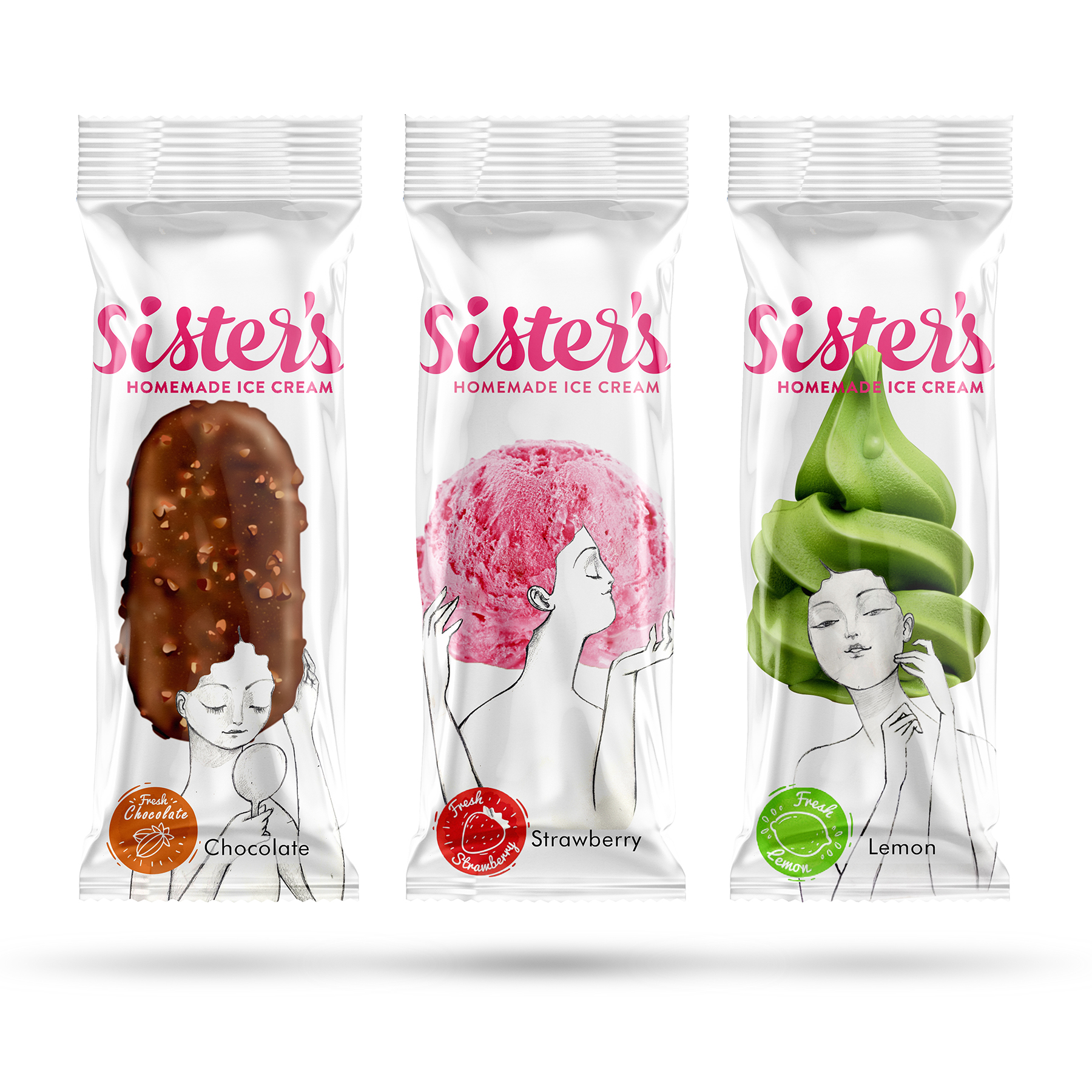
This Packaging is designed for the Sisters Ice Cream Company. The design team has tried to use three ladies, who are reminiscent of the manufacturers of this product, in the form of happy colors that come from the taste of each ice cream. In each flavor of the design, the shape pf the ice cream is used as the character’s hair, which presents an interesting and new image of ice cream packaging. This design, in its new form, has attracted a lot of attention amongst its competitors and has had high sales. The design tries to create original and creative packaging.
CREDIT
- Agency/Creative: Azadeh Gholizadeh
- Article Title: Sister’s Homemade Ice Cream
- Organisation/Entity: Freelance, Published Commercial Design
- Project Type: Packaging
- Agency/Creative Country: Iran
- Market Region: Europe
- Project Deliverables: Brand Strategy, Graphic Design, Illustration, Packaging Design, Product Naming
- Format: Bag
- Substrate: Plastic
FEEDBACK
Relevance: Solution/idea in relation to brand, product or service
Implementation: Attention, detailing and finishing of final solution
Presentation: Text, visualisation and quality of the presentation


