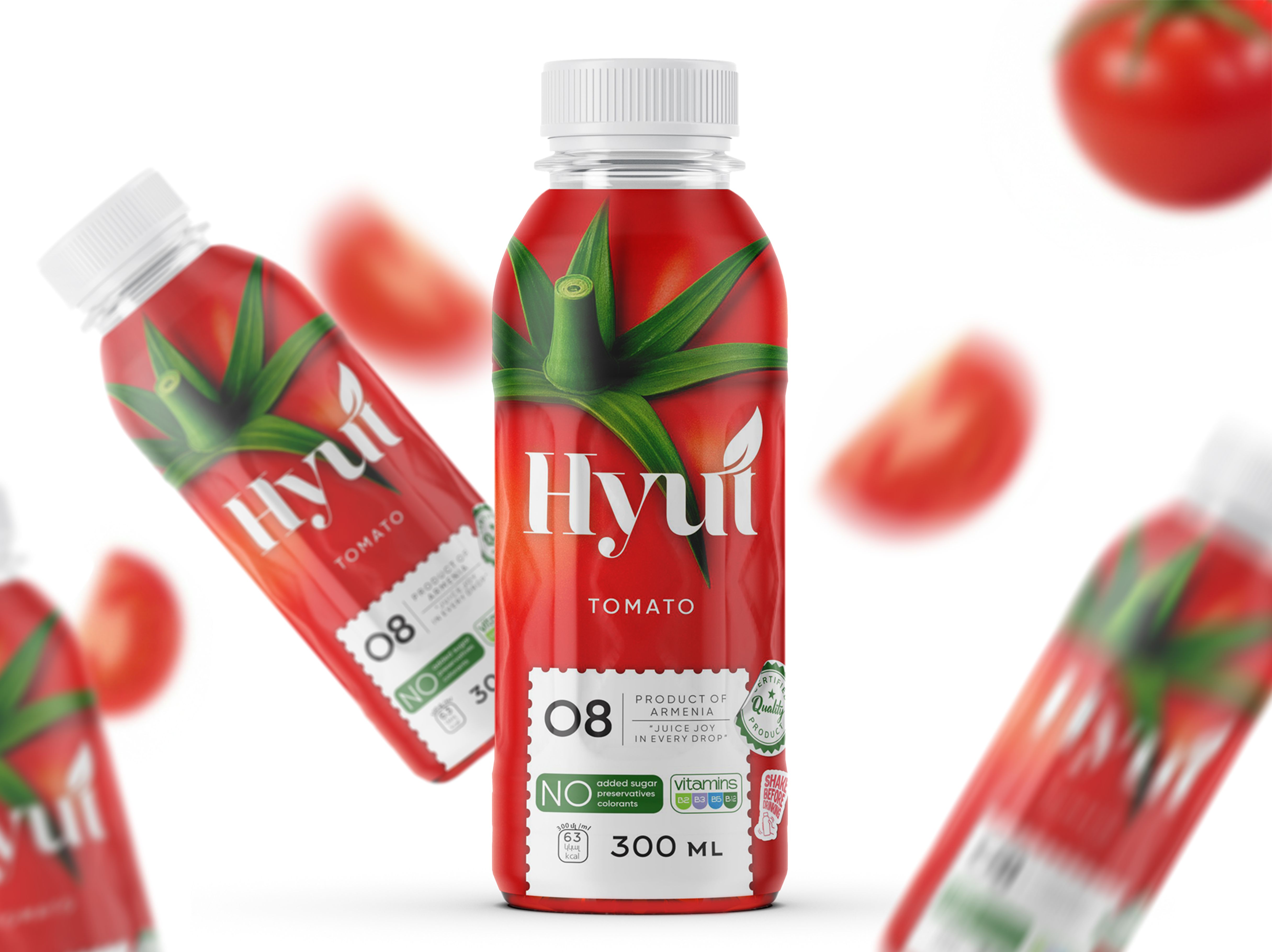
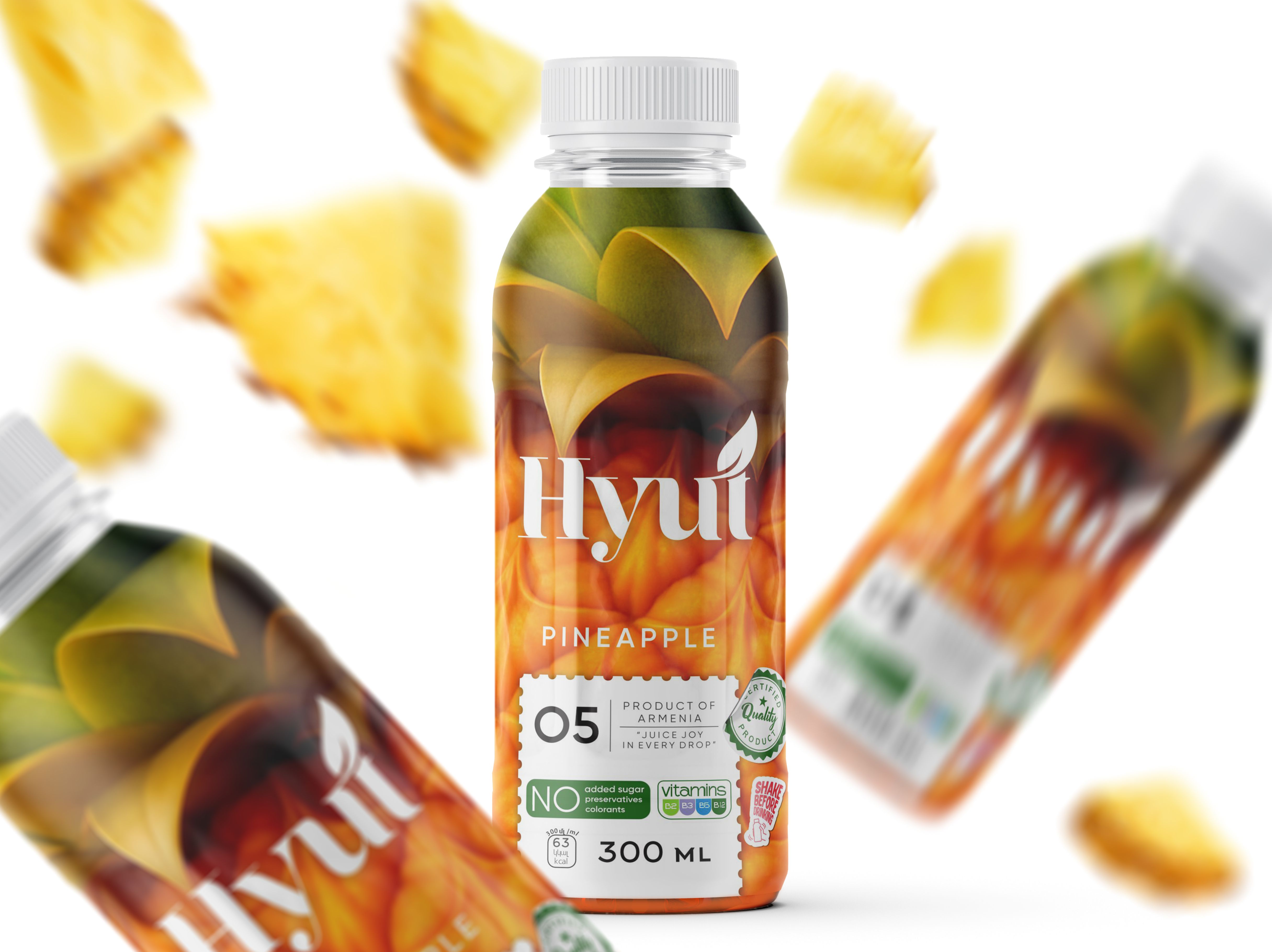
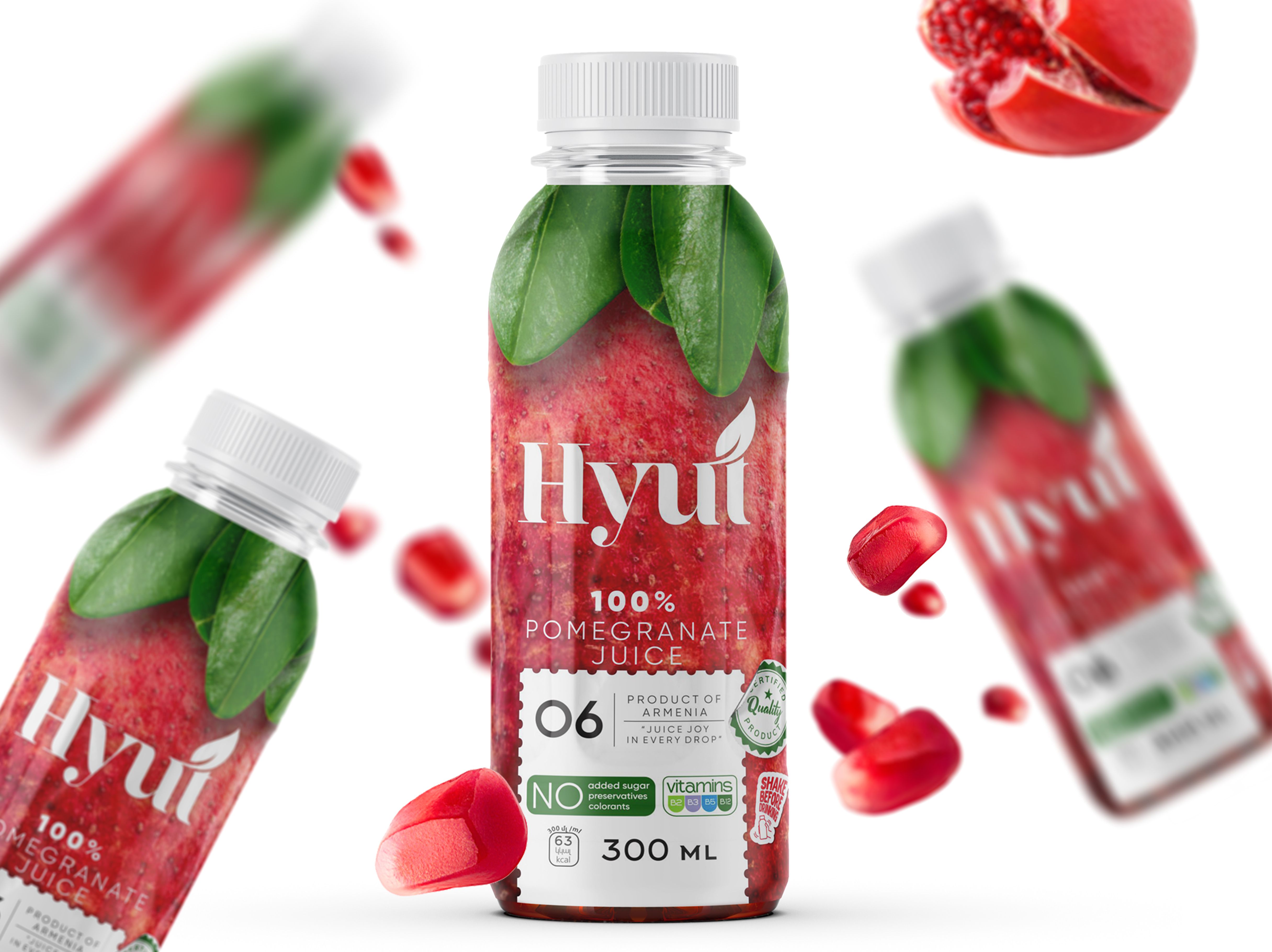
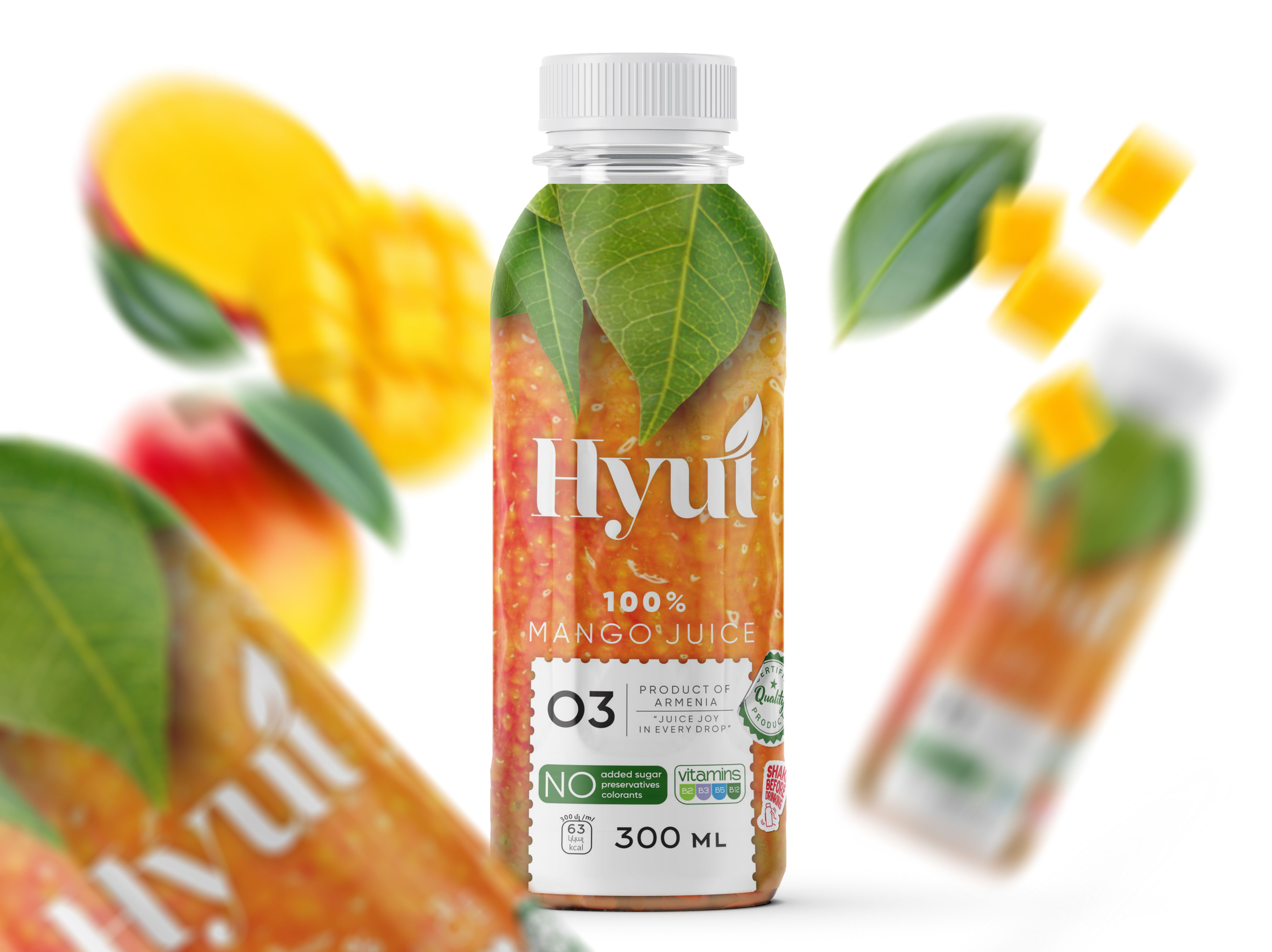
The HYÚT project was born from a desire to present juice as a pure, genuine product, while highlighting the meaning behind its Armenian name, which simply translates to “juice.” This connection to its linguistic origin became the foundation for a design philosophy centered on honesty, naturalness, and direct communication. The goal was not just to create attractive packaging, but to build a visual identity that reflects the true character of the product inside — clean, fresh, and unaltered.
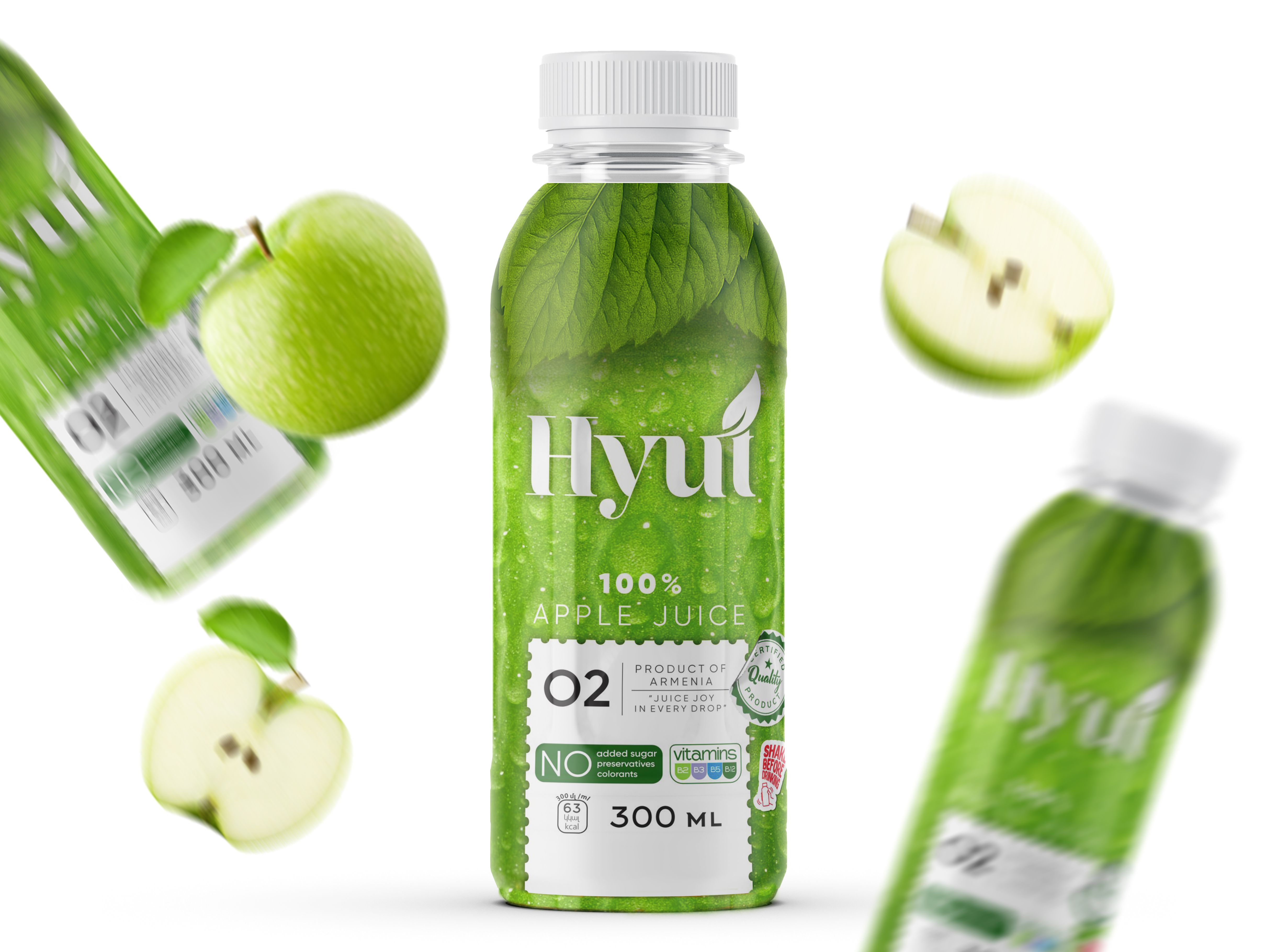
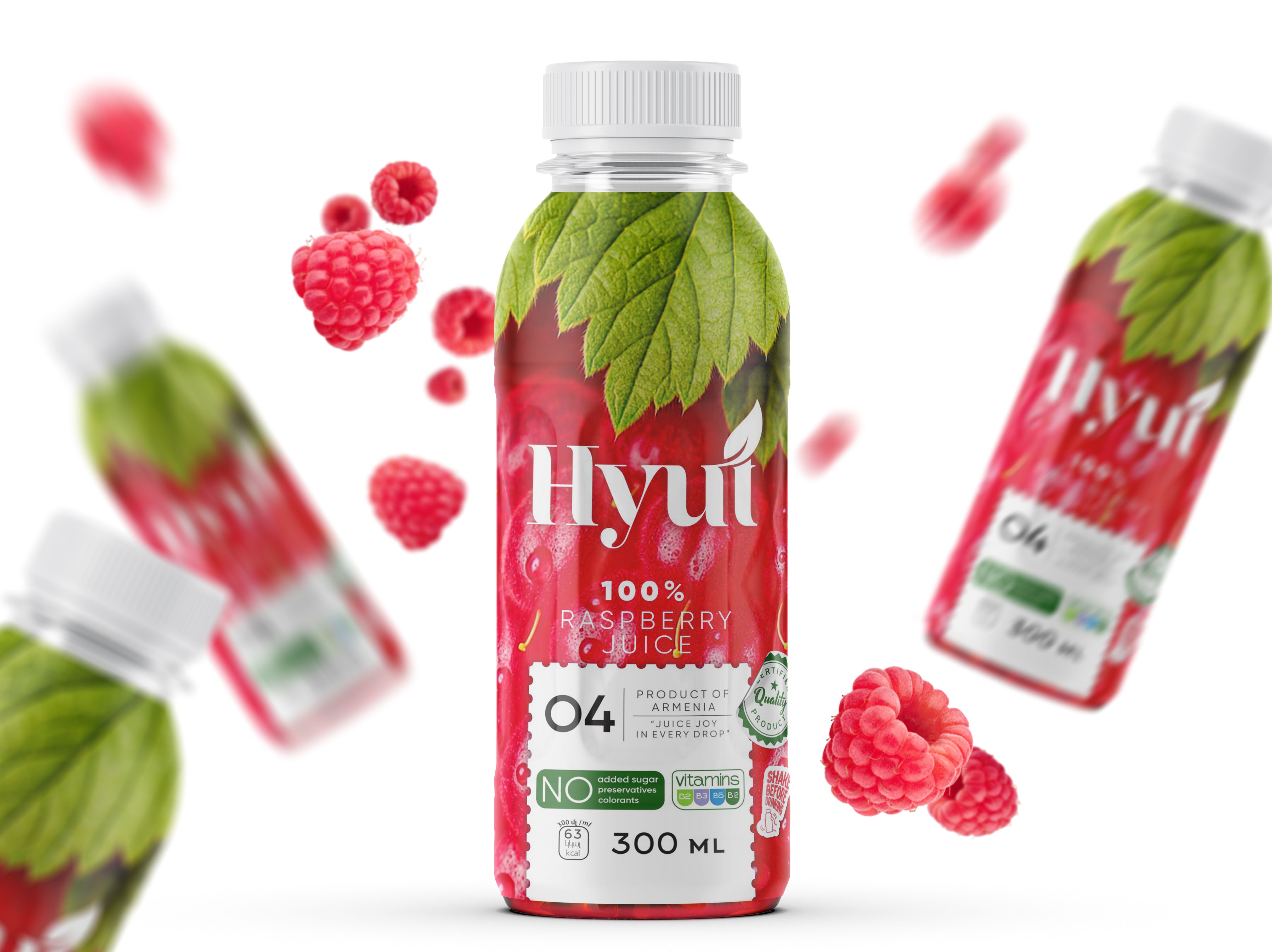
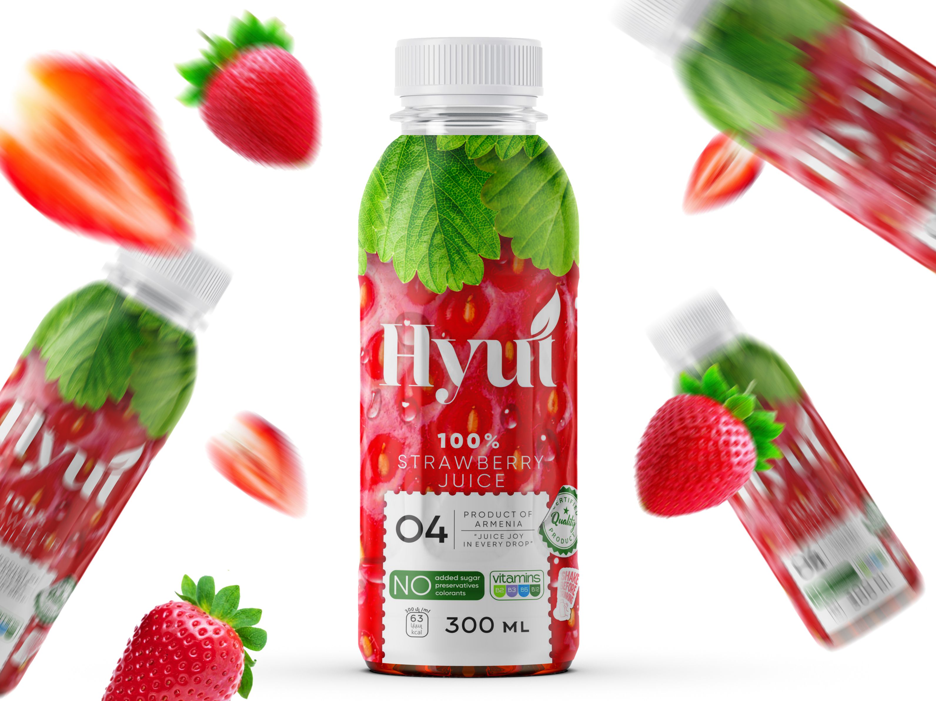
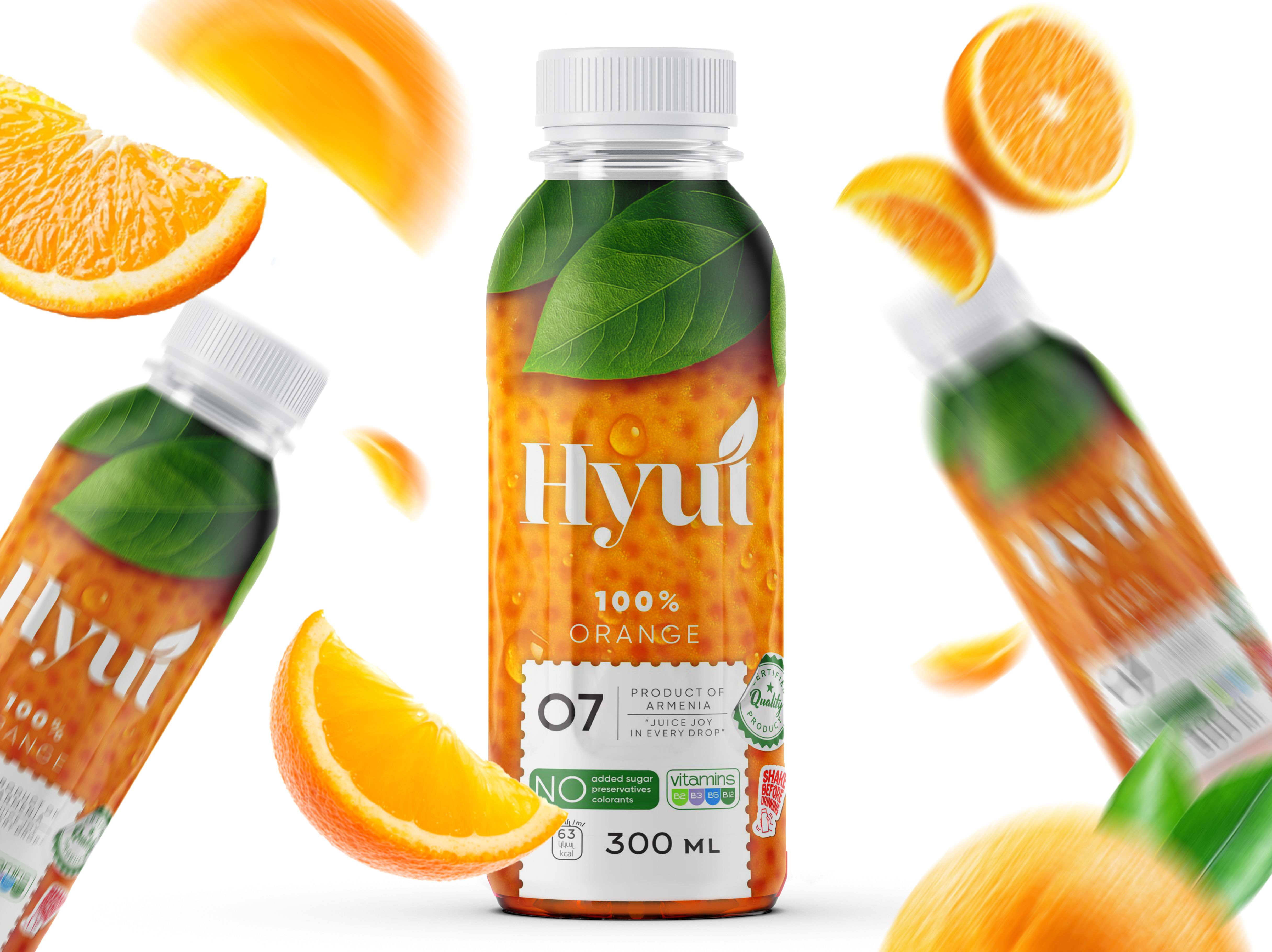
To achieve this, the design brings together photorealistic fruit imagery, soft leaf accents, and a spacious, airy composition. These elements work in harmony to convey a strong sense of freshness and transparency, giving the viewer an immediate understanding of what HYÚT represents. The realistic textures of the fruit create a feeling of closeness and authenticity, while the gentle botanical motifs introduce a natural softness that balances the overall visual rhythm. The open composition ensures that every element has room to breathe, resulting in packaging that feels modern, light, and visually confident on the shelf.
A clean white emblem and carefully placed visual markers enhance recognizability and reinforce the brand’s straightforward identity. Attention to detail is central to the design: the typography is chosen for its clarity and simplicity, the layout is intentionally structured to guide the eye naturally, and the informational blocks are designed to be accessible and transparent. With no added sugar and no unnecessary advertising claims, HYÚT prioritizes real flavor and genuinely beneficial quality.
The packaging communicates the brand’s foundational values — simplicity, quality, and naturalness — through a visual language that is both minimalistic and expressive. HYÚT stands as a thoughtful approach to contemporary product design, celebrating the essence of juice in its most honest form and offering consumers a refreshing, trustworthy experience rooted in nature.

CREDIT
- Agency/Creative: Sis Tsarukyan
- Article Title: Sis Tsarukyan Brings HYÚT to Life Through a Spacious, Fruit-Forward Design Language That Feels Immediate and Genuine
- Organisation/Entity: Agency
- Project Type: Packaging
- Project Status: Published
- Agency/Creative Country: Armenia
- Agency/Creative City: YEREVAN
- Market Region: Global
- Project Deliverables: Brand Design, Graphic Design, Packaging Design
- Format: Bottle
- Industry: Food/Beverage
- Keywords: Juice
-
Credits:
Designer: Sis Tsarukyan


