


Lieben Wine & Spirit Co. is a family business, owned and run by South African winemaker Alwyn Liebenberg and wife Beulah, jewellery designer and artist. Our relationship with the Liebenberg’s goes right back to the initial design work for of their “uniquely crafted” wines, so when it came time to add gin to their brand, we excitedly sat down to brainstorm.
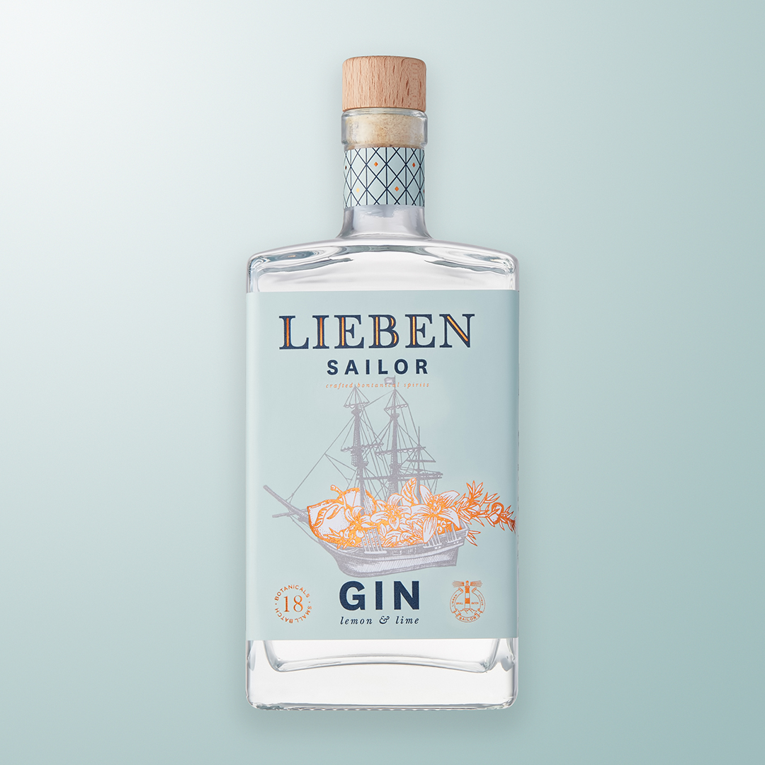
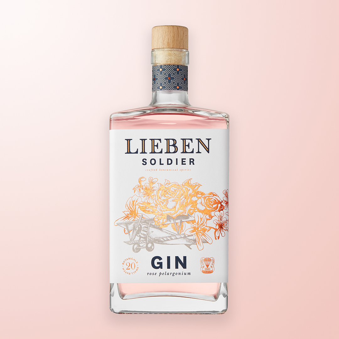
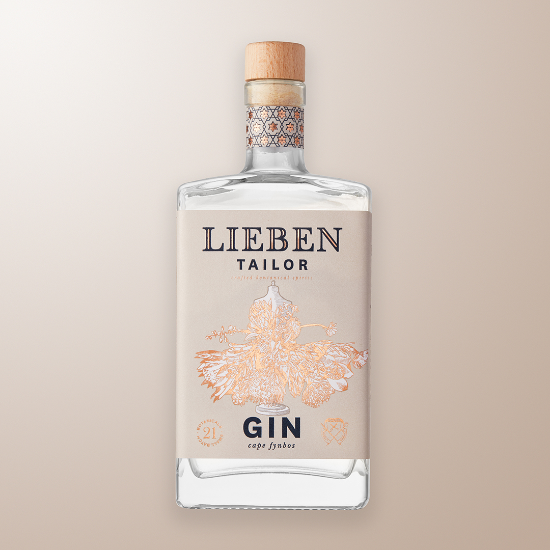
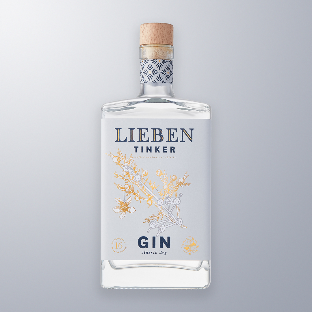
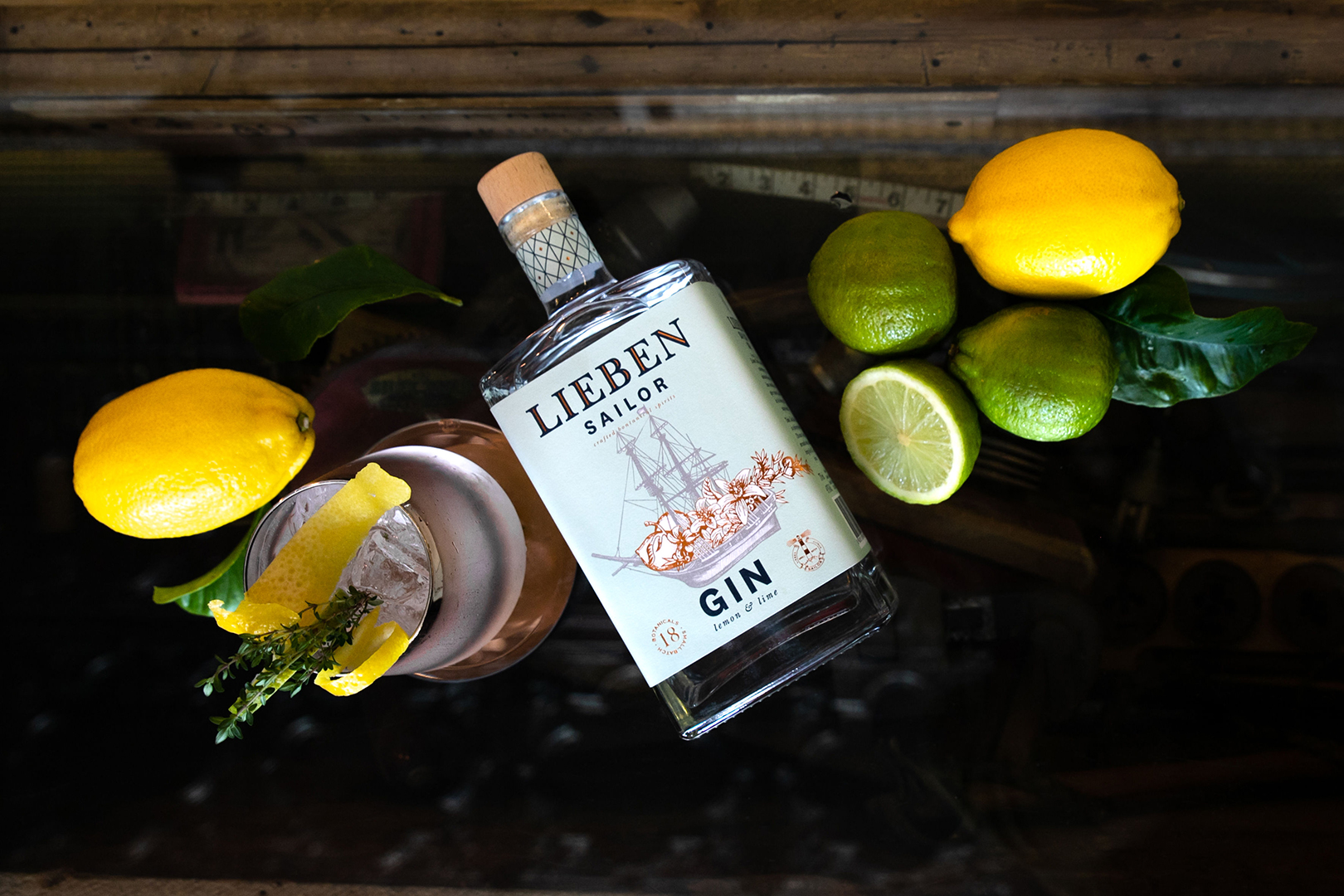
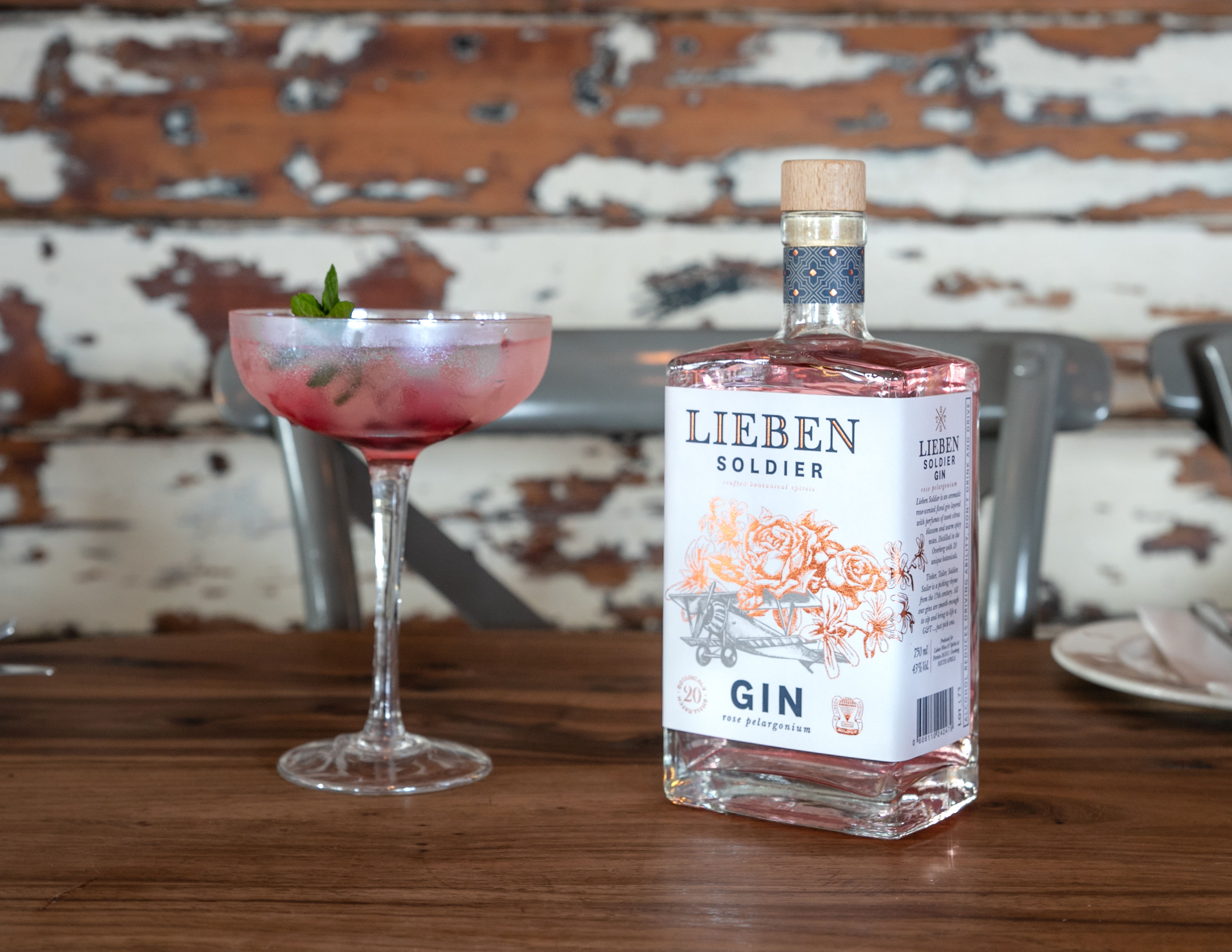
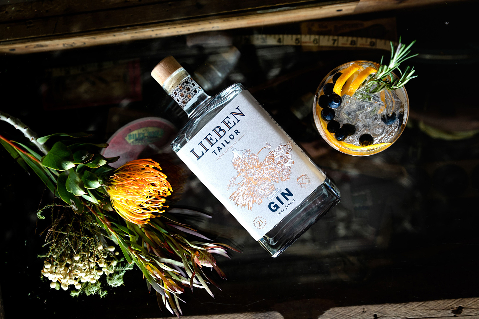
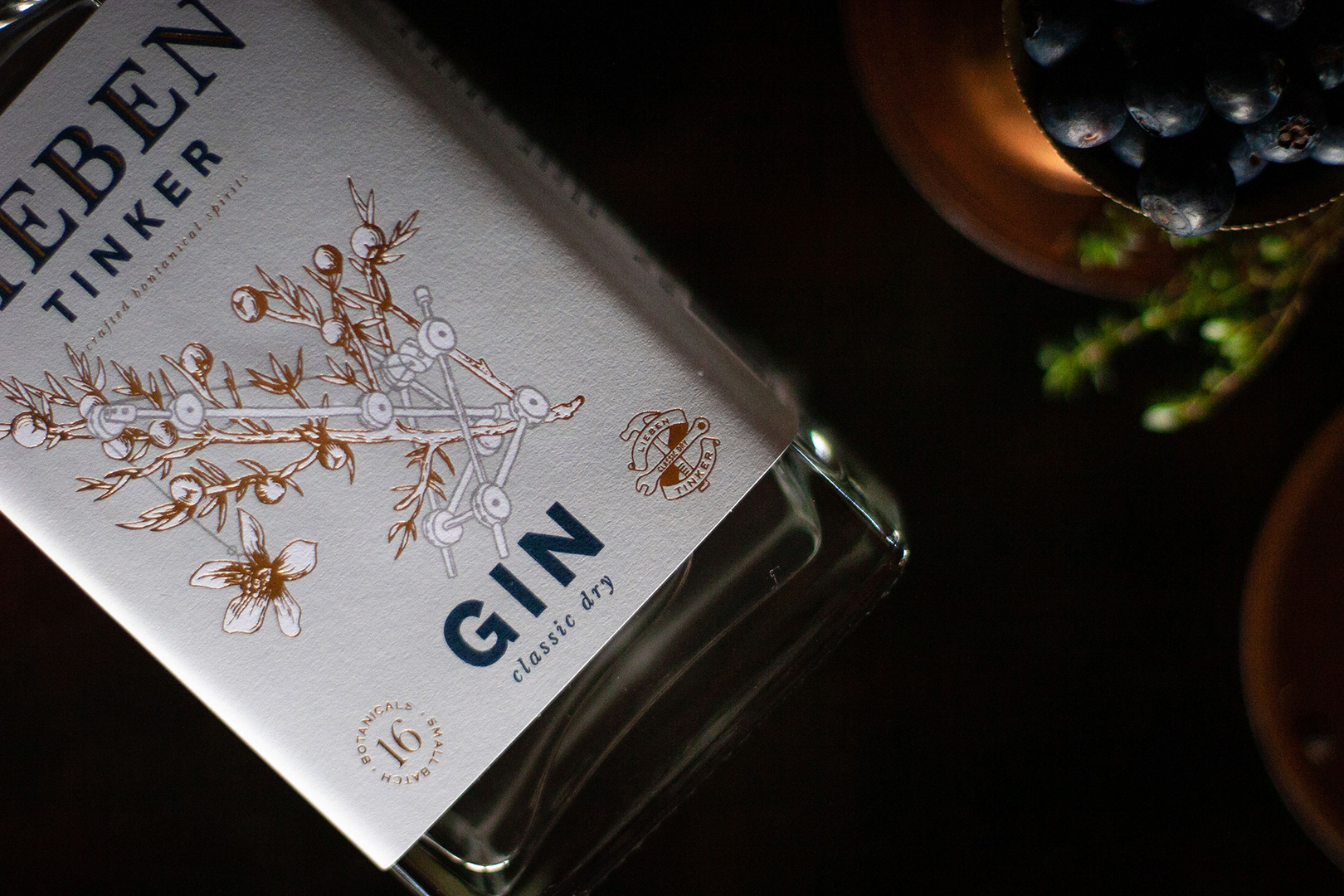
The Lieben gin range was inspired by and named after the 15th-century British picking rhyme “Tinker, Tailor, Soldier, Sailor”. This rhyme gives consumers the opportunity to pick their favourite gin from the range. All the gins are meticulously distilled to produce distinctive flavours and aromas so that each gin is unique while still having a distinctive juniper undertone.
The clients brief was to design a range of gins that was reminiscent of the British picking rhyme, with each gin telling its own story through unique illustrations that link the name to the botanicals it is distilled from.
Right from the start, we knew we wanted to use Adele van Heerden, a local fine artist and illustrator, as her personal style fitted perfectly with the brand feel we were looking to create.
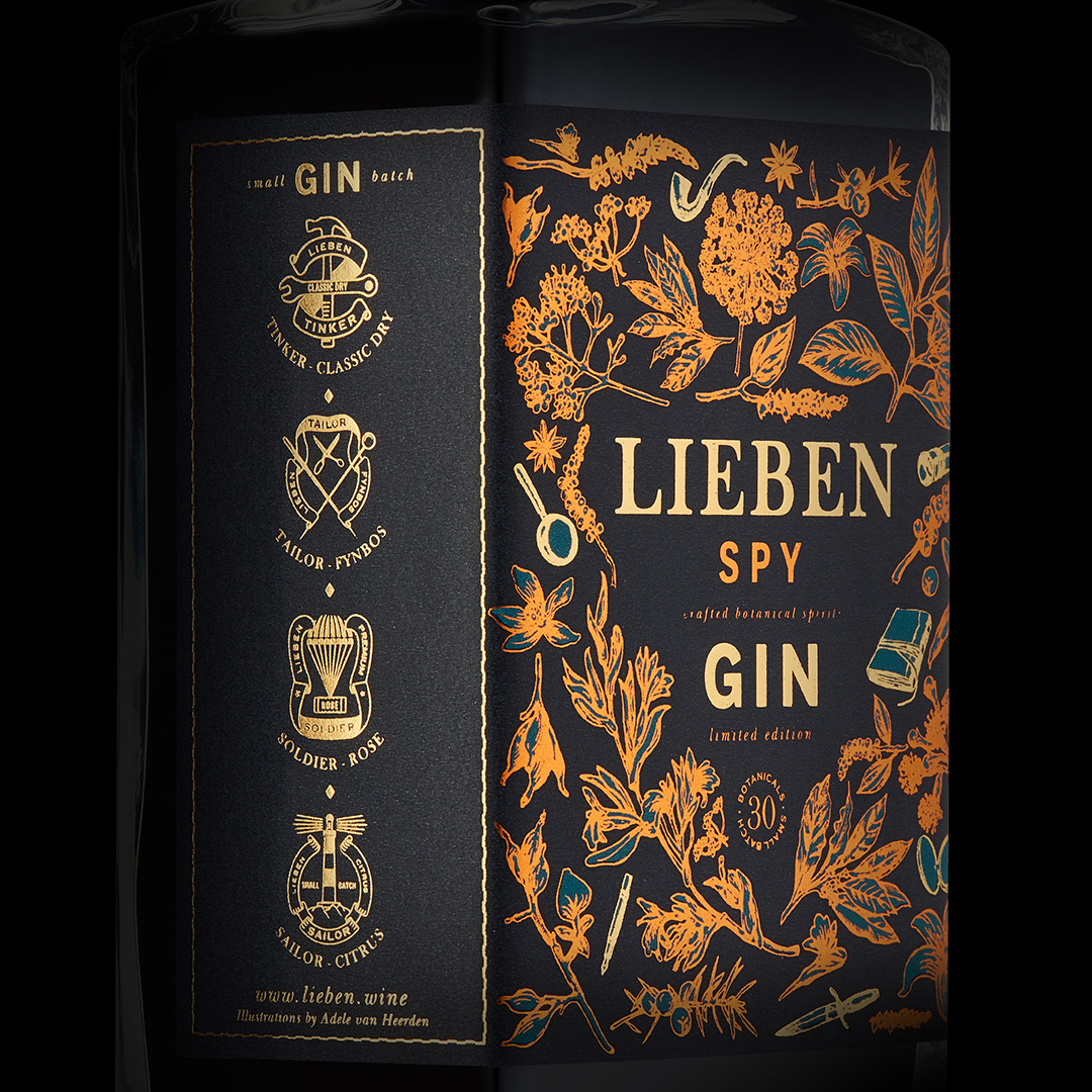
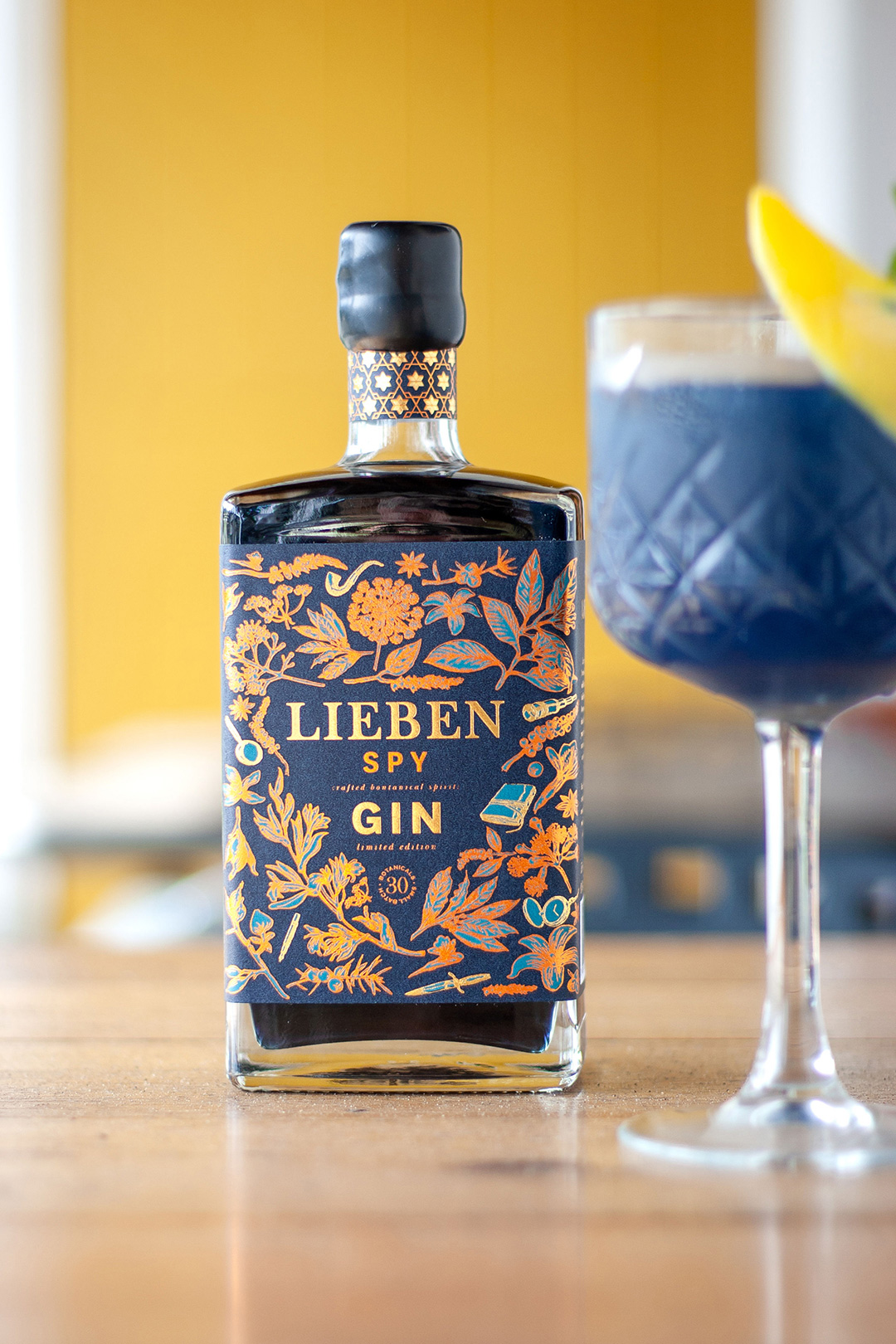
Along with the four initial gins, a fifth, limited edition gin, named Spy was added. This gin contains some 30 different botanicals creating a warm spicy flavour. The design plays with the visual theme of vintage spy tools, hidden among the botanicals, waiting for someone to discover them.
Lieben gins are sipping gins, meaning they can be enjoyed neat like a good whisky without needing a tonic, and so the packaging needed to be unique enough to attract a more discerning gin drinker, looking for something more complex and interesting than your everyday gin.
The initial step in the design process was to conceptualise each of the stories that would be told through the illustrations. Once these stories were created we could get to work designing the brand and unique emblems for each while Adele worked on the illustrations. Once these were completed, the next step was how the packaging would be printed. We worked through several designs and finally settled on the mix of foil and pencil sketch outlines for each illustration.
One highlight was the result of the printing and foiling, especially on the Spy, the foils against the inky blue background came out beautifully. Another was winning Silver for the design in the WINEMAG label design competition in 2020.
CREDIT
- Agency/Creative: Simplifi
- Article Title: Simplifi Agency Designs New Gin Packaging for Lieben Wine & Spirit Co.
- Organisation/Entity: Agency, Published Commercial Design
- Project Type: Packaging
- Agency/Creative Country: South Africa
- Market Region: Multiple Regions
- Project Deliverables: Brand Architecture, Brand Identity, Branding, Packaging Design, Product Architecture
- Format: Bottle
- Substrate: Glass Bottle


