


Caliptra · Creative Studio – Mil Piedras
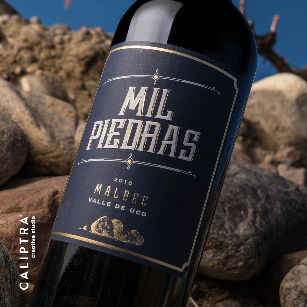
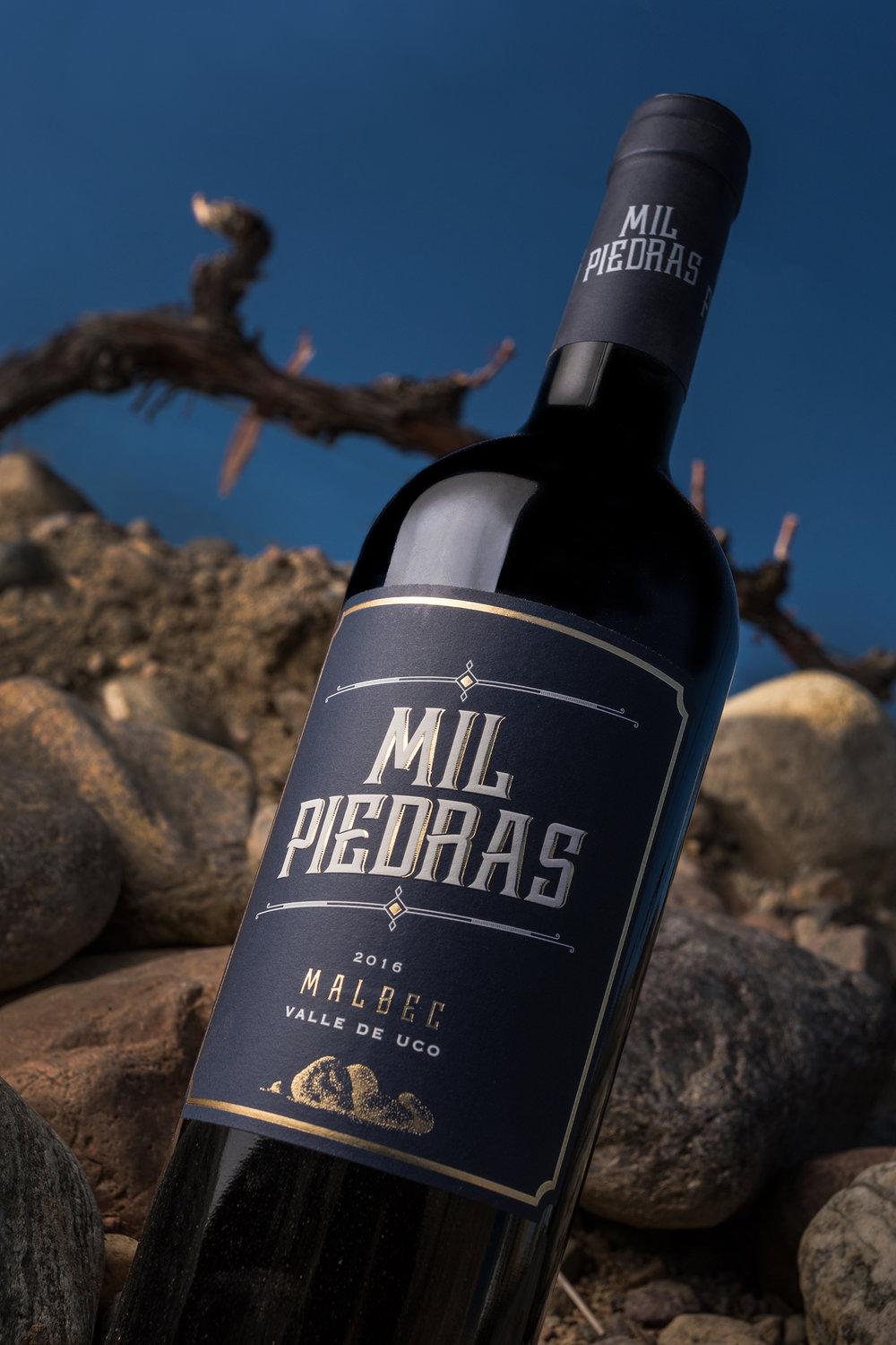
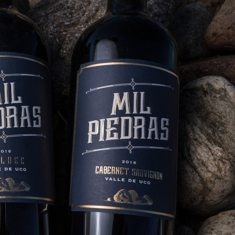
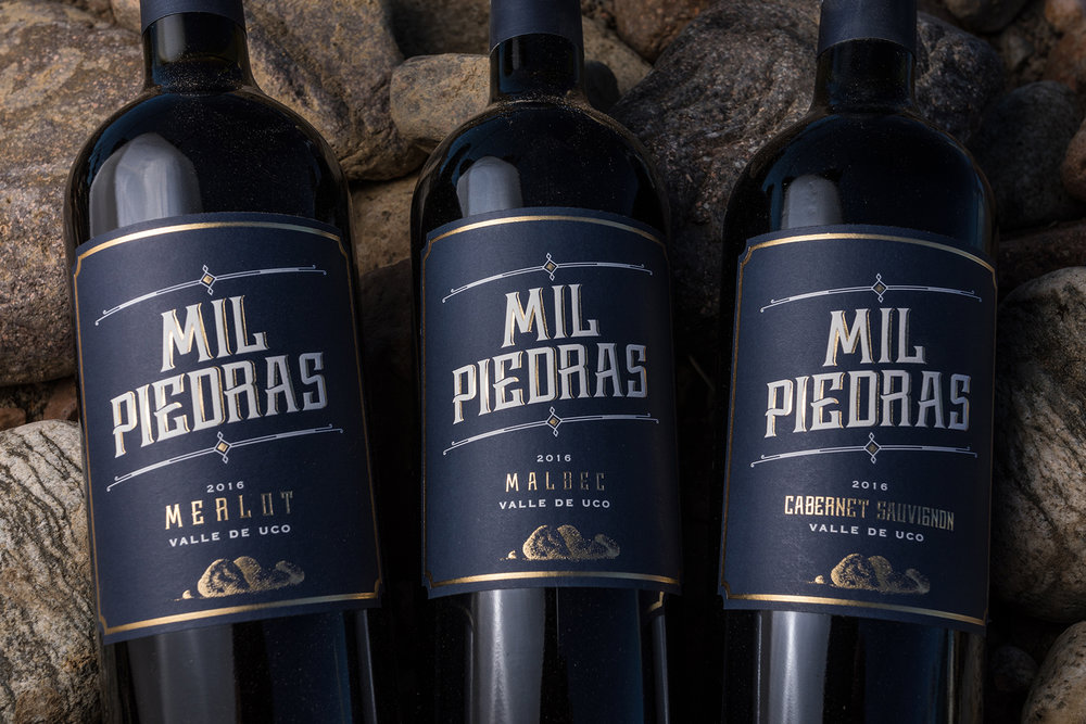
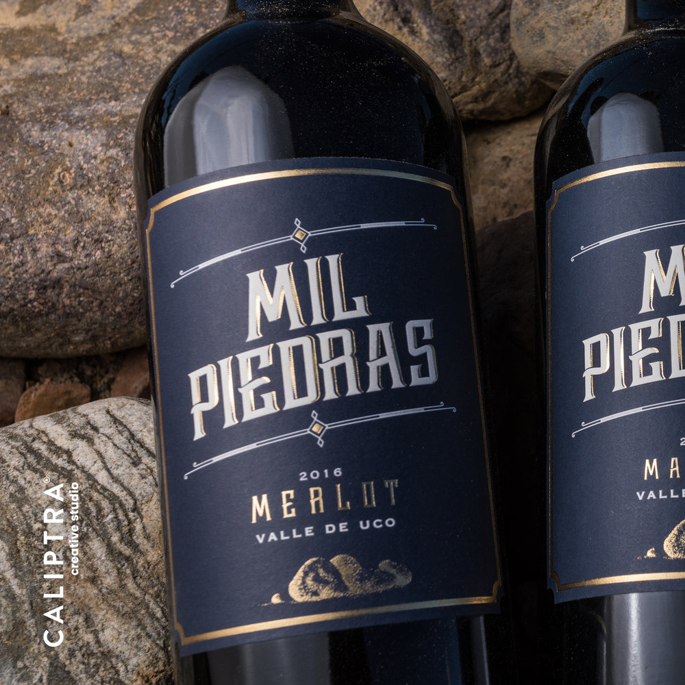
“Our base for this project was this very unique name “Mil Piedras”, which translates as “A thousand stones”, referring to the winery facade which is made of, well… stones. Therefore it was decided to design a strong and clean label that would express this as well as the character of a stony terroir. The chosen colour pallete is rather sober, powerful and elegant: white and gold contrasting with a deep dark blue as background. The fonts used show a strong and determined personality.”
CREDIT
- Agency/Creative: Caliptra · Creative Studio
- Article Title: Simple Wine Packaging Design from Argentina
- Organisation/Entity: Agency Commercial / Published
- Project Type: Packaging
- Agency/Creative Country: Argentina
- Market Region: Multiple Regions
- Format: Bottle
- Substrate: Pulp Paper
FEEDBACK
Relevance: Solution/idea in relation to brand, product or service
Implementation: Attention, detailing and finishing of final solution
Presentation: Text, visualisation and quality of the presentation


