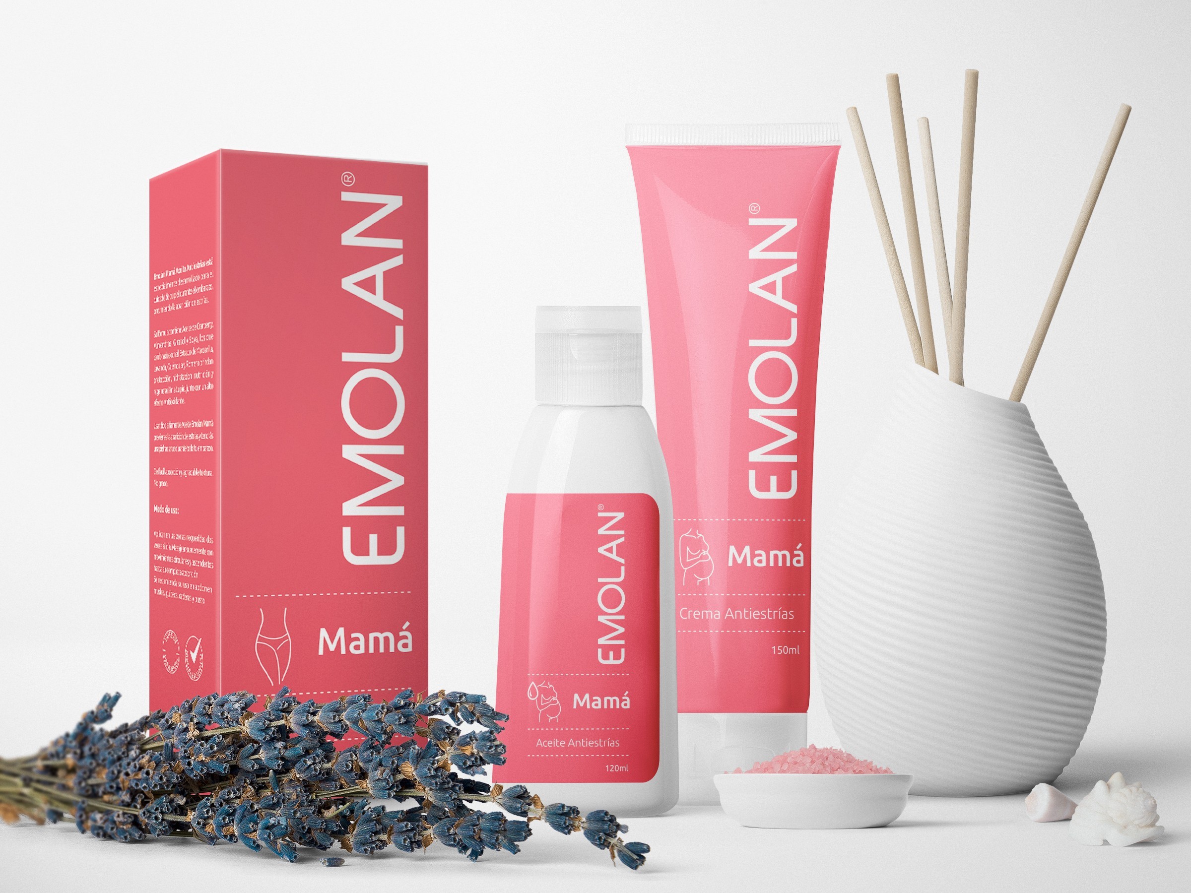
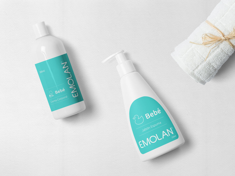
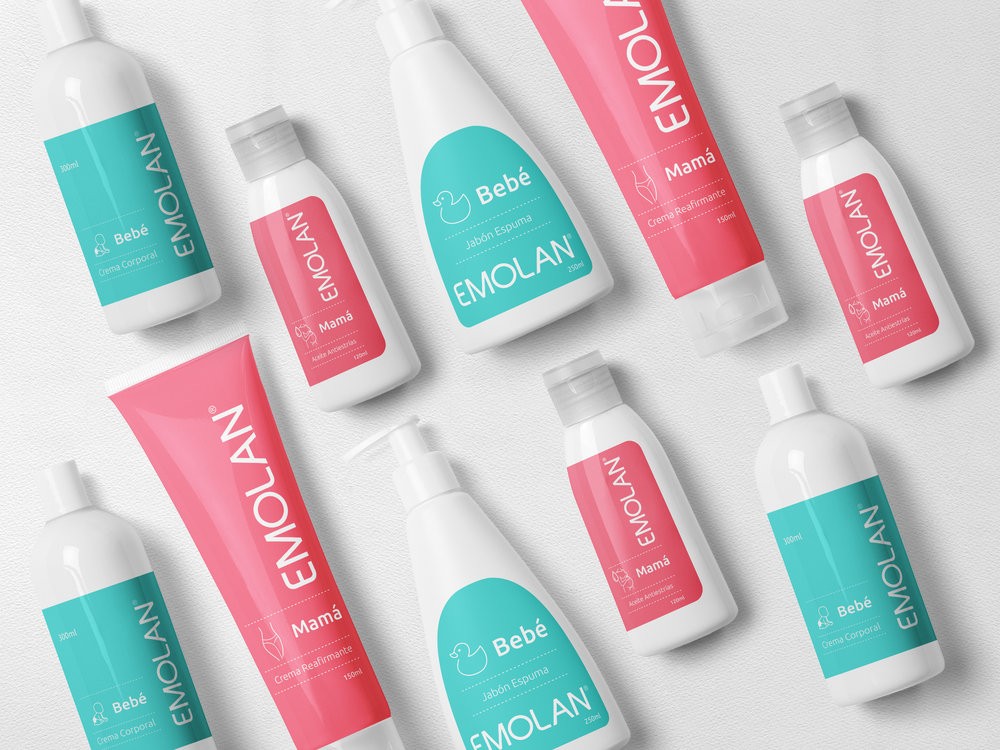
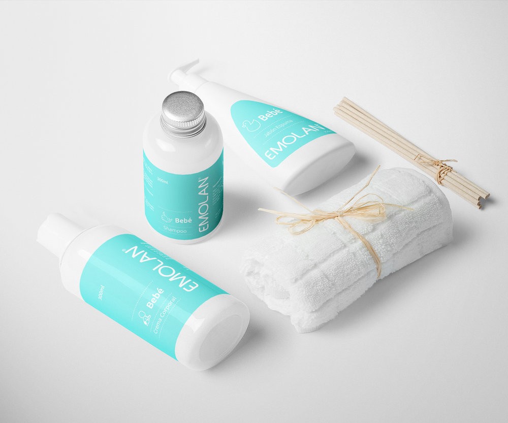
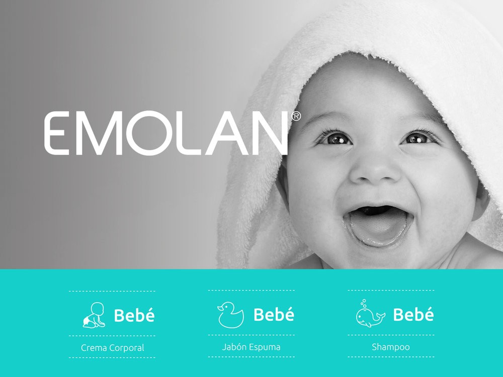
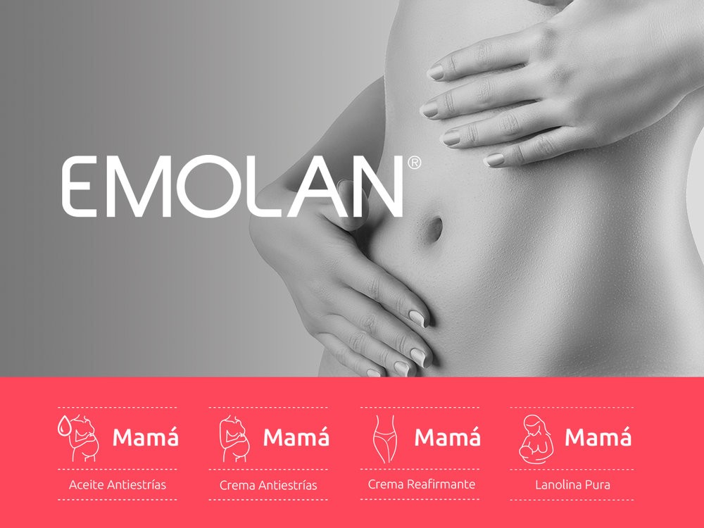
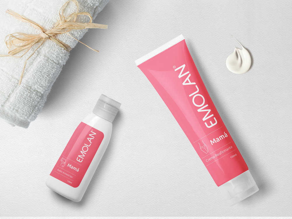
“Emolan is a company of dermatologic products, specialized in specific treatments, where all the offered is high quality, have a solid reputation and got medical background. Brand Problems – Consumers doesn’t know all the brand products – Consumers doesn’t know they have products for the whole family – Low presence of the brand in the POP – Highly competitive market Brief – Develop a design proposition for Emolan, with specific differences between the products but creating a visual coherence of the brand. – Have more presence in the POP and differentiation between the competence. – Re-evaluation and redesign of the Logo, the company face. The new packaging design use color coding effectively, strengthen freshness and professional image of the product. The design solutions included: Product Differentiation, all products divided into 2 colored lines depending on their focus: Mother Care and Baby Care. Also it is integrated with a series of icons that represent each product and their effect.”
CREDIT
- Agency/Creative: , Jose Duran
- Article Title: SIMPLE CHILE – Emolan
- Project Type: Packaging
- Format: Bottle, Box, Tube
- Substrate: Plastic, Pulp Carton


