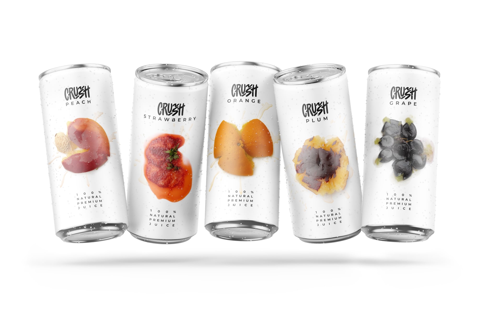
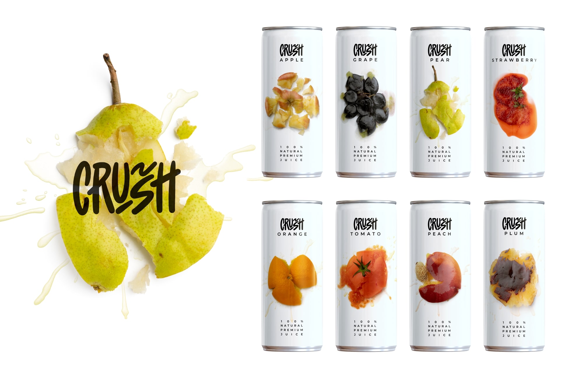
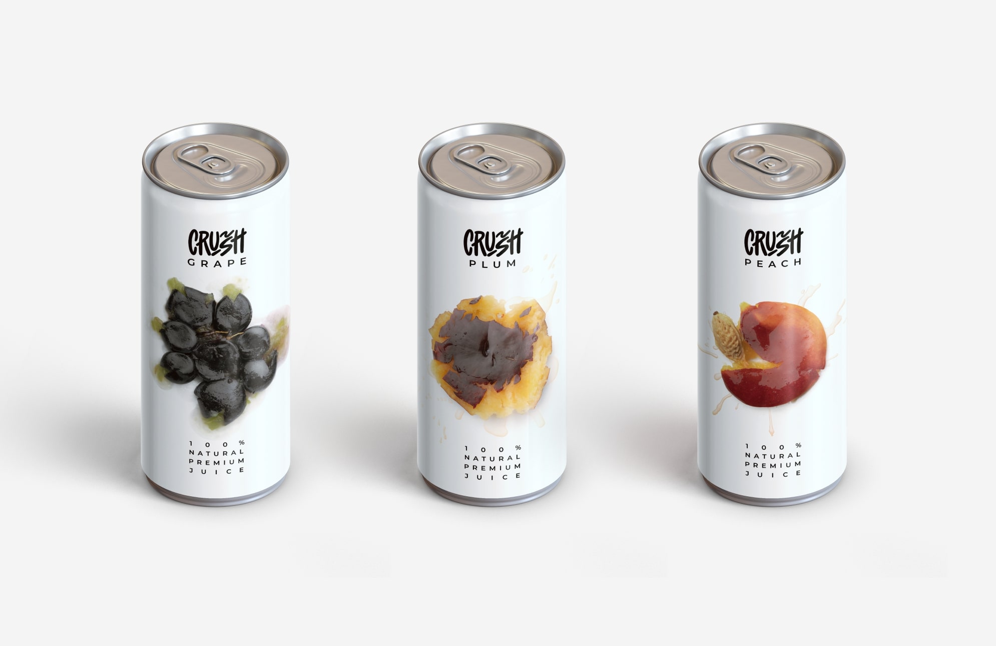
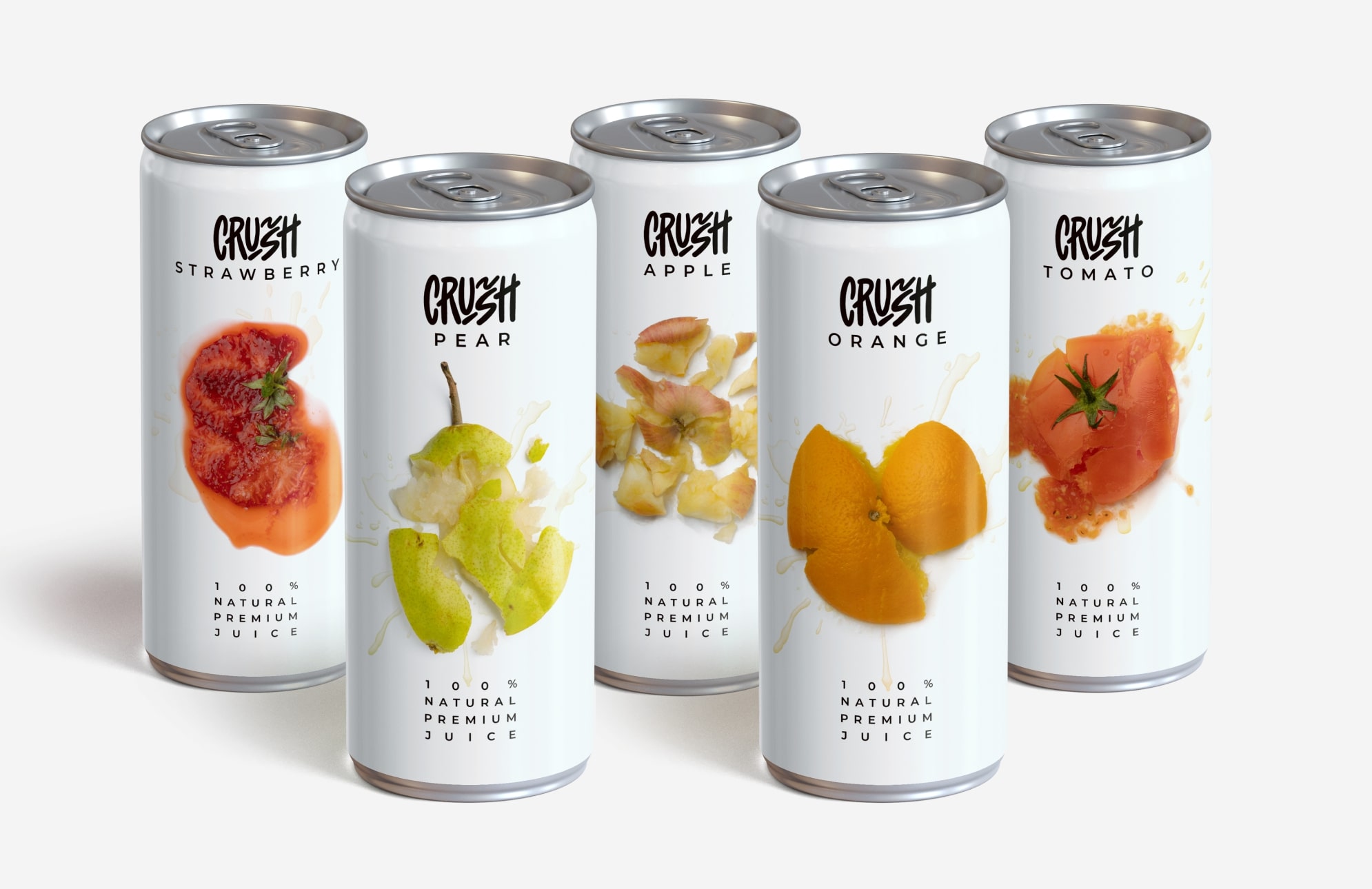
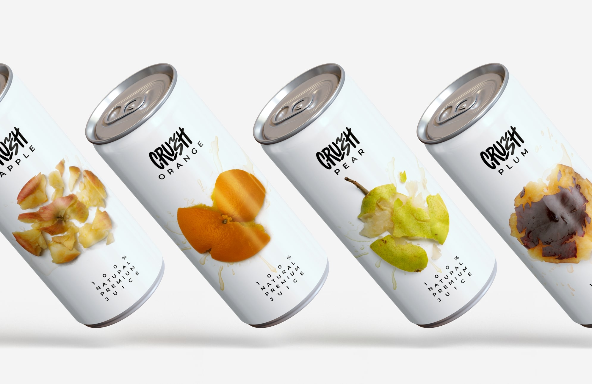
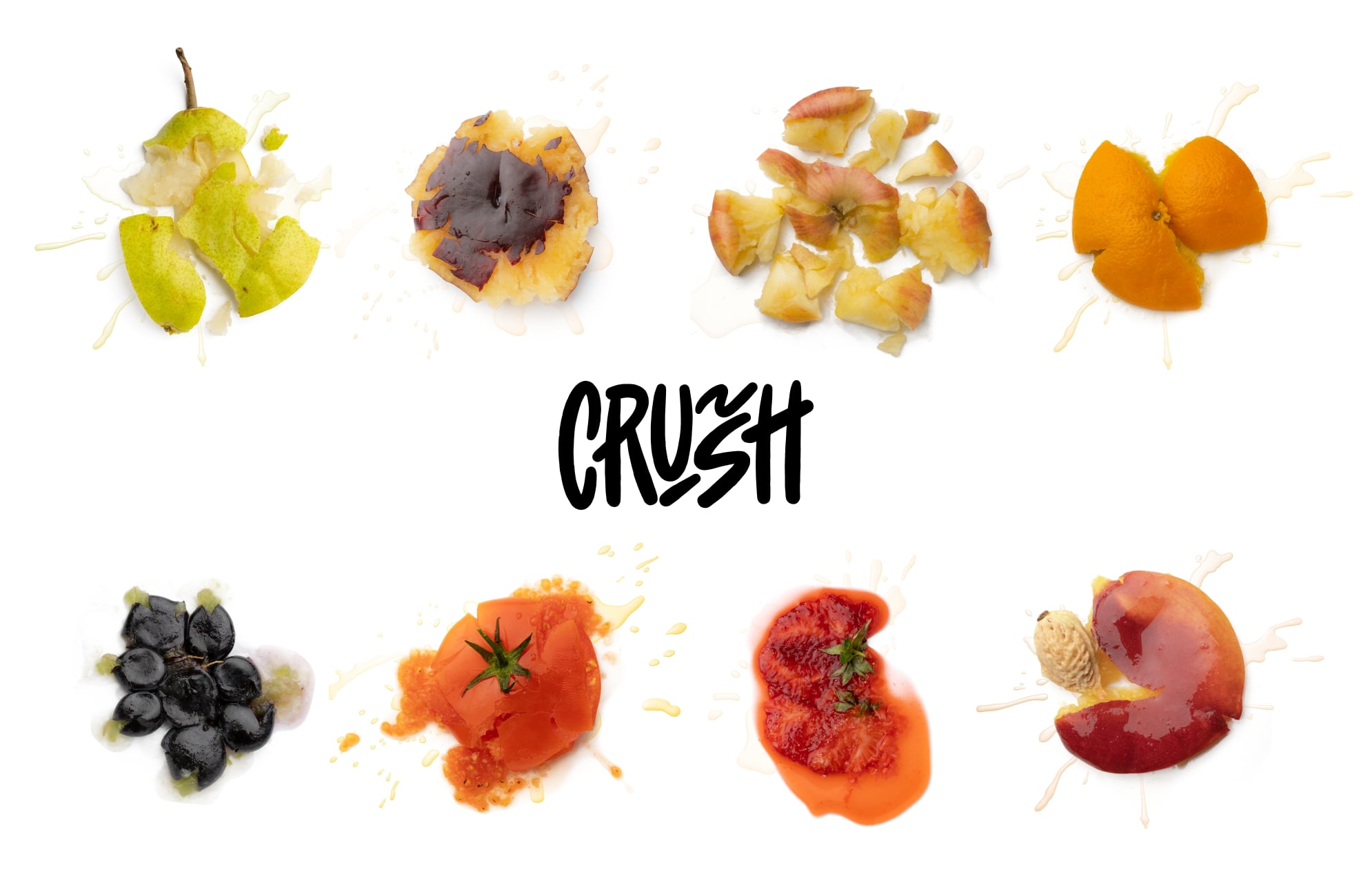
I would be happy to expand on this topic. The design of the Crush juice cans is truly remarkable. It is visually appealing and eye-catching, which makes it stand out among other brands on the supermarket shelves. The design is inspired by the concept of using realistic imagery of crushed fruits, which gives the impression of freshly squeezed fruit being used in these cans.
One of the most striking features of the Crush juice cans is the use of high-quality, life-like imagery of fruits. The images are so vivid and detailed that they almost look like they have been freshly picked from the orchard. This is a clever marketing tactic as it creates a sense of authenticity and freshness in the minds of the consumers. It also gives them the impression that the juice inside the can is made from real fruit and nothing more.
The design team behind Crush juice cans has truly outdone themselves in terms of creating a product that is visually stunning and speaks to the senses. The vibrant colors of the fruit, the sparkling water droplets, and the textural details of the crushed fruit all come together to create a beautiful composition. The design captures the essence of the Crush brand, which is all about fresh, delicious, and healthy fruit juices.
Another aspect of the Crush juice can design that deserves mention is the use of a shiny, reflective surface. The metallic finish on the can adds a touch of glamour and sophistication, making it look like a premium product. This design element also helps to catch the light and draw attention to the product on the shelf. The use of a metallic finish is a clever design choice that adds an element of luxury to the product without making it look too flashy.
The Crush juice can design also features a minimalistic approach to typography and branding. The brand name is prominently displayed in bold, block letters that are easy to read and recognize. The font used is clean and modern, which gives the product a contemporary feel. The use of a simple, understated design allows the imagery of the crushed fruit to take center stage, making the product look fresh and inviting.
In conclusion, the design of the Crush juice cans is a perfect example of how packaging design can be used to capture the essence of a brand and communicate its values to consumers. The use of realistic imagery of crushed fruits, a shiny metallic finish, and a minimalistic approach to typography all work together to create a product that is visually stunning and speaks to the senses. The design of the Crush juice cans is a testament to the creativity and innovation of the design team behind it, and it is sure to attract the attention of consumers for years to come.
CREDIT
- Agency/Creative: zerger agency
- Article Title: Simple and Modern Design for Crush Juice Can
- Organisation/Entity: Agency
- Project Type: Packaging
- Project Status: Non Published
- Agency/Creative Country: Kyrgyzstan
- Agency/Creative City: zerger agency
- Market Region: Asia
- Project Deliverables: Advertising Photography, Brand Identity, Calligraphy, Cinematography, Craft, Food Photography, Lettering, Packaging Design, Typography
- Format: Can
- Substrate: Metal
- Industry: Food/Beverage
- Keywords: juice, crush, fruits, apple, pinapple, grape, pear, strawberry, orange, tomato, peach, plum, package, design, concept, can package
-
Credits:
Creative Director & Founder: Dastan Miraj
Art Director & Founder: Azamat Asan
Designer: Nurzat Turgunalieva
Account manager: Burul Almazbekova


