


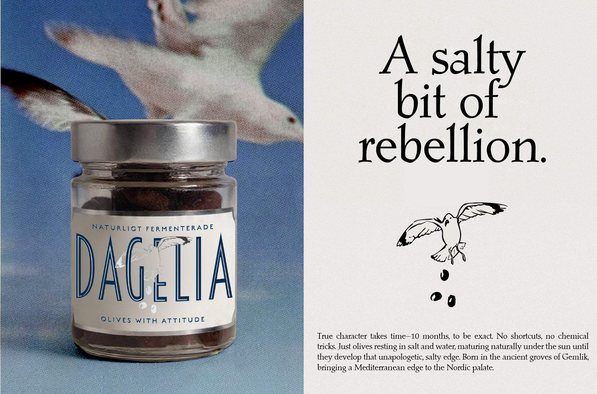
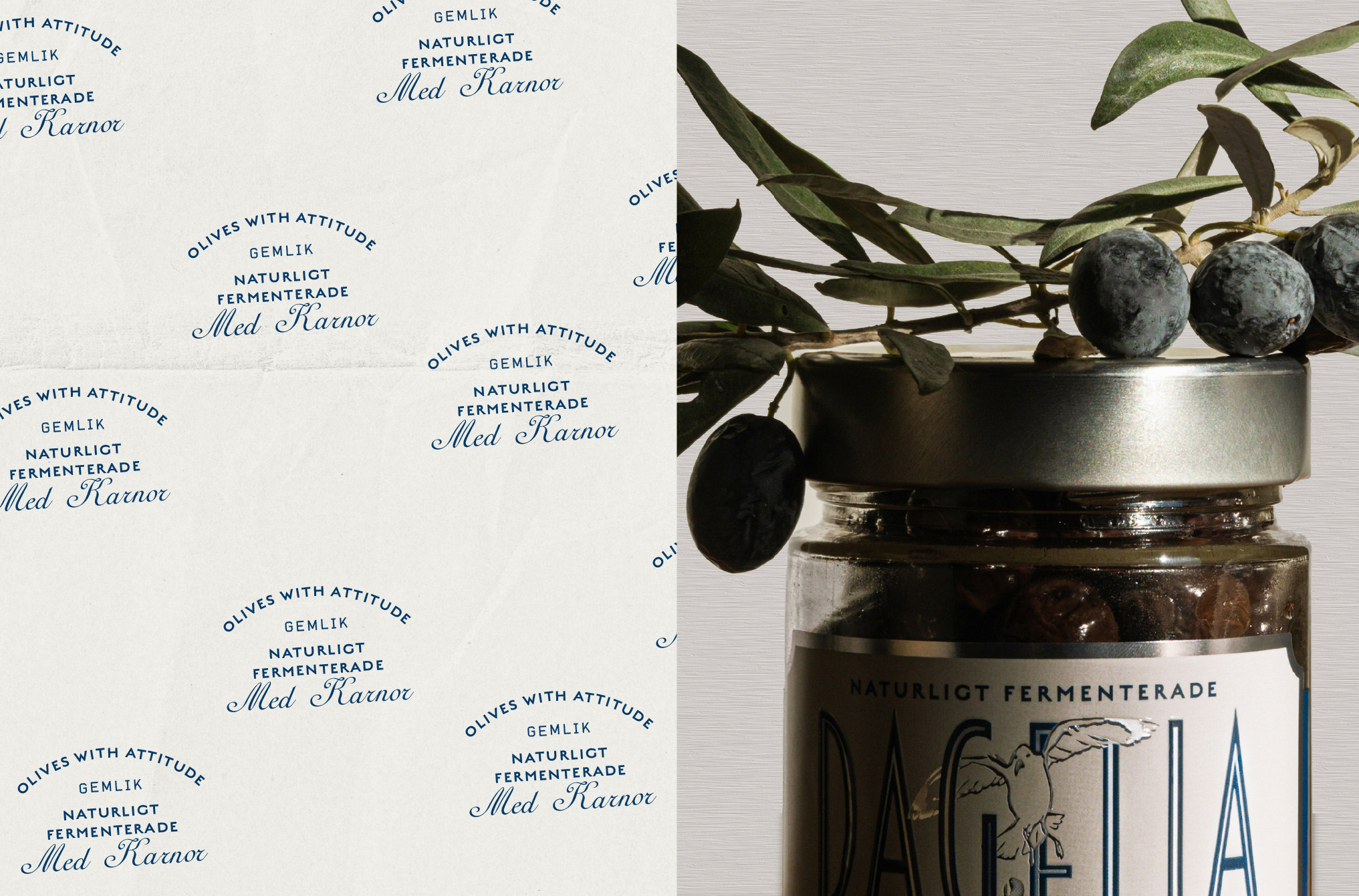
Introducing the authentic Gemlik olive to the Swedish market required not only a translation of product, but a deliberate shift in perception, taste culture, and visual expectation. In a region where subtlety, restraint, and minimalist food aesthetics dominate everyday consumption, the arrival of a deeply aromatic, rich, and character-driven Mediterranean olive becomes more than a product introduction—it becomes an invitation to expand the palate. It signals a bold Mediterranean presence entering a Nordic context, where clarity and purity are often prioritized over intensity and sensory complexity.
This project is rooted in the idea of contrast as value. The Gemlik olive carries with it a heritage of sun-soaked landscapes, slow cultivation, and a naturally robust flavor profile that stands in quiet opposition to the cool, measured culinary language of Scandinavia. Instead of softening or diluting that identity, the brand embraces it fully and reframes it as something desirable, almost exotic in its honesty. The positioning is not about adaptation in the traditional sense, but about confident introduction—allowing two cultural aesthetics to meet without compromise.
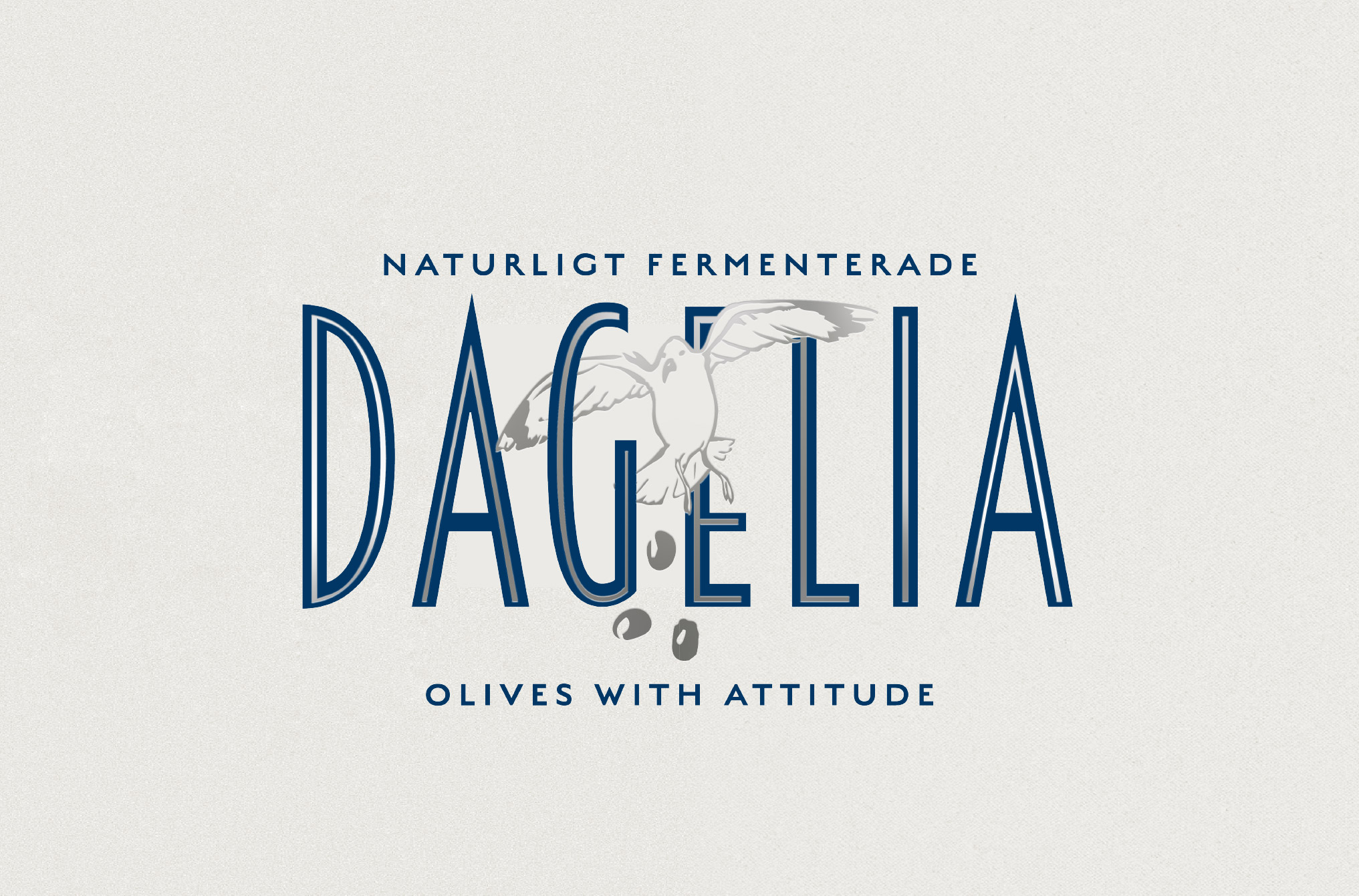
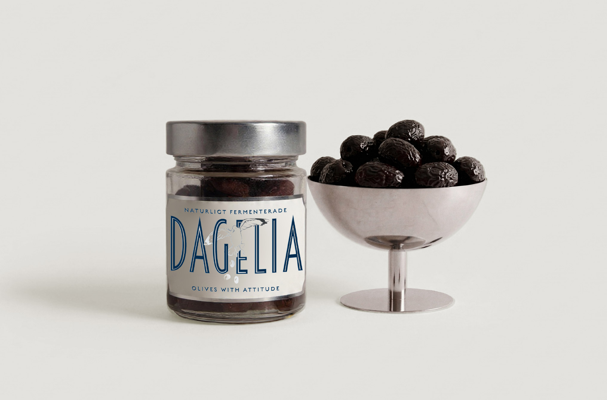
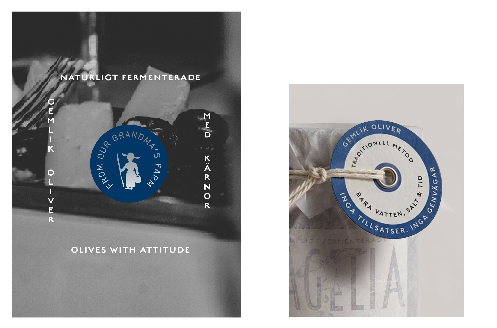
The visual identity is built on subtle irony and layered storytelling. Inspired by the mischievous and often overlooked presence of coastal seagulls—creatures that exist between elegance and disruption—the branding plays with the concept of an “unexpected gift from above.” This metaphor becomes central to the design system, suggesting that the olive, like a sudden encounter with nature, arrives unannounced yet unmistakably memorable. It introduces a sense of narrative lightness into what could otherwise be a purely functional food category.
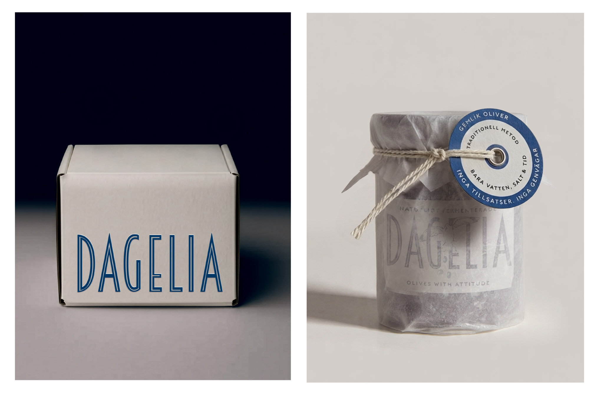
The design language is intentionally stripped back to heighten this tension. Sophisticated, modern typography establishes a calm and refined base, reflecting the Scandinavian visual environment it enters. Against this structure, playful illustrative elements introduce a moment of interruption—never overwhelming, but always present enough to create curiosity. This balance between control and spontaneity becomes the core expressive device of the brand.
Every touchpoint is designed to hold this duality: Mediterranean richness expressed through Nordic restraint; humor embedded within elegance; tradition reframed through contemporary minimalism. The result is a brand that does not try to fit in, but instead redefines its surroundings through presence alone. It feels timeless in its simplicity, yet quietly rebellious in its refusal to conform, positioning the Gemlik olive not just as a product on a shelf, but as a small cultural disruption wrapped in design clarity.
CREDIT
- Agency/Creative: Sila Design Studi
- Article Title: Sila Design Studi Introduces Gemlik Olive as a Mediterranean Product Reframed Through Nordic Minimalist Packaging Design
- Organisation/Entity: Freelance
- Project Type: Packaging
- Project Status: Published
- Agency/Creative Country: Turkey
- Agency/Creative City: ANTALYA
- Market Region: Europe
- Project Deliverables: Art Direction, Brand Design, Brand Identity, Branding, Label Design, Logo Design, Packaging Design
- Format: Jar
- Industry: Food/Beverage
- Keywords: olive, snack, salty, mediterranean


