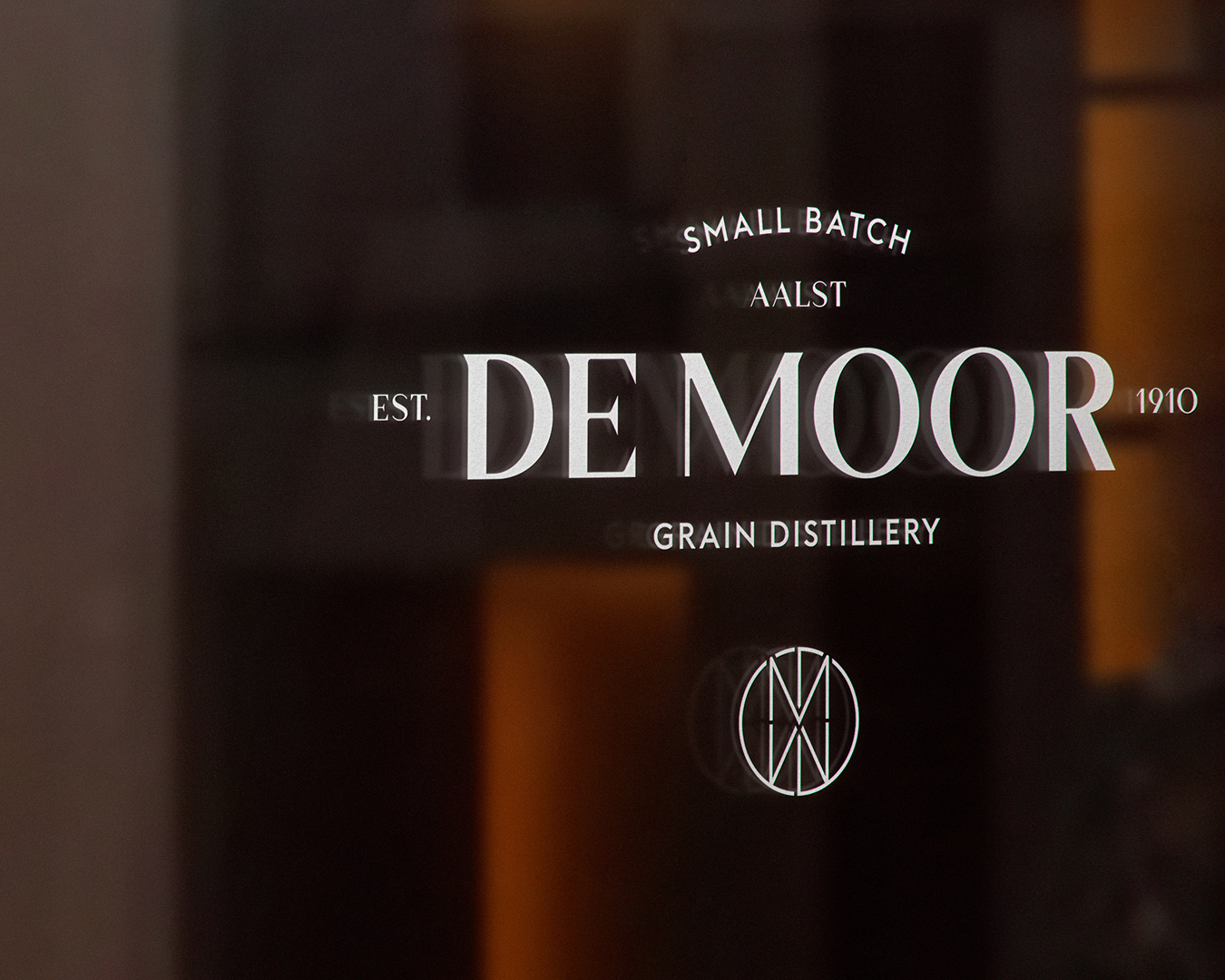
Very few companies more than 100 years old are still run by their founders’ family. De Moor distillery and wine & spirits shop is one of them in Belgium. It this village, values and traditions are important. Our approach to the foundations of their brand was therefore a journey into history, archives and a thorough analysis of their values and personality. The identity and brand architecture were literally constructed using these attributes. The ambition of this rebranding is to bring their business to the next level.
Distillery & shop, pottery & glass, future & past, traditional & modern, serious & absurd, industrial & handcrafted, rough & sophisticated,… These are the dualistic characteristics of 5th generation family business De Moor. The Aalst based distillery offers a large range of alcohols of their making, and their shop carries a wide range of wines, champagnes, spirits, and liqueurs since 1910.
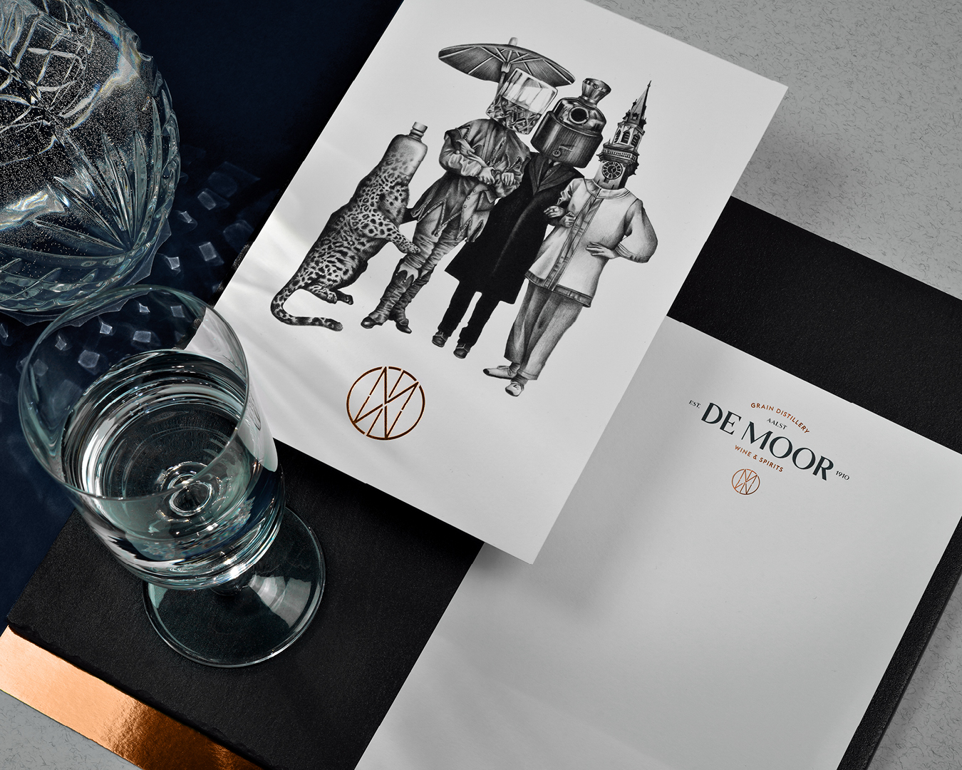
Taking direct inspiration from Aalst city, we created custom illustrations, based on the carnival culture, which is still alive and well these days. Aalst likes to dress up and the inhabitants are highly imaginative. The illustration references items we can find in the distillery, as well as clothing that are to be seen in their world famous carnivals. Aalst is proud of this culture, and so it up to us, as designers and illustrators, to integrate it in this new identity.
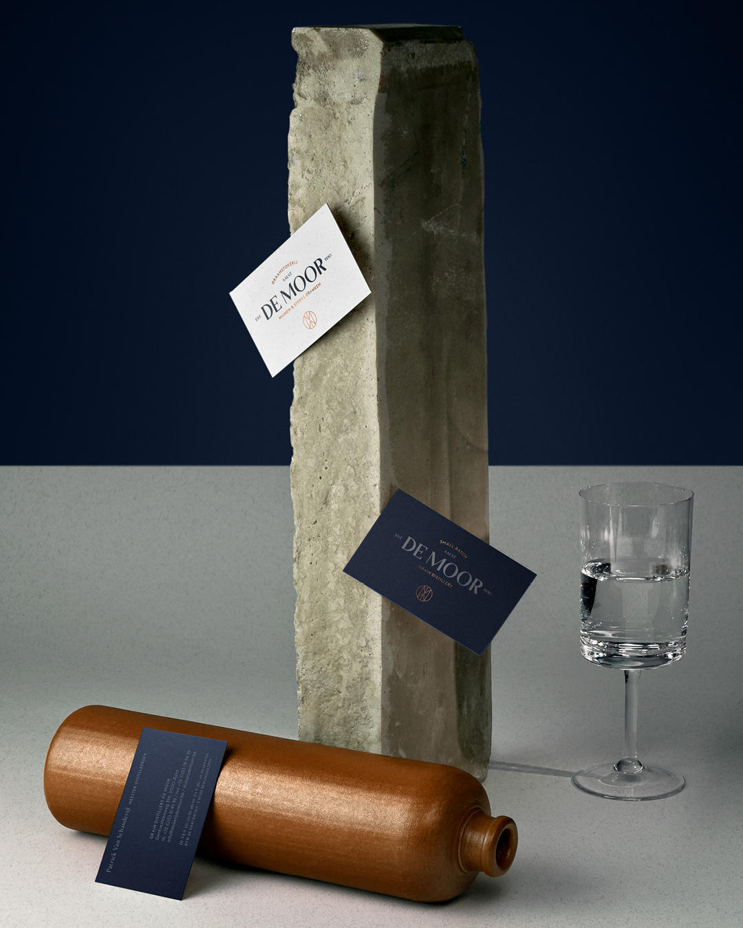
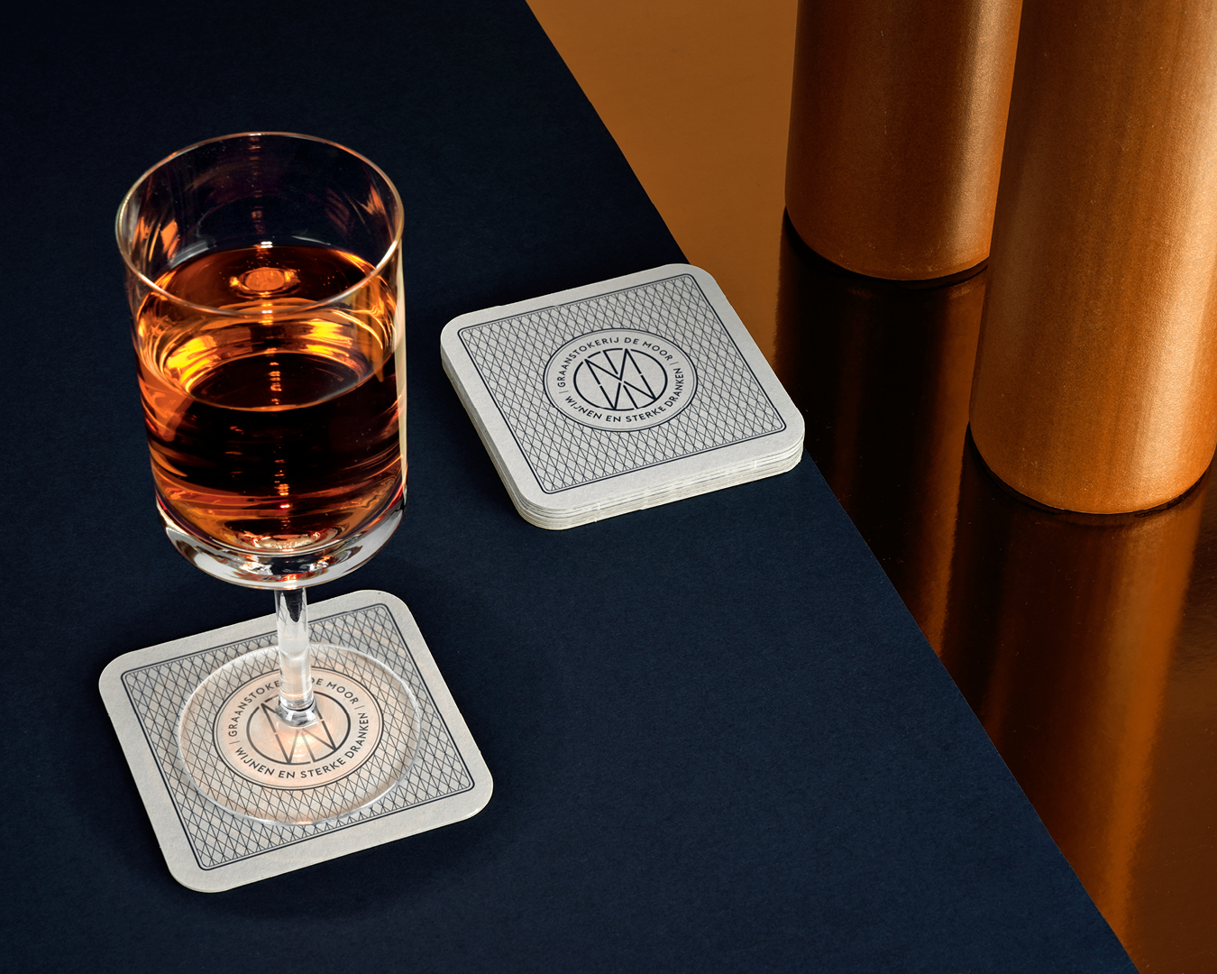
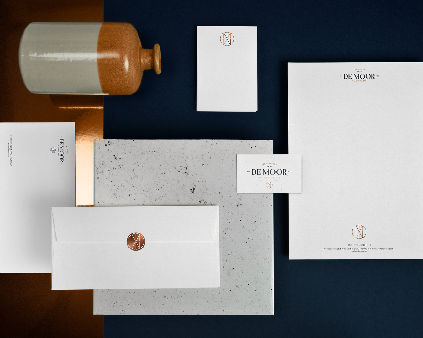
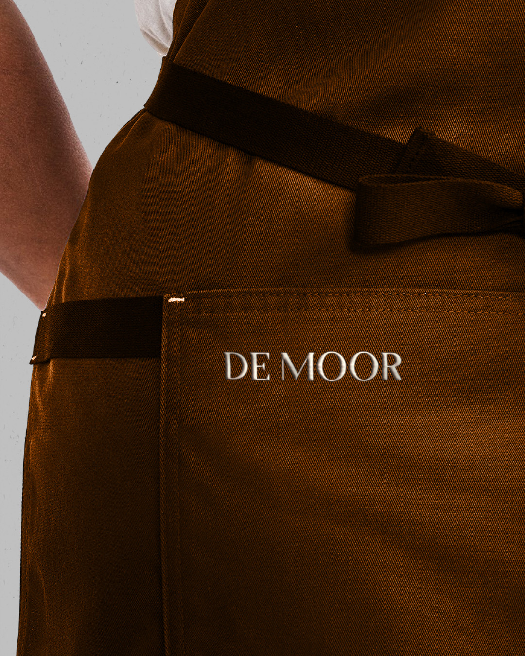
This new identity found its way on business cards, outdoor signage, coaster, notepads, letterheads, envelopes, apron embroidery…
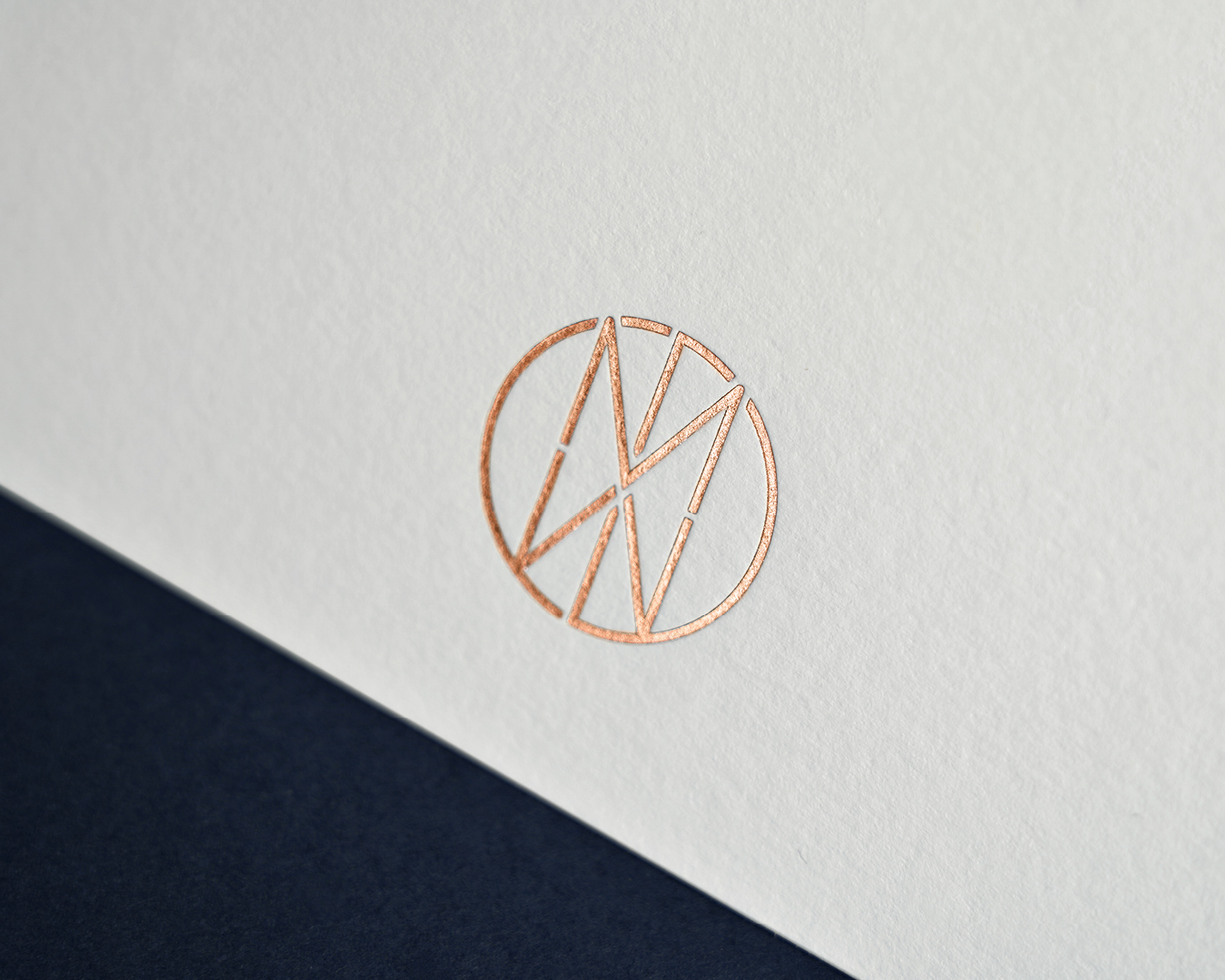
The logo is meticulously engineered with the letters D en M. The construction takes inspiration from the world of magic playing cards, where mirroring and symmetry is key.
This symmetry is the base of a custom pattern, seen on the coasters and wrapping paper. It will be further used to differentiate the many series of products that will come this year.
The use of copper hotfoil comes from the iconic brick colored gin bottles, and are used in the art direction of the presentation of this project. The hotfoil serves as a nice contrast to the midnight blue, which is chosen to highlight the companies quality products.
CREDIT
- Agency/Creative: Sign Brussels
- Article Title: Sign Brussels Translates Traditional Distillery Into Modern Times
- Organisation/Entity: Agency, Published Commercial Design
- Project Type: Identity
- Agency/Creative Country: Belgium
- Market Region: Europe
- Project Deliverables: Brand Architecture, Brand Identity, Brand Redesign, Brand Refinement, Brand World, Branding, Graphic Design, Identity System, Illustration, Rebranding, Research
- Industry: Food/Beverage
- Keywords: Spirits, Rebranding, Belgium, Traditional, Family, Aalst


