


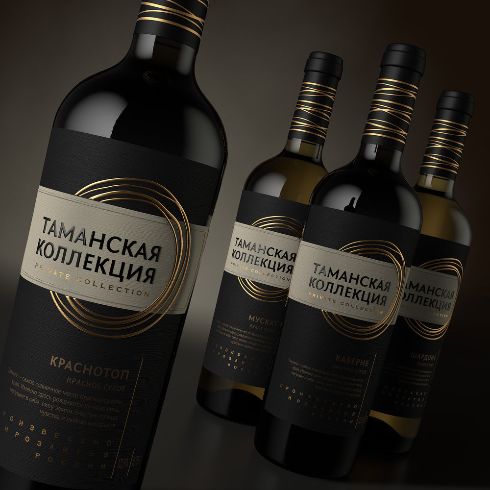
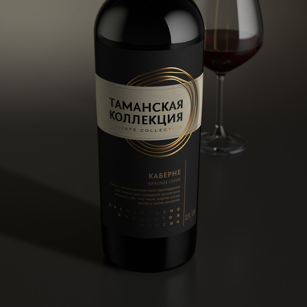
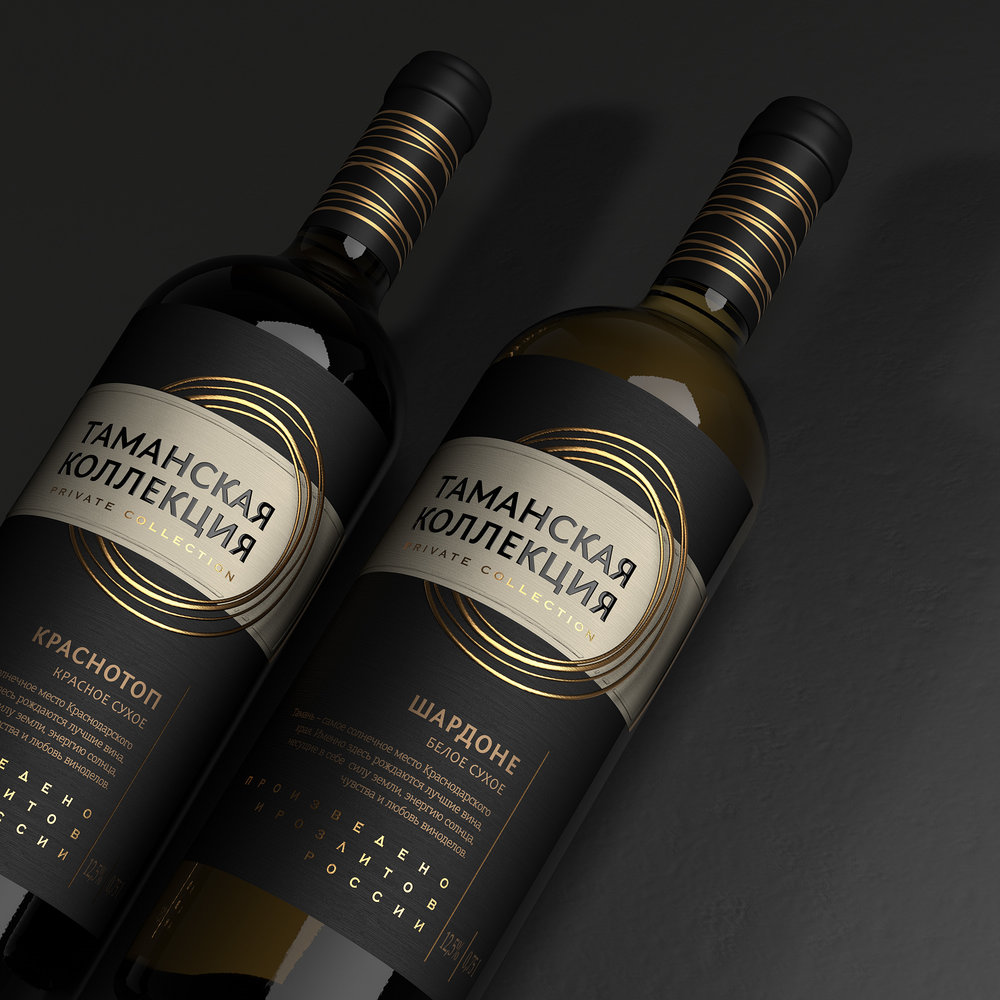
” This project set the agency with the task of creating a contemporary and attractive design aimed at someone living in a big metropolis. In order to make the product look original on the shelf, the visual lexicon had to exclude the traditional images of vineyards, fields, castles and other common elements used in wine packaging design.
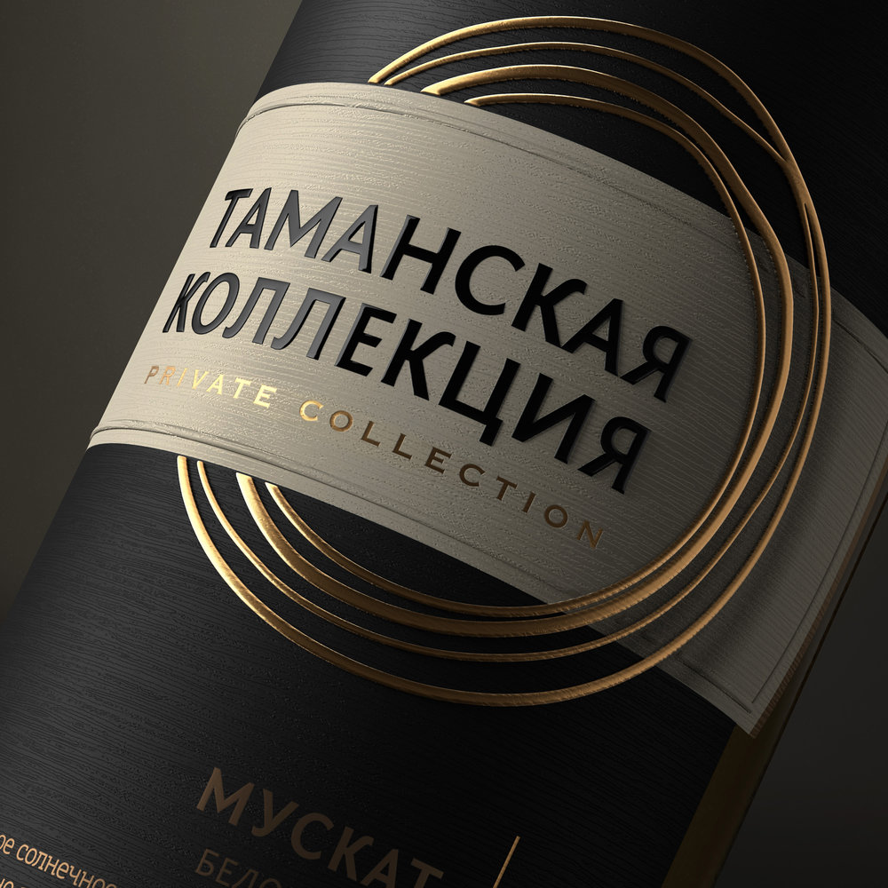
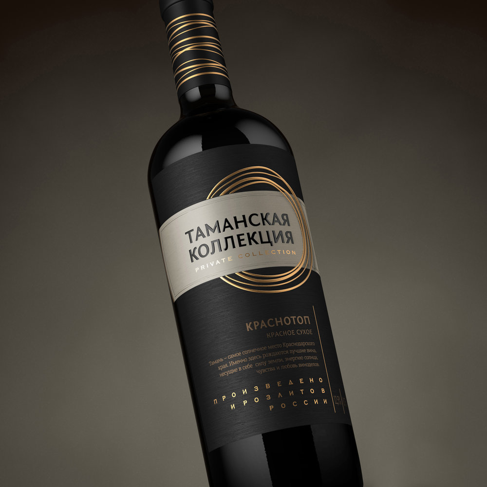
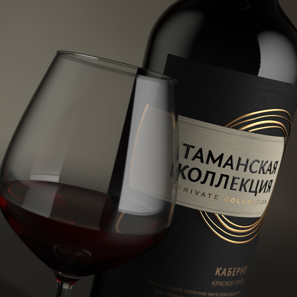
The solution presented by the agency was executed in a modern style, which allows setting the product apart from the majority in its price segment. Strict graphic blocks in mostly black, special type font solutions, and the overall temperance of the composition underline the status of quality wine, which can be appreciated by the potential buyer. The main eye-stopper in this label is the series of golden rings stylized as hand painted strokes, which twine around the label’s central element. The ring theme is repeated in the bottle cap design, which makes the bottle more attractive and brings completeness to the entire composition. Thanks to the use of special artistic paper and particular post-printing techniques, the label looks very modern and voluminously.”

CREDIT
- Agency/Creative: ShumiLoveDesign
- Article Title: ShumiLoveDesign – Taman Collection
- Project Type: Packaging
- Format: Bottle
- Substrate: Glass


