


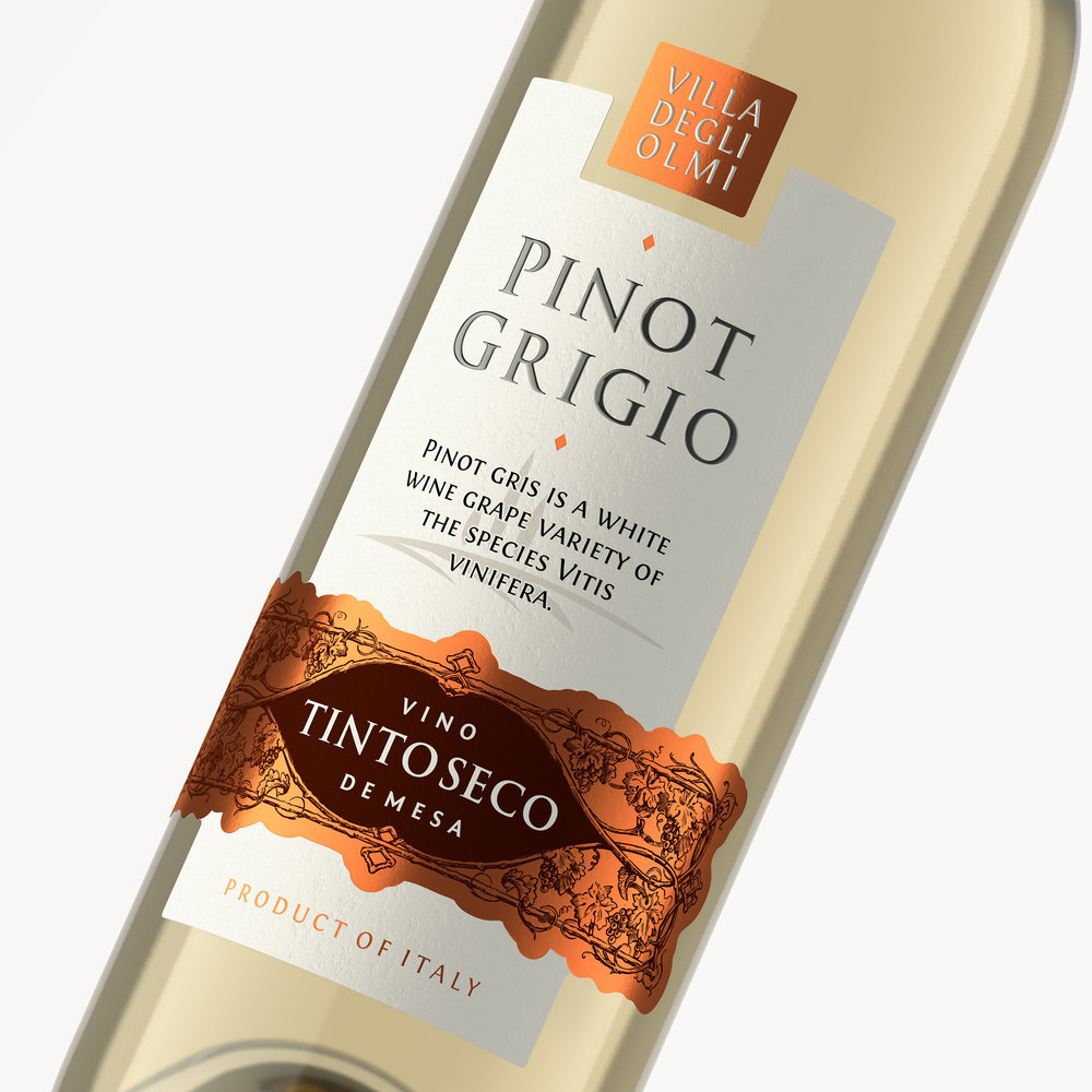
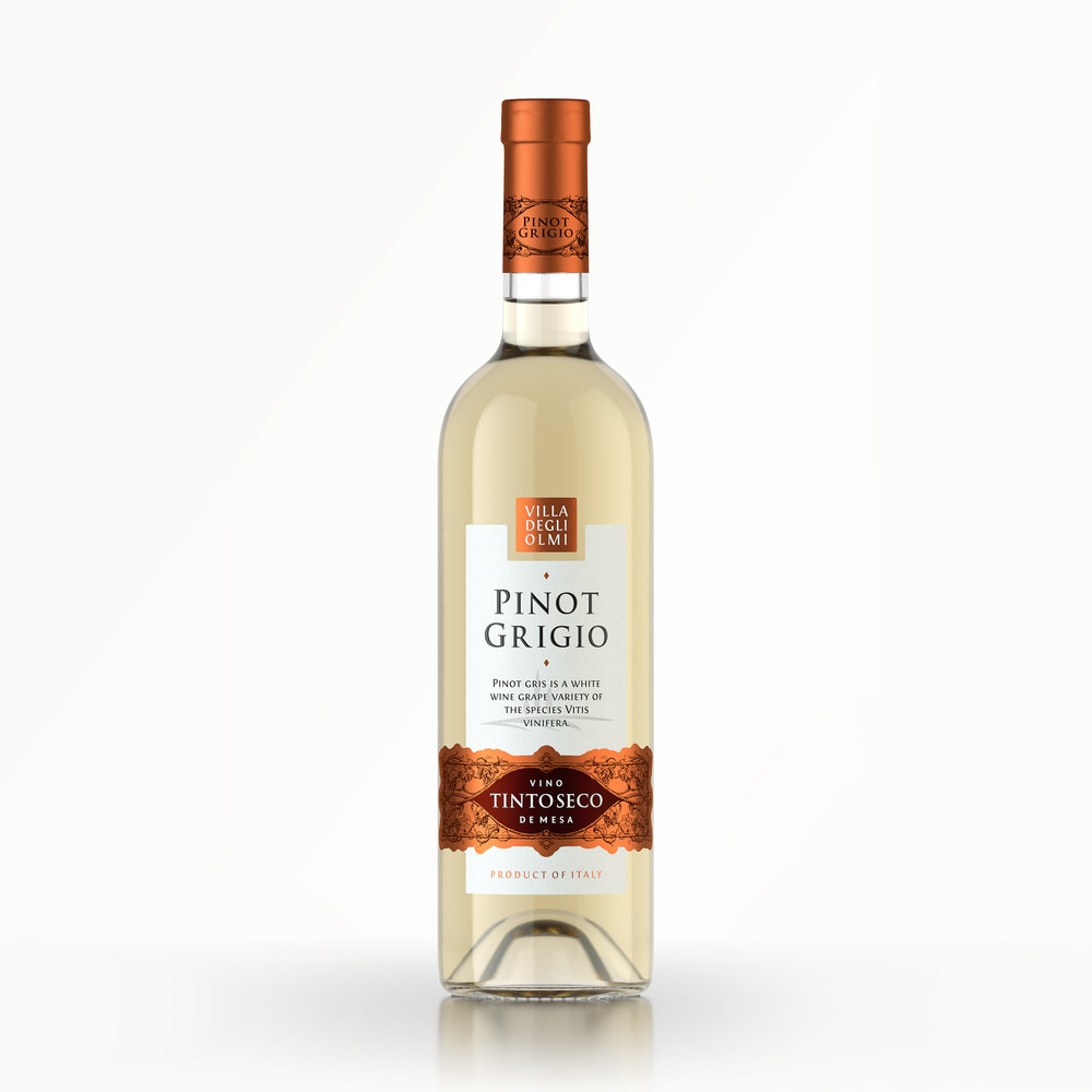
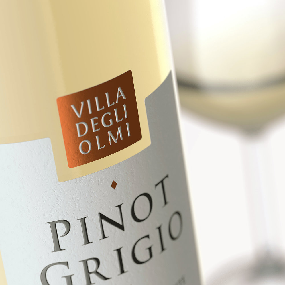
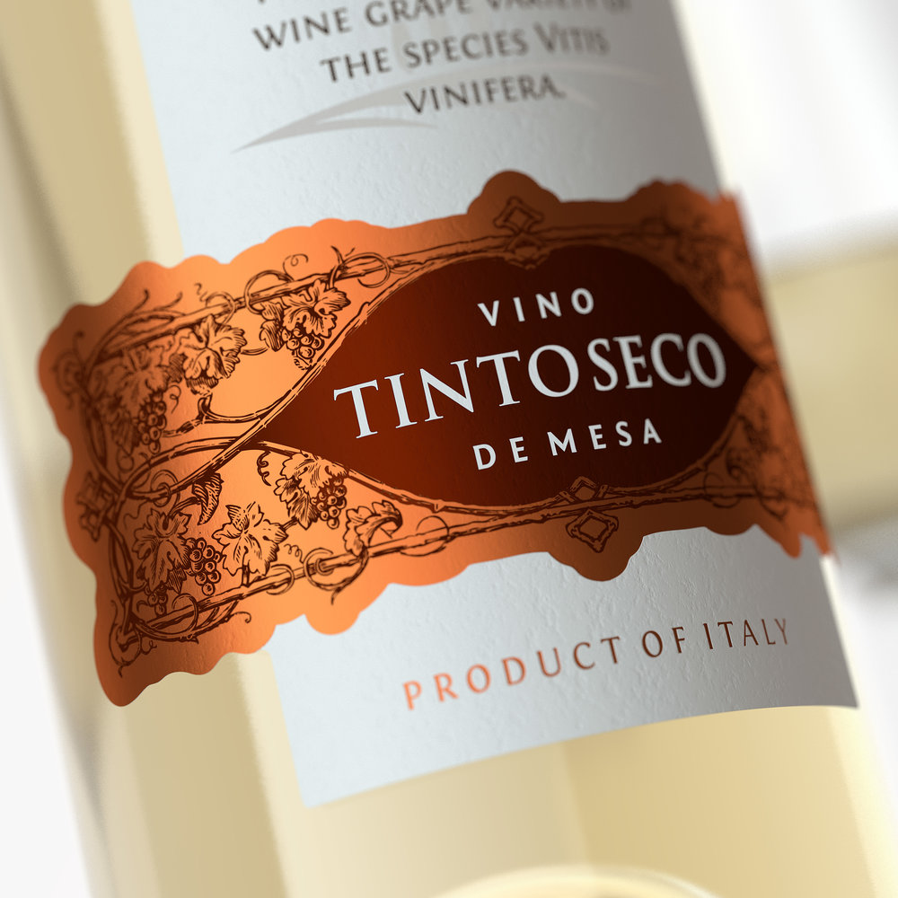
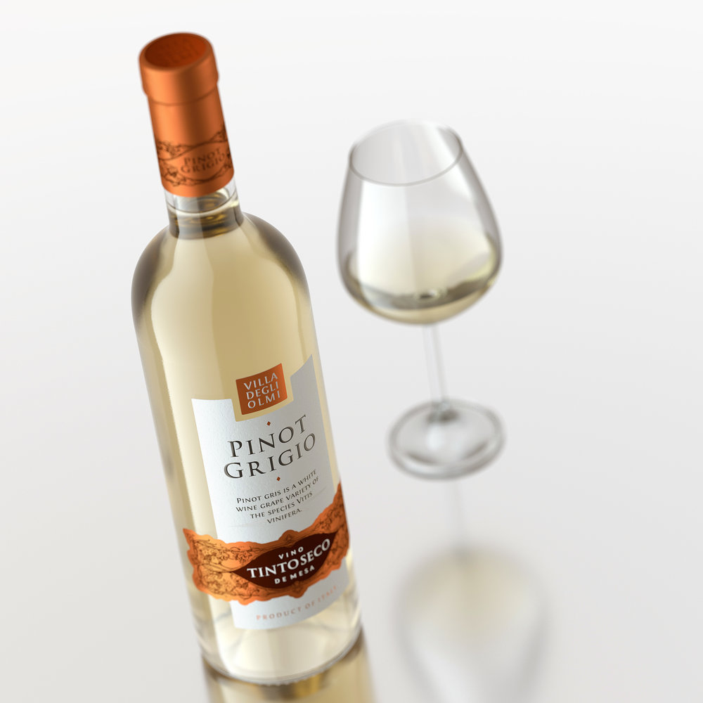
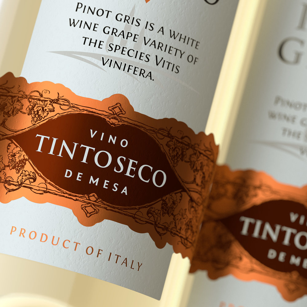
” The overriding task for the agency in this project was the creation of an integral image that would reflect the light and elegant feel of the product, and identify the drink’s region of origin. The unique Italian spirit is contained within every drop of this wine, and that’s exactly what was required to embody in the packaging design.The solution presented confirms in general lines the traditions of Italian wine packaging, while also carrying certain details that lend the composition a modern and fresh feel. First thing to note is the strict and minimalistic central piece, which serves as a kind of foundation for the more expressive elements located in the lower and upper part of the label respectively. The lower piece also carries stylized illustrations of grapevines, which form a kind of pattern that is repeated in the bottle cap design. The production process for the label involves additional printing and post-printing techniques that emphasize certain elements and make the overall composition more expressive.”
CREDIT
- Agency/Creative: ShumiLoveDesign
- Article Title: ShumiLoveDesign – Pinot Grigio
- Project Type: Packaging
- Format: Bottle
- Substrate: Glass


