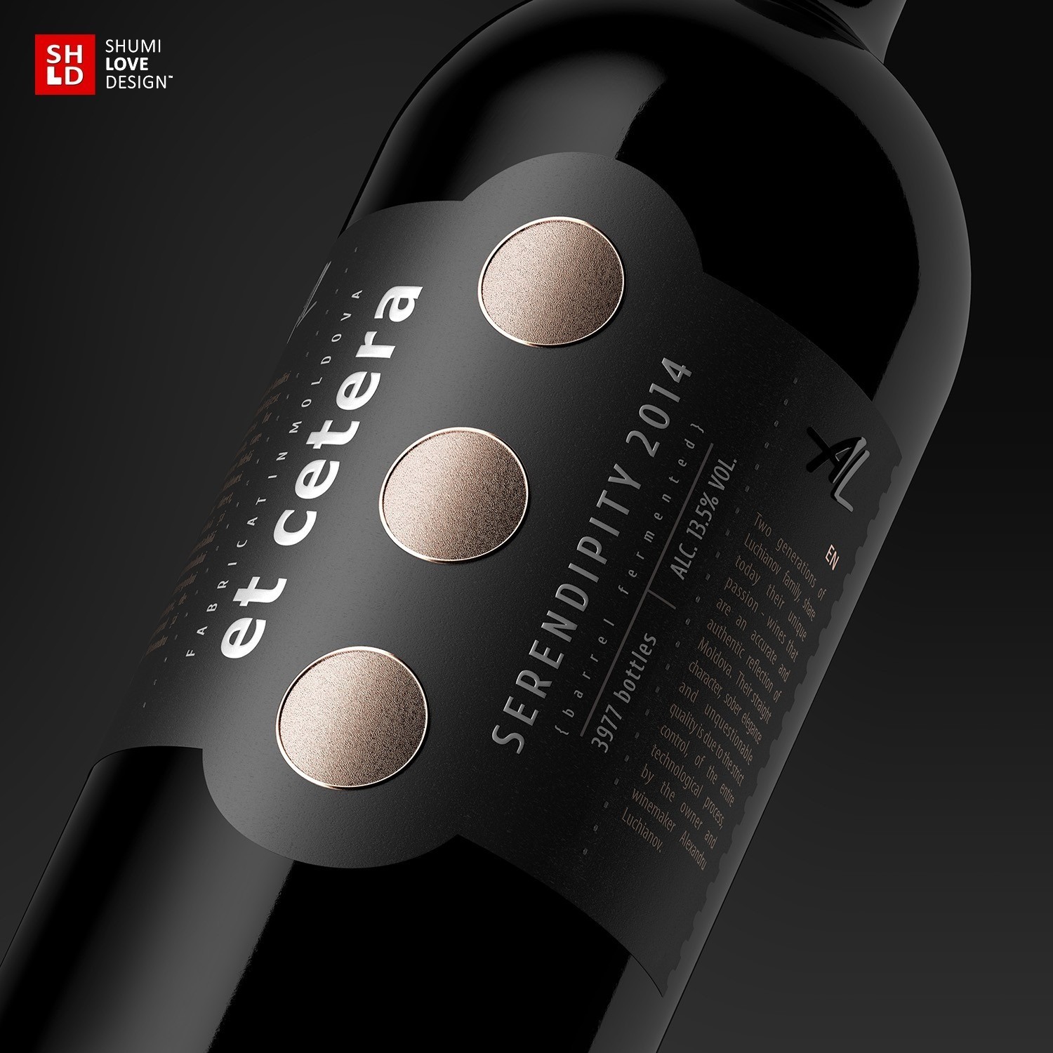
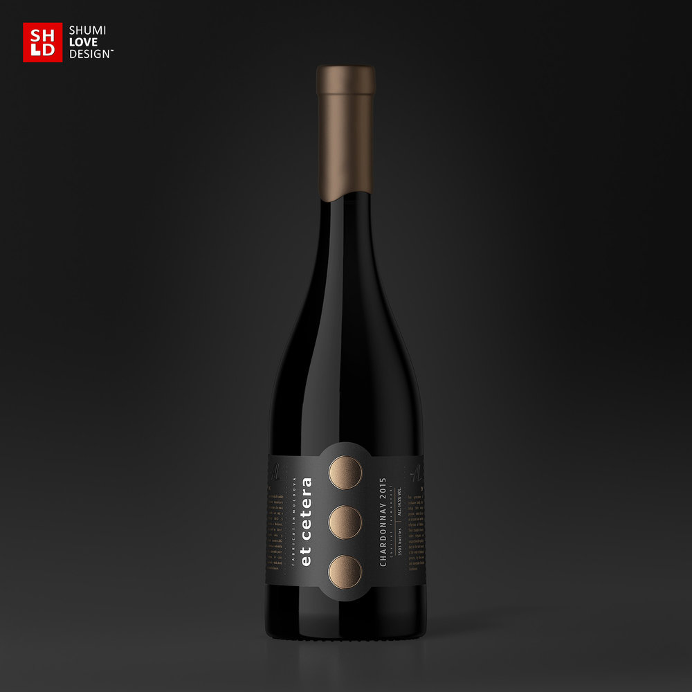
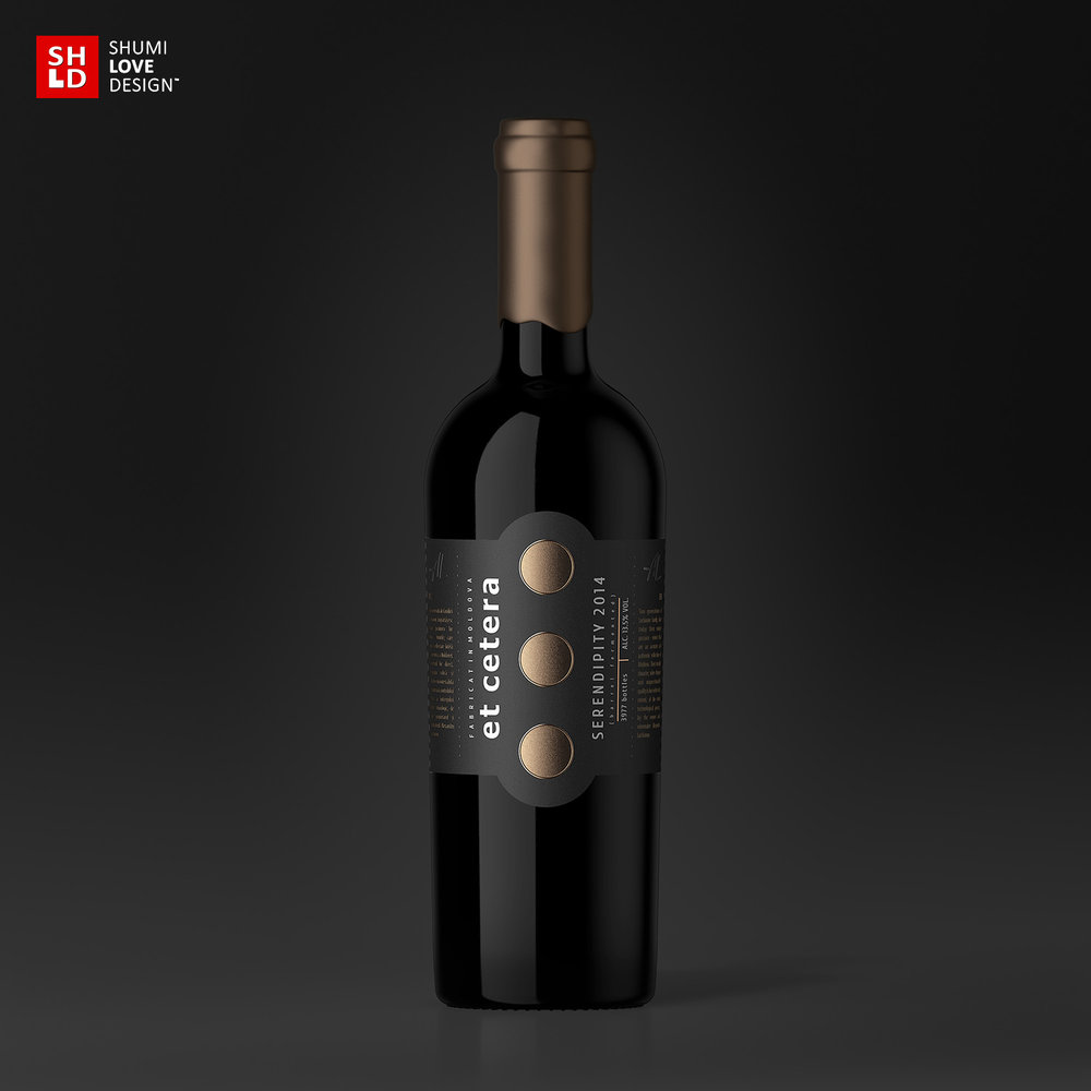
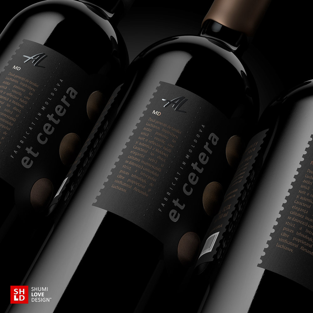
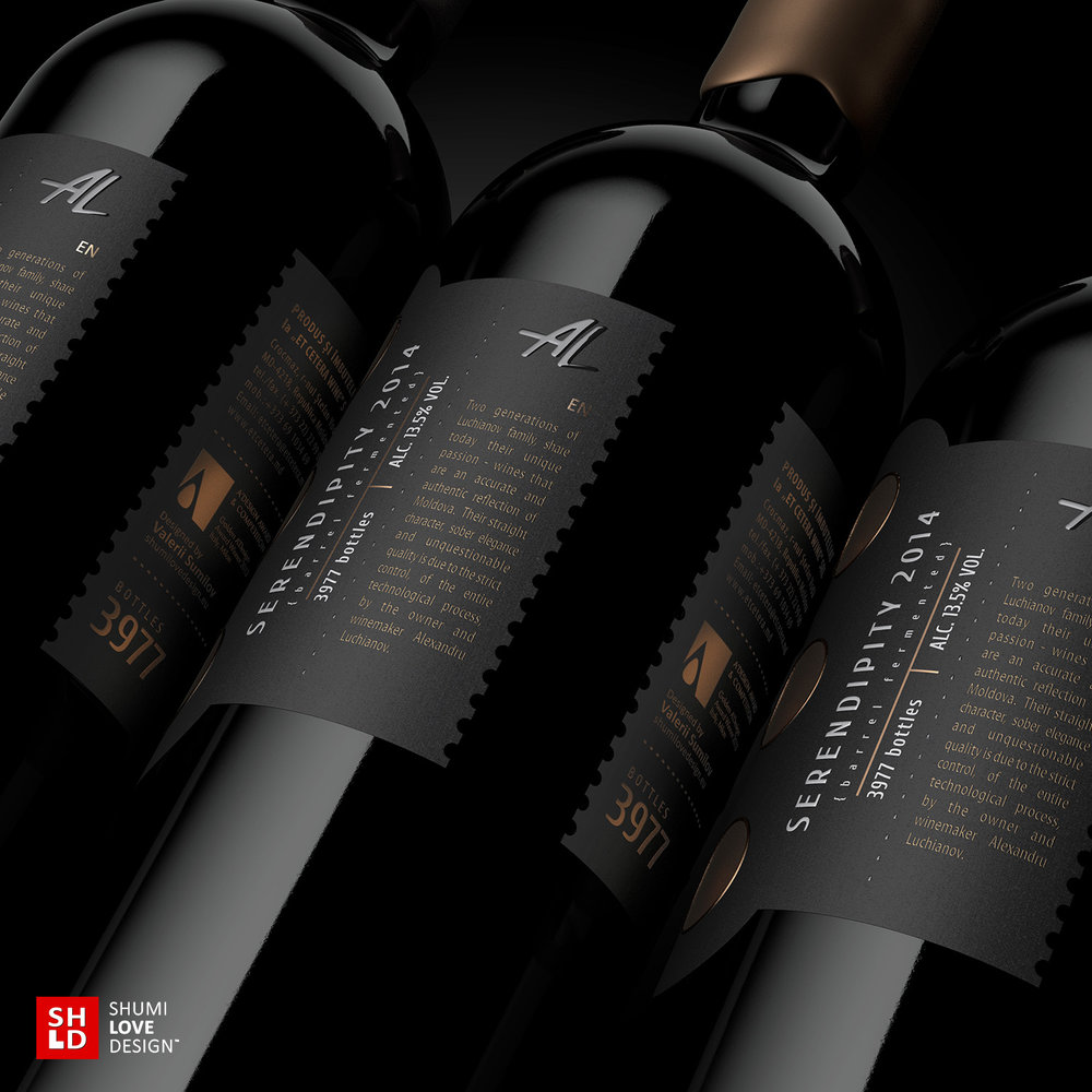
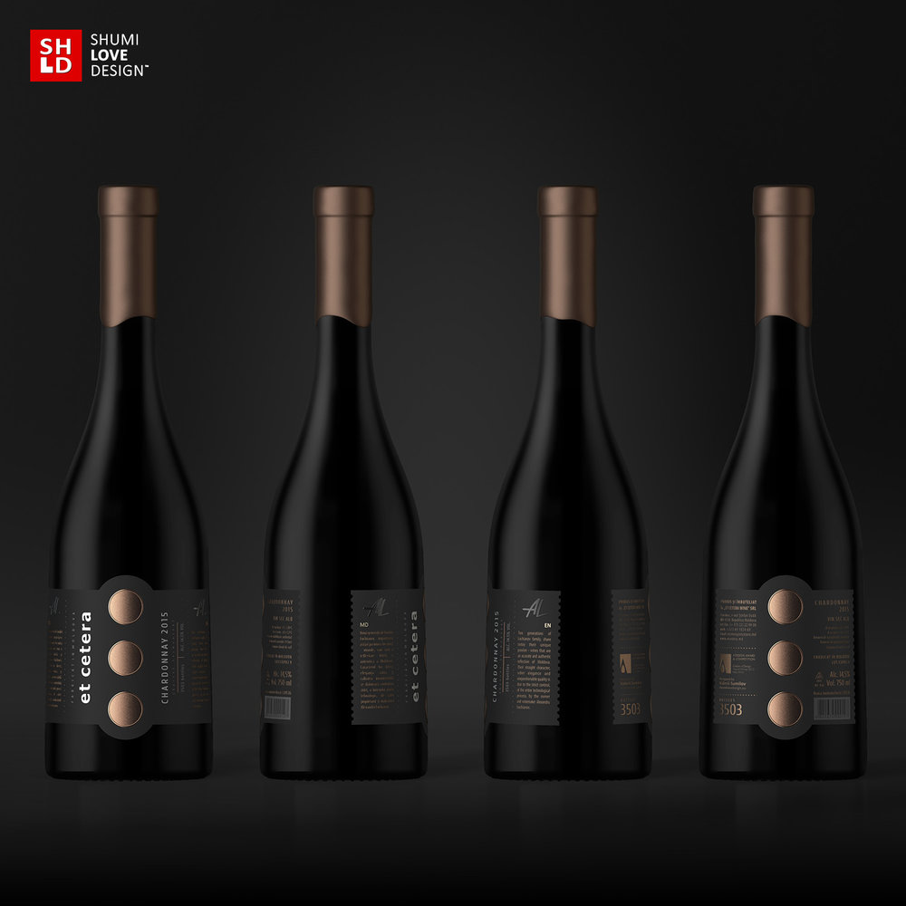
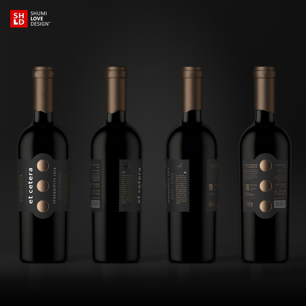
“This brand was developed by the agency’s specialists in 2008 and since then has garnered notoriety both on the domestic and international market. Back at that time, the trademark looked original, premium, and different from everything presented on the product shelves. However, since then the market has seen the introduction of many new players in the signature wine niche, characterized by bright and attractive visuals, which made the Et Cetera brand somewhat lost in the competition. So the agency’s task for this project was to create an original, vivid and attractive design, relevant to the current competitive environment, while retaining the recognizability, the brand’s DNA.The main step in the brand’s renewal was the change in bottle form and an original corking with wax, which make the product stand out and attract the consumer’s attention. The label design was also subject to substantial changes. First of all, one should note the new color scheme – black field and bronze elements – that looks temperate, stylish, and gives an instant impression of the product’s high level. While the label doesn’t wrap the bottle entirely, still the front and back labels are merged into one, which allows the label to work effectively regardless of the side the bottle is facing at the moment. The main visual accent was placed on the style-forming element of the trademark – the ellipsis sign – which was enlarged in order to emphasize the brand identification. The employed printing and post-printing techniques as well as the choice of artistic paper, all emphasize the product’s premium level and its exclusivity.”

CREDIT
- Agency/Creative: ShumiLoveDesign
- Article Title: ShumiLoveDesign – Et Cetera Premium
- Project Type: Packaging
- Format: Bottle
- Substrate: Glass, Pulp Paper


