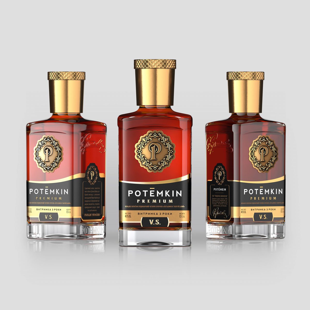
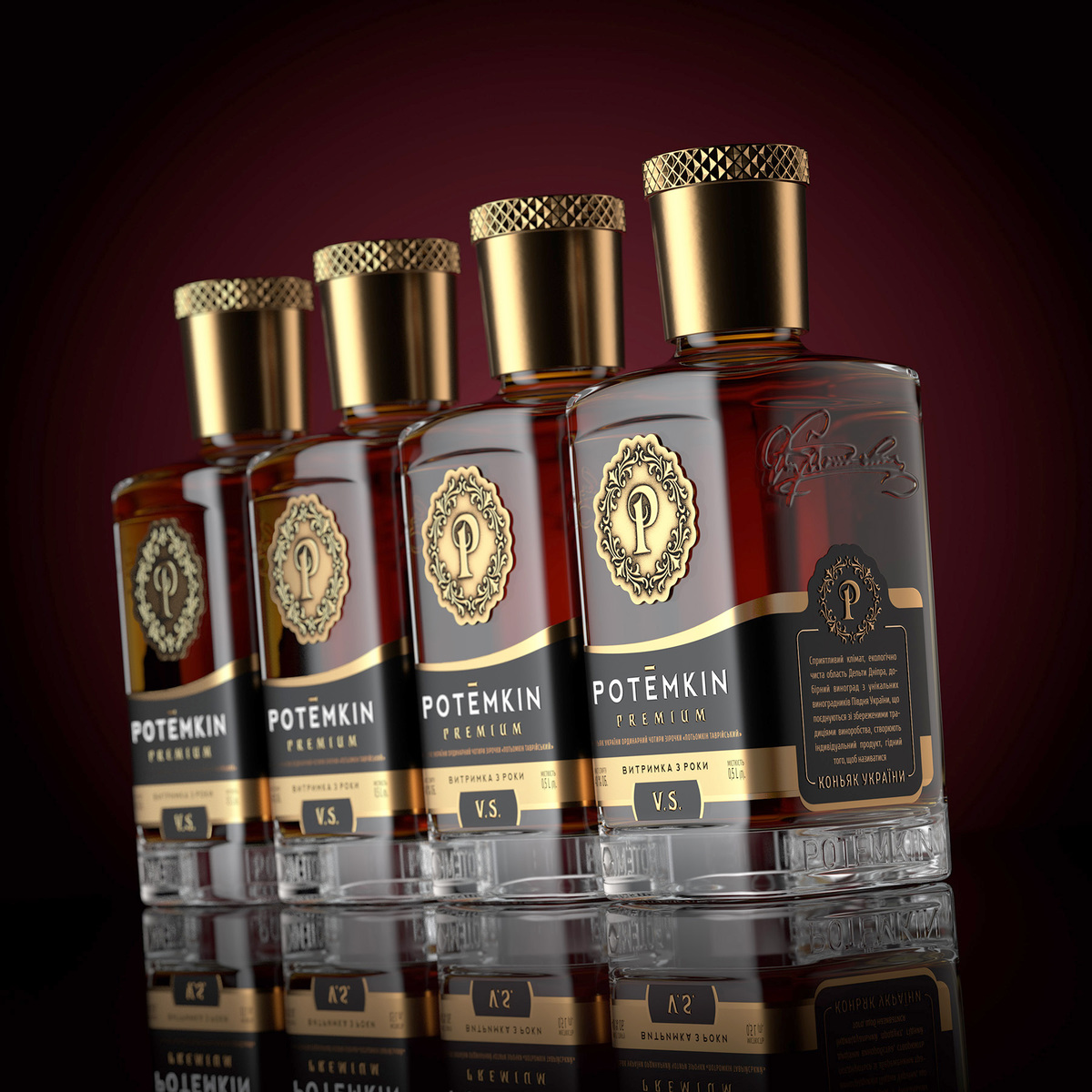
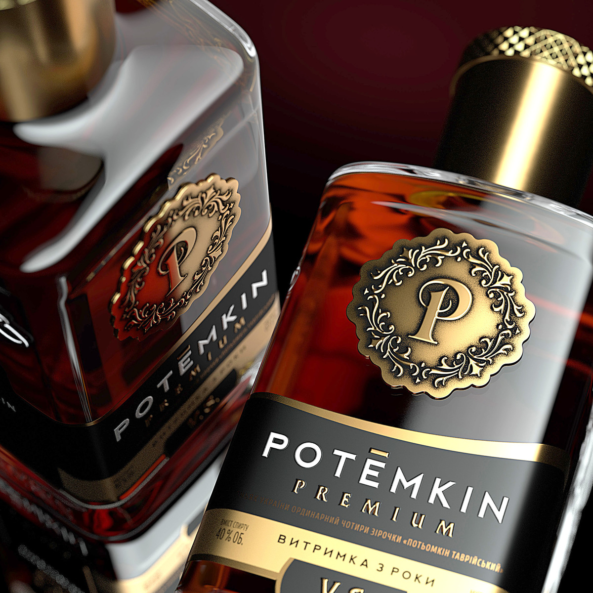
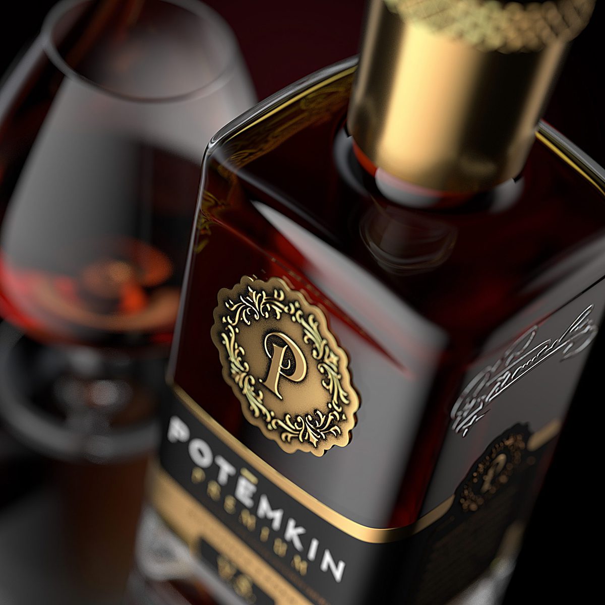
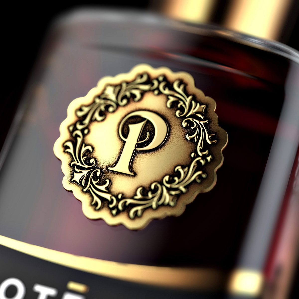
The branding works carried out resulted in a brand concept, which has been approved by the Customer. It combines a number of unique characteristics that are consistent with the design objective as we have developed:
1 / the brand symbol;
2 / the unique spelling of the TM;
3 / the brand concept of the product design.
The new design allowed us to solve the issues of the previous design.
Specifically, we have replaced the decal on the bottle with a logo made of dense aluminium, which is applied on the front side of the bottle above the label. This is how several issues have been solved at once:
1 / the trademark has acquired a recognizable, unique, memorisable brand symbol (logo);
2 / the issue of readability of the brand symbol on the bottle has been solved. Now, no matter at what angle the consumer looks at the bottle, he/she reads the brand symbol equally well and sees the entire design on the bottle;
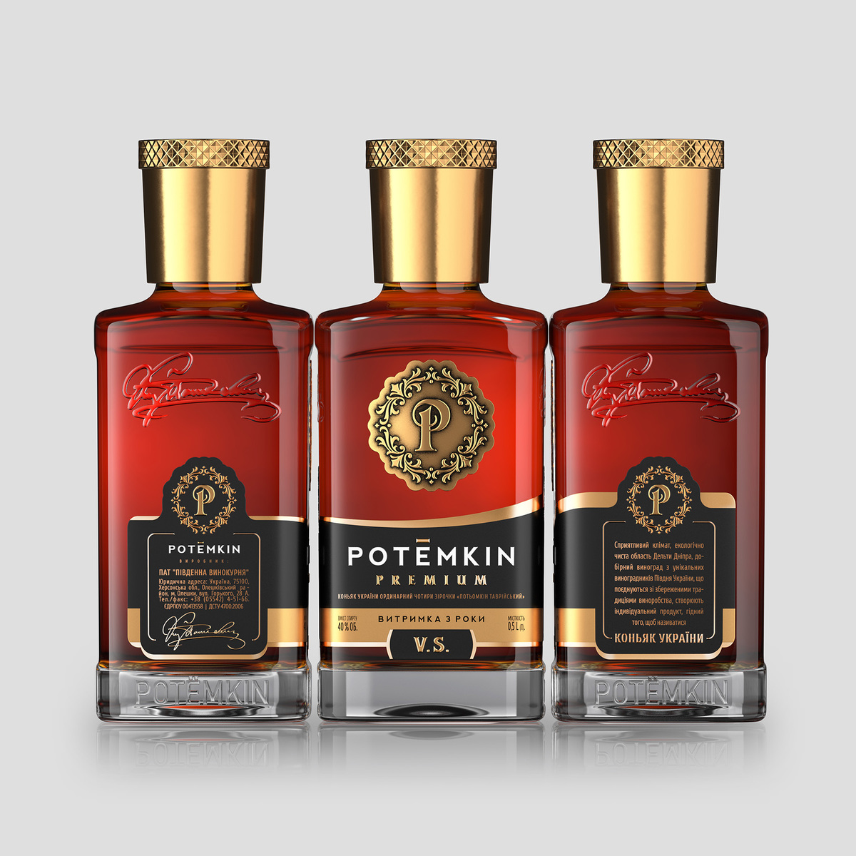
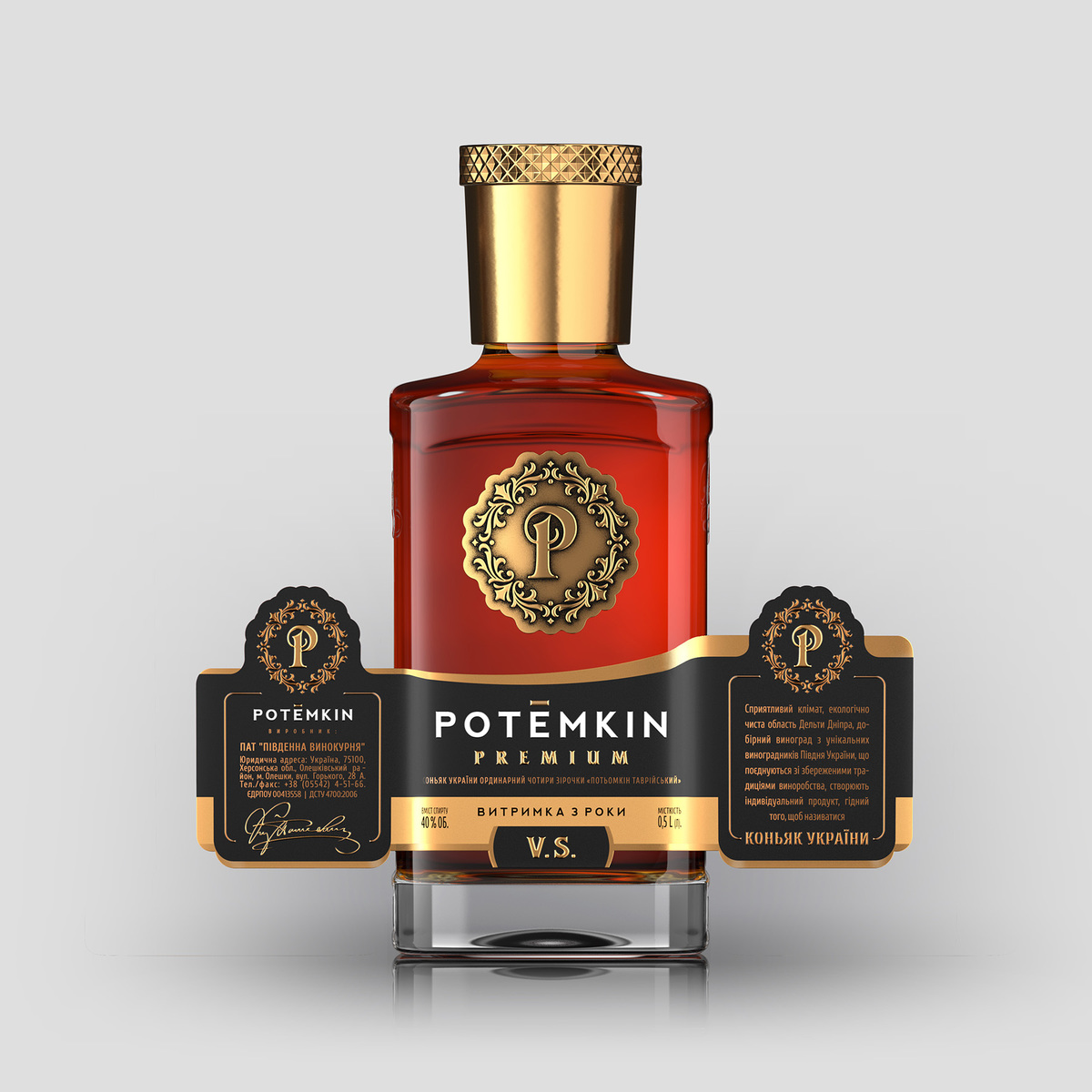
3 / we have developed a design that is equally concise, high status, respectable, ‘expensive’ in the good sense of the word.The label has a complex structure. In our search, we have found a solution that covers not only the front, but also two lateral sides of the bottle with square section.
Thus, the label that is pasted on the bottle covers three sides of the bottle. We have added an additional USP of the product on the lateral sides of the label, thus inviting the consumer not only to examine and study the product, but also to establish a communication between him/her and the brand.
CREDIT
- Agency/Creative: SHUMI LOVE DESIGN (TM) Branding Agency
- Article Title: SHUMI LOVE DESIGN (TM) Branding Agency – POTЁMKIN
- Project Type: Packaging
- Agency/Creative Country: Moldova


