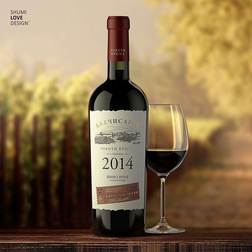
“While working on this project the agency’s specialists were required to create an image that would emphasize the product’s quality and class, while also pinpointing its region of origin. That’s why the agency’s specialists have focused their efforts on creating a laconic design that would reflect the product’s status through a tempered visual character.”

“The presented design can be characterized as classic, corresponding to the overall aesthetic of Old World wine packing. The white plane of the label, which features intentionally torn edges to create an impression of noble carelessness, wields only a few laconic visual elements executed in classic fonts. It’s the name of the trademark, region of origin, harvest year, grape variety and wine type. These text blocks surround a stylized illustration depicting the vineyards where the product started its journey from. The lower part of the label also features an information block stylized as a stamp, which contains additional technical data such as batch number and bottle quantity. Post-printing techniques applied in the production of the label should also be mentioned, since they enhance certain elements and imbue them with additional volume.”


CREDIT
- Agency/Creative: SHUMI LOVE DESIGN , Valerii Sumilov
- Article Title: SHUMI LOVE DESIGN – БАХЧИСАРАЙ / Premium Wine
- Project Type: Packaging
- Substrate: Glass


