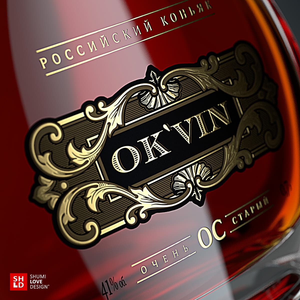
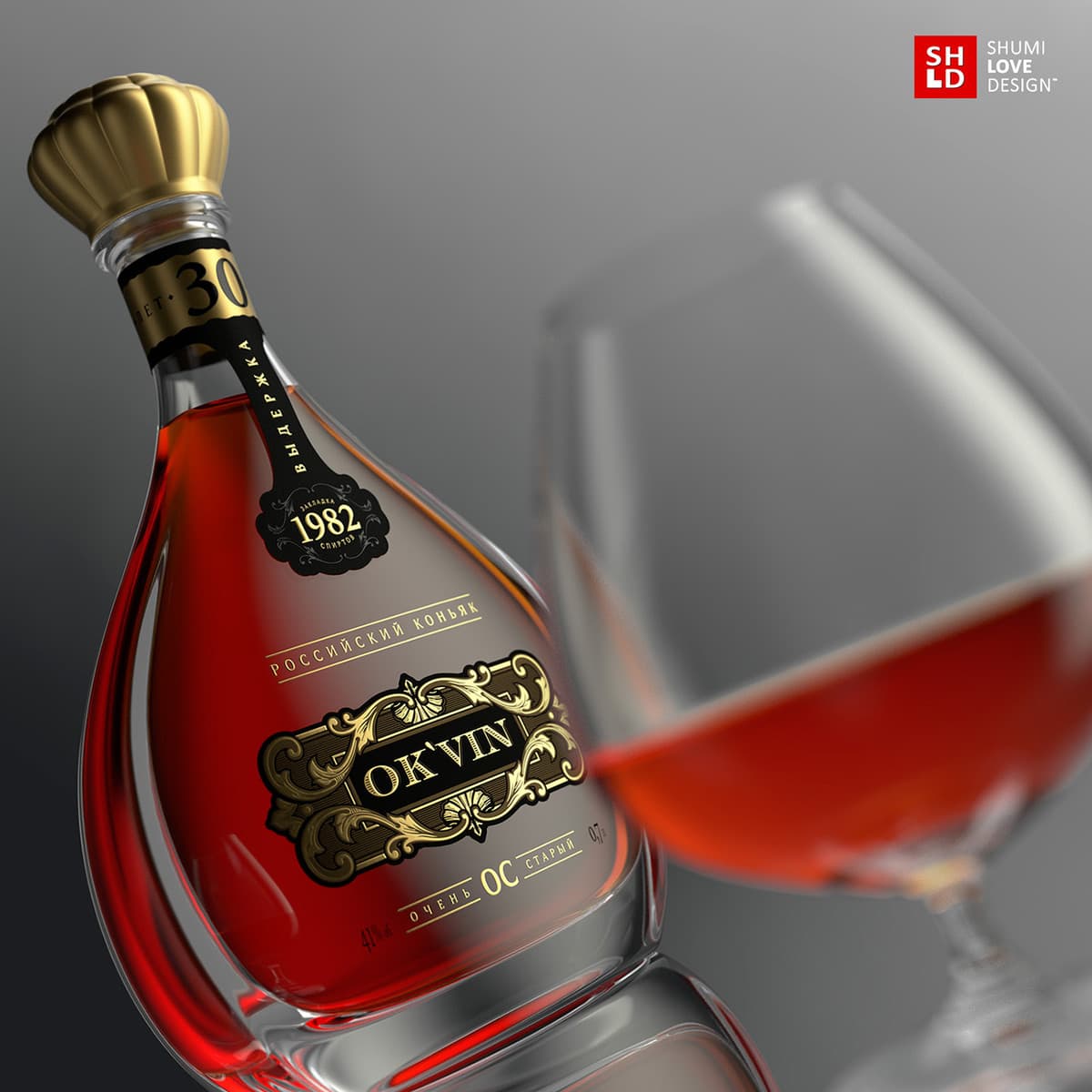
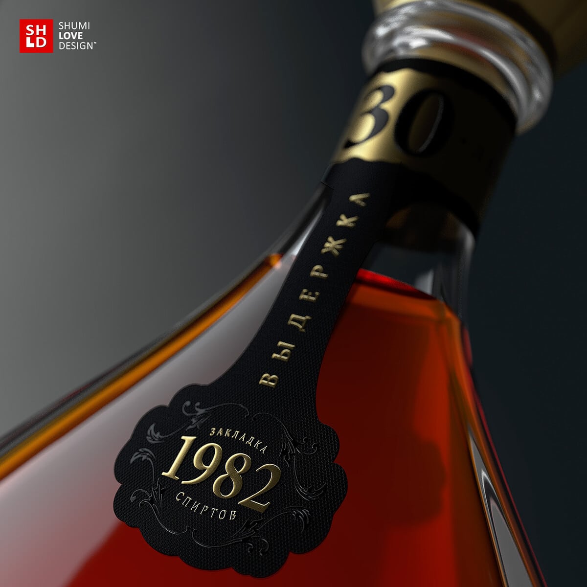
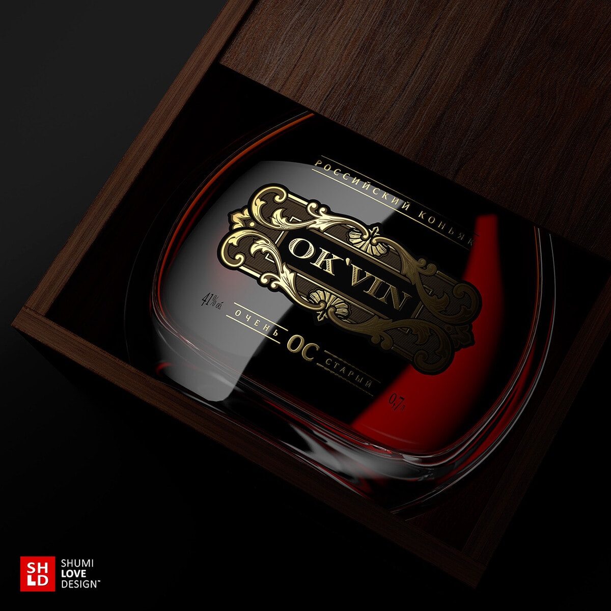
“Highlight the product’s character and create a visual that would make it more desirable, refined and expensive for the consumer – this was the task for this project. The packaging design of this brandy had to emphasize its premium status, while remaining within the overall style of the product line.The main graphic elements of the packaging repeat the design of the ordinary and matured brandies in this product line. Thus, by using common visual elements and style, it was possible to maintain the overall character of the trademark and keep its main visual identifiers. However, the packaging of this particular product emphasizes the high level and the refined character of the brandy. Thanks to the limited use of only the main and necessary graphic elements, the design for this drink features a degree of visual temperance that quality and delicacy speak for themselves. The seeming simplicity of this solution is nevertheless the result of hard work while seeking the ideal balance between minimalism and pompousness, common to this drink category.”


CREDIT
- Agency/Creative: Shumi Love Design
- Article Title: Shumi Love Design – Okvin Premium
- Project Type: Packaging
- Substrate: Glass


