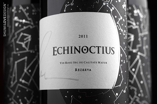
“DESCRIPTION: Limited series of exclusive wines.TASK: This project is unique in many ways. The design had to reflect the unique character of the product in question – exclusive author wine. Besides, there was a requirement to communicate the deep meaning in the product’s name – superlative, solstice, contrast between night and day, black and white, open and obscure. The design had the intent to reflect the secret hidden in the night: the beauty of the night sky that amazes us so much and the mystic riddle hidden in the constellations and the Zodiac. All this has served as the basis for the original and unique design not only by content but by its form as well. The label’s form is original and represents a contrast between day and night, wrapping the bottle around its entire circumference, forming an enclosed system of interaction, where one comes out of the other. Where day becomes night and night becomes day. On one hand, there’s a struggle and counteraction, while on the other – harmony and accordance.”

“SOLUTION: First of all I was inspired by the very product – the wine of the highest quality. It’s unique. Its running batch is only 2270 bottles. It represents a high level of mastery as shown by its magnificent author, Constantin Stratan. I’ve been working with him for a long time and have previously acted as a design partner for his unique wines. One of the examples of this collaboration is already known to the world design community in the form of the «5 elemente» project – platinum winner of the A`Packaging Design Award 2013. Another inspiration for me was the possibility to reflect on the theme of solstice – the contrast between night and day – and to touch upon the mystic aspect of this event. The production of this label involved the application of the most advanced printing techniques. The choice of paper was set to high quality art paper by FASSON MAILLE BLANC of the FASSON RICH collection. As for additional printing techniques I would like to note the application of tactile (volume) varnish not only in the vine’s name but in the author’s signature as well, which ensures the quality of the product. The nocturnal mystery was also reflected through the use of tactile varnish on the volume portion of the label, creating an openwork framing made of astrological constellations.”

“Label dimensions: 249 mm in length and 100 mm in width. The label is glued around the bottle’s entire circumference thus forming a continuous line.This is a unique label for an exclusive wine, which will only be distributed through the HoReCa system. The label’s main task is to outline the product from the rest of wines of the same category and make consumer remember it as something original, interesting and unusual. While working on the design, I was thinking about how the consumer sitting in the restaurant will be looking at the label, will take the bottle and be surprised after looking at it at a closer distance.The project was initiated in February 2013 and sent to the printing house in April 2013. The project’s presentation was held as a special event dedicated to the ECHINOCTIUS wine. Currently the wine is available for purchase only through the restaurant network in Chisinau.”

” This project took a lot of time to be finished. While it looks rather simple, temperately design and limited in its color scheme, the project represented a very hard task, since a lot of things were at stake: the winemaker’s reputation, the customer’s expectations, the designer’s professionalism. I started working on the project by learning more about solstice, since I had to understand the essence of this event and reflect it in the label’s design. Additionally, I’ve spent a lot time looking for an original form for the label, since it had to be new, original and unusual. At the same time it had to reflect the corporate spirit of the winemaking company as well as the essence of the product’s name. While making the first prototypes, there were many different forms that have been applied on a real bottle. The producer has also lent his advice. We were searching for the best graphic solution. More time was spent on selecting the right paper for printing and the desired post-printing techniques to be used. This implied many consultations with the printing house and its specialists.The most difficult thing about the entire project was understanding the bulk of responsibility associated with it. Creating a modest design, reflecting the high quality of the product, keeping the continuity with the previous products from the same winemaker, reflecting the product name’s essence and confirming own professional qualification – these were the hardest things about this project.”


CREDIT
- Agency/Creative: SHUMI LOVE DESIGN
- Article Title: SHUMI LOVE DESIGN – ECHINOCTIUS / SILVER
- Project Type: Packaging
- Substrate: Glass, Pulp Paper


