


London-based design and brand studio ShopTalk have rebranded Braemar Shipping Services to emphasise their purpose-driven, human-centric experience and place Braemar at the forefront of the shipbroking industry.
Paul Ferry, Director and Founder of ShopTalk says: “We’re proud to have partnered with Braemar on a new brand that modernises the conversation around the value of shipbroking. The brand we’ve created for Braemar positions the organisation as a leading challenger in the shipbroking industry and highlights the power of human expertise.”
Genuine, cohesive, sustainable
Braemar are expert advisors in shipping investment, chartering and risk management. Every day, their integrated teams deliver creative solutions and tailored support for customers around the world, placing Braemar at the forefront of the shipbroking industry.
In 2021 the organisation brought on ShopTalk to help them create a bold and recognisable visual identity for Braemar that would be able to grow and evolve with the brand. Crucially, the new Braemar brand elevates the organisation, confidently cementing Braemar’s role as the obvious choice for the discerning customer.
Coralie Carré, Design Director at ShopTalk says: “What sets Braemar apart from competitors is that the organisation’s approach genuinely integrates technical, financial and even engineering expertise into their broking teams, providing the most tailored of solutions to their clients. The brand, therefore, needed to communicate exactly why the experience is better with Braemar.”
The new identity also needed to highlight Braemar’s commitment to sustainability. “Energy transition is at the heart of what Braemar does and plays a permanent part in its business development,” says Carré. “And with sustainability missing tonally and visually across the industry, this was another key pillar to bring forward in the brand refresh – both to elevate Braemar’s reputation and to differentiate it from their competition.”
Dynamic challenger mindset
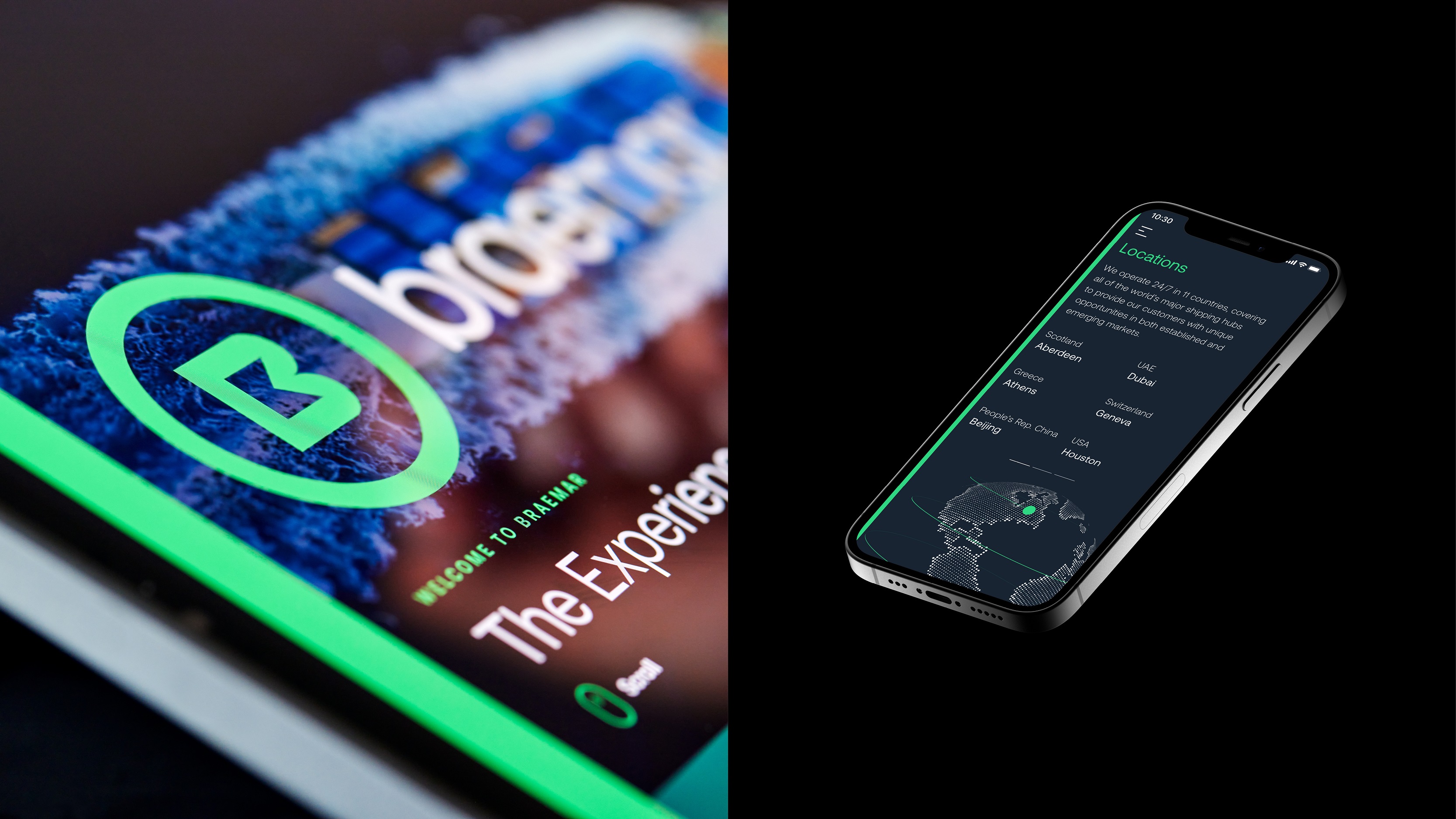
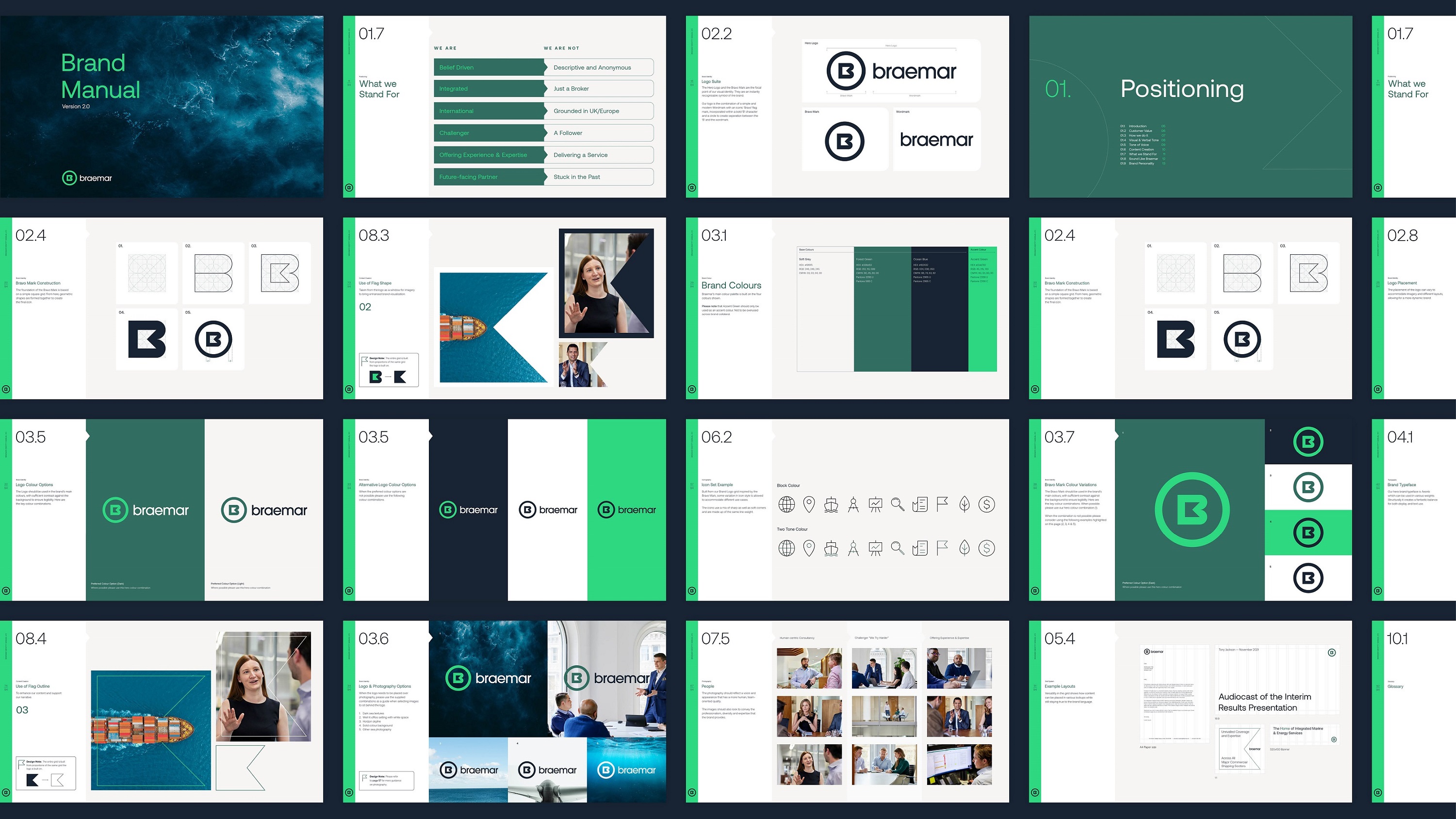
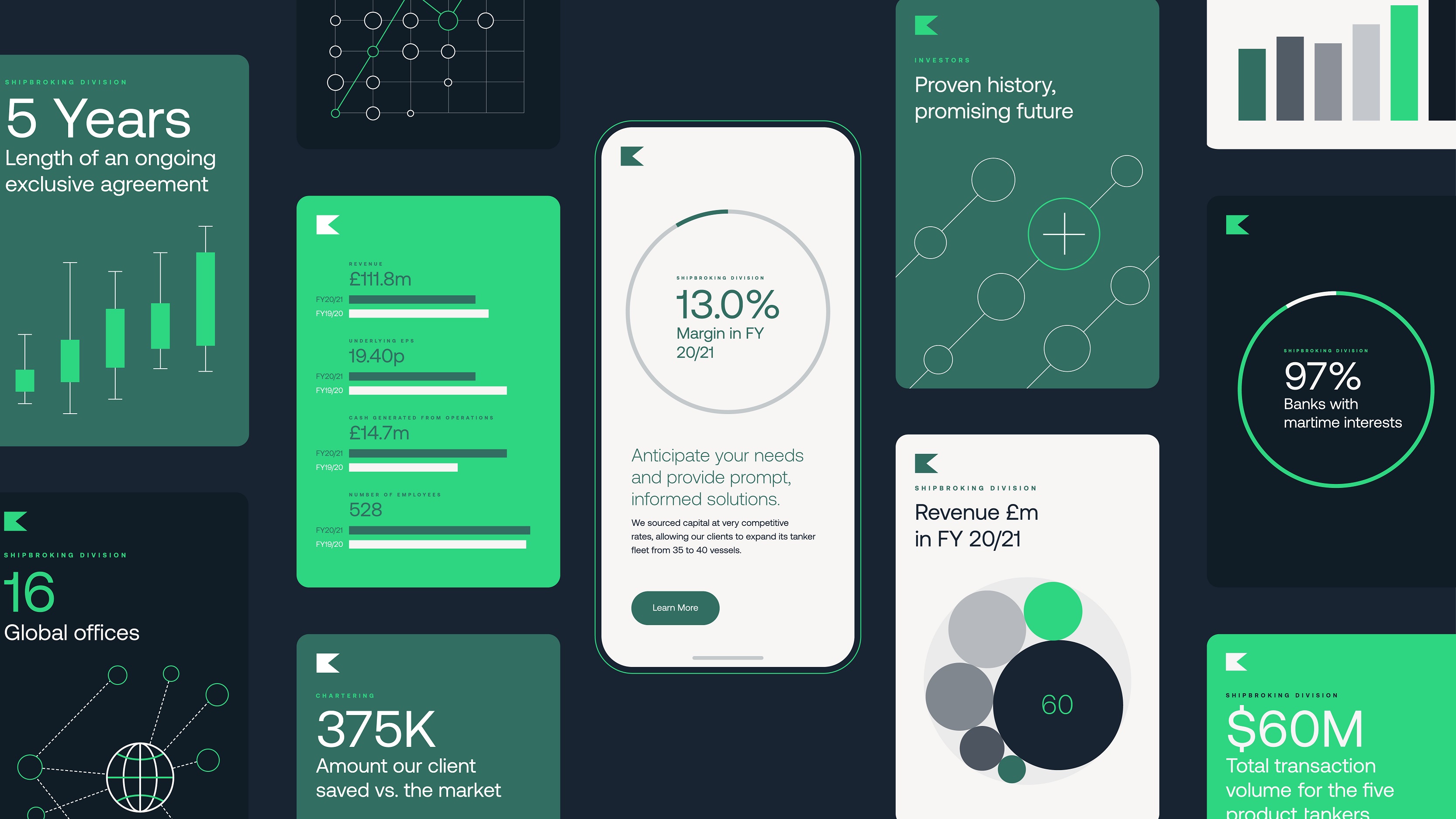
The result is an identity that carries a bold expression through its iconic brandmark and logo, typography, and vivid colour palette; as well as the use of graphic data visualisation that can be updated in line with the rapidly changing world.
Carré says: “Combined with a confident and precise language, this graphic approach translates Braemar’s expertise but also the transparent and honest way that the brand now communicates, with an injection of that dynamic challenger mindset.”
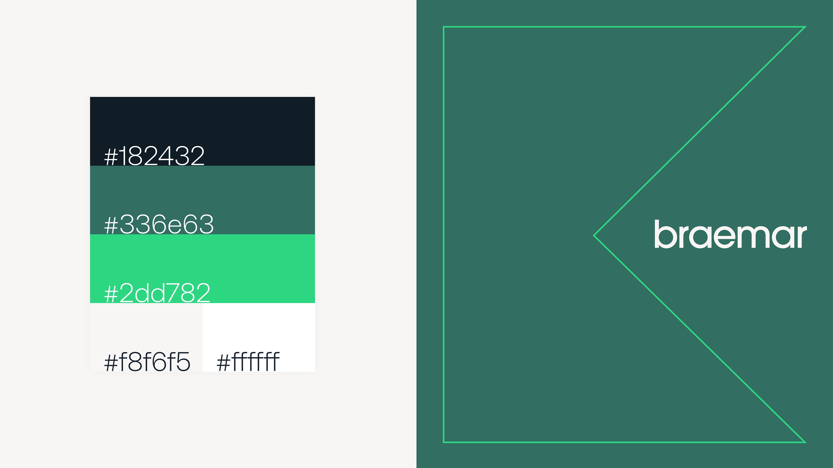
In addition, the new colour palette sets Braemar apart from chasing the pack – for whom the default choice is to have a shade of blue as their primary colour – having two shades of green, ‘Forest’, and a bright accent green that subtly strengthen their engagement for a greener future.
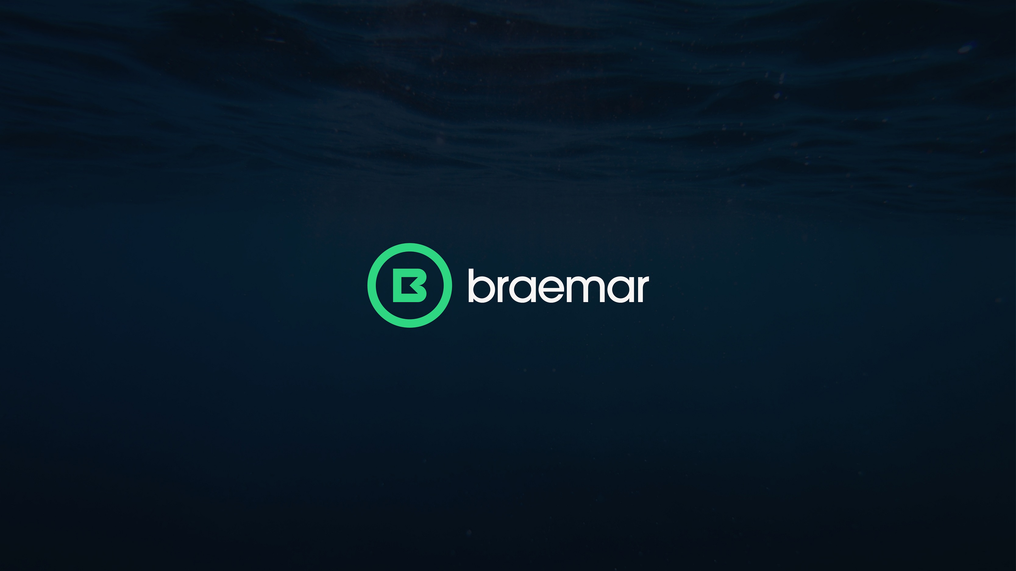
The Flag Mark
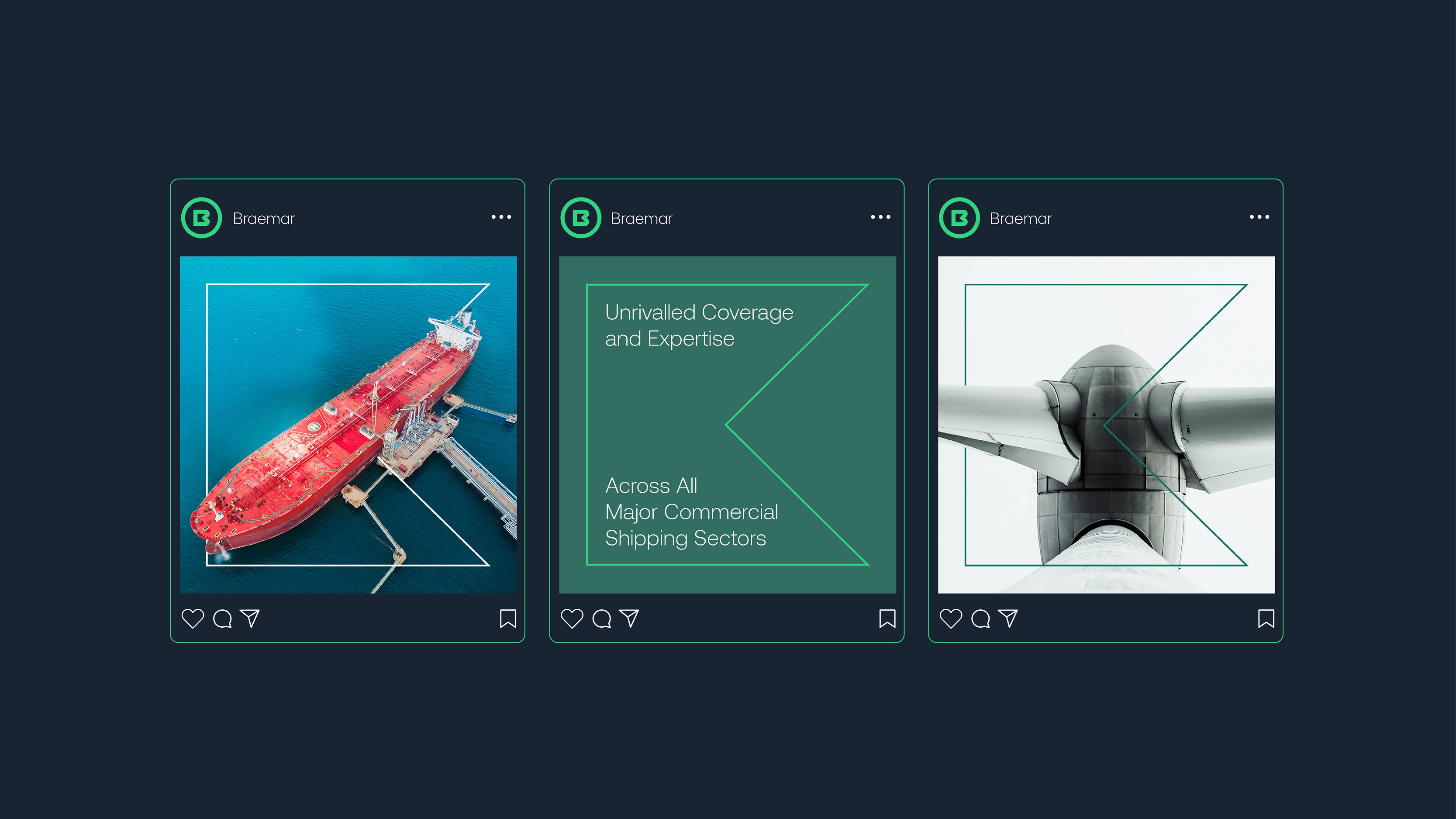
A new logo suite is at the core of the entire Braemar brand and has been broken down into three different marks. The Hero Logo and the nautical-inspired Flag Mark, are the focal point of Braemar’s new visual identity. “They are an instantly recognisable symbol of the brand, ensuring a cohesive and holistic approach to the different services,” explains Carré.
As a window, the Flag Mark can showcase content – particularly new photography that underlines the approachability and expertise of the organisation – or, when outlined, it enhances and supports our specific brand narrative.
ShopTalk also created an iconography set that is connected to the Flag Mark at a fundamental level, to maximise recognition and ownability across every internal material and presentation.
By combining both bold and iconic assets (the brandmark, logo and vivid colour palette) with more dynamic and flexible graphic elements (graphic data visualisation and immersive photography), every touchpoint of the new Braemar brand has been developed to play a specific role and to reflect ShopTalk’s intention to elevate both Braemar’s expertise and attitude.
Carré sums it up: “Drawn together, the elements of Braemar’s new identity successfully positions Braemar as a future facing partner, and provides flexibility to evolve with the brand.”
Braemar’s new brand identity is now live across all touchpoints.


CREDIT
- Agency/Creative: ShopTalk
- Article Title: ShopTalk Designs Modern New Identity for Braemar Shipping Services
- Organisation/Entity: Agency
- Project Type: Identity
- Project Status: Published
- Agency/Creative Country: United Kingdom
- Agency/Creative City: London
- Market Region: Global
- Project Deliverables: Brand Design, Brand Guidelines, Brand Identity, Brand Redesign, Brand Strategy, Brand Tone of Voice, Brand World, Design, Icon Design, Infographic
- Industry: Transport
- Keywords: Sustainability, purpose-driven, human-centric, challenger, bold expression, vivid colour, data visualisation.
-
Credits:
Design and Brand Studio: ShopTalk


