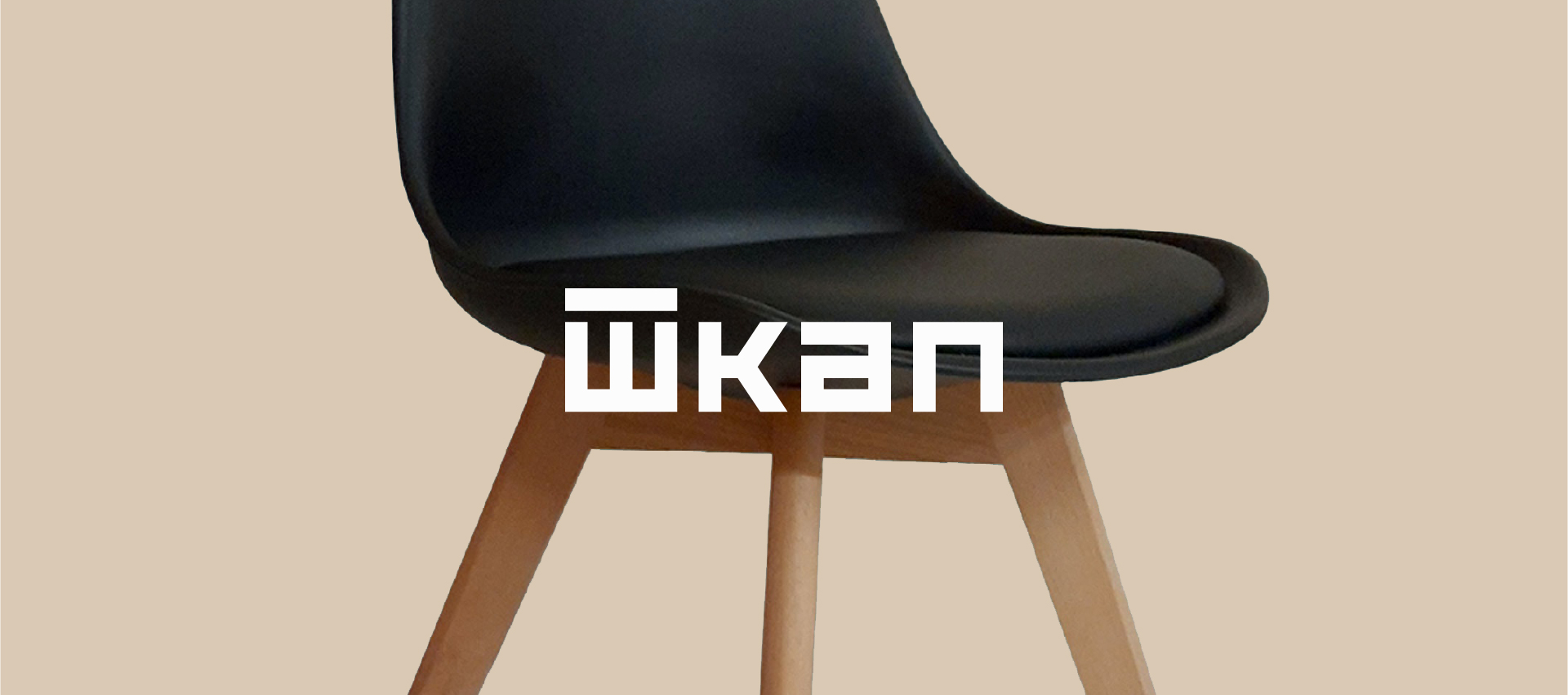
Shkap is one of Russia’s manufacturers and retailers specialising in affordable wooden furniture. Shkap combines simplicity and elegance and offers a fantastic range of durable furniture collections for home interiors and offices. All furniture is made only from high-quality materials with a wide range of colours. The product range includes more than 200 items, including cabinet furniture: tables, cabinets, beds, hallways, mini-walls, computer and coffee tables and even mirrors. One of the company’s specialisations is the production of modular furniture, with the help of which any buyer can create the interior of an apartment or office to his liking.
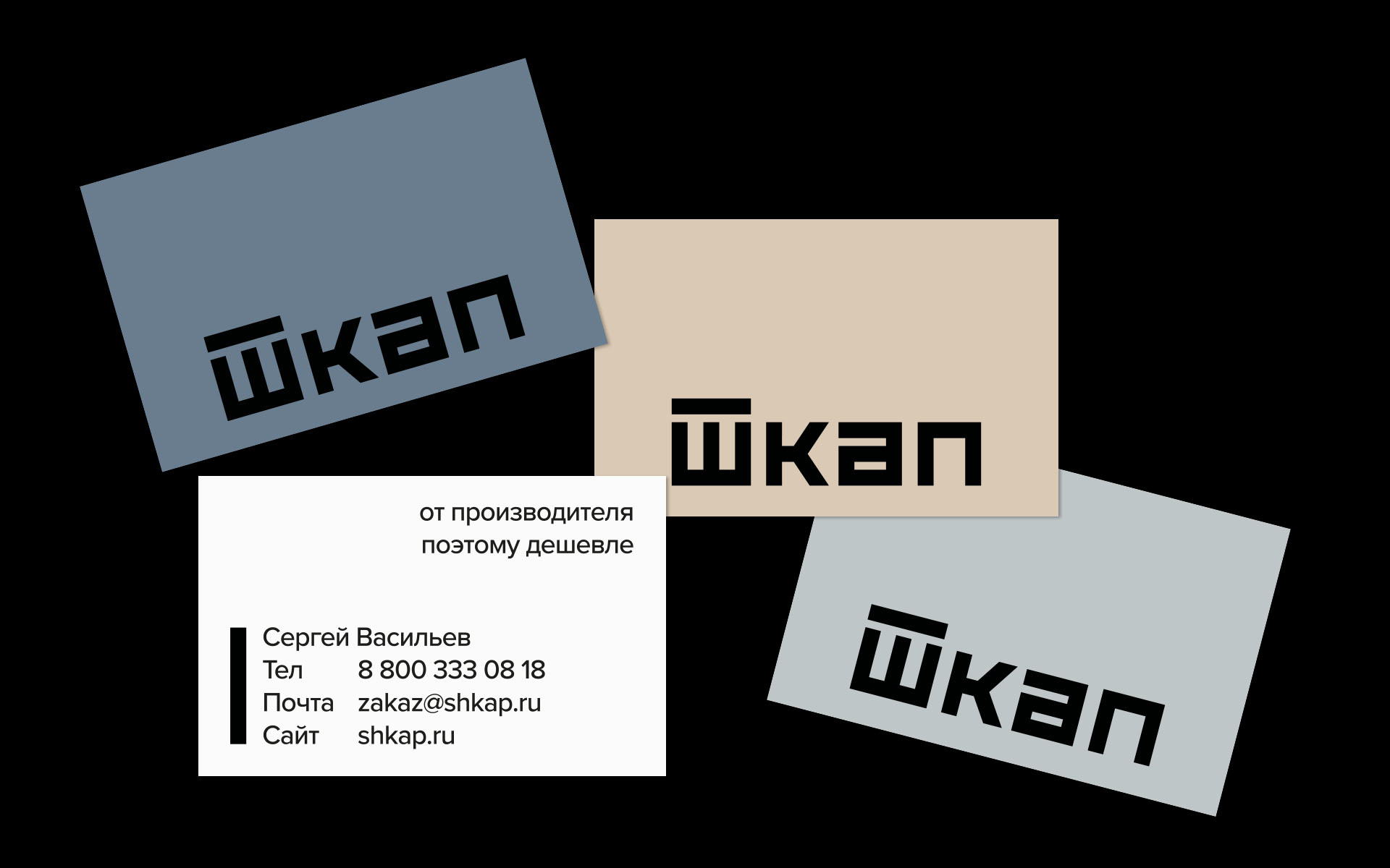
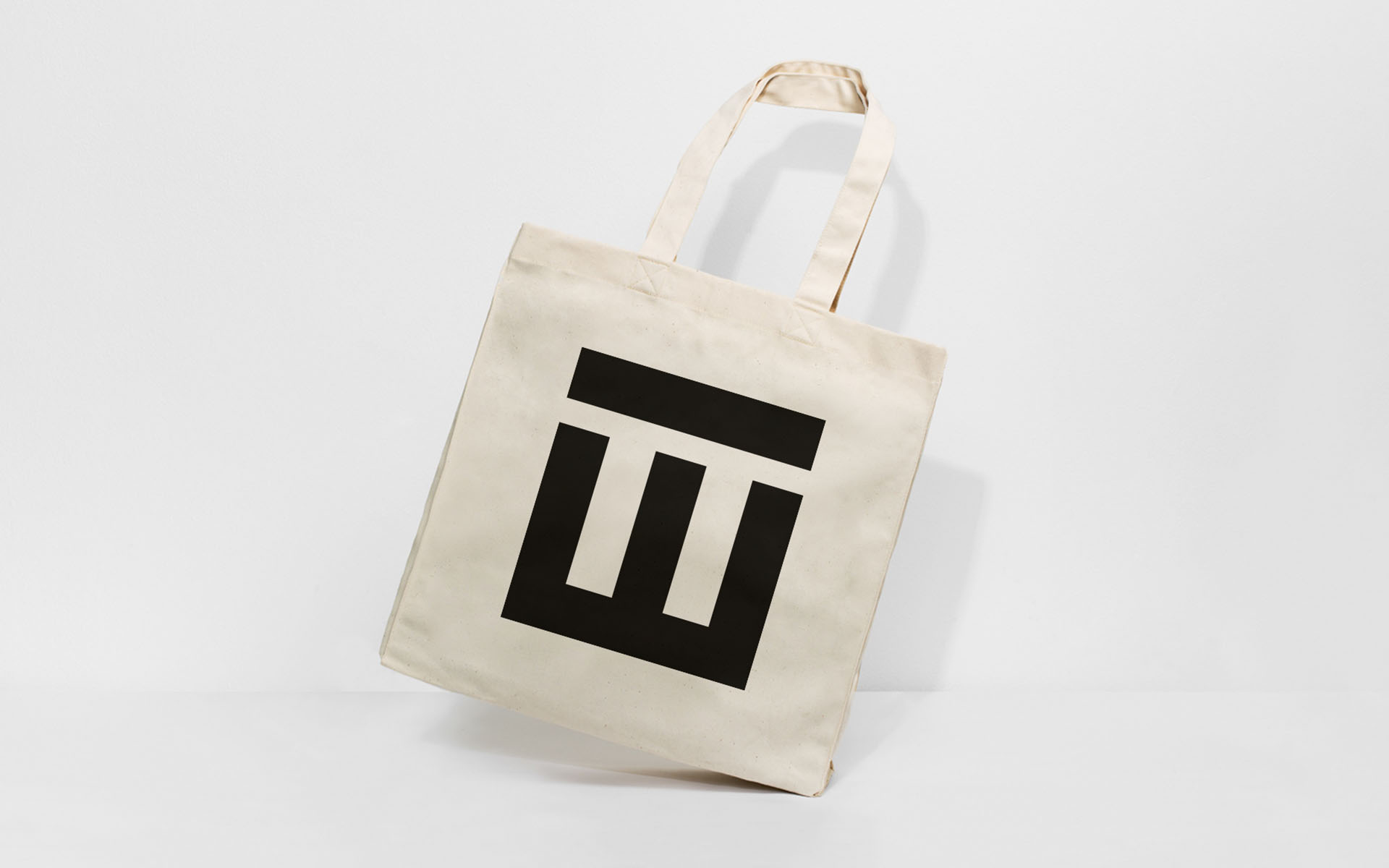
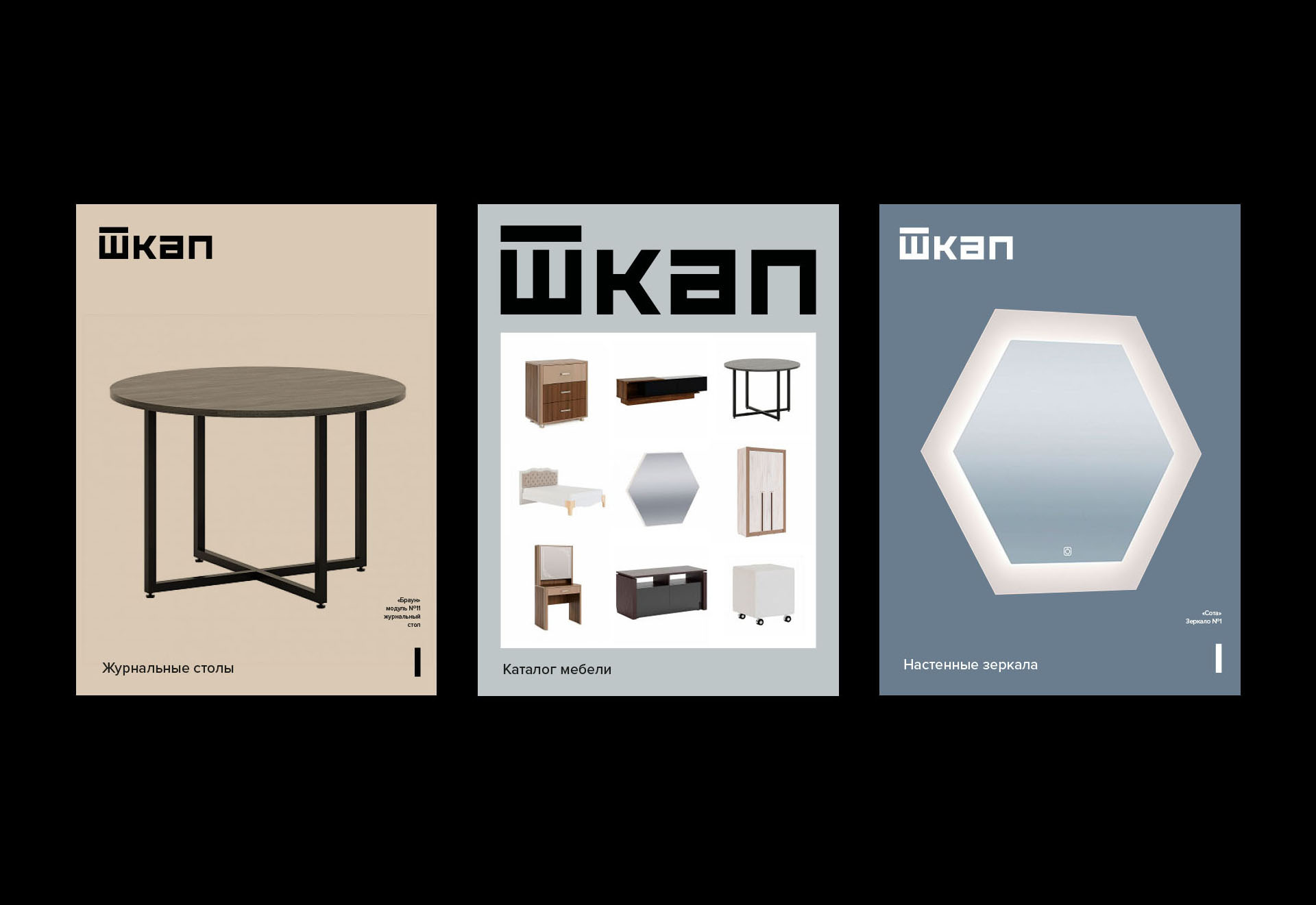
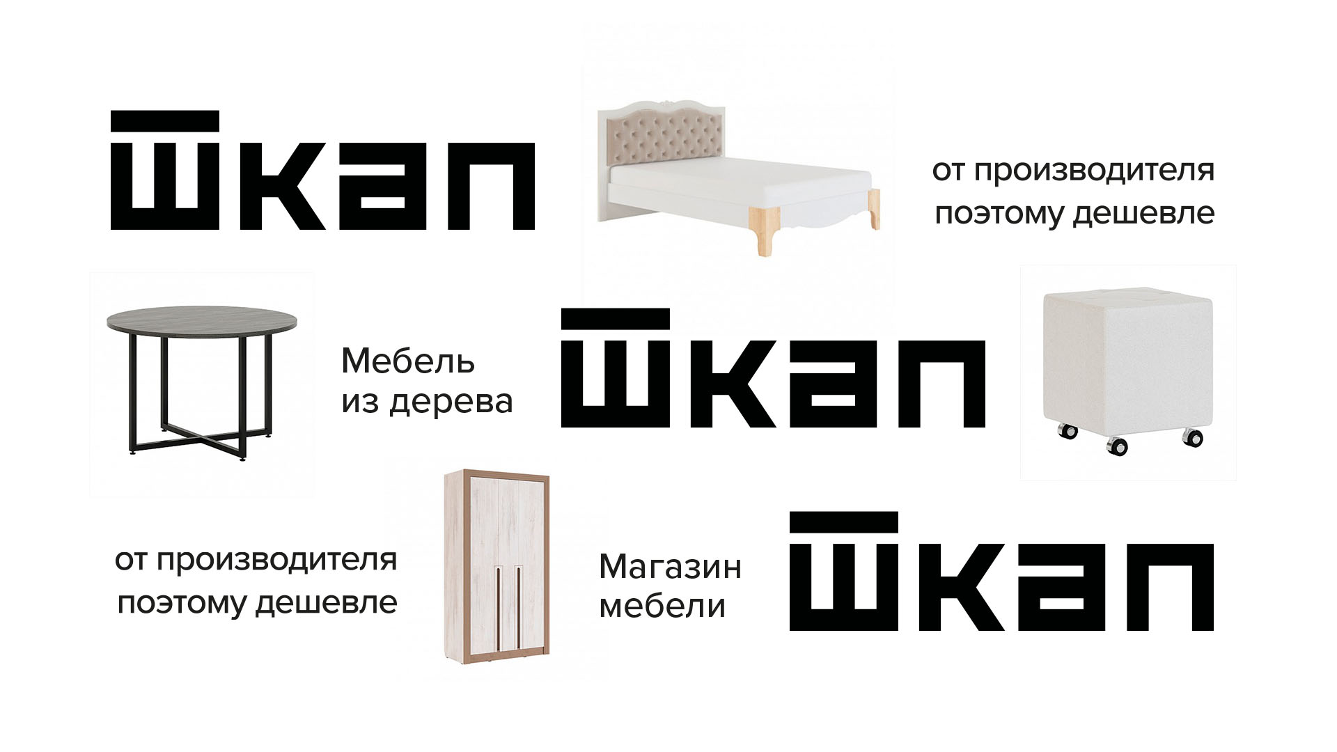
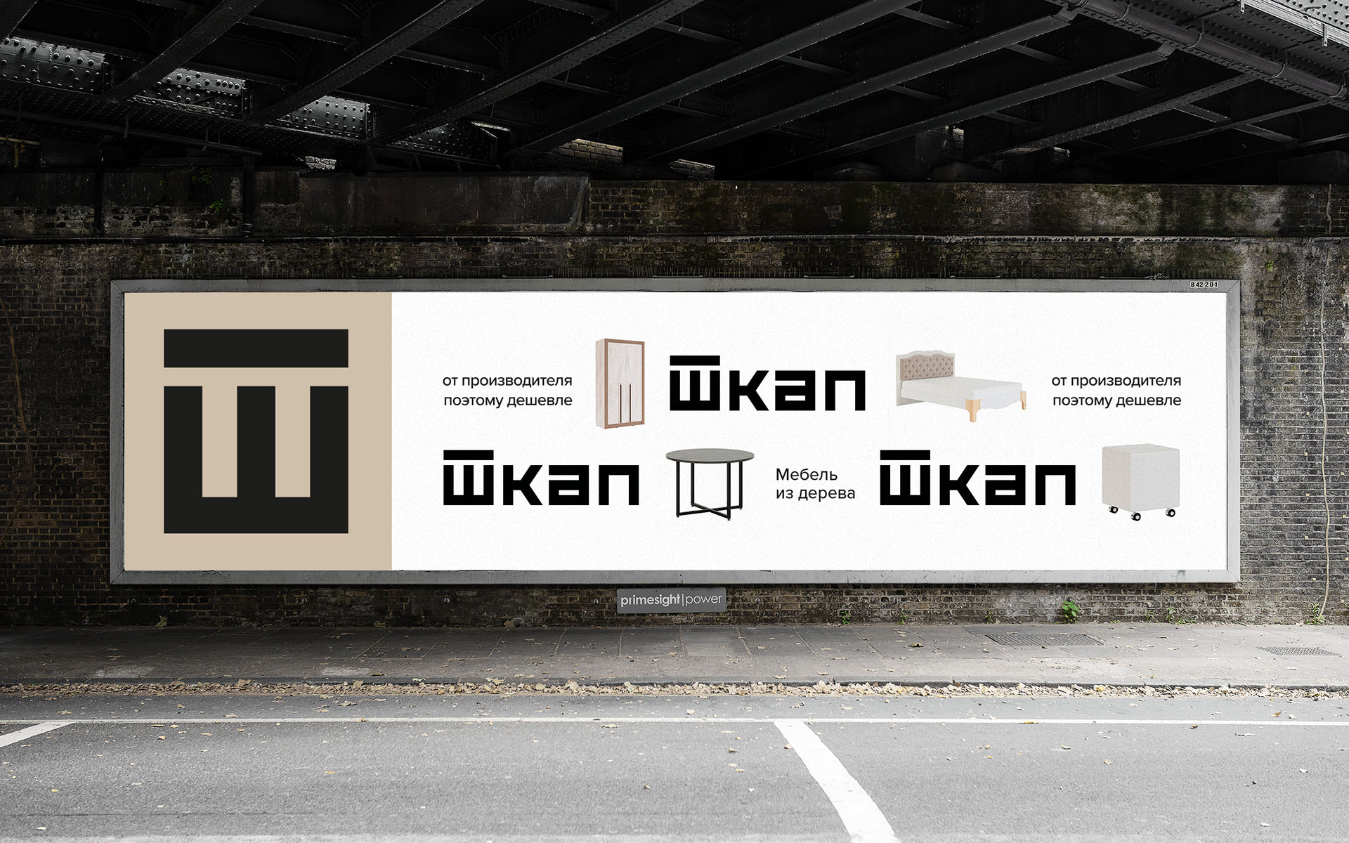
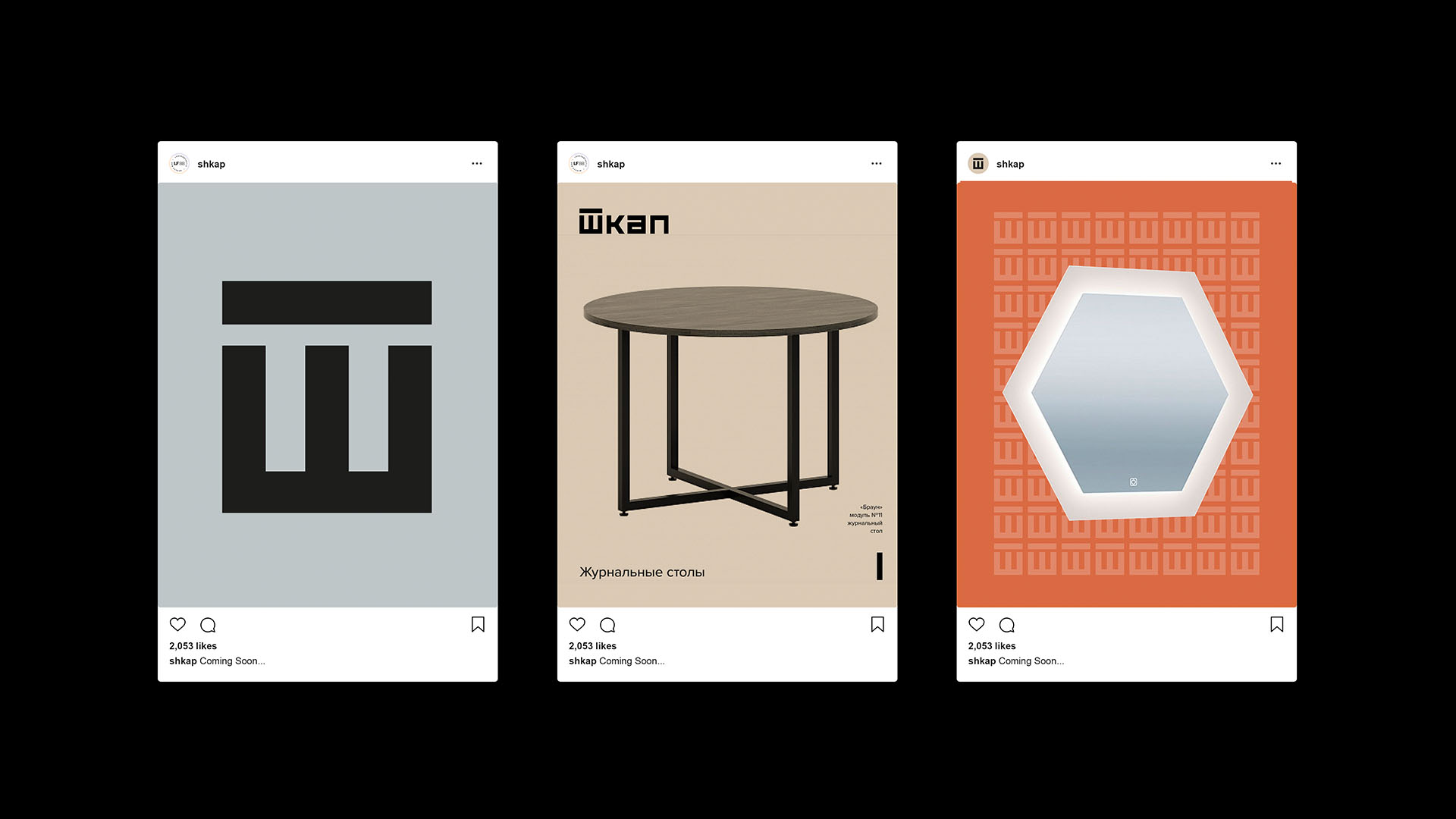
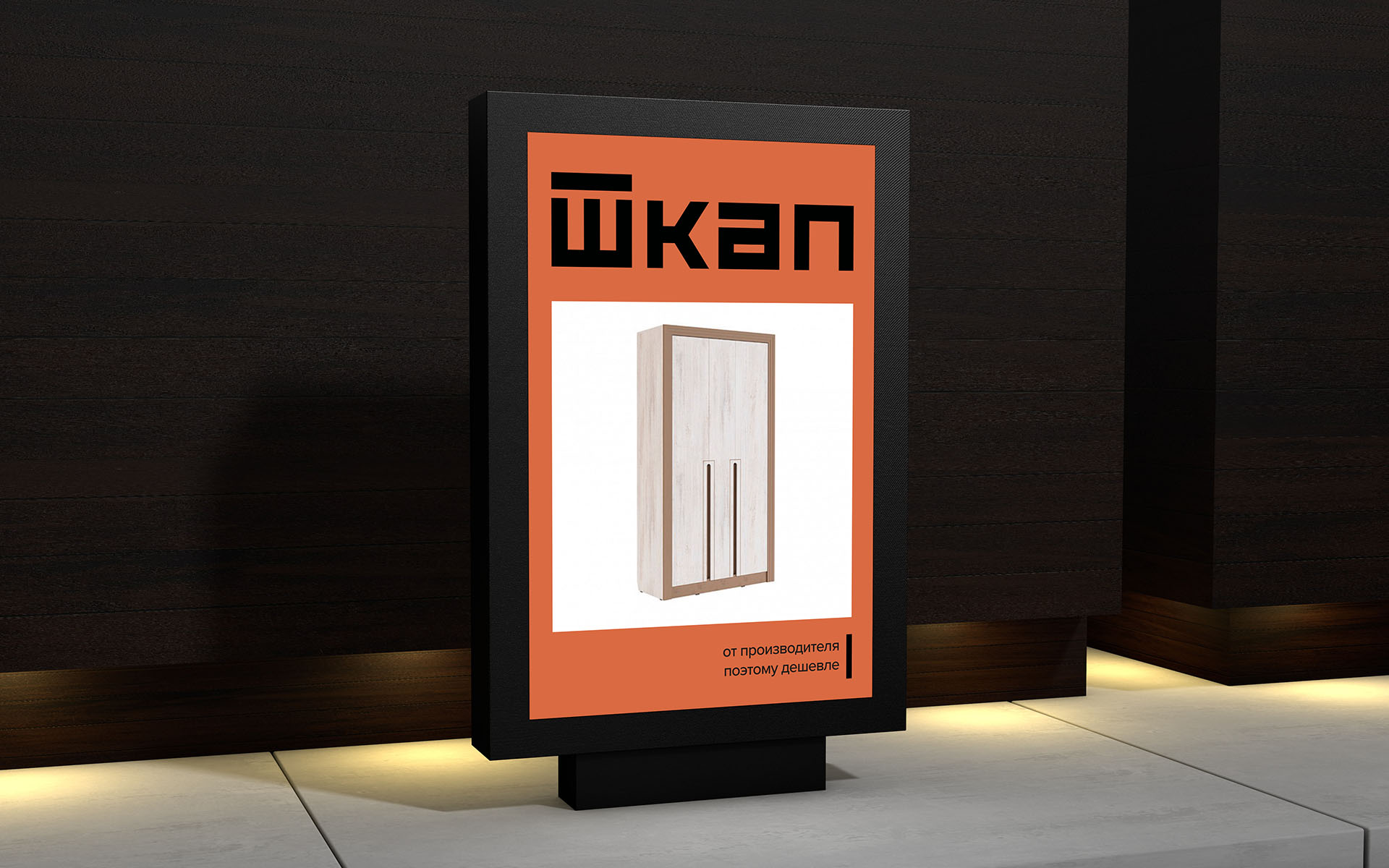
The name of the company “Shkap” means the same as a closet—a standing box with doors and shelves. For the logo, a crossbar above the letter Ш was used to form the shape of the cabinet. The dense set of letters gives a sense of stability, and the square shapes of the letters remind of the simple square shapes of the furniture.
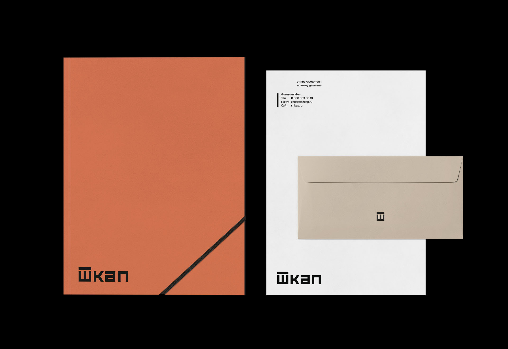
One of the tasks was to create a coherent, flexible, and bold brand identity, a visual system that will work with any photography that the company has and/or will have in a feature, the system that will work well for catalogues, various advertising campaigns and brochures. The minimalism of the concept helps to rollout designs across any platform and to keep it bold and simple and easy to use. Natural colours emphasise the natural quality materials that are used for producing the furniture and give a warm home feeling.
CREDIT
- Agency/Creative: Yuliya Ratnikova
- Article Title: Shkap Brand Identity Created by Yuliya Ratnikova
- Organisation/Entity: Freelance
- Project Type: Identity
- Project Status: Published
- Agency/Creative Country: Russia
- Agency/Creative City: Moscow
- Market Region: Europe
- Project Deliverables: Brand Design, Brand Identity, Design, Logo Design, Rebranding
- Industry: Retail
- Keywords: Furniture, Graphic Design, Branding, Design, Brand Refresh
-
Credits:
Graphic Designer: Yuliya Ratnikova


