Background:
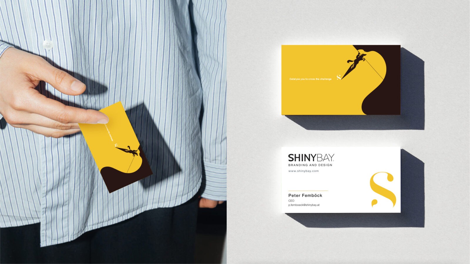
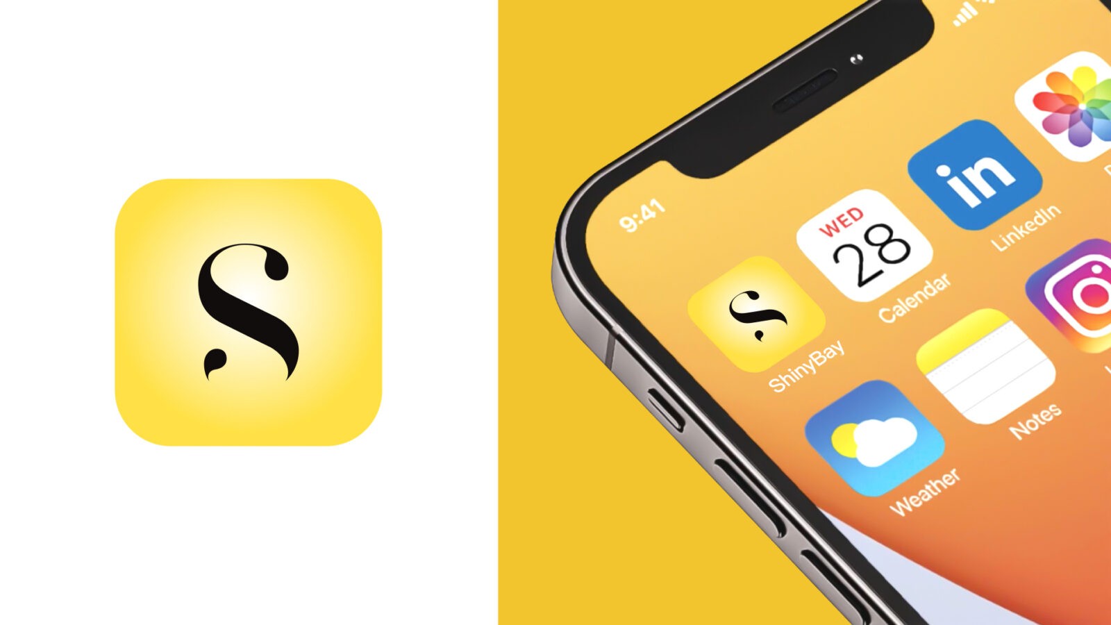
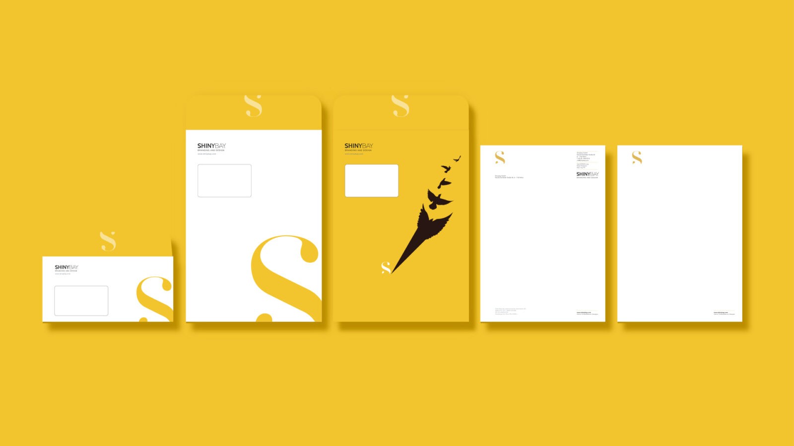
ShinyBay, as a dynamic brand agency, is driven by the vision of empowering businesses to reach their full potential by unlocking their unique brilliance. To reflect this mission more accurately, we undertook a comprehensive refresh of our brand identity. This refresh aimed to encapsulate our commitment to illuminating and elevating our clients’ brands through innovative solutions, strategic creativity, and personalized support.
Challenge:
Our previous brand logo, although visually appealing with its cute and cartoonish aesthetic, was not in line with our core objectives. It conveyed a playful image that failed to resonate with our target audience—serious business professionals seeking sophisticated and effective branding solutions. The misalignment between the logo and our agency’s values created a need for a design that truly represented our expertise and approach.
Idea & Symbolism:
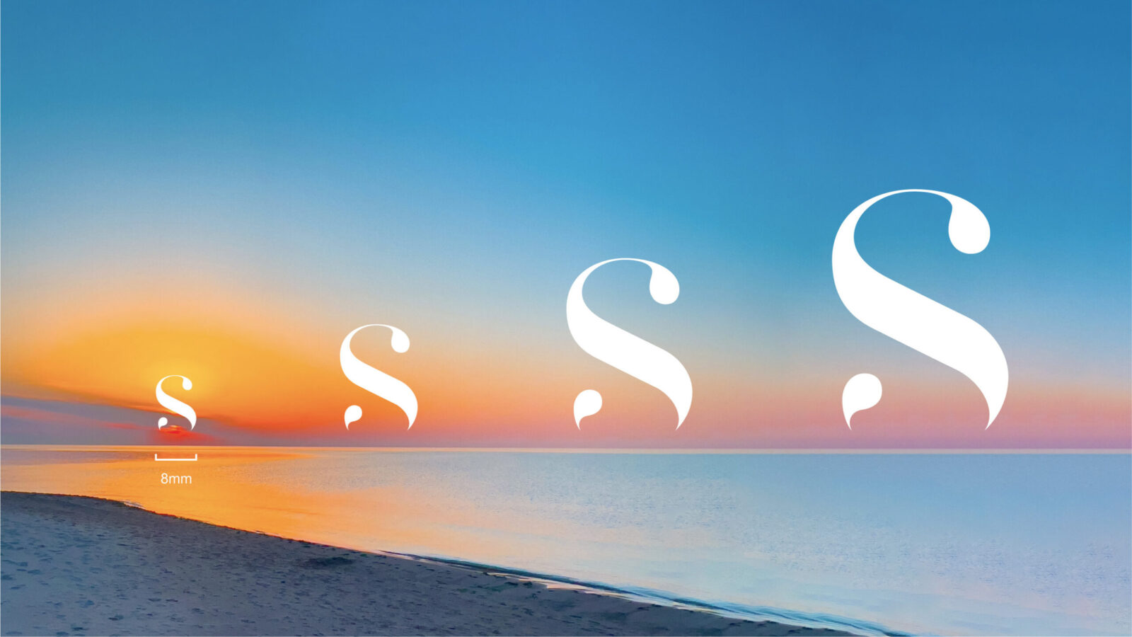
The cornerstone of our new visual identity is the logo, centered around the letter “S.” This “S” serves as a dual symbol: representing both the brand and the concept of “shining.” Meticulously crafted to resemble a rising sun, the “S” symbolizes the dawn of new opportunities, growth, and a bright future. This imagery perfectly aligns with our brand’s message of catalyzing individuals and brands to shine, highlighting the transformative power of creativity and innovation that we aim to bring to our clients.
Typography & Design:
The typography within our logo has been thoughtfully designed with smooth curves and elegant shapes, contributing to a fluid and dynamic aesthetic. These curves embody the brand’s ambition and forward-thinking approach. The flowing design elements convey a sense of movement and progress, reflecting ShinyBay’s unwavering commitment to guiding its clients toward success and helping them navigate the complexities of their industries with confidence. This refined and sophisticated design ensures that our brand identity resonates with the professional and discerning audience we seek to engage, while also standing out in a competitive market.


CREDIT
- Agency/Creative: ShinyBay Design
- Article Title: ShinyBay New Logo Design Illuminates Growth and Opportunity
- Organisation/Entity: Agency
- Project Status: Published
- Agency/Creative Country: China
- Agency/Creative City: SHANGHAI
- Project Deliverables: Brand Identity, Logo Design
- Industry: Service
- Keywords: WBDS Agency Design Awards 2024/25
- Keywords: WBDS Agency Design Awards 2024/25


