Mars Nutro Can Packaging Design
Project Background
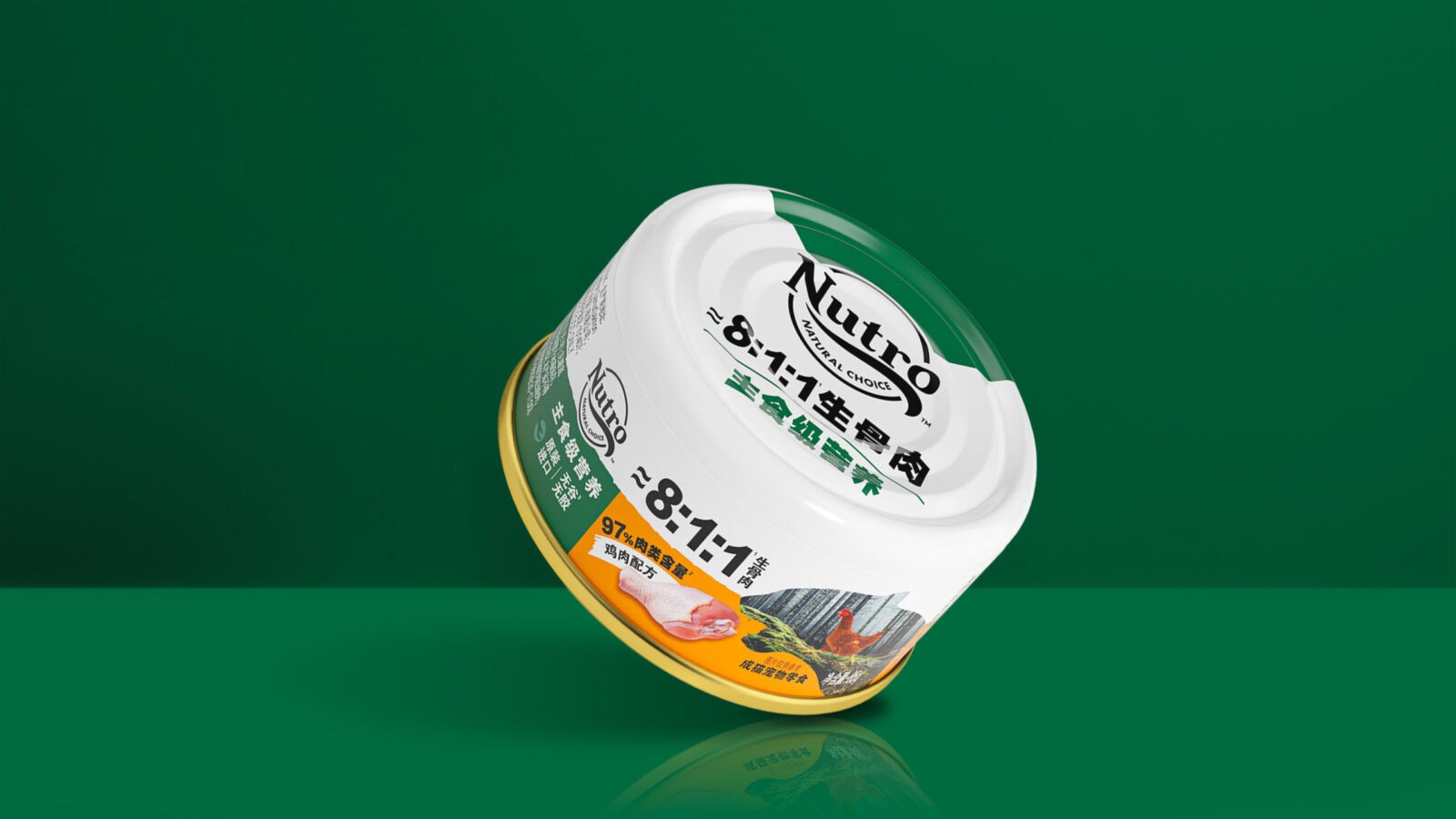
Continuing its commitment to nature, Nutro introduces premium wet cat food to strengthen its presence in the market. To meet consumer demand for high-quality pet food, Nutro’s new product features an 8:1:1(8 parts meat, 1 part bone and 1 organ) BARF(Bones And Raw Food) , over 97% meat content, and a grain-free, glue-free formula. This aims to provide cats with nutrition closer to their natural dietary habits, making feeding more natural, safe, and healthy.
Challenges
It is a new series under Nutro brand, which tailor made for China market, so it is challenged to well keep its tone and manner what the brand has built for years while downloading local insight to interpret in this new series.
Also the limited space of canned product shackled us to bring in more elements to enrich the whole story.
Strategy & Solutions
We immersed ourselves in the perspective of a pet owner who deeply loves his companion and desires to meet its natural instinct, ensuring the cat can have healthier and more nutritious meals. Through brainstorming and many trials, the story idea of ‘seeing instinct desire’ perspective became increasingly clear.
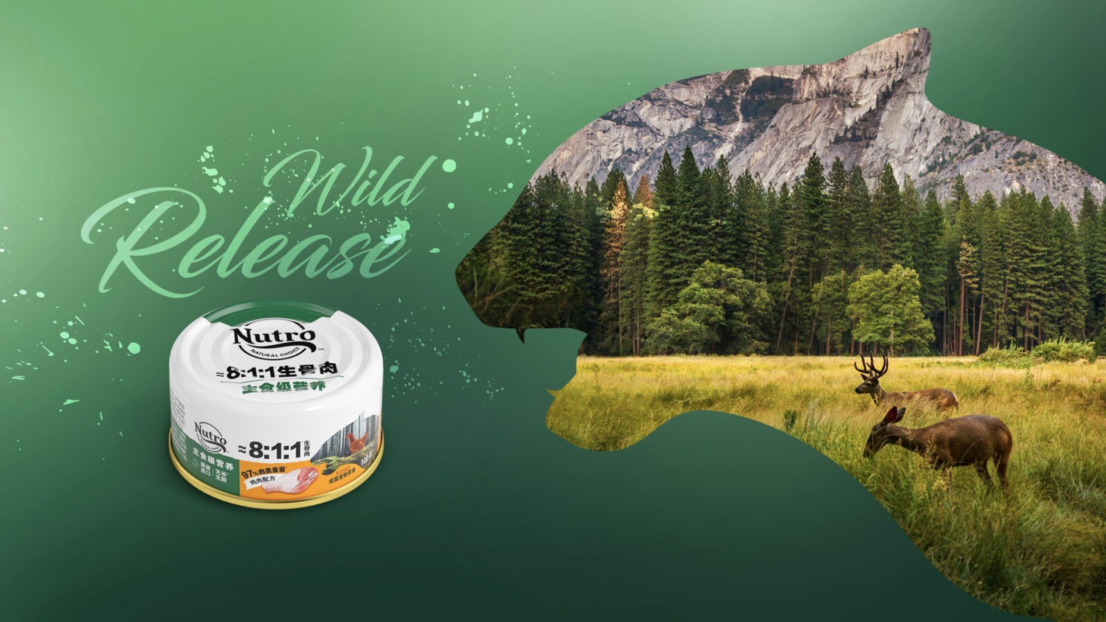
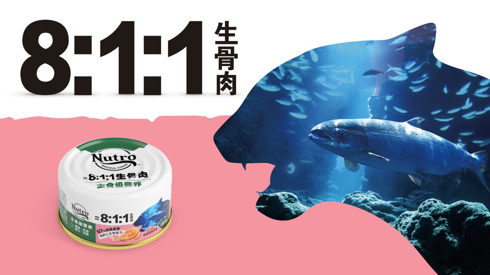
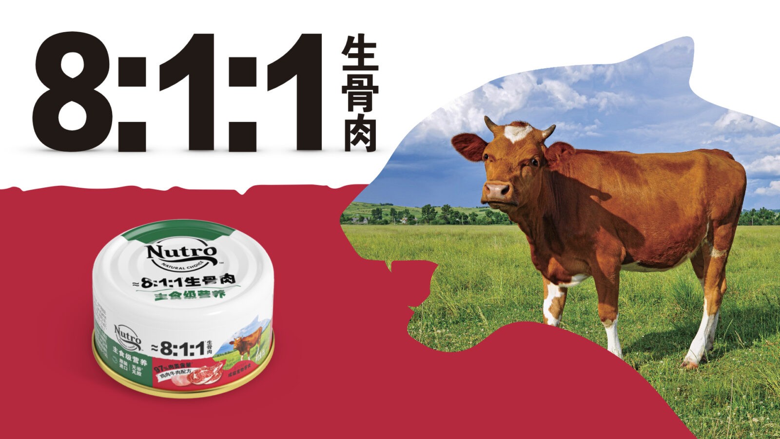
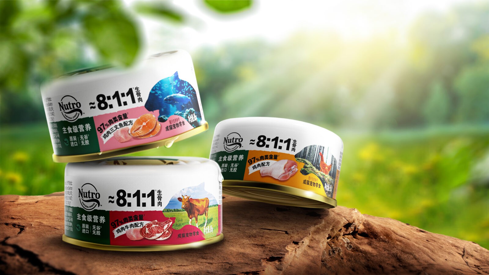
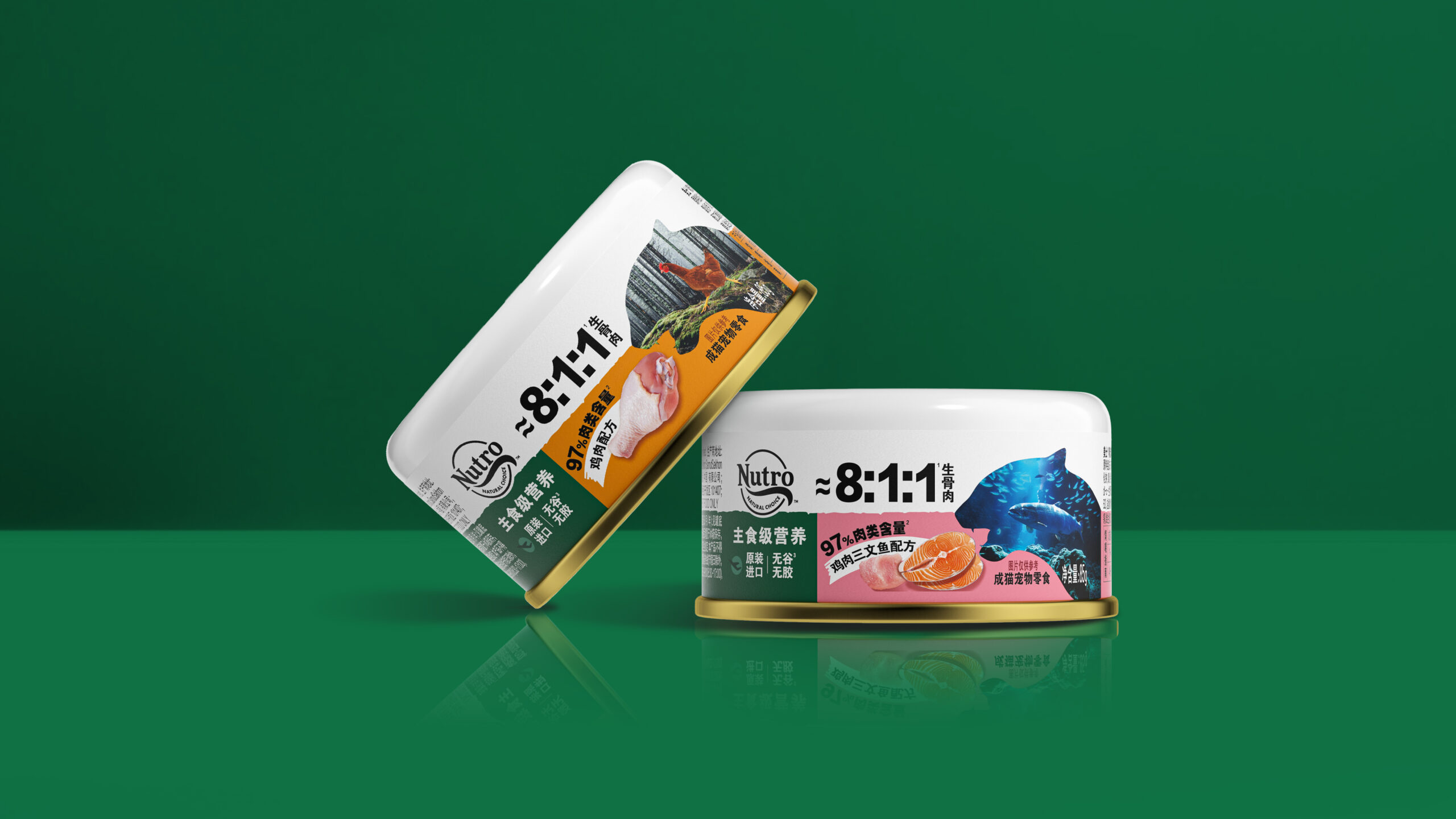
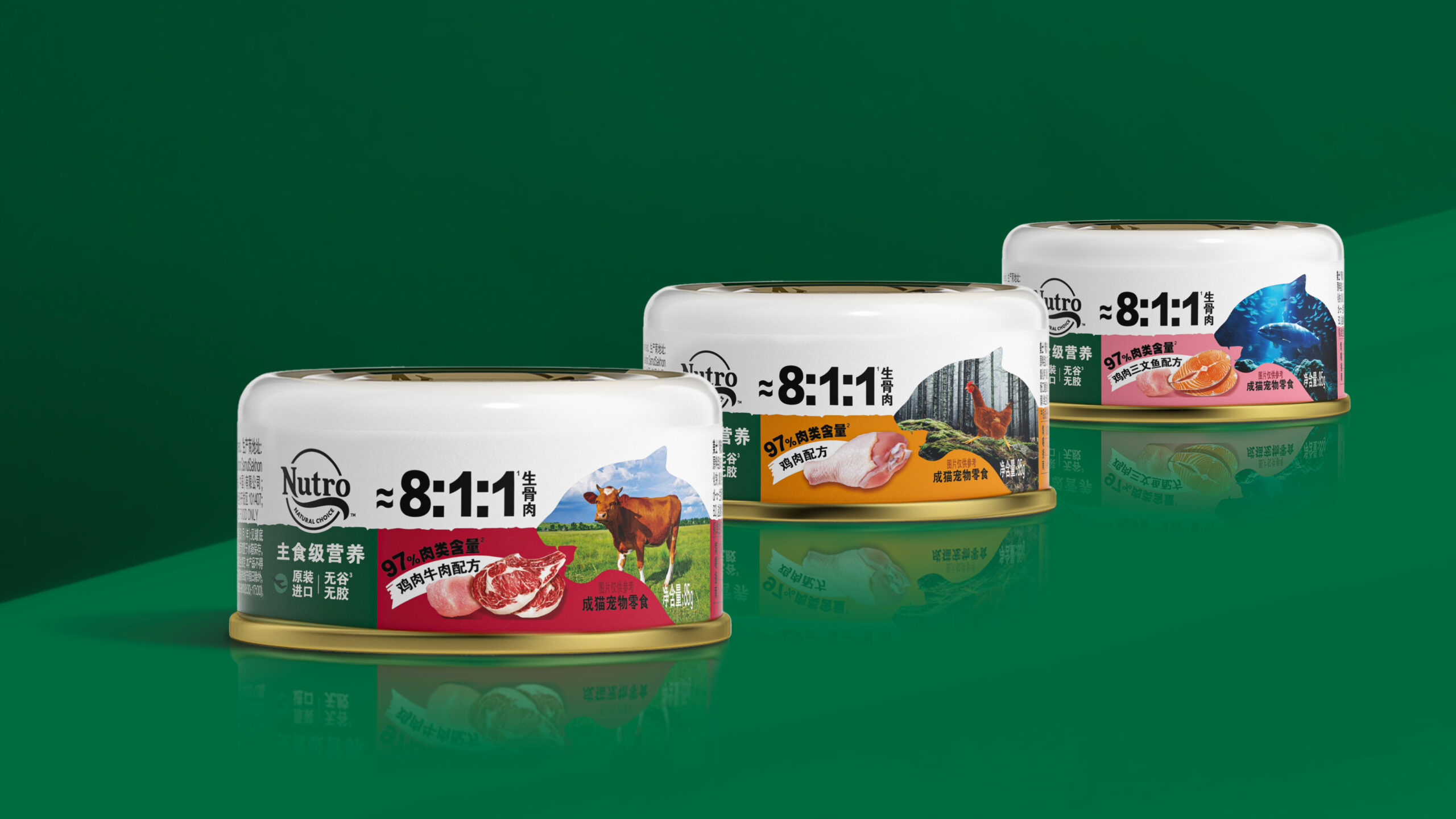
So with imagery of a cat silhouette with open mouth was to bring the idea to life and also well echo Nutro’s understanding of cats’ desire . We presented scenes of wilderness and nature within the silhouette, intuitively reflecting the taste of meat sources while conveying the power of nature.
The cat’s open mouth naturally aligns with the depiction of tangible ingredients, evoking the reassuring idea of feeding naturally.
The scientific ratio of 8:1:1 for raw meat is a highlight of our formula. We chose to visually present the “8:1:1” ratio prominently, making the natural formula instantly visible so that local consumers can better understand the most crucial highlight in terms of the formula.
To further enhance Nutro’s brand message of “feed clean,” we formatted a clean and concise brand and flavor area on the label, maintaining a sense of brand family while clearly distinguishing between flavors, building upon the distinctive features of the series.
Result
It was a success launch for this new series, brand team commented that the brand positioning is well maintained visually, while consumers found more connection between the brand and their cats as well as themselves as pet owners.
CREDIT
- Agency/Creative: ShinyBay Design
- Article Title: ShinyBay Design Develops Nutro’s New Cat Food Packaging to Meet Pet Owners’ Demand for Natural, Healthy Nutrition
- Organisation/Entity: Agency
- Project Status: Published
- Agency/Creative Country: China
- Agency/Creative City: Shanghai
- Project Deliverables: Packaging Design
- Industry: Food/Beverage
- Keywords: WBDS Agency Design Awards 2024/25
- Keywords: WBDS Agency Design Awards 2024/25


