Anchor, a subsidiary of Fonterra, as a star dairy brand in New Zealand, has always been committed to bringing the best dairy products to consumers in China. Apart from the standard milk products, Anchor decided to extend product offerings to the yogurt segment with a new sub-brand named “Pure Up” to accelerate sales growth and enhance its product portfolio in the Chinese market.
In a very competitive yogurt market environment, how to equip the new sub-brand with a unique visual identity that is ownable, relevant, and can stand out became a challenge. Meanwhile, delivering the product’s pureness and source of origin messages in a memorable and creative way is crucial.
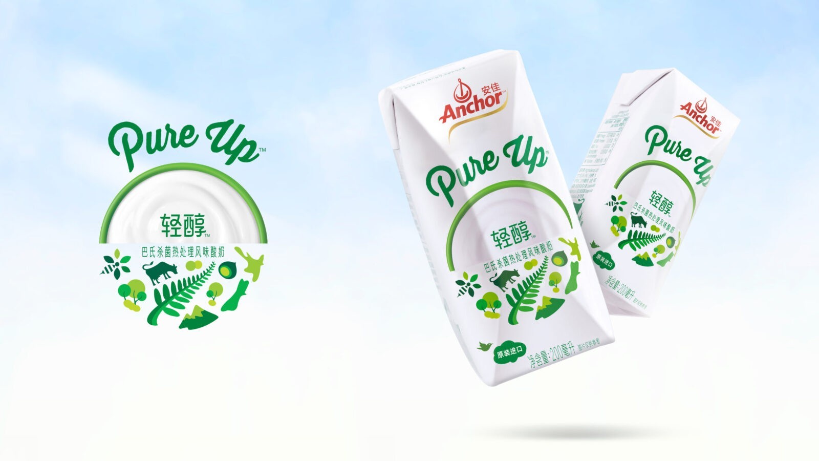
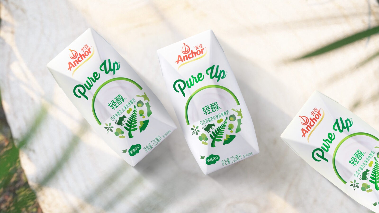
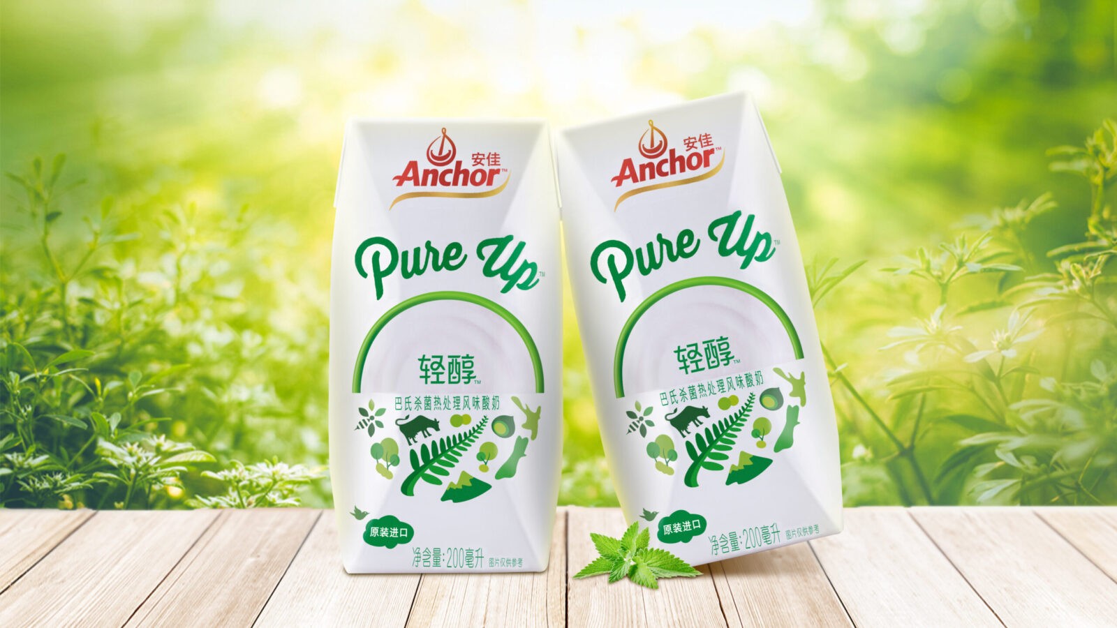
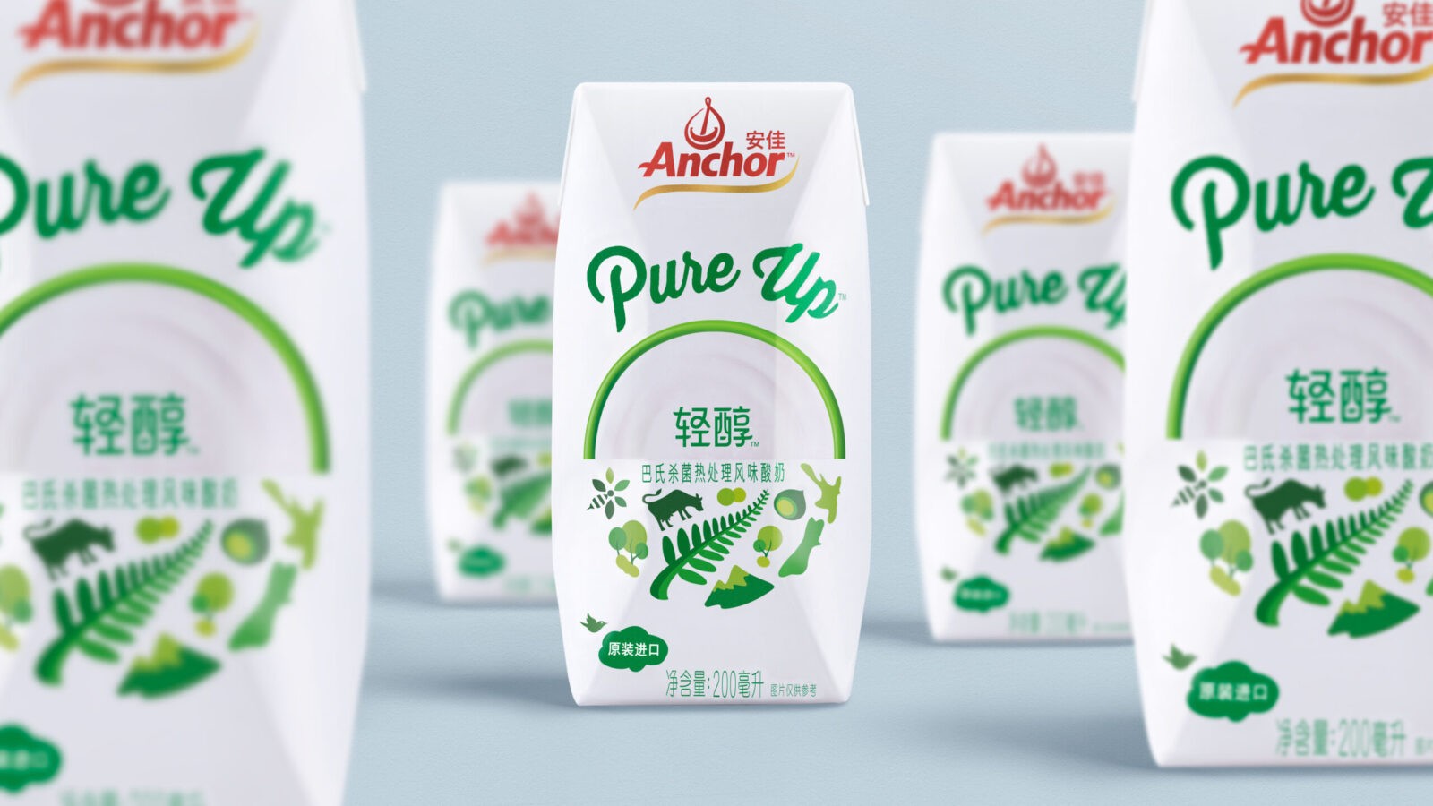
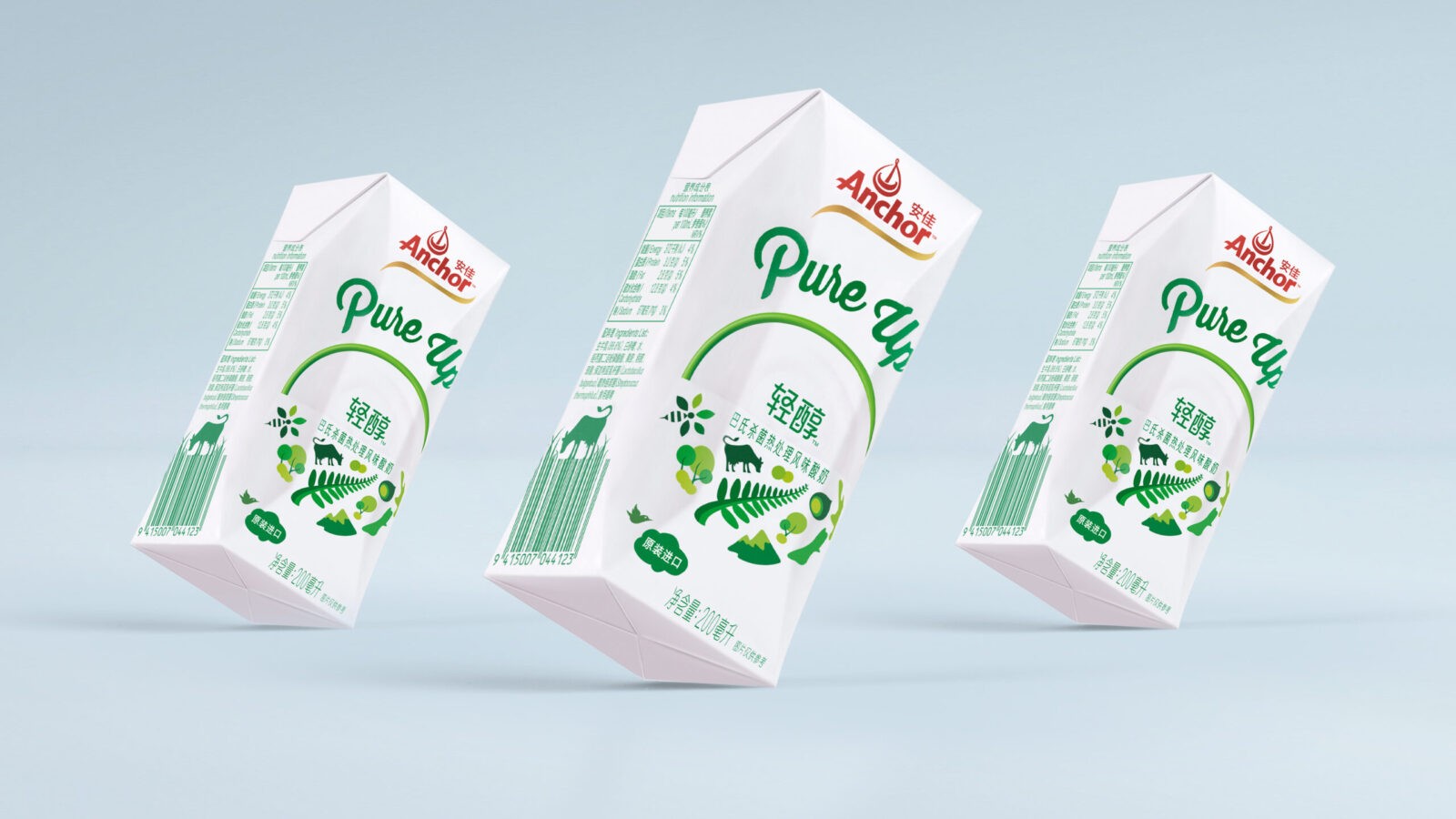
By bringing to life the joyful character from origin sources, we created a dynamic, living, and experiential identity that goes beyond traditional taste expressions. Our design features emotive graphics, each highlighting a unique benefit and New Zealand’s quality and purity, such as the New Zealand Map, the kiwi, the mountains, the signature New Zealand fern leaves, cows, and bees.
Combined with a clean product shot showing the yogurt’s creamy texture and a simple color palette, the overall design created a bold and appealing visual cue that communicated freshness, purity, and a natural feeling in a simple and imaginative way, as well as delivering a strong sense of nutritional essence and delicious taste. The design of the sub-brand name ‘Pure Up’ also helped strengthen the brand’s personality of being free, natural, and healthy.
The joyful spirit enhances shelf impact and aligns with natural themes. Our adaptable design system achieves high recognition and resonates with local preferences, spreading joy across a cohesive brand portfolio. The “Pure Up” yogurt attracted many health-conscious consumers and received popularity after entering the market. By integrating traditional Maori patterns and motifs, the design not only appeals to consumers’ desire for natural and wholesome products but also educates them about New Zealand’s rich heritage, adding depth and authenticity to the brand narrative.
CREDIT
- Agency/Creative: ShinyBay Design
- Article Title: ShinyBay Design Creates Anchor Pure-up Yogurt Packaging Design
- Organisation/Entity: Agency
- Project Status: Published
- Agency/Creative Country: China
- Agency/Creative City: Shanghai
- Market Region: China
- Project Deliverables: Packaging Design
- Industry: Food/Beverage
- Keywords: WBDS Agency Design Awards 2024/25
- Keywords: WBDS Agency Design Awards 2024/25


