


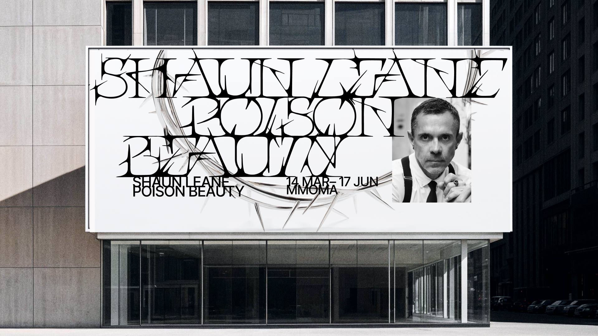
The Shaun Leane: Poison Beauty exhibition explores the provocative yet refined aesthetics of one of Britain’s most influential contemporary jewelry designers. Renowned for his sculptural precision and dramatic visual language, Shaun Leane creates jewelry in which elegance exists alongside sharpness and restraint is inseparable from danger. His work, shaped by the intersection of art and fashion and defined through his collaboration with Alexander McQueen, consistently challenges conventional ideas of adornment. This project translates Shaun Leane’s distinctive aesthetic into a bespoke typographic identity centered around a custom-designed accent display typeface.
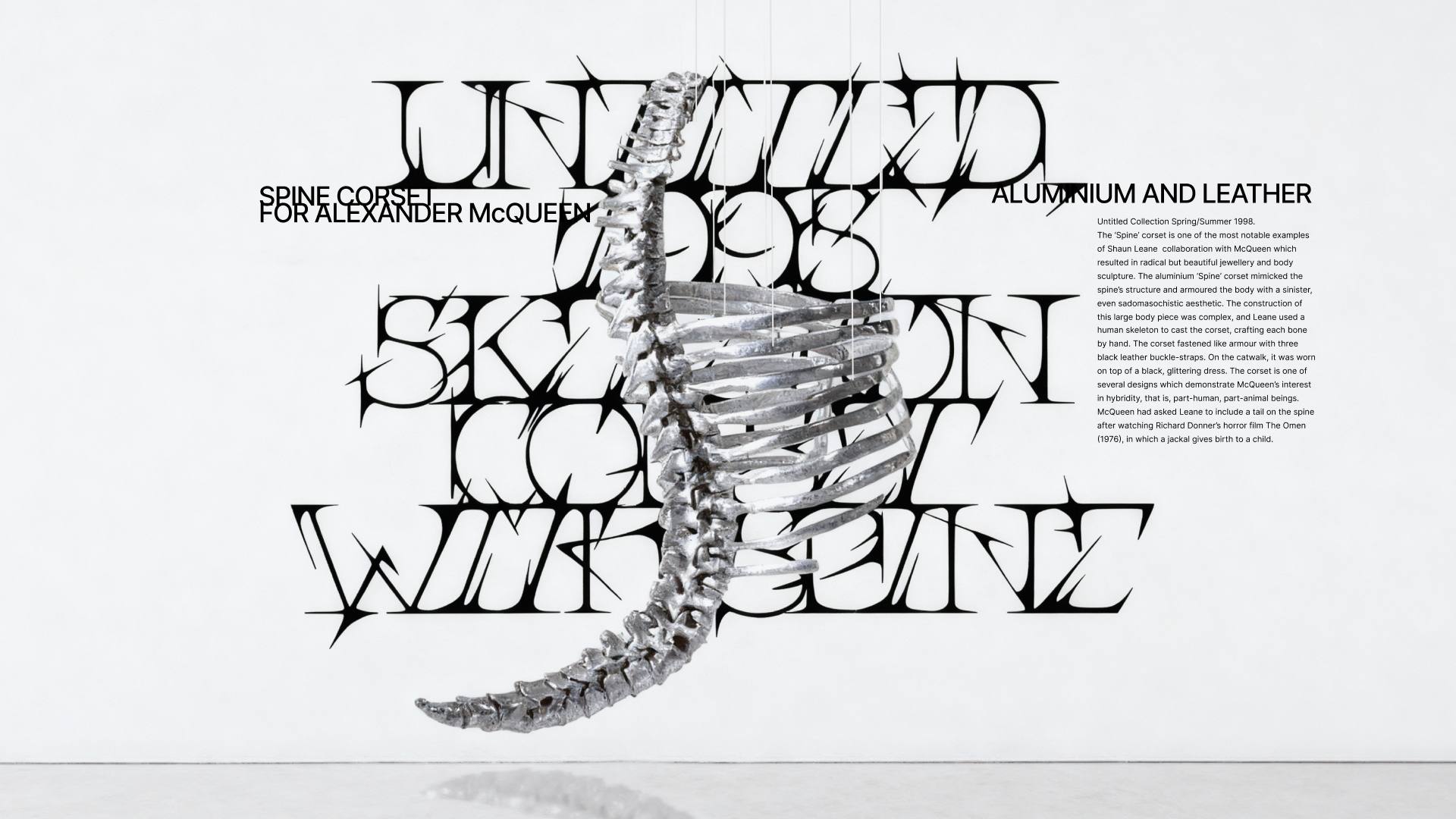
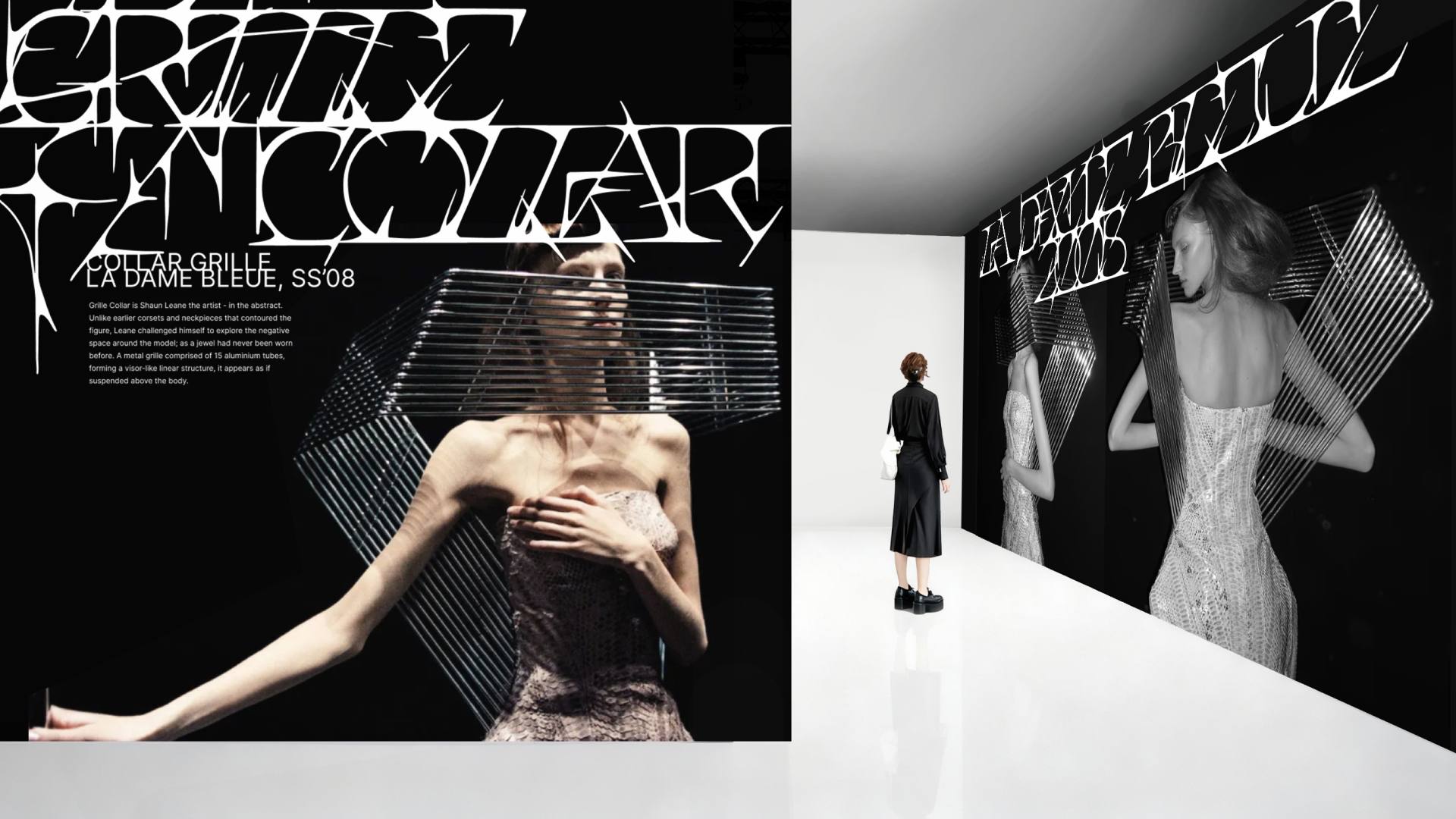
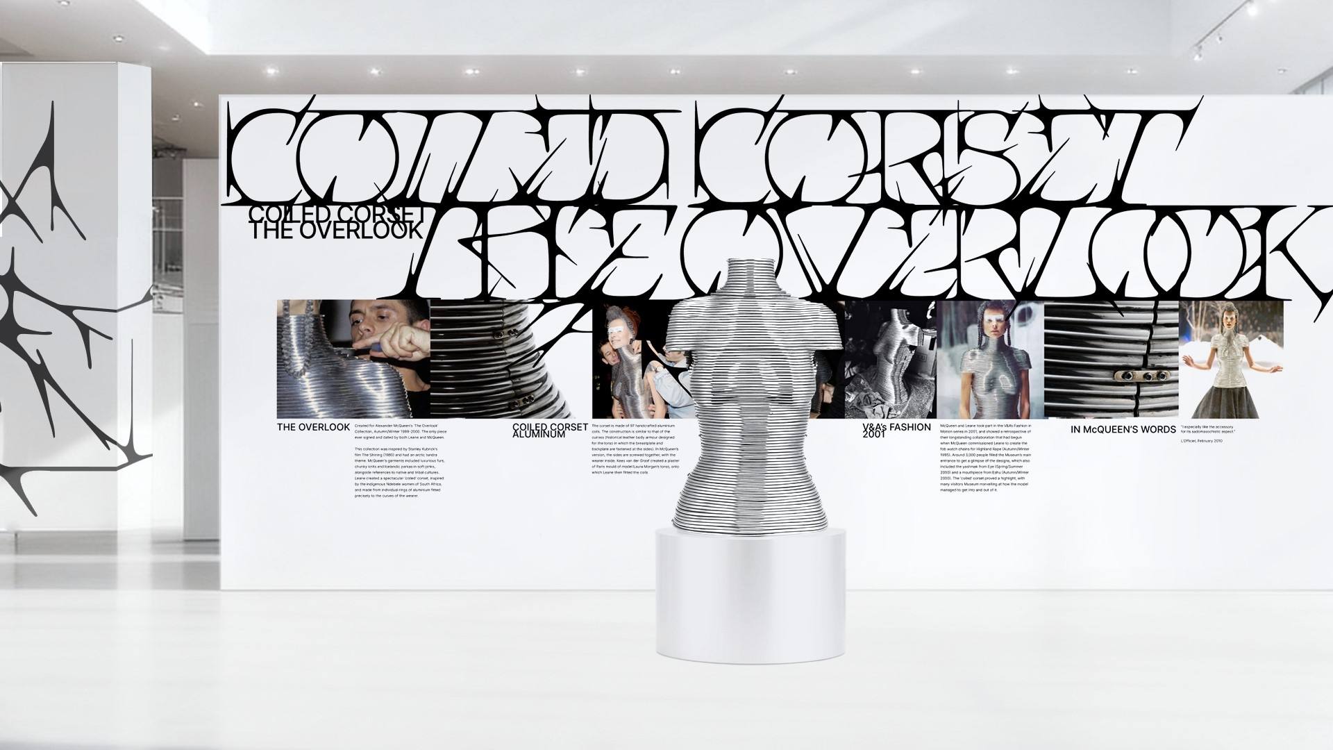
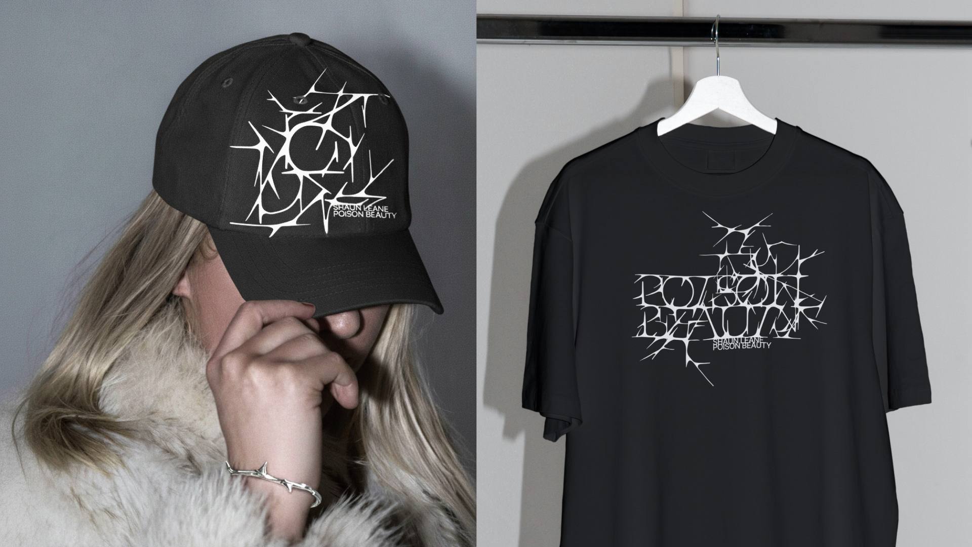
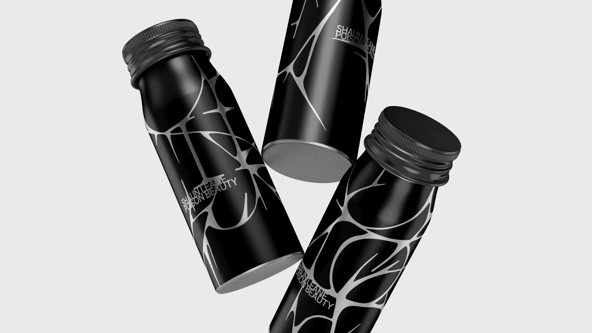
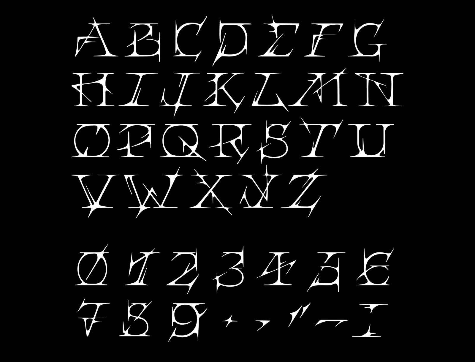
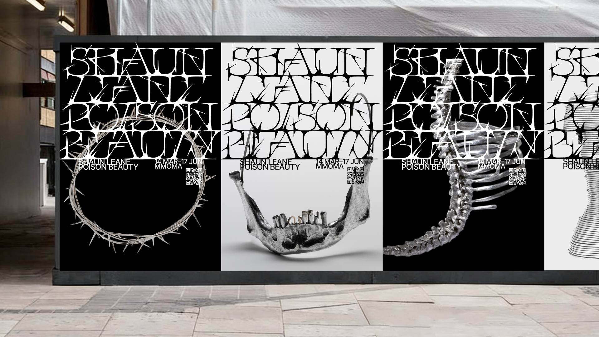
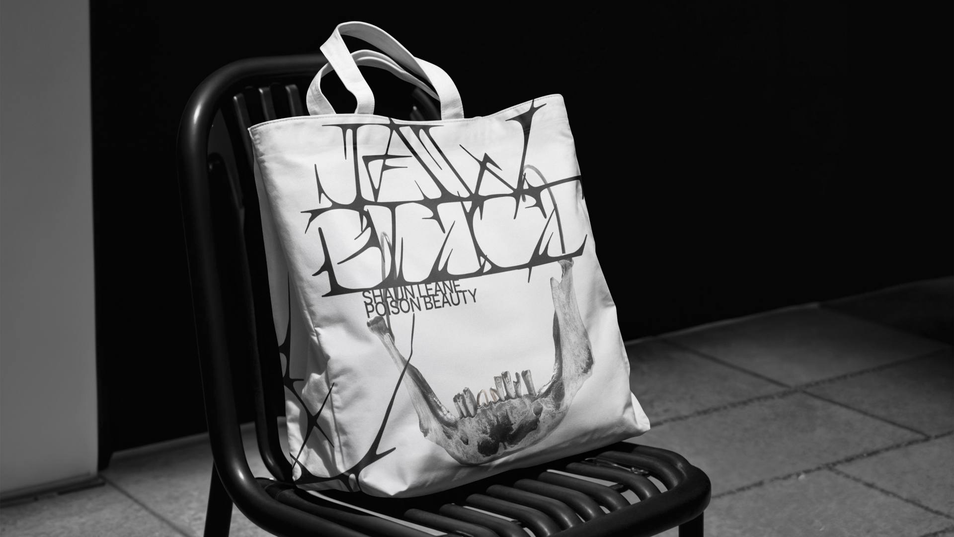
The core of the identity is a display typeface developed specifically for the project and inspired by the elegant yet aggressive forms of jewelry by Shaun Leane. Each letter is conceived as a sculptural object, enriched with refined, thorn-like details and elongated, blade-shaped terminals. These decorative elements introduce grace and sophistication while preserving the tension and sharpness characteristic of Shaun Leane’s work.
A defining feature of the typeface is the way individual characters interconnect and merge, forming a continuous, spiked typographic surface. The letters do not function as isolated forms but instead flow into one another, creating a unified texture reminiscent of the layered constructions and intricate surfaces found in Shaun Leane’s jewelry. This approach emphasizes the display nature of the typeface, allowing it to operate both as text and as an ornamental visual composition.
Through this typographic exploration, the project transforms Shaun Leane’s artistic universe into a contemporary visual narrative. It reinforces themes of rebellion, transformation, and provocation, encouraging audiences to rethink conventional notions of adornment. By translating his sculptural aesthetic into an expressive typographic system, the project positions typography as a medium capable of conveying the same emotional intensity and conceptual depth as jewelry itself.
CREDIT
- Agency/Creative: Anastasiia Shulga
- Article Title: Shaun Leane Poison Beauty Exhibition by Student Anastasiia Shulga
- Organisation/Entity: Student
- Project Type: Identity
- Project Status: Non Published
- Agency/Creative Country: Russia
- Agency/Creative City: HSE Art&Design School
- Market Region: Global
- Project Deliverables: Art Direction, Brand Identity, Exhibition Design
- Industry: Entertainment
- Keywords: Shaun Leane Poison Beauty Exhibition
-
Credits:
Curator: Leonid Slavin
Curator: Kirill Sirotin


