Reframing the ancient ritual of acupressure for modern living for Shakti.
The challenge? We were faced with 17 years of ‘home-grown’ branding that had got the founding team only so far. They were in desperate need of a unifying brand concept – one that united stakeholders globally, stood them apart from copycats (which were rife) and stayed true to their Indian origin roots and values.
Without any clear strategic foundation or coherent visual identity to leap from, we set about developing a single brand expression that would enable the growth they desired and spoke to a wider, wellness curious audience.
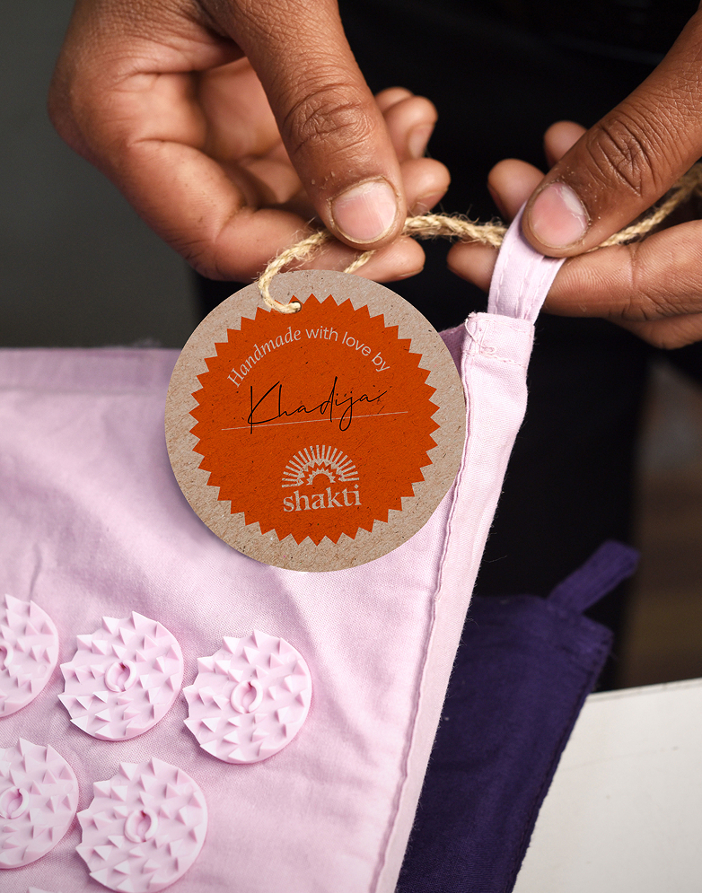
‘Indian Enlightenment’ was our brand concept – a fresh proposition that celebrates Shakti’s Indian roots, spotlights the talented craft women behind each product and educates on the stress-relieving ritual of acupressure.
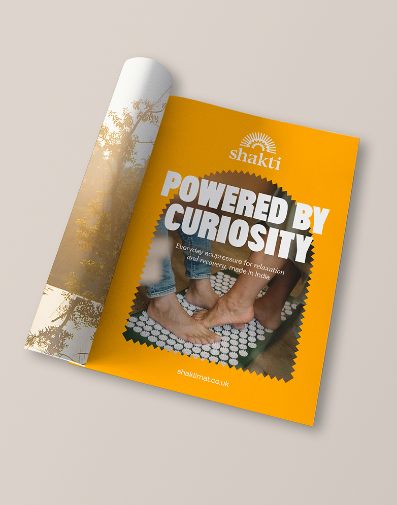
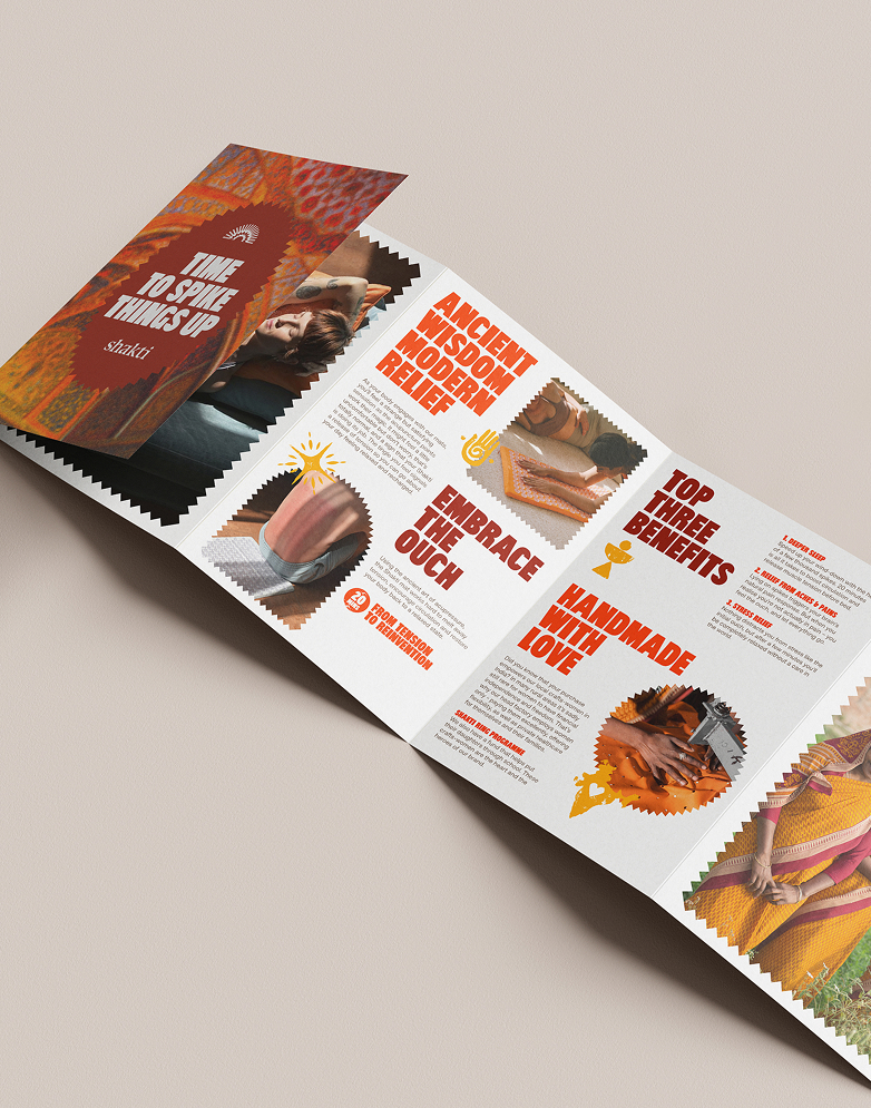
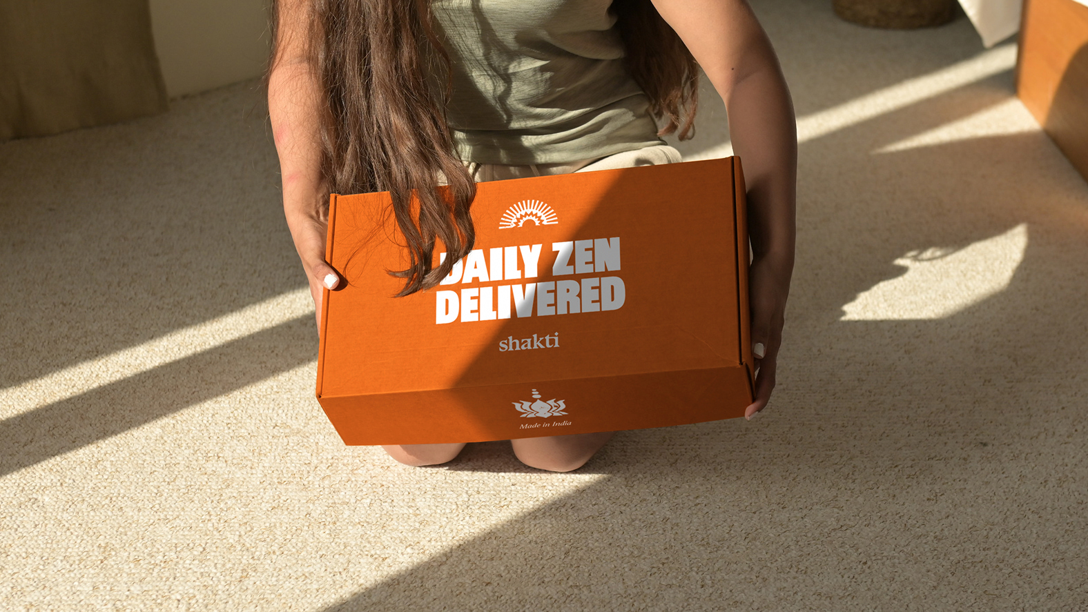
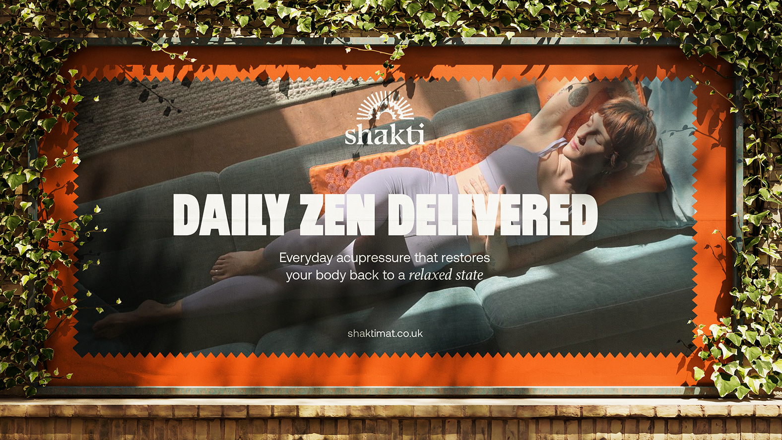
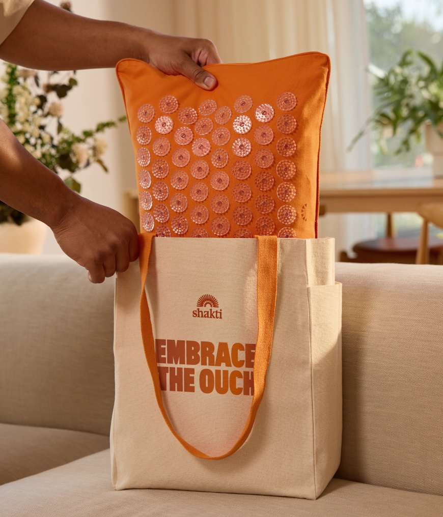
We used a playful, vibrant and energetic verbal and visual language, which brought the whole concept to life. We leaned into Shakti’s unorthodox approach that discomfort leads to feeling good, and celebrated it. ‘Embrace the Ouch’ was just one of our mantras that sat across many of the brand touchpoints. It was delivered in a bold, modern typestyle that’s full of personality and direct. The colour palette draws references from the rich culture of India. The Shakti logo is a symbol of renewal – a combination of spikes and half sun representing a new dawn and the beginning of a wellness journey. Derived from an ink stamp, the logo mimics the notion of applied pressure, a feature of acupressure itself.
Shakti’s impact story is represented at multiple touch points. Shakti use a full-female workforce in their production line. The Shakti Rising programme provides private education for the daughters of their crafts-women.

CREDIT
- Agency/Creative: Shed
- Article Title: Shakti’s Global Rebrand Reframes the Ancient Ritual of Acupressure
- Organisation/Entity: Agency
- Project Type: Identity
- Project Status: Non Published
- Agency/Creative Country: United Kingdom
- Agency/Creative City: London
- Market Region: Asia, Europe, Oceania
- Project Deliverables: Advertising, Art Direction, Brand Architecture, Brand Design, Brand Identity, Brand Strategy, Graphic Design, Logo Design
- Industry: Health Care
- Keywords: Rebrand, wellness, brand identity
-
Credits:
Director: Amaia Alcade
Senior Creative: Alex Drinkwell


