Sfezzo is a digital marketing agency born in Goiana/PE.
Under the leadership of its founder, Yara Sfezzo, the company specializes in customized strategies to help companies reach their target audience, increase brand visibility, where it includes consulting and analysis of profile for social networks, management of these social networks and creation of strategic content.
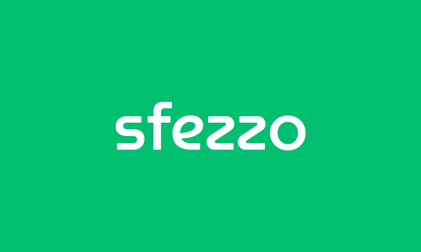
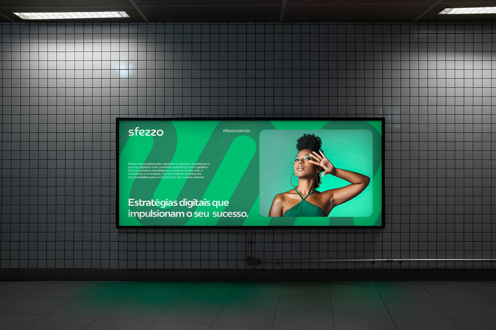
About Typography, we chose Museo Moderno as the font for the logo, as it contains forms with mechanical fluidity, which conveys a sense of modernity. We used the interconnected shapes and the variation of the letter “e” smiling in the typography, to convey a friendly atmosphere. The Redonda da Plau, on the other hand, is a versatile font, which talks well with the main one, without stealing its protagonism.
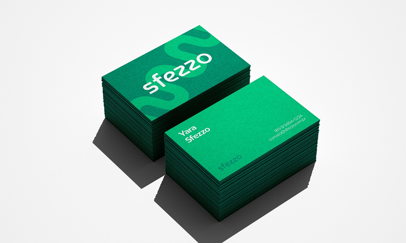
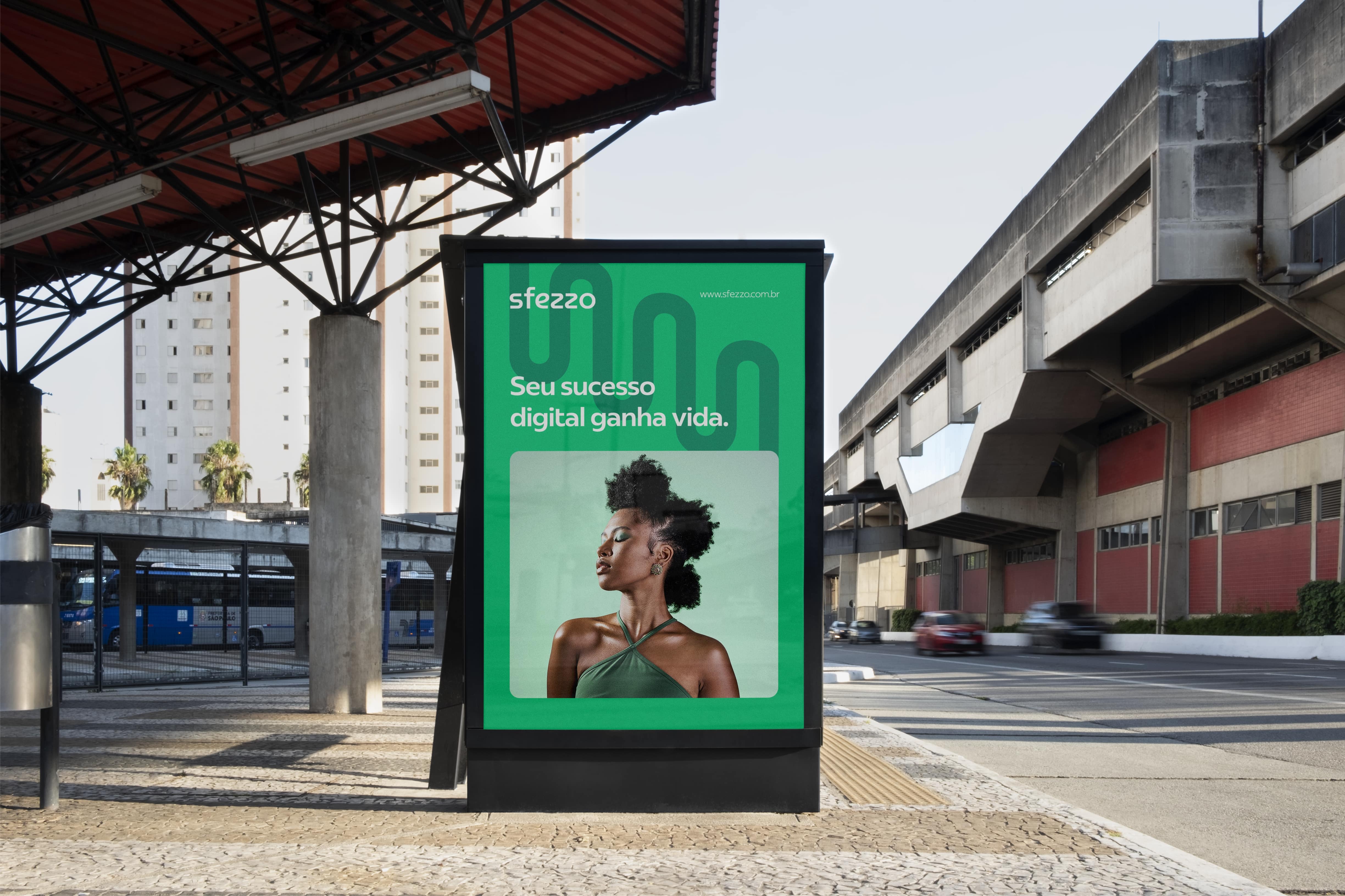
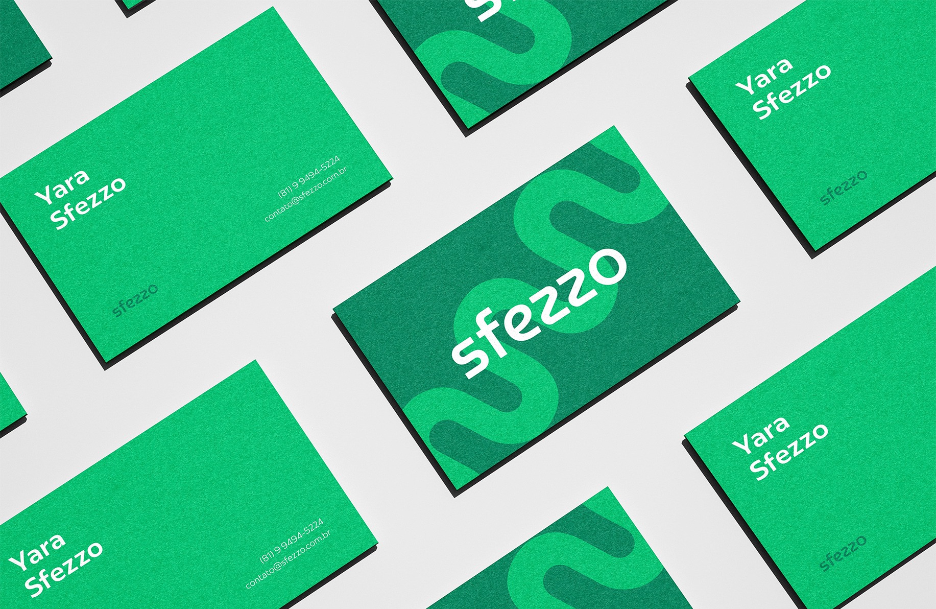
About Colors, seeking to create a positive and welcoming experience for our customers and balance in all points of contact with the brand, our choice of shades of green was its universal visual appeal. It’s a color that appeals to a wide range of audiences, making it a versatile and attractive choice for our potential customers.
It is a great challenge to design a brand among so many others. Differentiate yourself from the competition and still remain in the market as a highlight and encouragement. Through immersion, active listening, putting yourself in our client’s shoes, we arrive at functional and arrestive results. Next steps are the implementations so that the market absorbs the new brand positioning.




CREDIT
- Agency/Creative: Uman Studio
- Article Title: Sfezzo Digital Marketing Agency Branding
- Organisation/Entity: Agency
- Project Type: Identity
- Project Status: Published
- Agency/Creative Country: Brazil
- Agency/Creative City: Paulista
- Market Region: North America
- Project Deliverables: Brand Creation, Brand Identity, Brand Mark
- Industry: Technology
- Keywords: digital agency, brand idendity, brand, graphic design, branding, strategy, technology, digital
-
Credits:
Founder: Erenilton Cardozzo da Silva


