Idea.
Seryoznye Shci in translation from Russian means an expression, which in Russia is a very serious expression on a person’s face. Also schi is the name of one of the most popular ancient and traditional soups in Russia.
Concept.
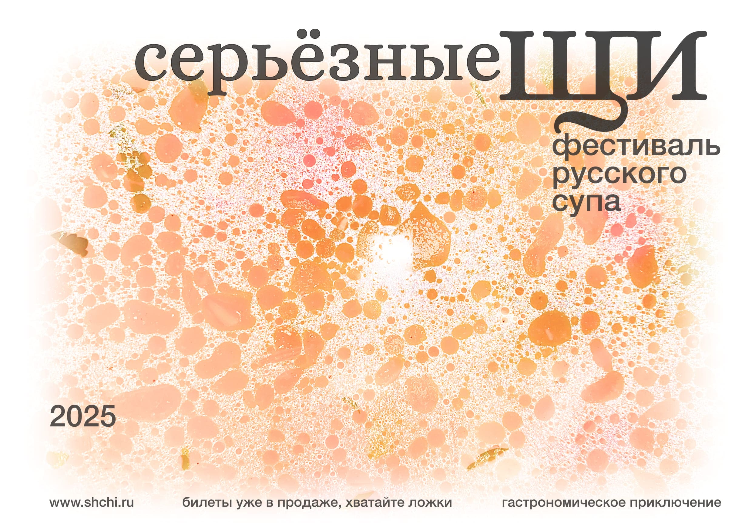
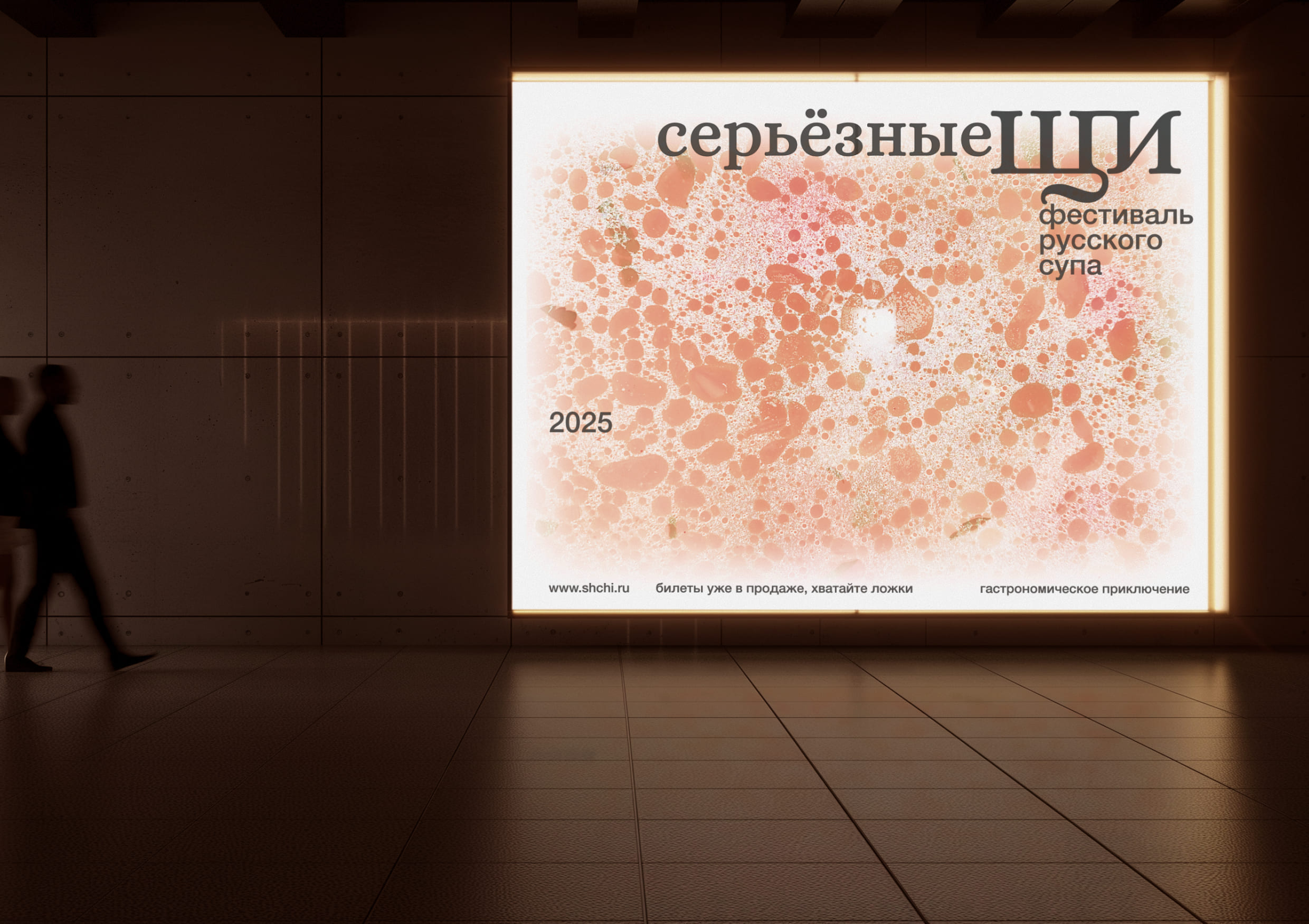
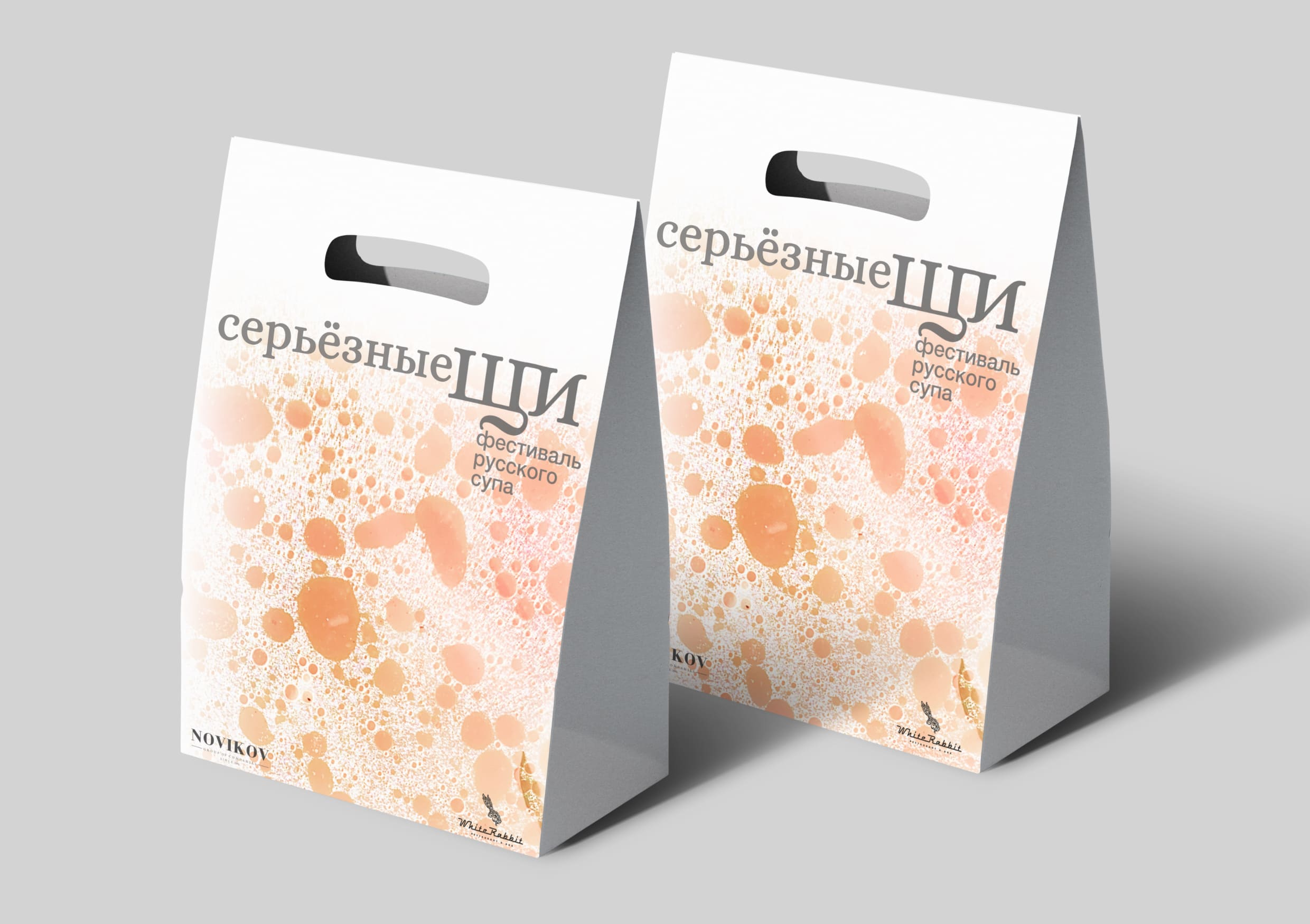
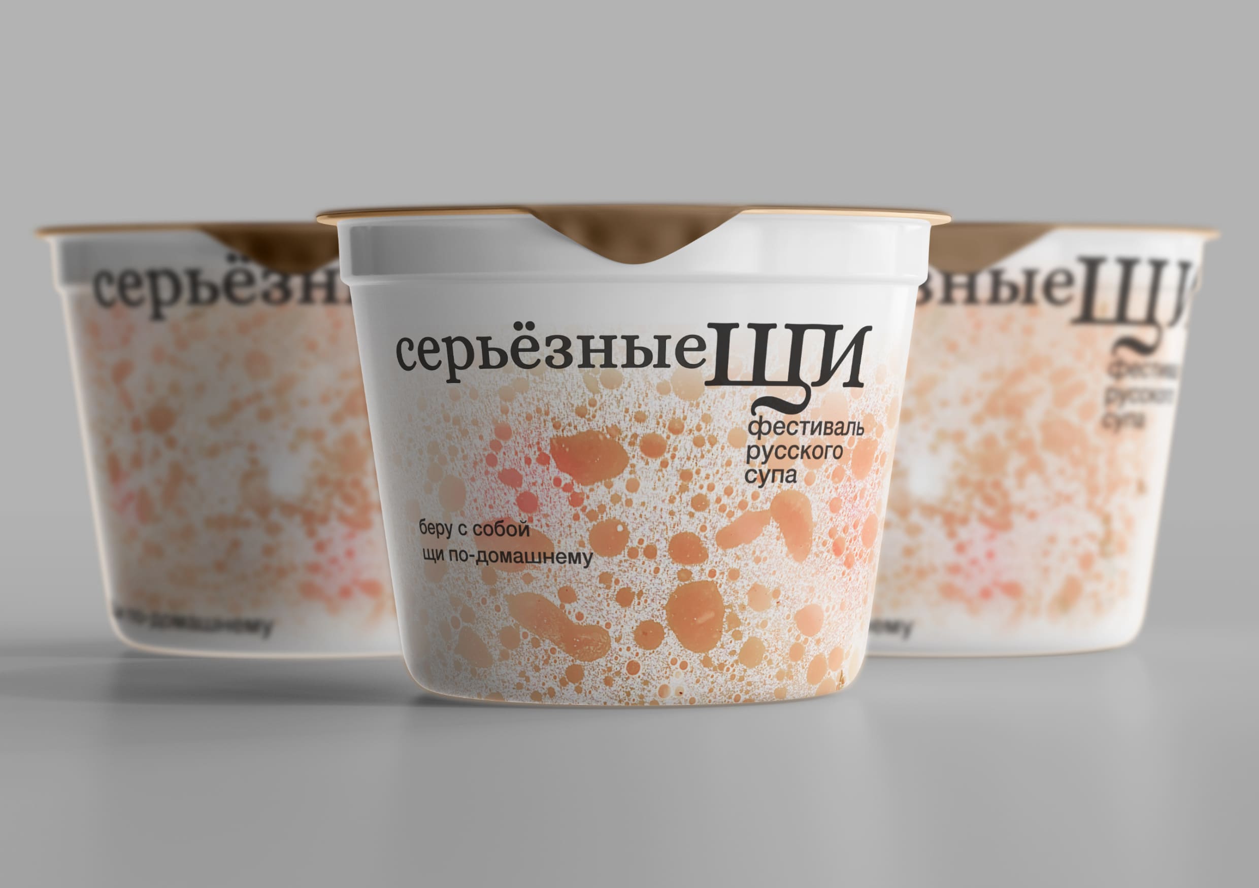
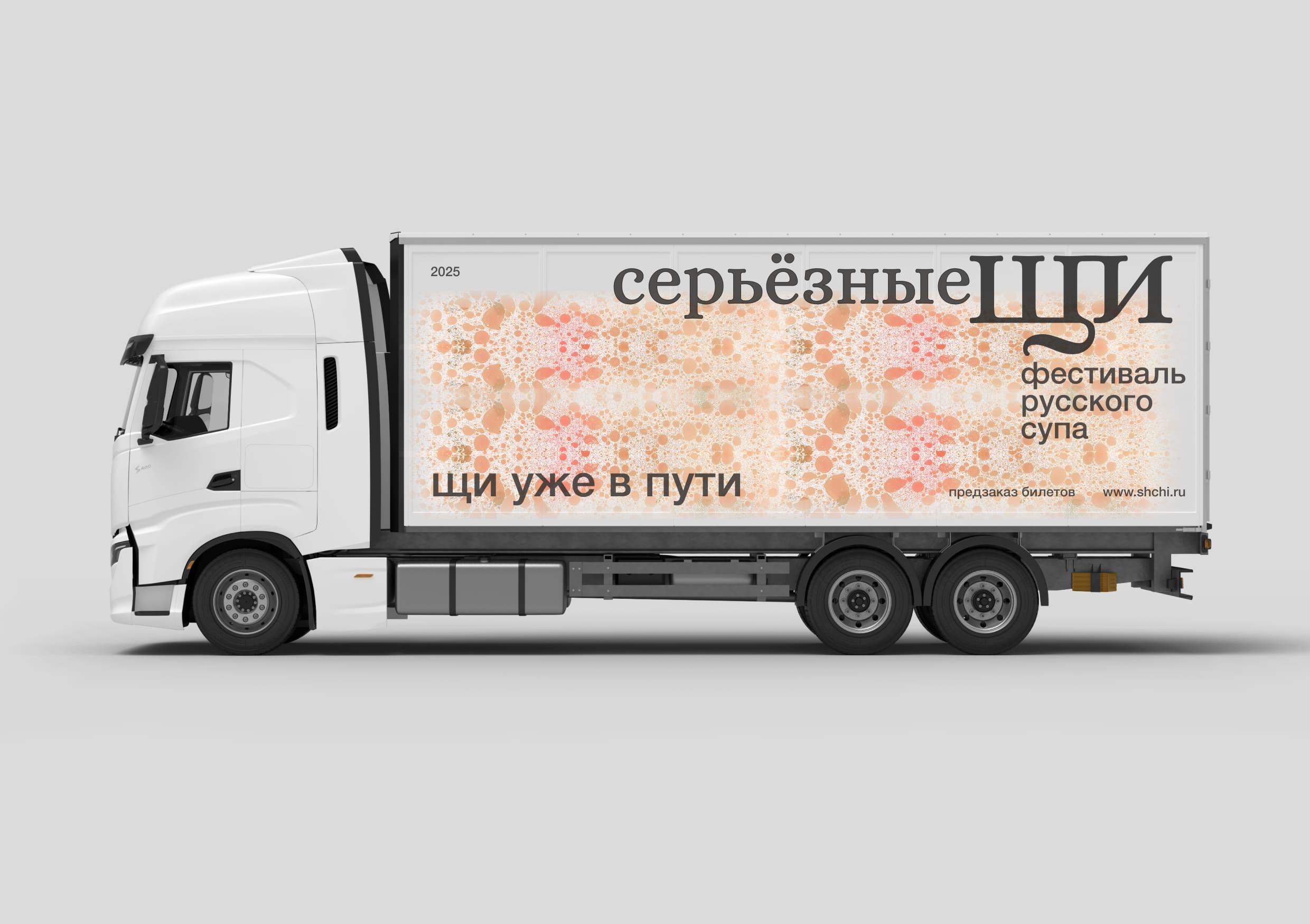
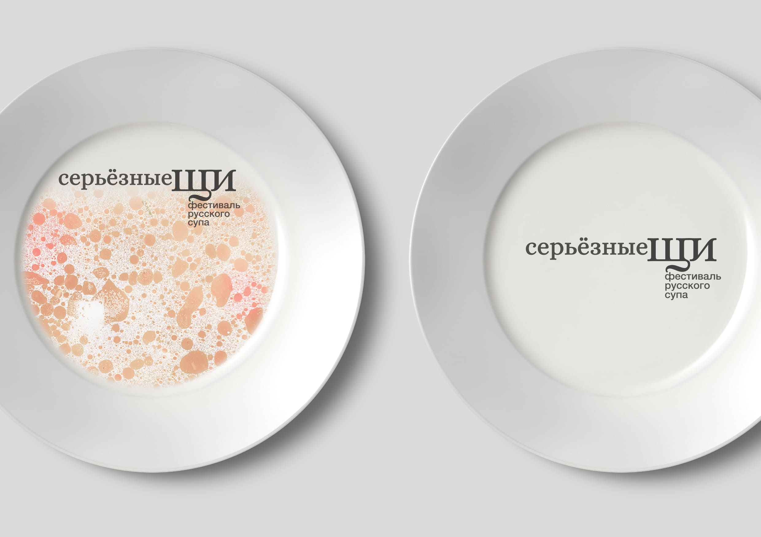
To realize the festival’s identity, a photo of a pot of soup, taken from a top-down perspective, was used. This solution allows people who see the identity to say: “Oh! That’s my bowl of soup!”. And the recognizable pattern of bubbles in the bowl extends to all of the corporate identity’s rapists.
Realization.
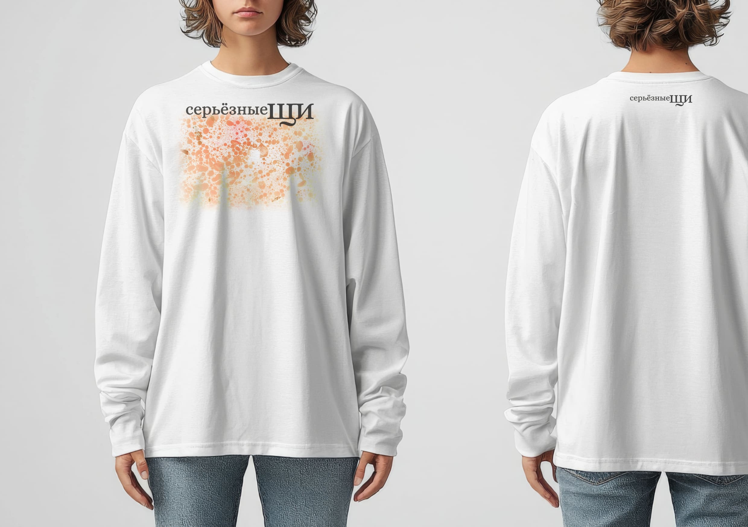
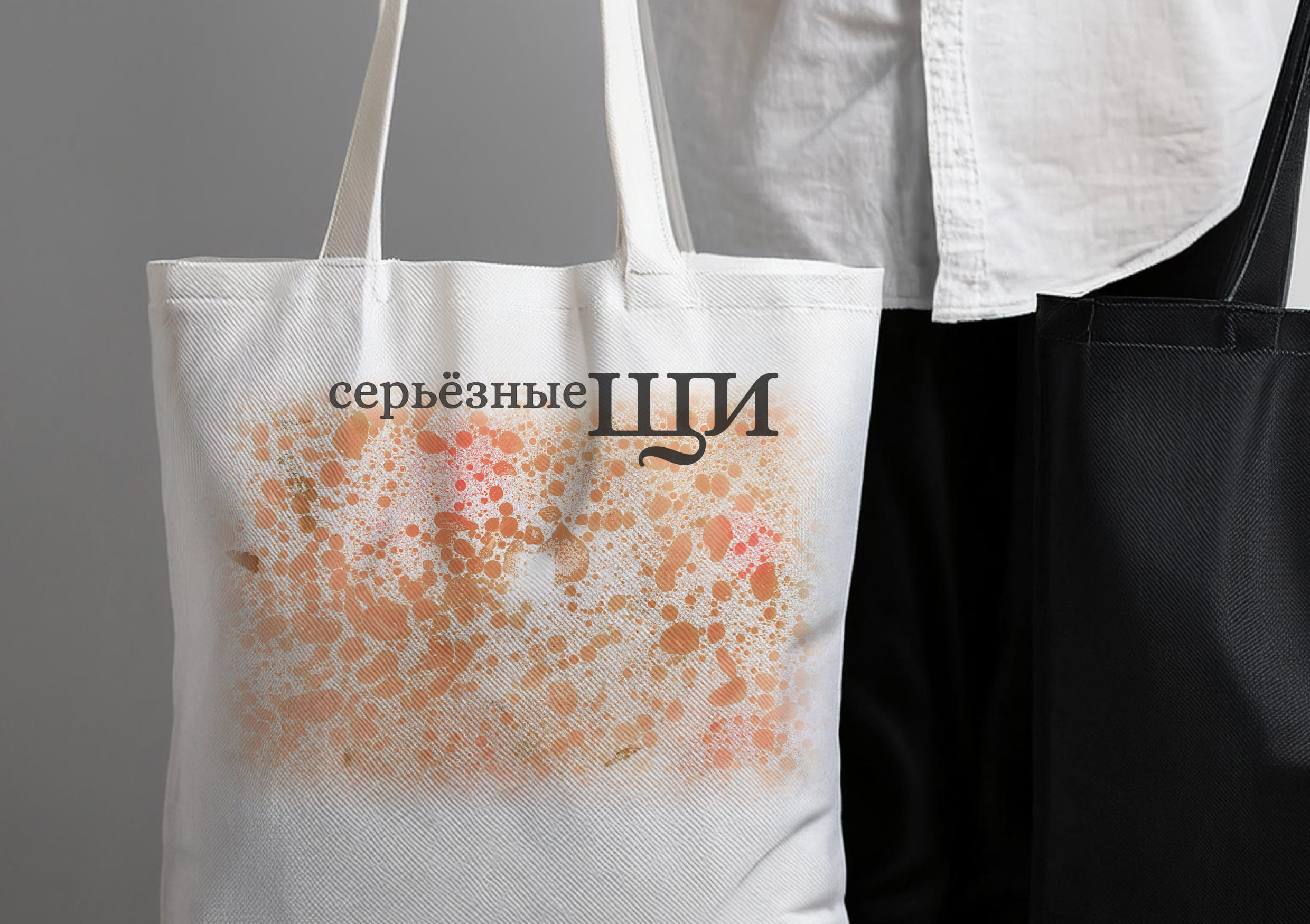
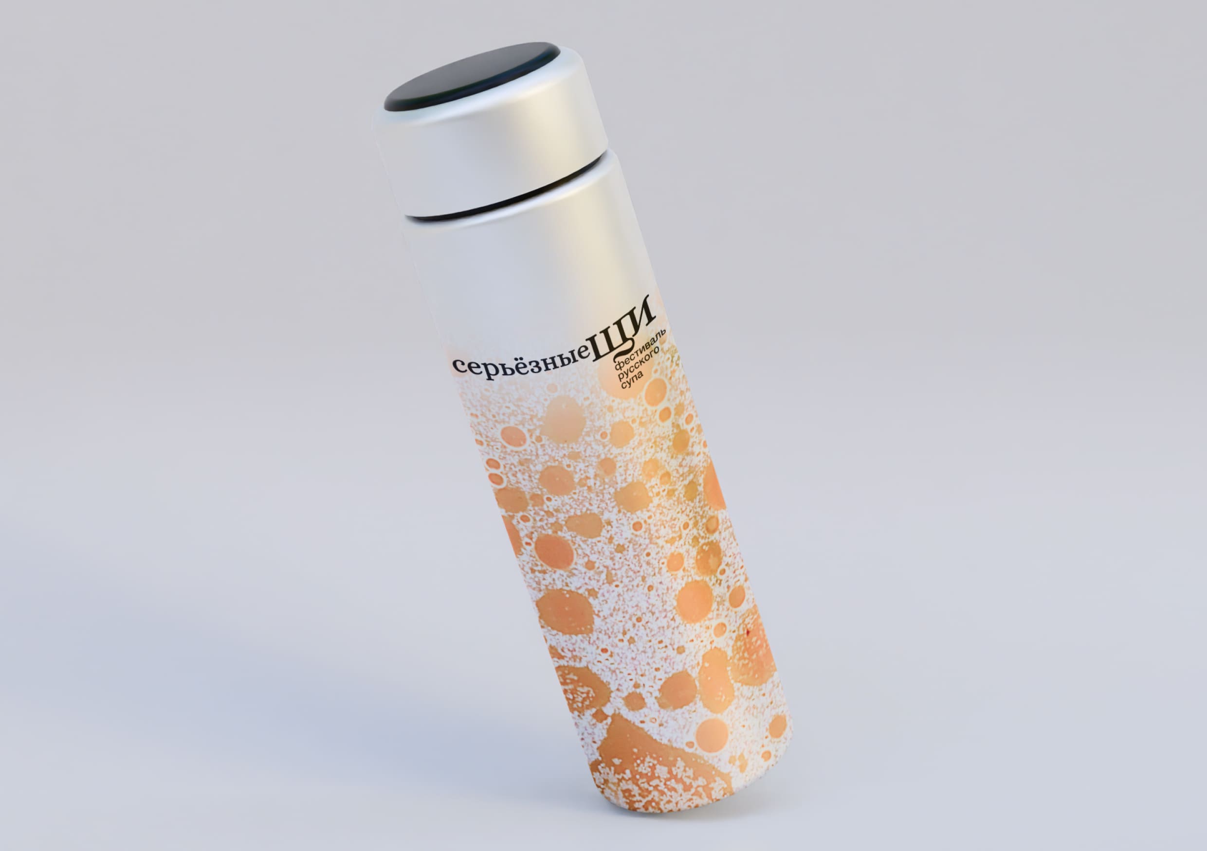
For the festival it was necessary to create media that would work. This is how external advertising, branded souvenirs for festival guests, branded transportation, and packaging appeared.
History.
The project was created within the framework of the art-direction course under the guidance of Leonid Slavin in HSE Art and Design School. The search for the right visual solution took a lot of time. The project needed a unique typographic solution: traditional typography was the most important part of the project. It was important to keep the typography relatively neutral so as not to distract viewers from the most important thing – the pattern. This is how we managed to transform the typeface for the project and create a dynamic system of texts and logo. This allowed us to maintain the consistency of visual solutions on all surfaces.
Authenticity.
This project is an example of a challenge to the conventional wisdom that creating an identity must be an incredibly complex process. Since the solution for the visual part is a photo of a real homemade soup, we tried to dispel the myth that a recognizable, working visual metaphor should appear only in complex graphic solutions.
CREDIT
- Agency/Creative: Elizaveta Kharitonyuk
- Article Title: Seryoznye Shci’s Festival Branding Student Concept Redefines Tradition Through Simple Design
- Organisation/Entity: Student
- Project Type: Identity
- Project Status: Non Published
- Agency/Creative Country: Russia
- Agency/Creative City: Moscow
- Market Region: Europe
- Project Deliverables: Art Direction
- Industry: Entertainment
- Keywords: art-direction, food, market, identity, traditional
-
Credits:
Supervisor: Leonid Slavin


