Serpentina Sync is an innovative skincare brand that reimagines the relationship between beauty, connectivity, and luxury. Inspired by the fluid grace and timeless symbolism of the serpent, Serpentina Sync embodies transformation, renewal, and strength. Its high-performance skincare products are meticulously crafted to unveil your skin’s natural radiance while elevating your self-care experience. The brand’s philosophy celebrates the idea that beauty is both personal and interconnected, offering products that are as functional as they are aesthetically captivating.
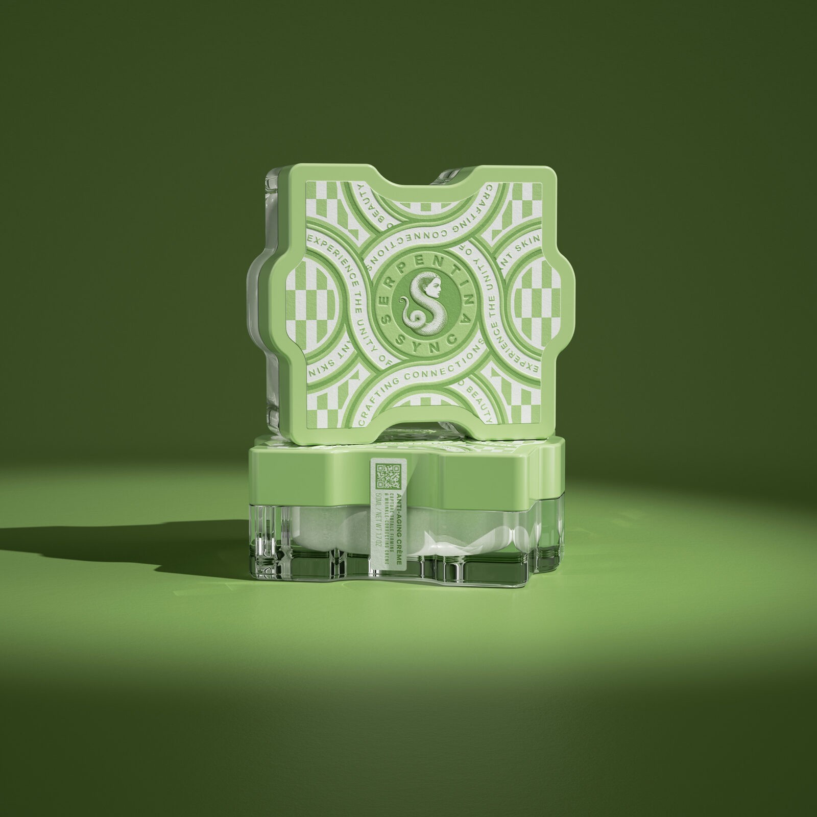
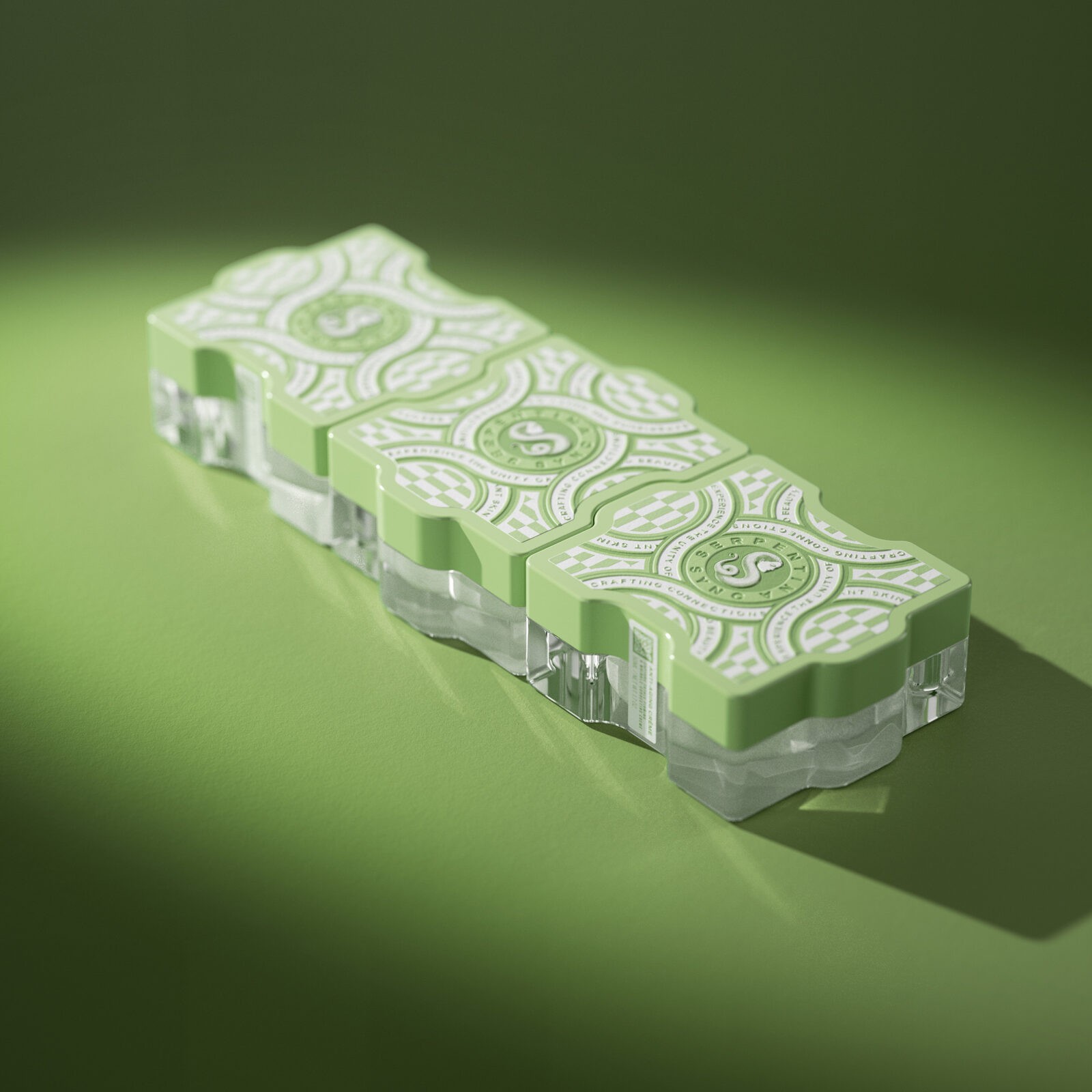
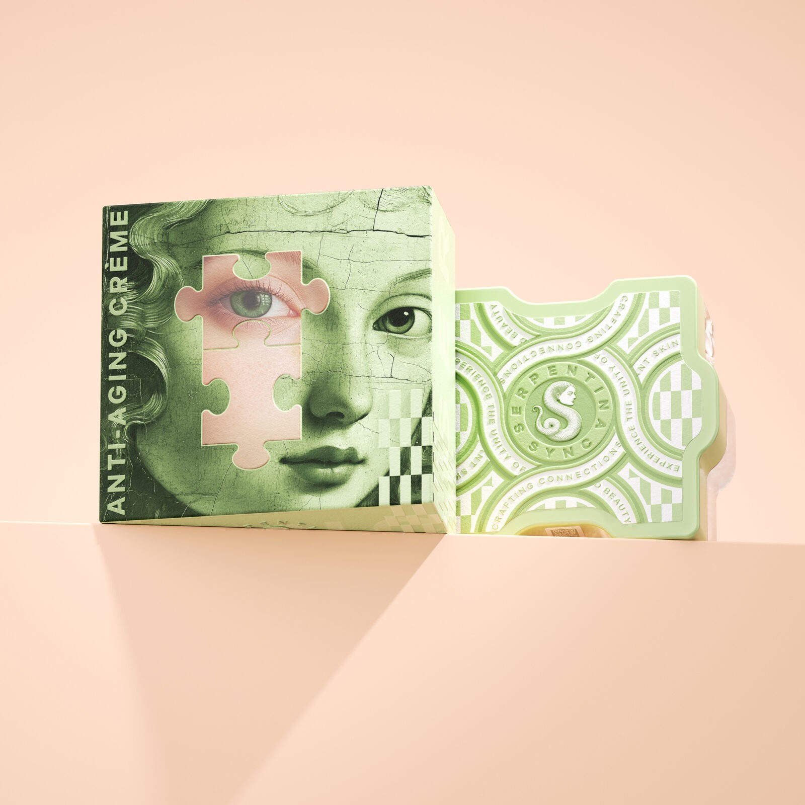
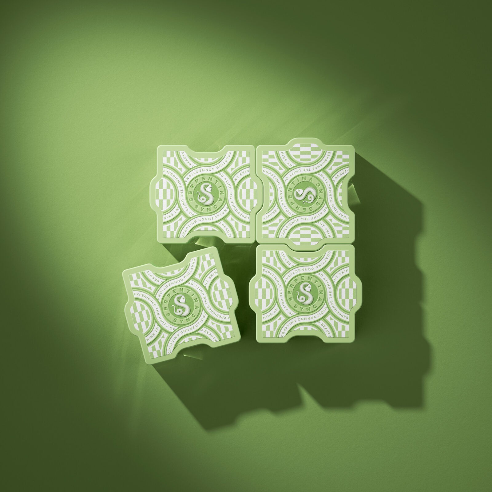
At the heart of Serpentina Sync’s innovation is its distinctive packaging design. Each product is housed in jars shaped like puzzle pieces, allowing customers to physically connect their skincare collection. This interactive feature is more than a playful novelty—it reflects the brand’s deeper philosophy of interconnectedness. By symbolizing the way each skincare product complements and enhances the others, the puzzle design encourages customers to thoughtfully build and expand their personalized beauty routines. The tactile experience of connecting the jars mirrors the emotional and practical connections fostered by a well-curated self-care regimen.
The brand further reinforces its themes of continuity and strength with a label design that includes a chain graphic. This visual element speaks to resilience and unity, subtly reminding users of the enduring power of self-care and transformation. The embossed finish on the packaging adds a luxurious, textured feel, inviting customers to engage with the products in a multi-sensory way that elevates the overall skincare experience.
Serpentina Sync’s symbol—a snake with a female face—captures the essence of the brand’s ethos. Representing wisdom, beauty, and renewal, the serpent’s body elegantly forms an ‘S,’ echoing the brand name and its promise of continuous care and transformation. This emblem encapsulates the duality of strength and grace, serving as a visual reminder of the brand’s commitment to empowering customers through exceptional skincare.
By blending innovation, artistic design, and high-performance skincare, Serpentina Sync transcends traditional beauty norms. It offers a holistic experience that bridges form and function, creating a space where self-care becomes an art form. For those seeking skincare that is as transformative as it is beautiful, Serpentina Sync offers a seamless blend of luxury, connectivity, and radiant results.


CREDIT
- Agency/Creative: Pavla Chuykina
- Article Title: Serpentina Sync Combines Functionality and Aesthetics in Puzzle-Perfect Skincare Packaging by Pavla Chuykina
- Organisation/Entity: Creative
- Project Status: Non Published
- Agency/Creative Country: Australia
- Agency/Creative City: Melbourne
- Industry: Beauty/Cosmetics
- Keywords: WBDS Creative Design Awards 2024/25 Serpentina Sync Skincare Packaging Design
- Keywords: WBDS Creative Design Awards 2024/25 Serpentina Sync Skincare Packaging Design
-
Credits:
Designer: Pavla Chuykina
3D Artist: Pavel Gubin


